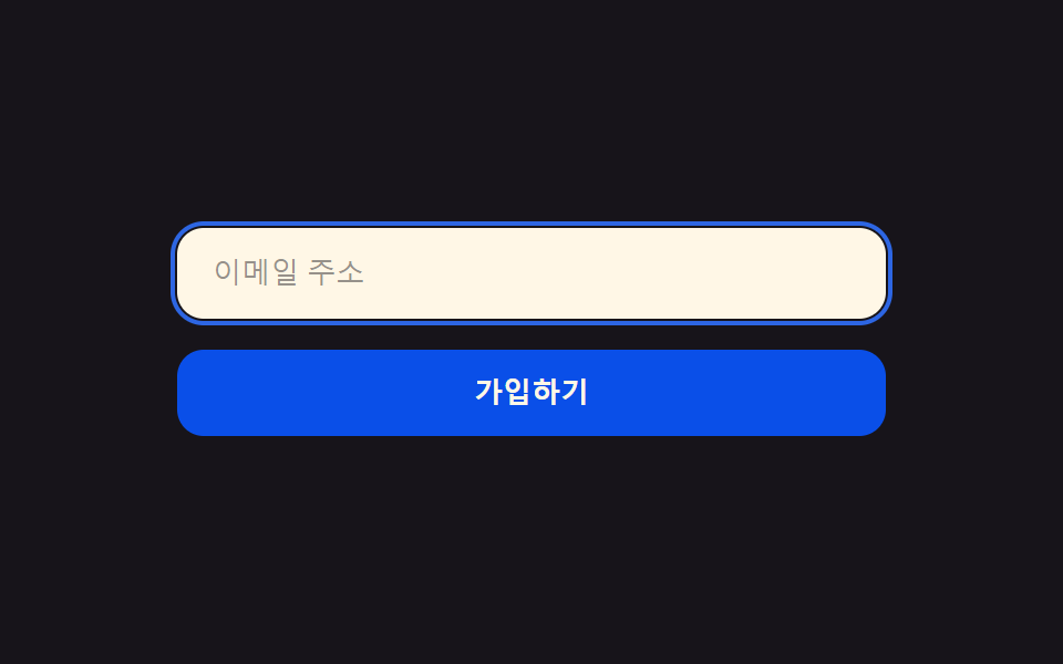
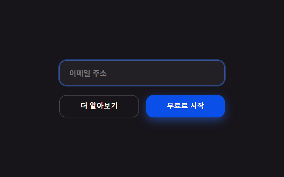
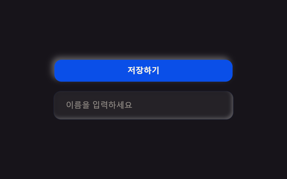
09クリーンなボタン・入力欄
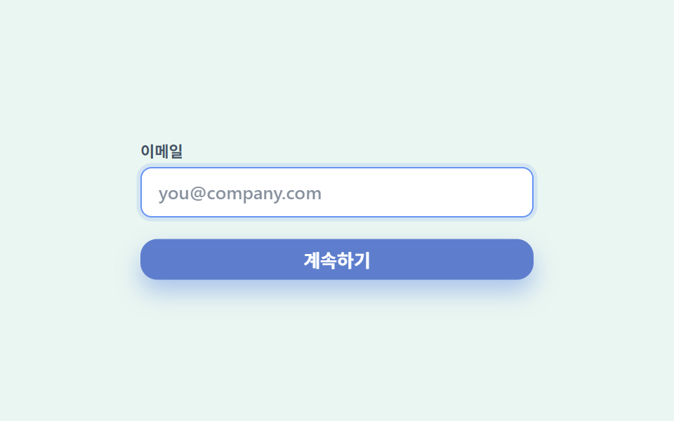
ボタンはホバーで背景がわずかに濃くなり1px浮き上がり、入力欄はフォーカスで薄いグレーの枠が青い二重リングへ滑らかに変わります。信頼キットの手触りを一つにまとめた項目です。
使いどころフォーム送信ボタン・ログイン入力欄
1px lift 호버focus 2중 링radius 12
<main class="stage">
  <div class="controls">
    <label class="controls__field">
      <span class="controls__label">メール</span>
      <input class="controls__input" type="text" placeholder="[email protected]">
    </label>
    <button class="controls__btn" type="button">続ける</button>
  </div>
</main>
@use "../../../../site/static/demo-tokens" as *;
$duration: $dur-loop;
$easing: $ease-out;
$color: $subject-blue;
$trust-mint: #eaf6f1;
$trust-ink: $subject-ink;
$trust-slate: #475569;
$trust-blue: $subject-blue;
$trust-blue-deep: #7386ba;
@include stage($trust-mint);
.controls {
box-sizing: border-box;
width: clamp(220px, 78vw, 280px);
display: flex;
flex-direction: column;
gap: $sp-4;
}
.controls__field {
display: flex;
flex-direction: column;
gap: $sp-1;
}
.controls__label {
color: $trust-slate;
font-weight: 600; font-size: 11px; line-height: 1.4;
font-family: inherit;
}
.controls__input {
box-sizing: border-box;
width: 100%;
border: 1.5px solid #e2e8f0;
border-radius: $r-sm;
background: $stage-paper;
color: $trust-ink;
padding: $sp-2 $sp-3;
font-weight: 500; font-size: 13px; line-height: 1.4;
font-family: inherit;
outline: none;
animation: ringPulse $duration $easing infinite;
}
.controls__input::placeholder {
color: $trust-slate;
opacity: .65;
}
.controls__btn {
border: 0;
border-radius: $r-control;
background: $trust-blue;
color: $stage-paper;
padding: $sp-2 $sp-5;
font-weight: 700; font-size: 13px; line-height: 1;
font-family: inherit;
box-shadow: 0 6px 14px rgba($trust-blue, .28);
animation: btnDarken $duration $easing infinite;
}
// 데모: 입력창은 포커스를 받은 것처럼 얇은 테두리가 두 겹 파란 링으로 부드럽게 퍼졌다 가라앉고, 버튼은 배경이 살짝 짙어지며 1px 떠오른다
@keyframes ringPulse {
0%, 60%, 100% { border-color: #e2e8f0; box-shadow: none; }
25% { border-color: $trust-blue; box-shadow: 0 0 0 4px rgba(47, 109, 246, .18); }
}
@keyframes btnDarken {
0%, 60%, 100% { transform: translateY(0); background: $trust-blue; box-shadow: 0 6px 14px rgba(47, 109, 246, .28); }
25% { transform: translateY(-1px); background: #7386ba; box-shadow: 0 10px 18px rgba(29, 78, 216, .34); }
}
@media (max-width: 340px), (max-height: 220px) {
.controls { gap: $sp-2; }
.controls__input { padding: $sp-1 $sp-2; }
.controls__btn { padding: $sp-1 $sp-4; }
}
@media (prefers-reduced-motion: reduce) {
.controls__input, .controls__btn { animation: none !important; transform: none; }
.controls__input { border-color: #e2e8f0; box-shadow: none; }
.controls__btn { background: $trust-blue; }
}html, body {
margin: 0;
overflow: hidden;
}
.stage {
box-sizing: border-box;
min-height: 100vh;
display: grid;
place-items: center;
margin: 0;
background: #eaf6f1;
font-family: -apple-system, "Segoe UI", "Noto Sans KR", sans-serif;
padding: clamp(8px, 4vw, 24px);
}
.controls {
box-sizing: border-box;
width: clamp(220px, 78vw, 280px);
display: flex;
flex-direction: column;
gap: 16px;
}
.controls__field {
display: flex;
flex-direction: column;
gap: 4px;
}
.controls__label {
color: #475569;
font-weight: 600;
font-size: 11px;
line-height: 1.4;
font-family: inherit;
}
.controls__input {
box-sizing: border-box;
width: 100%;
border: 1.5px solid #e2e8f0;
border-radius: 8px;
background: #ffffff;
color: #17141a;
padding: 8px 12px;
font-weight: 500;
font-size: 13px;
line-height: 1.4;
font-family: inherit;
outline: none;
animation: ringPulse 2s ease-out infinite;
}
.controls__input::placeholder {
color: #475569;
opacity: 0.65;
}
.controls__btn {
border: 0;
border-radius: 12px;
background: #2f6df6;
color: #ffffff;
padding: 8px 20px;
font-weight: 700;
font-size: 13px;
line-height: 1;
font-family: inherit;
box-shadow: 0 6px 14px rgba(47, 109, 246, 0.28);
animation: btnDarken 2s ease-out infinite;
}
@keyframes ringPulse {
0%, 60%, 100% {
border-color: #e2e8f0;
box-shadow: none;
}
25% {
border-color: #2f6df6;
box-shadow: 0 0 0 4px rgba(47, 109, 246, 0.18);
}
}
@keyframes btnDarken {
0%, 60%, 100% {
transform: translateY(0);
background: #2f6df6;
box-shadow: 0 6px 14px rgba(47, 109, 246, 0.28);
}
25% {
transform: translateY(-1px);
background: #7386ba;
box-shadow: 0 10px 18px rgba(29, 78, 216, 0.34);
}
}
@media (max-width: 340px), (max-height: 220px) {
.controls {
gap: 8px;
}
.controls__input {
padding: 4px 8px;
}
.controls__btn {
padding: 4px 16px;
}
}
@media (prefers-reduced-motion: reduce) {
.controls__input, .controls__btn {
animation: none !important;
transform: none;
}
.controls__input {
border-color: #e2e8f0;
box-shadow: none;
}
.controls__btn {
background: #2f6df6;
}
}import type { CSSProperties } from "react";
import styles from "./ButtonsInputsTrust.module.scss";
export type ButtonsInputsTrustProps = {
label?: string;
placeholder?: string;
cta?: string;
duration?: number;
easing?: string;
color?: string;
};
type Vars = CSSProperties & { "--duration"?: string; "--easing"?: string; "--color"?: string };
export default function ButtonsInputsTrust({
label = "이메일",
placeholder = "[email protected]",
cta = "계속하기",
duration = 2000,
easing = "ease-out",
color = "#2f6df6",
}: ButtonsInputsTrustProps) {
const vars: Vars = { "--duration": `${duration}ms`, "--easing": easing, "--color": color };
return (
<div className={styles.controls} style={vars}>
<label className={styles.field}>
<span className={styles.label}>{label}</span>
<input className={styles.input} type="text" placeholder={placeholder} />
</label>
<button type="button" className={styles.btn}>{cta}</button>
</div>
);
}09 クリーンなボタン・入力欄 — 計測 累積面積 10.641% · 動いたフレーム 12/23GODRICH オリジナル · SCSS と React は zip に同梱 · saas サイト デザイン 信頼感キット、クリーンなセクション9選
このデモが属する記事
 saas サイト デザイン 信頼感キット、クリーンなセクション9選saas サイト デザインの良さは、白とオフホワイトという二つの中立な背景の上に、ブランドカラーを青一色だけ重ね、影は色付きにせずグレー系で浅く、角の丸みも抑えた半径に統一するところにあります。パステルやキャンディグラデーションの明るさとは この記事のデモをすべて見る