saas サイト デザイン 信頼感キット、クリーンなセクション9選
saas サイト デザインの良さは、白とオフホワイトという二つの中立な背景の上に、ブランドカラーを青一色だけ重ね、影は色付きにせずグレー系で浅く、角の丸みも抑えた半径に統一するところにあります。パステルやキャンディグラデーションの明るさとは違い、この明るさは色数ではなく余白と節度から生まれます。
以下は、その原則で実際に作った原ページです。Stripe や Linear のようなあの画面を、名前が分からず保存していた人のために、そのまま置いています。ナビからフッターまでスクロールしながら、本当に色が青一色しかないかを数えてみてください。

上の画面を構成する9つの部品を一つずつ切り離し、グリッドに並べ直しました。訪問者が画面を開いたときに目が動く順番 — 目を引く・見て回る・機能を確認する・料金を確認する・信頼する・行動する — その順番のままです。キット全体で使う色は青一色だけで、それ以外はすべて白・オフホワイト・グレーです。
 01 hero-trust
 02 nav-trust
 03 card-grid-trust
 04 feature-list-trust
 05 pricing-trust
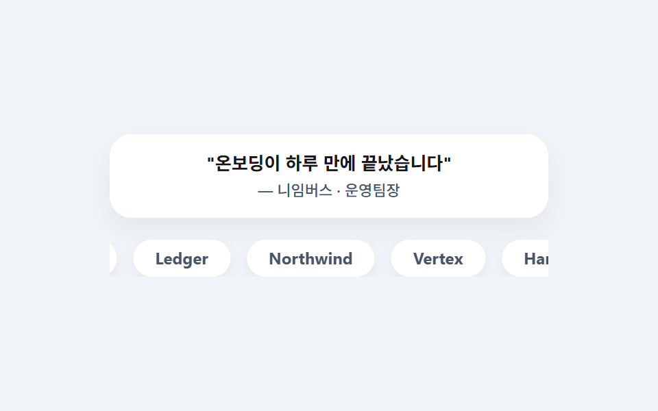 06 testimonial-trust
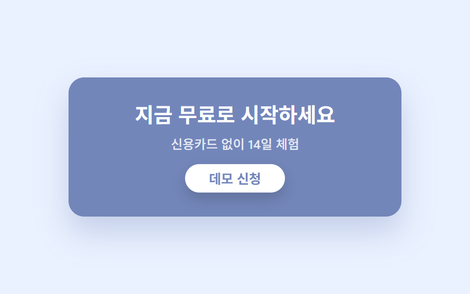 07 cta-band-trust
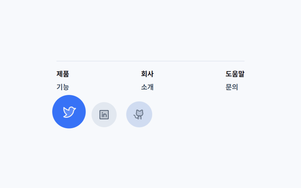 08 footer-trust
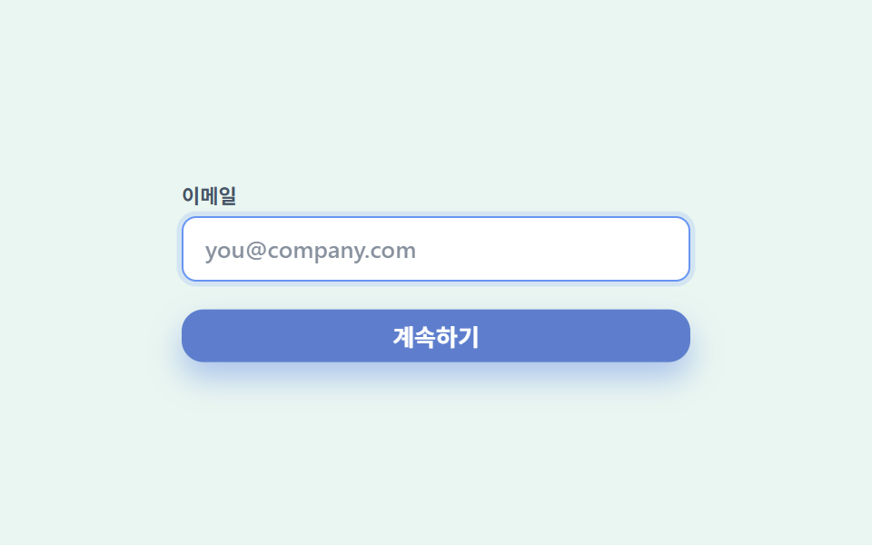 09 buttons-inputs-trust
自動再生 · タイルを押すとその項目へ · すべて1つのzip
- 01 ソフトグリッドのヒーロー
- 02 アンダーラインナビ
- 03 アイコンカードグリッド
- 04 チェック機能リスト
- 05 シンプル料金プラン
- 06 ロゴ信頼のレビュー
- 07 ソリッドCTA帯
- 08 ミニマル4カラムフッター
- 09 クリーンなボタン・入力欄
企業サイト デザイン 参考としてまとめたこのキットの色は8つで終わります。ブランドカラーを小さな本文の文字色に直接使わないことが、読みやすい信頼感の条件です。同じdesign柱で色数を増やし果物のように鮮やかへ振れたのがビタミンカラー デザイン LPキット、紙を切って層を重ねたのがペーパーカット デザインのLPパーツです。
| 役割 | 色 | 使う場所 |
|---|---|---|
| オフホワイト | #f7f9fc |
ページ全体の背景 |
| ブルーティント | #eaf1ff |
カードグリッドの舞台・アイコン背景 |
| グレーティント | #f1f5f9 |
ナビ・ロゴ帯の舞台 |
| ミントティント | #eaf6f1 |
チェックアイコン・入力欄の舞台 |
| ブランドブルー | #2f6df6 |
ボタン・アイコン・枠線・強調 |
| ブルーディープ | #1d4ed8 |
CTA帯の背景・ボタンの押し込み |
| スレート | #475569 |
補助文字 |
| インク | #17141a |
見出し・本文の文字 |
01ソフトグリッドのヒーロー
saas lp デザインで何が見えるか
オフホワイトの背景にごく薄いドットグリッドを敷き、手前の白いカードがゆっくりと上下に浮かびます。
<main class="stage">
  <section class="herotrust">
    <span class="herotrust__badge" aria-hidden="true">
      <svg xmlns="http://www.w3.org/2000/svg" width="1em" height="1em" viewBox="0 0 256 256"><g fill="currentColor"><path d="M216 56v56c0 96-88 120-88 120s-88-24-88-120V56a8 8 0 0 1 8-8h160a8 8 0 0 1 8 8" opacity=".2"/><path d="M208 40H48a16 16 0 0 0-16 16v56c0 52.72 25.52 84.67 46.93 102.19c23.06 18.86 46 25.26 47 25.53a8 8 0 0 0 4.2 0c1-.27 23.91-6.67 47-25.53C198.48 196.67 224 164.72 224 112V56a16 16 0 0 0-16-16m0 72c0 37.07-13.66 67.16-40.6 89.42a129.3 129.3 0 0 1-39.4 22.2a128.3 128.3 0 0 1-38.92-21.81C61.82 179.51 48 149.3 48 112V56h160ZM82.34 141.66a8 8 0 0 1 11.32-11.32L112 148.69l50.34-50.35a8 8 0 0 1 11.32 11.32l-56 56a8 8 0 0 1-11.32 0Z"/></g></svg>
    </span>
    <div class="herotrust__card">
      <p class="herotrust__eyebrow">Trusted by teams</p>
      <h1 class="herotrust__title">より速く、安全なスタート</h1>
      <p class="herotrust__desc">信頼が必要なチームのためのSaaSランディング</p>
      <button class="herotrust__cta" type="button">無料で始める</button>
    </div>
  </section>
</main>
@use "../../../../site/static/demo-tokens" as *;
$duration: $dur-loop; // 카드가 한 번 뜨고 가라앉는 주기
$easing: $ease-out; // 통통 튀지 않는 절제된 곡선
$color: $subject-blue; // 유일한 브랜드 컬러
// 신뢰감 팔레트 — 흰색·오프화이트 바탕에 파란색 하나만 강조. 카드류는 잉크 대비 4.5:1 이상(접근성 섹션 참고), 그림자는 회색 계열로 얕게
$trust-offwhite: #f7f9fc;
$trust-ink: $subject-ink;
$trust-slate: #475569;
$trust-blue: $subject-blue;
@include stage($trust-offwhite);
// 점 격자 배경 — 정적 장식. 애니메이션 대상이 아니다
.stage {
background-image: radial-gradient(circle, rgba($trust-ink, .08) 1px, transparent 1px);
background-size: 20px 20px;
}
.herotrust {
position: relative;
width: clamp(220px, 76vw, 340px);
}
.herotrust__badge {
position: absolute;
top: -16px;
right: 12px;
width: clamp(28px, 8vw, 36px);
aspect-ratio: 1;
display: grid;
place-items: center;
border-radius: 50%;
background: $trust-blue;
color: $stage-paper;
box-shadow: 0 8px 16px rgba($trust-blue, .35);
font-size: clamp(14px, 4vw, 18px);
animation: badgeFloat $duration $easing infinite;
}
.herotrust__card {
box-sizing: border-box;
width: 100%;
display: flex;
flex-direction: column;
align-items: flex-start;
gap: $sp-2;
padding: $sp-5;
border-radius: $r-card;
background: $stage-paper;
box-shadow: 0 14px 28px rgba($trust-ink, .1);
animation: cardBob $duration $easing infinite;
}
.herotrust__eyebrow {
margin: 0;
color: $trust-blue;
font-weight: 700; font-size: clamp(10px, 2.6vw, 12px); line-height: 1;
font-family: inherit;
letter-spacing: .08em;
text-transform: uppercase;
}
.herotrust__title {
margin: 0;
color: $trust-ink;
font-weight: 700; font-size: clamp(18px, 4.6vw, 24px); line-height: 1.25;
font-family: inherit;
}
.herotrust__desc {
margin: 0;
color: $trust-slate;
font-weight: 500; font-size: clamp(12px, 2.8vw, 14px); line-height: 1.4;
font-family: inherit;
}
.herotrust__cta {
margin-top: $sp-1;
border: 0;
border-radius: $r-pill;
background: $trust-blue;
color: $stage-paper;
padding: $sp-2 $sp-5;
font-weight: 700; font-size: clamp(12px, 2.8vw, 14px); line-height: 1;
font-family: inherit;
box-shadow: 0 8px 18px rgba($trust-blue, .3);
}
.herotrust__cta:focus-visible {
outline: 3px solid $trust-blue;
outline-offset: 2px;
}
// 데모: 카드가 완만하게 떠올랐다 가라앉고(큰 피사체라 누적면적을 확보), 배지는 다른 위상으로 살짝 흔들린다
@keyframes cardBob {
0%, 100% { transform: translateY(0); box-shadow: 0 14px 28px rgba($trust-ink, .1); }
50% { transform: translateY(-9px); box-shadow: 0 20px 32px rgba($trust-ink, .07); }
}
@keyframes badgeFloat {
0%, 100% { transform: translateY(0) scale(1); }
50% { transform: translateY(6px) scale(1.06); }
}
@media (max-width: 340px), (max-height: 220px) {
.herotrust__card { padding: $sp-3 $sp-4; gap: $sp-1; }
.herotrust__eyebrow { display: none; }
.herotrust__title { font-size: 15px; line-height: 1.15; }
.herotrust__desc { display: none; }
.herotrust__cta { padding: $sp-1 $sp-4; margin-top: 0; }
.herotrust__badge { width: 22px; top: -8px; right: 6px; }
}
@media (prefers-reduced-motion: reduce) {
.herotrust__badge, .herotrust__card { animation: none !important; transform: none; }
}html, body {
margin: 0;
overflow: hidden;
}
.stage {
box-sizing: border-box;
min-height: 100vh;
display: grid;
place-items: center;
margin: 0;
background: #f7f9fc;
font-family: -apple-system, "Segoe UI", "Noto Sans KR", sans-serif;
padding: clamp(8px, 4vw, 24px);
}
.stage {
background-image: radial-gradient(circle, rgba(23, 20, 26, 0.08) 1px, transparent 1px);
background-size: 20px 20px;
}
.herotrust {
position: relative;
width: clamp(220px, 76vw, 340px);
}
.herotrust__badge {
position: absolute;
top: -16px;
right: 12px;
width: clamp(28px, 8vw, 36px);
aspect-ratio: 1;
display: grid;
place-items: center;
border-radius: 50%;
background: #2f6df6;
color: #ffffff;
box-shadow: 0 8px 16px rgba(47, 109, 246, 0.35);
font-size: clamp(14px, 4vw, 18px);
animation: badgeFloat 2s ease-out infinite;
}
.herotrust__card {
box-sizing: border-box;
width: 100%;
display: flex;
flex-direction: column;
align-items: flex-start;
gap: 8px;
padding: 20px;
border-radius: 16px;
background: #ffffff;
box-shadow: 0 14px 28px rgba(23, 20, 26, 0.1);
animation: cardBob 2s ease-out infinite;
}
.herotrust__eyebrow {
margin: 0;
color: #2f6df6;
font-weight: 700;
font-size: clamp(10px, 2.6vw, 12px);
line-height: 1;
font-family: inherit;
letter-spacing: 0.08em;
text-transform: uppercase;
}
.herotrust__title {
margin: 0;
color: #17141a;
font-weight: 700;
font-size: clamp(18px, 4.6vw, 24px);
line-height: 1.25;
font-family: inherit;
}
.herotrust__desc {
margin: 0;
color: #475569;
font-weight: 500;
font-size: clamp(12px, 2.8vw, 14px);
line-height: 1.4;
font-family: inherit;
}
.herotrust__cta {
margin-top: 4px;
border: 0;
border-radius: 999px;
background: #2f6df6;
color: #ffffff;
padding: 8px 20px;
font-weight: 700;
font-size: clamp(12px, 2.8vw, 14px);
line-height: 1;
font-family: inherit;
box-shadow: 0 8px 18px rgba(47, 109, 246, 0.3);
}
.herotrust__cta:focus-visible {
outline: 3px solid #2f6df6;
outline-offset: 2px;
}
@keyframes cardBob {
0%, 100% {
transform: translateY(0);
box-shadow: 0 14px 28px rgba(23, 20, 26, 0.1);
}
50% {
transform: translateY(-9px);
box-shadow: 0 20px 32px rgba(23, 20, 26, 0.07);
}
}
@keyframes badgeFloat {
0%, 100% {
transform: translateY(0) scale(1);
}
50% {
transform: translateY(6px) scale(1.06);
}
}
@media (max-width: 340px), (max-height: 220px) {
.herotrust__card {
padding: 12px 16px;
gap: 4px;
}
.herotrust__eyebrow {
display: none;
}
.herotrust__title {
font-size: 15px;
line-height: 1.15;
}
.herotrust__desc {
display: none;
}
.herotrust__cta {
padding: 4px 16px;
margin-top: 0;
}
.herotrust__badge {
width: 22px;
top: -8px;
right: 6px;
}
}
@media (prefers-reduced-motion: reduce) {
.herotrust__badge, .herotrust__card {
animation: none !important;
transform: none;
}
}import type { CSSProperties } from "react";
import styles from "./HeroTrust.module.scss";
export type HeroTrustProps = {
eyebrow?: string;
title?: string;
desc?: string;
cta?: string;
/** 한 주기(기본 2000ms) */
duration?: number;
easing?: string;
color?: string;
};
type Vars = CSSProperties & { "--duration"?: string; "--easing"?: string; "--color"?: string };
export default function HeroTrust({
eyebrow = "Trusted by teams",
title = "더 빠르고 안전한 시작",
desc = "신뢰가 필요한 팀을 위한 SaaS 랜딩",
cta = "무료로 시작",
duration = 2000,
easing = "ease-out",
color = "#2f6df6",
}: HeroTrustProps) {
const vars: Vars = { "--duration": `${duration}ms`, "--easing": easing, "--color": color };
return (
<section className={styles.herotrust} style={vars}>
<span className={styles.badge} aria-hidden="true">
<svg xmlns="http://www.w3.org/2000/svg" width="1em" height="1em" viewBox="0 0 256 256"><g fill="currentColor"><path d="M216 56v56c0 96-88 120-88 120s-88-24-88-120V56a8 8 0 0 1 8-8h160a8 8 0 0 1 8 8" opacity=".2"/><path d="M208 40H48a16 16 0 0 0-16 16v56c0 52.72 25.52 84.67 46.93 102.19c23.06 18.86 46 25.26 47 25.53a8 8 0 0 0 4.2 0c1-.27 23.91-6.67 47-25.53C198.48 196.67 224 164.72 224 112V56a16 16 0 0 0-16-16m0 72c0 37.07-13.66 67.16-40.6 89.42a129.3 129.3 0 0 1-39.4 22.2a128.3 128.3 0 0 1-38.92-21.81C61.82 179.51 48 149.3 48 112V56h160ZM82.34 141.66a8 8 0 0 1 11.32-11.32L112 148.69l50.34-50.35a8 8 0 0 1 11.32 11.32l-56 56a8 8 0 0 1-11.32 0Z"/></g></svg>
</span>
<div className={styles.card}>
<p className={styles.eyebrow}>{eyebrow}</p>
<h1 className={styles.title}>{title}</h1>
<p className={styles.desc}>{desc}</p>
<button type="button" className={styles.cta}>{cta}</button>
</div>
</section>
);
}01 · ソフトグリッドのヒーロー — 計測 累積面積 11.469% · 動いたフレーム 23/23GODRICH オリジナル · SCSS と React は zip に同梱 · パスワードを見る
コードのどこを見るか
強調は小さな青いバッジひとつだけで、影はすべて中立なグレーで浅く保っています。
<section class="dotgrid relative overflow-hidden rounded-card py-20">
  <div class="relative mx-auto flex max-w-xl flex-col items-start gap-4
              rounded-card bg-white p-10 shadow-soft">
    <p class="text-xs font-bold uppercase tracking-widest text-brand">Trusted by teams</p>
    <h1 class="text-4xl font-bold leading-tight">もっと速く、もっと安全に</h1>
    <button class="rounded-pill bg-brand px-6 py-3 text-sm font-bold text-white shadow-brand">無料で始める</button>
  </div>
</section>
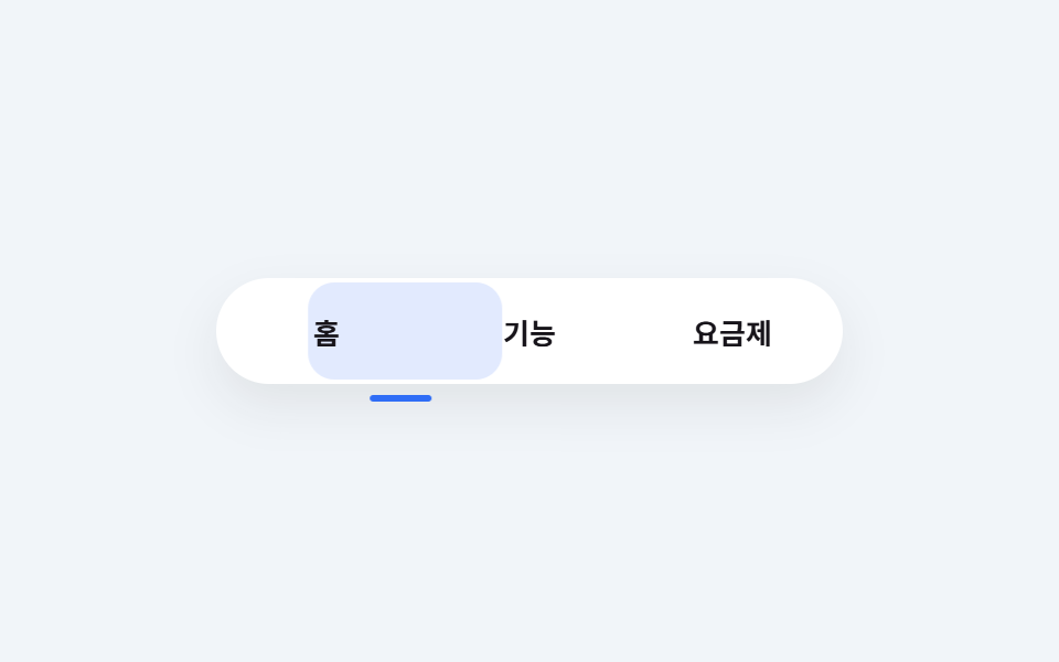
02アンダーラインナビ
画面で起きること
メニュー文字の下で青いアンダーラインがアクティブなタブへなめらかに移動します。
<main class="stage">
  <nav class="navtrust">
    <span class="navtrust__highlight" aria-hidden="true"></span>
    <span class="navtrust__tab">ホーム</span>
    <span class="navtrust__tab">機能</span>
    <span class="navtrust__tab">料金</span>
    <span class="navtrust__underline" aria-hidden="true"></span>
  </nav>
</main>
@use "../../../../site/static/demo-tokens" as *;
$duration: 3s; // 세 칸을 도는 한 바퀴 — 2s 로프($dur-loop)보다 정거장이 많아 별도 토큰(합치지 않는다, blog-design 규칙 2)
$easing: $ease-out;
$color: $subject-blue;
$trust-graytint: #f1f5f9;
$trust-ink: $subject-ink;
$trust-blue: $subject-blue;
@include stage($trust-graytint);
// 탭 3개 — 폭을 고정(flex:0 0 auto)해 인디케이터 translateX 이동량과 어긋나지 않는다 (BD19). 320px 안에 들어가도록 전체 폭을 284px 로 미리 잡는다
$tab-w: 92px;
$tab-h: 48px;
$underline-w: 28px;
$underline-offset: 32px; // ($tab-w - $underline-w) / 2, 나눗셈 없이 상수로
.navtrust {
position: relative;
box-sizing: border-box;
display: flex;
align-items: center;
width: $tab-w * 3 + $sp-2;
height: $tab-h;
padding: 0 $sp-1;
border-radius: $r-pill;
background: $stage-paper;
box-shadow: 0 10px 22px rgba($trust-ink, .08);
}
.navtrust__highlight {
position: absolute;
left: $sp-1;
top: 2px;
width: $tab-w - 4px;
height: $tab-h - 4px;
border-radius: $r-control;
background: rgba($trust-blue, .14);
animation: slideTab $duration $easing infinite;
}
.navtrust__tab {
position: relative;
z-index: 1;
flex: 0 0 $tab-w;
text-align: center;
color: $trust-ink;
font-weight: 600; font-size: clamp(11px, 3vw, 13px); line-height: 1;
font-family: inherit;
}
.navtrust__underline {
position: absolute;
bottom: -$sp-2;
left: 0;
width: $underline-w;
height: 3px;
border-radius: $r-xs;
background: $trust-blue;
transform: translateX($underline-offset);
animation: slideUnderline $duration $easing infinite;
}
// 데모: 하이라이트 블록(넓은 면적)과 밑줄(얇은 신호선)이 같은 박자로 세 칸을 순서대로 돈다
@keyframes slideTab {
0%, 22% { transform: translateX(0); }
33%, 55% { transform: translateX($tab-w); }
66%, 88% { transform: translateX($tab-w * 2); }
100% { transform: translateX(0); }
}
@keyframes slideUnderline {
0%, 22% { transform: translateX($underline-offset); }
33%, 55% { transform: translateX($tab-w + $underline-offset); }
66%, 88% { transform: translateX($tab-w * 2 + $underline-offset); }
100% { transform: translateX($underline-offset); }
}
@media (prefers-reduced-motion: reduce) {
.navtrust__highlight, .navtrust__underline { animation: none !important; }
.navtrust__highlight { transform: translateX(0); }
.navtrust__underline { transform: translateX($underline-offset); }
}html, body {
margin: 0;
overflow: hidden;
}
.stage {
box-sizing: border-box;
min-height: 100vh;
display: grid;
place-items: center;
margin: 0;
background: #f1f5f9;
font-family: -apple-system, "Segoe UI", "Noto Sans KR", sans-serif;
padding: clamp(8px, 4vw, 24px);
}
.navtrust {
position: relative;
box-sizing: border-box;
display: flex;
align-items: center;
width: 284px;
height: 48px;
padding: 0 4px;
border-radius: 999px;
background: #ffffff;
box-shadow: 0 10px 22px rgba(23, 20, 26, 0.08);
}
.navtrust__highlight {
position: absolute;
left: 4px;
top: 2px;
width: 88px;
height: 44px;
border-radius: 12px;
background: rgba(47, 109, 246, 0.14);
animation: slideTab 3s ease-out infinite;
}
.navtrust__tab {
position: relative;
z-index: 1;
flex: 0 0 92px;
text-align: center;
color: #17141a;
font-weight: 600;
font-size: clamp(11px, 3vw, 13px);
line-height: 1;
font-family: inherit;
}
.navtrust__underline {
position: absolute;
bottom: -8px;
left: 0;
width: 28px;
height: 3px;
border-radius: 4px;
background: #2f6df6;
transform: translateX(32px);
animation: slideUnderline 3s ease-out infinite;
}
@keyframes slideTab {
0%, 22% {
transform: translateX(0);
}
33%, 55% {
transform: translateX(92px);
}
66%, 88% {
transform: translateX(184px);
}
100% {
transform: translateX(0);
}
}
@keyframes slideUnderline {
0%, 22% {
transform: translateX(32px);
}
33%, 55% {
transform: translateX(124px);
}
66%, 88% {
transform: translateX(216px);
}
100% {
transform: translateX(32px);
}
}
@media (prefers-reduced-motion: reduce) {
.navtrust__highlight, .navtrust__underline {
animation: none !important;
}
.navtrust__highlight {
transform: translateX(0);
}
.navtrust__underline {
transform: translateX(32px);
}
}import type { CSSProperties } from "react";
import styles from "./NavTrust.module.scss";
export type NavTrustProps = {
tabs?: string[];
duration?: number;
easing?: string;
color?: string;
};
type Vars = CSSProperties & { "--duration"?: string; "--easing"?: string; "--color"?: string };
export default function NavTrust({
tabs = ["홈", "기능", "요금제"],
duration = 3000,
easing = "ease-out",
color = "#2f6df6",
}: NavTrustProps) {
const vars: Vars = { "--duration": `${duration}ms`, "--easing": easing, "--color": color };
return (
<nav className={styles.navtrust} style={vars}>
<span className={styles.highlight} aria-hidden="true" />
{tabs.map((t) => (
<span key={t} className={styles.tab}>{t}</span>
))}
<span className={styles.underline} aria-hidden="true" />
</nav>
);
}02 · アンダーラインナビ — 計測 累積面積 8.271% · 動いたフレーム 9/23GODRICH オリジナル · SCSS と React は zip に同梱 · パスワードを見る
コードの読み方
実際のデモでは、線と同じ拍子で薄い青のハイライトブロックも一緒に動きます — 3pxの線一本だけでは、動き自体がほとんど見えなかったためです。
<nav class="mx-auto flex max-w-5xl items-center gap-6 rounded-pill bg-white px-5 py-3 shadow-soft-sm">
  <span class="relative whitespace-nowrap text-xs font-semibold pb-1
               after:absolute after:-bottom-[13px] after:left-0
               after:h-[3px] after:w-full after:rounded-control after:bg-brand">ホーム</span>
  <span class="whitespace-nowrap text-xs font-semibold text-slate">機能</span>
</nav>
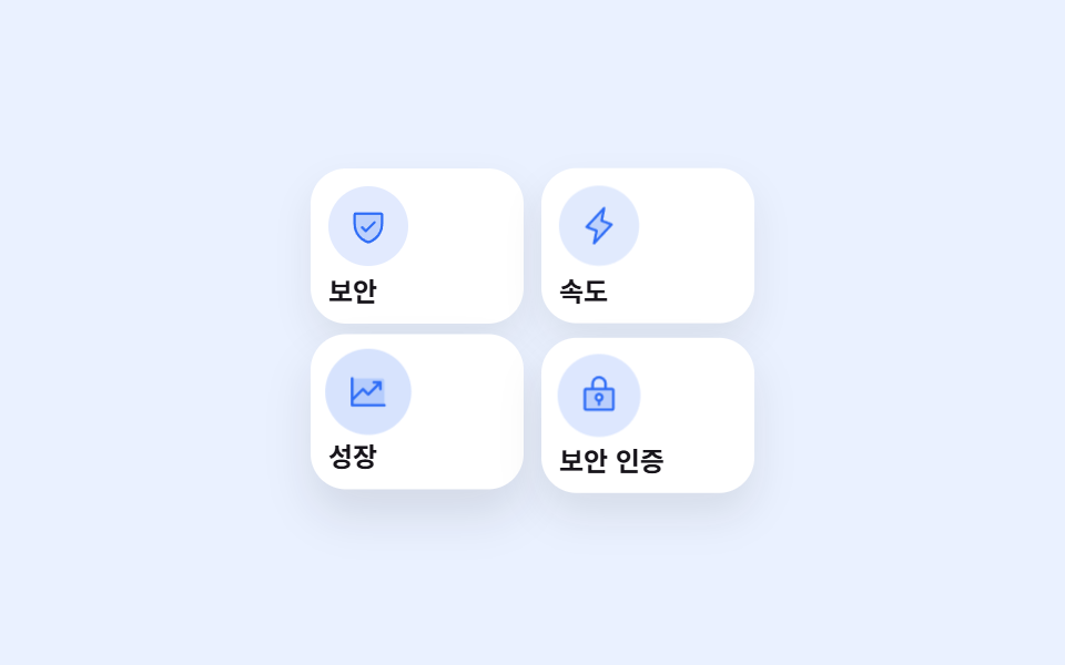
03アイコンカードグリッド
どんな動きか
白いカード4枚がごく薄いグレーの影だけをまとってグリッドに並び、アイコンを収めた青い円は開始時刻をずらしながら順番に少し拡大して濃くなります。
<main class="stage">
  <div class="cardgrid">
    <div class="cardgrid__card cardgrid__card--a">
      <span class="cardgrid__icon" aria-hidden="true"><svg xmlns="http://www.w3.org/2000/svg" width="1em" height="1em" viewBox="0 0 256 256"><g fill="currentColor"><path d="M216 56v56c0 96-88 120-88 120s-88-24-88-120V56a8 8 0 0 1 8-8h160a8 8 0 0 1 8 8" opacity=".2"/><path d="M208 40H48a16 16 0 0 0-16 16v56c0 52.72 25.52 84.67 46.93 102.19c23.06 18.86 46 25.26 47 25.53a8 8 0 0 0 4.2 0c1-.27 23.91-6.67 47-25.53C198.48 196.67 224 164.72 224 112V56a16 16 0 0 0-16-16m0 72c0 37.07-13.66 67.16-40.6 89.42a129.3 129.3 0 0 1-39.4 22.2a128.3 128.3 0 0 1-38.92-21.81C61.82 179.51 48 149.3 48 112V56h160ZM82.34 141.66a8 8 0 0 1 11.32-11.32L112 148.69l50.34-50.35a8 8 0 0 1 11.32 11.32l-56 56a8 8 0 0 1-11.32 0Z"/></g></svg></span>
      <p class="cardgrid__label">セキュリティ</p>
    </div>
    <div class="cardgrid__card cardgrid__card--b">
      <span class="cardgrid__icon" aria-hidden="true"><svg xmlns="http://www.w3.org/2000/svg" width="1em" height="1em" viewBox="0 0 256 256"><g fill="currentColor"><path d="m96 240l16-80l-64-24L160 16l-16 80l64 24Z" opacity=".2"/><path d="M215.79 118.17a8 8 0 0 0-5-5.66L153.18 90.9l14.66-73.33a8 8 0 0 0-13.69-7l-112 120a8 8 0 0 0 3 13l57.63 21.61l-14.62 73.25a8 8 0 0 0 13.69 7l112-120a8 8 0 0 0 1.94-7.26M109.37 214l10.47-52.38a8 8 0 0 0-5-9.06L62 132.71l84.62-90.66l-10.46 52.38a8 8 0 0 0 5 9.06l52.8 19.8Z"/></g></svg></span>
      <p class="cardgrid__label">スピード</p>
    </div>
    <div class="cardgrid__card cardgrid__card--c">
      <span class="cardgrid__icon" aria-hidden="true"><svg xmlns="http://www.w3.org/2000/svg" width="1em" height="1em" viewBox="0 0 256 256"><g fill="currentColor"><path d="M224 64v144H32V48h176a16 16 0 0 1 16 16" opacity=".2"/><path d="M232 208a8 8 0 0 1-8 8H32a8 8 0 0 1-8-8V48a8 8 0 0 1 16 0v108.69l50.34-50.35a8 8 0 0 1 11.32 0L128 132.69L180.69 80H160a8 8 0 0 1 0-16h40a8 8 0 0 1 8 8v40a8 8 0 0 1-16 0V91.31l-58.34 58.35a8 8 0 0 1-11.32 0L96 123.31l-56 56V200h184a8 8 0 0 1 8 8"/></g></svg></span>
      <p class="cardgrid__label">成長</p>
    </div>
    <div class="cardgrid__card cardgrid__card--d">
      <span class="cardgrid__icon" aria-hidden="true"><svg xmlns="http://www.w3.org/2000/svg" width="1em" height="1em" viewBox="0 0 256 256"><g fill="currentColor"><path d="M208 88H48a8 8 0 0 0-8 8v112a8 8 0 0 0 8 8h160a8 8 0 0 0 8-8V96a8 8 0 0 0-8-8m-80 72a20 20 0 1 1 20-20a20 20 0 0 1-20 20" opacity=".2"/><path d="M208 80h-32V56a48 48 0 0 0-96 0v24H48a16 16 0 0 0-16 16v112a16 16 0 0 0 16 16h160a16 16 0 0 0 16-16V96a16 16 0 0 0-16-16M96 56a32 32 0 0 1 64 0v24H96Zm112 152H48V96h160zm-80-96a28 28 0 0 0-8 54.83V184a8 8 0 0 0 16 0v-17.17a28 28 0 0 0-8-54.83m0 40a12 12 0 1 1 12-12a12 12 0 0 1-12 12"/></g></svg></span>
      <p class="cardgrid__label">セキュリティ認証</p>
    </div>
  </div>
</main>
@use "../../../../site/static/demo-tokens" as *;
$duration: $dur-loop;
$easing: $ease-out;
$color: $subject-blue;
$trust-bluetint: #eaf1ff;
$trust-ink: $subject-ink;
$trust-blue: $subject-blue;
@include stage($trust-bluetint);
.cardgrid {
display: grid;
grid-template-columns: repeat(2, 1fr);
gap: $sp-2;
width: 200px;
}
.cardgrid__card {
box-sizing: border-box;
display: flex;
flex-direction: column;
align-items: flex-start;
gap: $sp-1;
padding: $sp-2;
border-radius: $r-card;
background: $stage-paper;
box-shadow: 0 8px 16px rgba($trust-ink, .08);
animation: cardLift $duration $easing infinite;
}
.cardgrid__card--a { animation-delay: 0s; }
.cardgrid__card--b { animation-delay: $duration * -0.75; }
.cardgrid__card--c { animation-delay: $duration * -0.5; }
.cardgrid__card--d { animation-delay: $duration * -0.25; }
.cardgrid__icon {
display: grid;
place-items: center;
width: 36px;
height: 36px;
border-radius: 50%;
background: rgba($trust-blue, .14);
color: $trust-blue;
font-size: 18px;
animation: iconScale $duration $easing infinite;
}
.cardgrid__card--a .cardgrid__icon { animation-delay: 0s; }
.cardgrid__card--b .cardgrid__icon { animation-delay: $duration * -0.75; }
.cardgrid__card--c .cardgrid__icon { animation-delay: $duration * -0.5; }
.cardgrid__card--d .cardgrid__icon { animation-delay: $duration * -0.25; }
.cardgrid__label {
margin: 0;
color: $trust-ink;
font-weight: 600; font-size: 12px; line-height: 1.2;
font-family: inherit;
}
// 데모: 카드 네 장이 시작 시각을 어긋내 순서대로 살짝 뜨고(호버 시 들리는 느낌), 아이콘 원은 배경이 진해지며 함께 커진다
@keyframes cardLift {
0%, 60%, 100% { transform: translateY(0); box-shadow: 0 8px 16px rgba(23, 20, 26, .08); }
20% { transform: translateY(-5px); box-shadow: 0 14px 22px rgba(23, 20, 26, .12); }
}
@keyframes iconScale {
0%, 60%, 100% { transform: scale(1); background: rgba(47, 109, 246, .14); }
20% { transform: scale(1.12); background: rgba(47, 109, 246, .22); }
}
@media (max-width: 340px), (max-height: 220px) {
.cardgrid { width: 176px; gap: $sp-1; }
.cardgrid__card { padding: $sp-1; }
.cardgrid__icon { width: 28px; height: 28px; font-size: 14px; }
.cardgrid__label { font-size: 10px; }
}
@media (prefers-reduced-motion: reduce) {
.cardgrid__card, .cardgrid__icon { animation: none !important; transform: none; }
}html, body {
margin: 0;
overflow: hidden;
}
.stage {
box-sizing: border-box;
min-height: 100vh;
display: grid;
place-items: center;
margin: 0;
background: #eaf1ff;
font-family: -apple-system, "Segoe UI", "Noto Sans KR", sans-serif;
padding: clamp(8px, 4vw, 24px);
}
.cardgrid {
display: grid;
grid-template-columns: repeat(2, 1fr);
gap: 8px;
width: 200px;
}
.cardgrid__card {
box-sizing: border-box;
display: flex;
flex-direction: column;
align-items: flex-start;
gap: 4px;
padding: 8px;
border-radius: 16px;
background: #ffffff;
box-shadow: 0 8px 16px rgba(23, 20, 26, 0.08);
animation: cardLift 2s ease-out infinite;
}
.cardgrid__card--a {
animation-delay: 0s;
}
.cardgrid__card--b {
animation-delay: -1.5s;
}
.cardgrid__card--c {
animation-delay: -1s;
}
.cardgrid__card--d {
animation-delay: -0.5s;
}
.cardgrid__icon {
display: grid;
place-items: center;
width: 36px;
height: 36px;
border-radius: 50%;
background: rgba(47, 109, 246, 0.14);
color: #2f6df6;
font-size: 18px;
animation: iconScale 2s ease-out infinite;
}
.cardgrid__card--a .cardgrid__icon {
animation-delay: 0s;
}
.cardgrid__card--b .cardgrid__icon {
animation-delay: -1.5s;
}
.cardgrid__card--c .cardgrid__icon {
animation-delay: -1s;
}
.cardgrid__card--d .cardgrid__icon {
animation-delay: -0.5s;
}
.cardgrid__label {
margin: 0;
color: #17141a;
font-weight: 600;
font-size: 12px;
line-height: 1.2;
font-family: inherit;
}
@keyframes cardLift {
0%, 60%, 100% {
transform: translateY(0);
box-shadow: 0 8px 16px rgba(23, 20, 26, 0.08);
}
20% {
transform: translateY(-5px);
box-shadow: 0 14px 22px rgba(23, 20, 26, 0.12);
}
}
@keyframes iconScale {
0%, 60%, 100% {
transform: scale(1);
background: rgba(47, 109, 246, 0.14);
}
20% {
transform: scale(1.12);
background: rgba(47, 109, 246, 0.22);
}
}
@media (max-width: 340px), (max-height: 220px) {
.cardgrid {
width: 176px;
gap: 4px;
}
.cardgrid__card {
padding: 4px;
}
.cardgrid__icon {
width: 28px;
height: 28px;
font-size: 14px;
}
.cardgrid__label {
font-size: 10px;
}
}
@media (prefers-reduced-motion: reduce) {
.cardgrid__card, .cardgrid__icon {
animation: none !important;
transform: none;
}
}import type { CSSProperties, ReactNode } from "react";
import styles from "./CardGridTrust.module.scss";
type Item = { label: string; icon: ReactNode };
export type CardGridTrustProps = {
duration?: number;
easing?: string;
color?: string;
};
type Vars = CSSProperties & { "--duration"?: string; "--easing"?: string; "--color"?: string };
const ICONS: Item[] = [
{
label: "보안",
icon: (
<svg xmlns="http://www.w3.org/2000/svg" width="1em" height="1em" viewBox="0 0 256 256"><g fill="currentColor"><path d="M216 56v56c0 96-88 120-88 120s-88-24-88-120V56a8 8 0 0 1 8-8h160a8 8 0 0 1 8 8" opacity=".2"/><path d="M208 40H48a16 16 0 0 0-16 16v56c0 52.72 25.52 84.67 46.93 102.19c23.06 18.86 46 25.26 47 25.53a8 8 0 0 0 4.2 0c1-.27 23.91-6.67 47-25.53C198.48 196.67 224 164.72 224 112V56a16 16 0 0 0-16-16m0 72c0 37.07-13.66 67.16-40.6 89.42a129.3 129.3 0 0 1-39.4 22.2a128.3 128.3 0 0 1-38.92-21.81C61.82 179.51 48 149.3 48 112V56h160ZM82.34 141.66a8 8 0 0 1 11.32-11.32L112 148.69l50.34-50.35a8 8 0 0 1 11.32 11.32l-56 56a8 8 0 0 1-11.32 0Z"/></g></svg>
),
},
{
label: "속도",
icon: (
<svg xmlns="http://www.w3.org/2000/svg" width="1em" height="1em" viewBox="0 0 256 256"><g fill="currentColor"><path d="m96 240l16-80l-64-24L160 16l-16 80l64 24Z" opacity=".2"/><path d="M215.79 118.17a8 8 0 0 0-5-5.66L153.18 90.9l14.66-73.33a8 8 0 0 0-13.69-7l-112 120a8 8 0 0 0 3 13l57.63 21.61l-14.62 73.25a8 8 0 0 0 13.69 7l112-120a8 8 0 0 0 1.94-7.26M109.37 214l10.47-52.38a8 8 0 0 0-5-9.06L62 132.71l84.62-90.66l-10.46 52.38a8 8 0 0 0 5 9.06l52.8 19.8Z"/></g></svg>
),
},
{
label: "성장",
icon: (
<svg xmlns="http://www.w3.org/2000/svg" width="1em" height="1em" viewBox="0 0 256 256"><g fill="currentColor"><path d="M224 64v144H32V48h176a16 16 0 0 1 16 16" opacity=".2"/><path d="M232 208a8 8 0 0 1-8 8H32a8 8 0 0 1-8-8V48a8 8 0 0 1 16 0v108.69l50.34-50.35a8 8 0 0 1 11.32 0L128 132.69L180.69 80H160a8 8 0 0 1 0-16h40a8 8 0 0 1 8 8v40a8 8 0 0 1-16 0V91.31l-58.34 58.35a8 8 0 0 1-11.32 0L96 123.31l-56 56V200h184a8 8 0 0 1 8 8"/></g></svg>
),
},
{
label: "보안 인증",
icon: (
<svg xmlns="http://www.w3.org/2000/svg" width="1em" height="1em" viewBox="0 0 256 256"><g fill="currentColor"><path d="M208 88H48a8 8 0 0 0-8 8v112a8 8 0 0 0 8 8h160a8 8 0 0 0 8-8V96a8 8 0 0 0-8-8m-80 72a20 20 0 1 1 20-20a20 20 0 0 1-20 20" opacity=".2"/><path d="M208 80h-32V56a48 48 0 0 0-96 0v24H48a16 16 0 0 0-16 16v112a16 16 0 0 0 16 16h160a16 16 0 0 0 16-16V96a16 16 0 0 0-16-16M96 56a32 32 0 0 1 64 0v24H96Zm112 152H48V96h160zm-80-96a28 28 0 0 0-8 54.83V184a8 8 0 0 0 16 0v-17.17a28 28 0 0 0-8-54.83m0 40a12 12 0 1 1 12-12a12 12 0 0 1-12 12"/></g></svg>
),
},
];
export default function CardGridTrust({ duration = 2000, easing = "ease-out", color = "#2f6df6" }: CardGridTrustProps) {
const vars: Vars = { "--duration": `${duration}ms`, "--easing": easing, "--color": color };
const delays = ["a", "b", "c", "d"] as const;
return (
<div className={styles.grid} style={vars}>
{ICONS.map((it, i) => (
<div key={it.label} className={`${styles.card} ${styles[delays[i]]}`}>
<span className={`${styles.icon} ${styles[delays[i]]}`}>{it.icon}</span>
<p className={styles.label}>{it.label}</p>
</div>
))}
</div>
);
}03 · アイコンカードグリッド — 計測 累積面積 7.384% · 動いたフレーム 23/23GODRICH オリジナル · SCSS と React は zip に同梱 · パスワードを見る
どこを変えるか
色はすべて同じ青一色です。
<div class="flex flex-col items-start gap-3 rounded-card bg-white p-5 shadow-soft-sm">
  <span class="grid h-9 w-9 place-items-center rounded-full bg-bluetint text-brand">
    <svg><!-- ph:shield-check-duotone --></svg>
  </span>
  <p class="text-sm font-bold">セキュリティ</p>
</div>
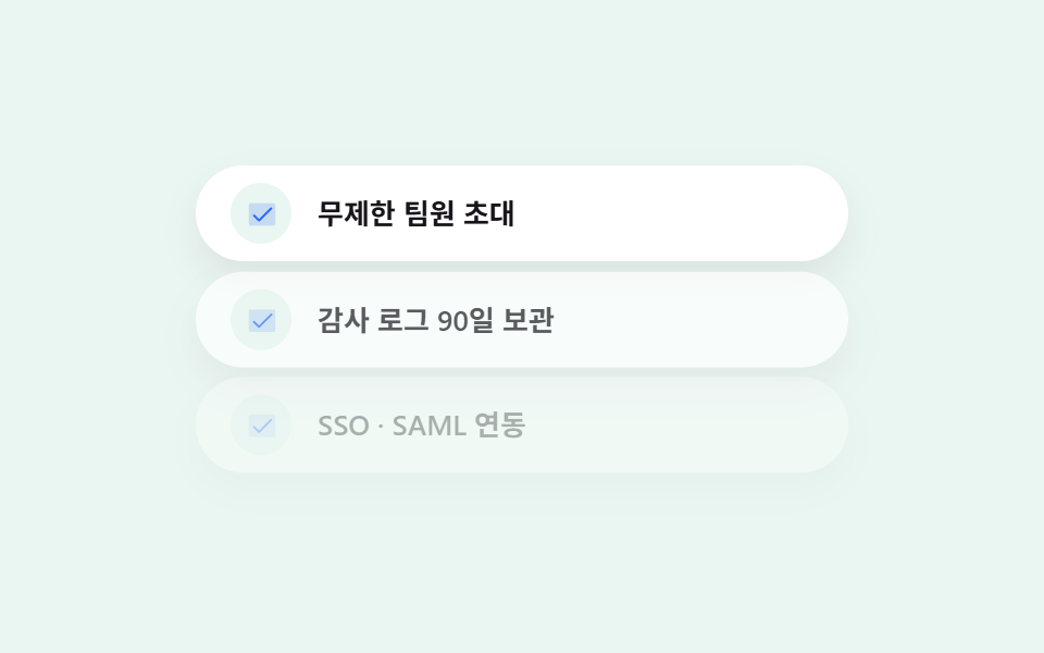
04チェック機能リスト
何が見えるか
各行は薄いミントの円の中に青いチェックが描かれ、リストは上から順に滑るように現れては消えることを繰り返します。
<main class="stage">
  <ul class="featurelist">
    <li class="featurelist__row featurelist__row--1">
      <span class="featurelist__check" aria-hidden="true"><svg xmlns="http://www.w3.org/2000/svg" width="1em" height="1em" viewBox="0 0 256 256"><g fill="currentColor"><path d="M232 56v144a16 16 0 0 1-16 16H40a16 16 0 0 1-16-16V56a16 16 0 0 1 16-16h176a16 16 0 0 1 16 16" opacity=".2"/><path d="m205.66 85.66l-96 96a8 8 0 0 1-11.32 0l-40-40a8 8 0 0 1 11.32-11.32L104 164.69l90.34-90.35a8 8 0 0 1 11.32 11.32"/></g></svg></span>
      <span class="featurelist__text">チームメンバー招待無制限</span>
    </li>
    <li class="featurelist__row featurelist__row--2">
      <span class="featurelist__check" aria-hidden="true"><svg xmlns="http://www.w3.org/2000/svg" width="1em" height="1em" viewBox="0 0 256 256"><g fill="currentColor"><path d="M232 56v144a16 16 0 0 1-16 16H40a16 16 0 0 1-16-16V56a16 16 0 0 1 16-16h176a16 16 0 0 1 16 16" opacity=".2"/><path d="m205.66 85.66l-96 96a8 8 0 0 1-11.32 0l-40-40a8 8 0 0 1 11.32-11.32L104 164.69l90.34-90.35a8 8 0 0 1 11.32 11.32"/></g></svg></span>
      <span class="featurelist__text">監査ログを90日間保存</span>
    </li>
    <li class="featurelist__row featurelist__row--3">
      <span class="featurelist__check" aria-hidden="true"><svg xmlns="http://www.w3.org/2000/svg" width="1em" height="1em" viewBox="0 0 256 256"><g fill="currentColor"><path d="M232 56v144a16 16 0 0 1-16 16H40a16 16 0 0 1-16-16V56a16 16 0 0 1 16-16h176a16 16 0 0 1 16 16" opacity=".2"/><path d="m205.66 85.66l-96 96a8 8 0 0 1-11.32 0l-40-40a8 8 0 0 1 11.32-11.32L104 164.69l90.34-90.35a8 8 0 0 1 11.32 11.32"/></g></svg></span>
      <span class="featurelist__text">SSO・SAML連携</span>
    </li>
  </ul>
</main>
@use "../../../../site/static/demo-tokens" as *;
$duration: $dur-loop;
$easing: $ease-out;
$color: $subject-blue;
$trust-mint: #eaf6f1;
$trust-ink: $subject-ink;
$trust-blue: $subject-blue;
@include stage($trust-mint);
.featurelist {
margin: 0;
padding: 0;
list-style: none;
display: flex;
flex-direction: column;
gap: $sp-2;
width: clamp(220px, 78vw, 300px);
}
.featurelist__row {
box-sizing: border-box;
display: flex;
align-items: center;
gap: $sp-3;
padding: $sp-2 $sp-4;
border-radius: $r-pill;
background: $stage-paper;
box-shadow: 0 8px 16px rgba($trust-ink, .07);
opacity: 0;
animation: rowIn $duration $easing infinite;
}
.featurelist__row--1 { animation-delay: 0s; }
.featurelist__row--2 { animation-delay: $duration * -0.83; }
.featurelist__row--3 { animation-delay: $duration * -0.66; }
.featurelist__check {
display: grid;
place-items: center;
width: 28px;
height: 28px;
flex: 0 0 auto;
border-radius: 50%;
background: $trust-mint;
color: $trust-blue;
font-size: 15px;
}
.featurelist__text {
color: $trust-ink;
font-weight: 600; font-size: 13px; line-height: 1.3;
font-family: inherit;
}
// 데모: 행마다 시작 시각을 어긋내 위에서 아래로 미끄러져 들어오고, 한 바퀴가 끝나면 다시 사라졌다 나타난다
@keyframes rowIn {
0% { opacity: 0; transform: translateY(-10px); }
16%, 82% { opacity: 1; transform: translateY(0); }
100% { opacity: 0; transform: translateY(-10px); }
}
@media (max-width: 340px), (max-height: 220px) {
.featurelist__row { padding: $sp-1 $sp-3; gap: $sp-2; }
.featurelist__check { width: 22px; height: 22px; font-size: 12px; }
.featurelist__text { font-size: 11px; }
}
@media (prefers-reduced-motion: reduce) {
.featurelist__row { animation: none !important; opacity: 1; transform: none; }
}html, body {
margin: 0;
overflow: hidden;
}
.stage {
box-sizing: border-box;
min-height: 100vh;
display: grid;
place-items: center;
margin: 0;
background: #eaf6f1;
font-family: -apple-system, "Segoe UI", "Noto Sans KR", sans-serif;
padding: clamp(8px, 4vw, 24px);
}
.featurelist {
margin: 0;
padding: 0;
list-style: none;
display: flex;
flex-direction: column;
gap: 8px;
width: clamp(220px, 78vw, 300px);
}
.featurelist__row {
box-sizing: border-box;
display: flex;
align-items: center;
gap: 12px;
padding: 8px 16px;
border-radius: 999px;
background: #ffffff;
box-shadow: 0 8px 16px rgba(23, 20, 26, 0.07);
opacity: 0;
animation: rowIn 2s ease-out infinite;
}
.featurelist__row--1 {
animation-delay: 0s;
}
.featurelist__row--2 {
animation-delay: -1.66s;
}
.featurelist__row--3 {
animation-delay: -1.32s;
}
.featurelist__check {
display: grid;
place-items: center;
width: 28px;
height: 28px;
flex: 0 0 auto;
border-radius: 50%;
background: #eaf6f1;
color: #2f6df6;
font-size: 15px;
}
.featurelist__text {
color: #17141a;
font-weight: 600;
font-size: 13px;
line-height: 1.3;
font-family: inherit;
}
@keyframes rowIn {
0% {
opacity: 0;
transform: translateY(-10px);
}
16%, 82% {
opacity: 1;
transform: translateY(0);
}
100% {
opacity: 0;
transform: translateY(-10px);
}
}
@media (max-width: 340px), (max-height: 220px) {
.featurelist__row {
padding: 4px 12px;
gap: 8px;
}
.featurelist__check {
width: 22px;
height: 22px;
font-size: 12px;
}
.featurelist__text {
font-size: 11px;
}
}
@media (prefers-reduced-motion: reduce) {
.featurelist__row {
animation: none !important;
opacity: 1;
transform: none;
}
}import type { CSSProperties } from "react";
import styles from "./FeatureListTrust.module.scss";
export type FeatureListTrustProps = {
items?: string[];
duration?: number;
easing?: string;
color?: string;
};
type Vars = CSSProperties & { "--duration"?: string; "--easing"?: string; "--color"?: string };
const CHECK = (
<svg xmlns="http://www.w3.org/2000/svg" width="1em" height="1em" viewBox="0 0 256 256"><g fill="currentColor"><path d="M232 56v144a16 16 0 0 1-16 16H40a16 16 0 0 1-16-16V56a16 16 0 0 1 16-16h176a16 16 0 0 1 16 16" opacity=".2"/><path d="m205.66 85.66l-96 96a8 8 0 0 1-11.32 0l-40-40a8 8 0 0 1 11.32-11.32L104 164.69l90.34-90.35a8 8 0 0 1 11.32 11.32"/></g></svg>
);
export default function FeatureListTrust({
items = ["무제한 팀원 초대", "감사 로그 90일 보관", "SSO · SAML 연동"],
duration = 2000,
easing = "ease-out",
color = "#2f6df6",
}: FeatureListTrustProps) {
const vars: Vars = { "--duration": `${duration}ms`, "--easing": easing, "--color": color };
const delays = [0, -1660, -1320];
return (
<ul className={styles.list} style={vars}>
{items.map((text, i) => (
<li key={text} className={styles.row} style={{ animationDelay: `${delays[i] ?? 0}ms` }}>
<span className={styles.check} aria-hidden="true">{CHECK}</span>
<span className={styles.text}>{text}</span>
</li>
))}
</ul>
);
}04 · チェック機能リスト — 計測 累積面積 29.301% · 動いたフレーム 16/23GODRICH オリジナル · SCSS と React は zip に同梱 · パスワードを見る
コードのどこを見るか
チェックは手描きの図形ではなく、Phosphor Duotoneセットの実物のアイコンです。
<li class="flex items-center gap-3 rounded-pill bg-white px-5 py-3 shadow-soft-sm">
  <span class="grid h-7 w-7 shrink-0 place-items-center rounded-full bg-mint text-brand">
    <svg><!-- ph:check-duotone --></svg>
  </span>
  <span class="text-sm font-semibold">チームメンバー無制限</span>
</li>
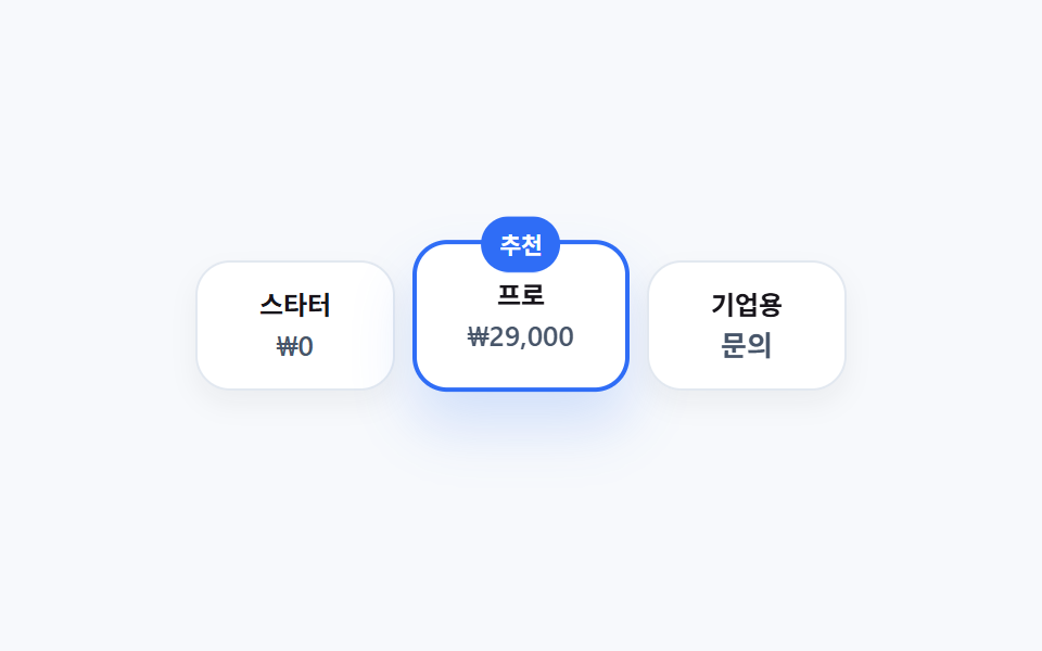
05シンプル料金プラン
画面で起きること
3つのプランはすべて同じ白いカードですが、おすすめのプランだけに細い青枠とやや深い影を付けて区別します。
<main class="stage">
  <div class="pricing">
    <div class="pricing__card">
      <p class="pricing__name">スターター</p>
      <p class="pricing__price">₩0</p>
    </div>
    <div class="pricing__card pricing__card--pro">
      <span class="pricing__badge">おすすめ</span>
      <p class="pricing__name">プロ</p>
      <p class="pricing__price">₩29,000</p>
    </div>
    <div class="pricing__card">
      <p class="pricing__name">エンタープライズ</p>
      <p class="pricing__price">お問い合わせ</p>
    </div>
  </div>
</main>
@use "../../../../site/static/demo-tokens" as *;
$duration: $dur-loop;
$easing: $ease-out;
$color: $subject-blue;
$trust-offwhite: #f7f9fc;
$trust-ink: $subject-ink;
$trust-slate: #475569;
$trust-blue: $subject-blue;
@include stage($trust-offwhite);
.pricing {
display: flex;
align-items: center;
gap: $sp-2;
}
.pricing__card {
position: relative;
box-sizing: border-box;
width: 92px;
display: flex;
flex-direction: column;
align-items: center;
gap: $sp-1;
padding: $sp-3 $sp-2;
border-radius: $r-card;
border: 1px solid #e2e8f0;
background: $stage-paper;
box-shadow: 0 6px 12px rgba($trust-ink, .05);
text-align: center;
}
.pricing__card--pro {
width: 100px;
padding: $sp-4 $sp-2;
border: 2px solid $trust-blue;
box-shadow: 0 16px 26px rgba($trust-blue, .18);
animation: proLift $duration $easing infinite;
}
.pricing__badge {
position: absolute;
top: -12px;
left: 50%;
transform: translateX(-50%);
border-radius: $r-pill;
background: $trust-blue;
color: $stage-paper;
padding: $sp-1 $sp-2;
font-weight: 700; font-size: 10px; line-height: 1.6;
font-family: inherit;
animation: badgePulse $duration $easing infinite;
}
.pricing__name {
margin: 0;
color: $trust-ink;
font-weight: 700; font-size: 12px; line-height: 1.2;
font-family: inherit;
}
.pricing__price {
margin: 0;
color: $trust-slate;
font-weight: 600; font-size: 13px; line-height: 1.2;
font-family: inherit;
}
// 데모: 추천 플랜만 배지가 숨 쉬듯 살짝 커졌다 작아지고, 카드 전체도 아주 완만하게 떠오른다 — 화려한 색 대신 테두리·그림자 차이가 위계를 만든다
@keyframes proLift {
0%, 100% { transform: translateY(0); }
50% { transform: translateY(-6px); }
}
@keyframes badgePulse {
0%, 100% { transform: translateX(-50%) scale(1); }
50% { transform: translateX(-50%) scale(1.1); }
}
@media (max-width: 340px), (max-height: 220px) {
.pricing { gap: $sp-1; }
.pricing__card { width: 76px; padding: $sp-2 $sp-1; }
.pricing__card--pro { width: 82px; padding: $sp-3 $sp-1; }
.pricing__name { font-size: 10px; }
.pricing__price { font-size: 11px; }
}
@media (prefers-reduced-motion: reduce) {
.pricing__card--pro, .pricing__badge { animation: none !important; transform: none; }
.pricing__badge { transform: translateX(-50%); }
}html, body {
margin: 0;
overflow: hidden;
}
.stage {
box-sizing: border-box;
min-height: 100vh;
display: grid;
place-items: center;
margin: 0;
background: #f7f9fc;
font-family: -apple-system, "Segoe UI", "Noto Sans KR", sans-serif;
padding: clamp(8px, 4vw, 24px);
}
.pricing {
display: flex;
align-items: center;
gap: 8px;
}
.pricing__card {
position: relative;
box-sizing: border-box;
width: 92px;
display: flex;
flex-direction: column;
align-items: center;
gap: 4px;
padding: 12px 8px;
border-radius: 16px;
border: 1px solid #e2e8f0;
background: #ffffff;
box-shadow: 0 6px 12px rgba(23, 20, 26, 0.05);
text-align: center;
}
.pricing__card--pro {
width: 100px;
padding: 16px 8px;
border: 2px solid #2f6df6;
box-shadow: 0 16px 26px rgba(47, 109, 246, 0.18);
animation: proLift 2s ease-out infinite;
}
.pricing__badge {
position: absolute;
top: -12px;
left: 50%;
transform: translateX(-50%);
border-radius: 999px;
background: #2f6df6;
color: #ffffff;
padding: 4px 8px;
font-weight: 700;
font-size: 10px;
line-height: 1.6;
font-family: inherit;
animation: badgePulse 2s ease-out infinite;
}
.pricing__name {
margin: 0;
color: #17141a;
font-weight: 700;
font-size: 12px;
line-height: 1.2;
font-family: inherit;
}
.pricing__price {
margin: 0;
color: #475569;
font-weight: 600;
font-size: 13px;
line-height: 1.2;
font-family: inherit;
}
@keyframes proLift {
0%, 100% {
transform: translateY(0);
}
50% {
transform: translateY(-6px);
}
}
@keyframes badgePulse {
0%, 100% {
transform: translateX(-50%) scale(1);
}
50% {
transform: translateX(-50%) scale(1.1);
}
}
@media (max-width: 340px), (max-height: 220px) {
.pricing {
gap: 4px;
}
.pricing__card {
width: 76px;
padding: 8px 4px;
}
.pricing__card--pro {
width: 82px;
padding: 12px 4px;
}
.pricing__name {
font-size: 10px;
}
.pricing__price {
font-size: 11px;
}
}
@media (prefers-reduced-motion: reduce) {
.pricing__card--pro, .pricing__badge {
animation: none !important;
transform: none;
}
.pricing__badge {
transform: translateX(-50%);
}
}import type { CSSProperties } from "react";
import styles from "./PricingTrust.module.scss";
export type PricingTrustProps = {
duration?: number;
easing?: string;
color?: string;
};
type Vars = CSSProperties & { "--duration"?: string; "--easing"?: string; "--color"?: string };
export default function PricingTrust({ duration = 2000, easing = "ease-out", color = "#2f6df6" }: PricingTrustProps) {
const vars: Vars = { "--duration": `${duration}ms`, "--easing": easing, "--color": color };
return (
<div className={styles.pricing} style={vars}>
<div className={styles.card}>
<p className={styles.name}>스타터</p>
<p className={styles.price}>₩0</p>
</div>
<div className={`${styles.card} ${styles.pro}`}>
<span className={styles.badge}>추천</span>
<p className={styles.name}>프로</p>
<p className={styles.price}>₩29,000</p>
</div>
<div className={styles.card}>
<p className={styles.name}>기업용</p>
<p className={styles.price}>문의</p>
</div>
</div>
);
}05 · シンプル料金プラン — 計測 累積面積 2.276% · 動いたフレーム 23/23GODRICH オリジナル · SCSS と React は zip に同梱 · パスワードを見る
コードの読み方
派手な背景色ではなく、枠線の太さと影の深さだけで序列を作るのがこのスタイルの核心です。
<div class="relative flex-1 max-w-[240px] rounded-card border-2 border-brand
            bg-white p-6 text-center shadow-brand">
  <span class="absolute -top-3 left-1/2 -translate-x-1/2 rounded-pill
               bg-brand px-3 py-1 text-[11px] font-bold text-white">おすすめ</span>
  <p class="text-sm font-bold">プロ</p>
</div>
06ロゴ信頼のレビュー
どんな動きか
レビューカードの上でグレーのロゴチップ6個が、元の並びと複製した並びをつなげて-50%だけ動かすことで、継ぎ目なく無限に横へ流れます。
<main class="stage">
  <div class="logotrust">
    <figure class="logotrust__quote">
      <blockquote>「オンボーディングが1日で完了しました。」</blockquote>
      <figcaption>— ニンバス ・ 運用チームリーダー</figcaption>
    </figure>
    <div class="logotrust__viewport">
      <div class="logotrust__track" aria-hidden="true">
        <span class="logotrust__chip">Nimbus</span>
        <span class="logotrust__chip">Ledger</span>
        <span class="logotrust__chip">Northwind</span>
        <span class="logotrust__chip">Vertex</span>
        <span class="logotrust__chip">Harborline</span>
        <span class="logotrust__chip">Anchorpay</span>
      </div>
    </div>
  </div>
</main>
@use "../../../../site/static/demo-tokens" as *;
$duration: 6s; // 열두 칩(원본6+복제6)이 한 바퀴 도는 시간 — $dur-loop 보다 길어야 흐름이 자연스럽다(합치지 않는다, 규칙2)
$easing: linear;
$color: $subject-blue;
$trust-graytint: #f1f5f9;
$trust-ink: $subject-ink;
$trust-slate: #475569;
$trust-blue: $subject-blue;
@include stage($trust-graytint);
.logotrust {
display: flex;
flex-direction: column;
align-items: center;
gap: $sp-4;
width: 320px;
}
.logotrust__quote {
margin: 0;
box-sizing: border-box;
width: 100%;
padding: $sp-3 $sp-4;
border-radius: $r-card;
background: $stage-paper;
box-shadow: 0 8px 18px rgba($trust-ink, .07);
text-align: center;
}
.logotrust__quote blockquote {
margin: 0 0 $sp-1;
color: $trust-ink;
font-weight: 700; font-size: 13px; line-height: 1.4;
font-family: inherit;
}
.logotrust__quote figcaption {
color: $trust-slate;
font-weight: 500; font-size: 11px; line-height: 1.3;
font-family: inherit;
}
.logotrust__viewport {
width: 100%;
overflow: hidden;
}
.logotrust__track {
display: flex;
width: max-content;
animation: scrollLogos $duration $easing infinite;
}
.logotrust__chip {
flex: 0 0 auto;
margin-right: $sp-3;
border-radius: $r-pill;
background: $stage-paper;
color: $trust-slate;
padding: $sp-1 $sp-4;
font-weight: 700; font-size: 12px; line-height: 1.6;
font-family: inherit;
box-shadow: 0 4px 10px rgba($trust-ink, .06);
}
.logotrust__chip:hover {
color: $trust-blue;
box-shadow: 0 6px 14px rgba($trust-blue, .18);
}
// 데모: 원본 6개 + 복제 6개를 이어 붙여 -50% 만큼 옮기면 이음새 없이 무한히 흐른다. 간격은 flex gap 대신 margin-right(BD15)
@keyframes scrollLogos {
from { transform: translateX(0); }
to { transform: translateX(-50%); }
}
@media (max-width: 340px), (max-height: 220px) {
.logotrust { width: 260px; gap: $sp-2; }
.logotrust__quote { padding: $sp-2 $sp-3; }
.logotrust__quote blockquote { font-size: 11px; }
.logotrust__chip { padding: 4px $sp-3; font-size: 11px; margin-right: $sp-2; }
}
@media (prefers-reduced-motion: reduce) {
.logotrust__track { animation: none !important; }
}html, body {
margin: 0;
overflow: hidden;
}
.stage {
box-sizing: border-box;
min-height: 100vh;
display: grid;
place-items: center;
margin: 0;
background: #f1f5f9;
font-family: -apple-system, "Segoe UI", "Noto Sans KR", sans-serif;
padding: clamp(8px, 4vw, 24px);
}
.logotrust {
display: flex;
flex-direction: column;
align-items: center;
gap: 16px;
width: 320px;
}
.logotrust__quote {
margin: 0;
box-sizing: border-box;
width: 100%;
padding: 12px 16px;
border-radius: 16px;
background: #ffffff;
box-shadow: 0 8px 18px rgba(23, 20, 26, 0.07);
text-align: center;
}
.logotrust__quote blockquote {
margin: 0 0 4px;
color: #17141a;
font-weight: 700;
font-size: 13px;
line-height: 1.4;
font-family: inherit;
}
.logotrust__quote figcaption {
color: #475569;
font-weight: 500;
font-size: 11px;
line-height: 1.3;
font-family: inherit;
}
.logotrust__viewport {
width: 100%;
overflow: hidden;
}
.logotrust__track {
display: flex;
width: max-content;
animation: scrollLogos 6s linear infinite;
}
.logotrust__chip {
flex: 0 0 auto;
margin-right: 12px;
border-radius: 999px;
background: #ffffff;
color: #475569;
padding: 4px 16px;
font-weight: 700;
font-size: 12px;
line-height: 1.6;
font-family: inherit;
box-shadow: 0 4px 10px rgba(23, 20, 26, 0.06);
}
.logotrust__chip:hover {
color: #2f6df6;
box-shadow: 0 6px 14px rgba(47, 109, 246, 0.18);
}
@keyframes scrollLogos {
from {
transform: translateX(0);
}
to {
transform: translateX(-50%);
}
}
@media (max-width: 340px), (max-height: 220px) {
.logotrust {
width: 260px;
gap: 8px;
}
.logotrust__quote {
padding: 8px 12px;
}
.logotrust__quote blockquote {
font-size: 11px;
}
.logotrust__chip {
padding: 4px 12px;
font-size: 11px;
margin-right: 8px;
}
}
@media (prefers-reduced-motion: reduce) {
.logotrust__track {
animation: none !important;
}
}import type { CSSProperties } from "react";
import styles from "./LogoTrust.module.scss";
export type LogoTrustProps = {
quote?: string;
author?: string;
logos?: string[];
duration?: number;
easing?: string;
color?: string;
};
type Vars = CSSProperties & { "--duration"?: string; "--easing"?: string; "--color"?: string };
export default function LogoTrust({
quote = '"온보딩이 하루 만에 끝났습니다"',
author = "— 니임버스 · 운영팀장",
logos = ["Nimbus", "Ledger", "Northwind", "Vertex", "Harborline", "Anchorpay"],
duration = 6000,
easing = "linear",
color = "#2f6df6",
}: LogoTrustProps) {
const vars: Vars = { "--duration": `${duration}ms`, "--easing": easing, "--color": color };
const doubled = [...logos, ...logos];
return (
<div className={styles.wrap} style={vars}>
<figure className={styles.quote}>
<blockquote>{quote}</blockquote>
<figcaption>{author}</figcaption>
</figure>
<div className={styles.viewport}>
<div className={styles.track} aria-hidden="true">
{doubled.map((name, i) => (
<span key={`${name}-${i}`} className={styles.chip}>{name}</span>
))}
</div>
</div>
</div>
);
}06 · ロゴ信頼のレビュー — 計測 累積面積 5.942% · 動いたフレーム 23/23GODRICH オリジナル · SCSS と React は zip に同梱 · パスワードを見る
どこを変えるか
ホバーしたチップだけ青色に戻ります。
<div class="track flex w-max" style="animation: scrollLogos 6s linear infinite">
  <span class="mr-3 shrink-0 rounded-pill bg-white px-5 py-2 text-xs
               font-bold text-slate shadow-soft-sm">Nimbus</span>
  <!-- 同じ6個のチップをもう一度そのまま続けて並べる -->
</div>
07ソリッドCTA帯
何が見えるか
帯はグラデーションなしのブランドブルー単色で塗り、中の白いボタンだけが押し込まれては浮き上がる動きを繰り返します。
<main class="stage">
  <section class="ctaband">
    <h2 class="ctaband__title">今すぐ無料で始めましょう</h2>
    <p class="ctaband__desc">クレジットカード不要、14日間トライアル</p>
    <button class="ctaband__btn" type="button">デモを申し込む</button>
  </section>
</main>
@use "../../../../site/static/demo-tokens" as *;
$duration: $dur-loop;
$easing: $ease-out;
$color: $subject-blue;
$trust-bluetint: #eaf1ff;
$trust-blue-deep: #7386ba;
@include stage($trust-bluetint);
.ctaband {
box-sizing: border-box;
width: clamp(240px, 82vw, 340px);
display: flex;
flex-direction: column;
align-items: center;
gap: $sp-2;
padding: $sp-6 $sp-4;
border-radius: $r-card;
background: $trust-blue-deep;
text-align: center;
box-shadow: 0 16px 30px rgba($trust-blue-deep, .32);
}
.ctaband__title {
margin: 0;
color: $stage-paper;
font-weight: 700; font-size: clamp(16px, 4.4vw, 21px); line-height: 1.3;
font-family: inherit;
}
.ctaband__desc {
margin: 0;
color: rgba($stage-paper, .82);
font-weight: 500; font-size: clamp(11px, 2.8vw, 13px); line-height: 1.4;
font-family: inherit;
}
.ctaband__btn {
margin-top: $sp-1;
border: 0;
border-radius: $r-pill;
background: $stage-paper;
color: $trust-blue-deep;
padding: $sp-2 $sp-6;
font-weight: 700; font-size: clamp(12px, 2.8vw, 14px); line-height: 1;
font-family: inherit;
box-shadow: 0 6px 14px rgba(23, 20, 26, .18);
animation: btnLift $duration $easing infinite;
}
.ctaband__btn:focus-visible {
outline: 3px solid $stage-paper;
outline-offset: 2px;
}
// 데모: 흰 버튼만 눌렸다 떠오르기를 반복한다 — 배경은 그라디언트 없이 진한 파란 단색 그대로 고정
@keyframes btnLift {
0%, 100% { transform: translateY(0); box-shadow: 0 6px 14px rgba(23, 20, 26, .18); }
50% { transform: translateY(-4px); box-shadow: 0 12px 22px rgba(23, 20, 26, .24); }
}
@media (max-width: 340px), (max-height: 220px) {
.ctaband { padding: $sp-4 $sp-3; gap: $sp-1; }
.ctaband__desc { display: none; }
.ctaband__btn { padding: $sp-1 $sp-4; margin-top: 0; }
}
@media (prefers-reduced-motion: reduce) {
.ctaband__btn { animation: none !important; transform: none; }
}html, body {
margin: 0;
overflow: hidden;
}
.stage {
box-sizing: border-box;
min-height: 100vh;
display: grid;
place-items: center;
margin: 0;
background: #eaf1ff;
font-family: -apple-system, "Segoe UI", "Noto Sans KR", sans-serif;
padding: clamp(8px, 4vw, 24px);
}
.ctaband {
box-sizing: border-box;
width: clamp(240px, 82vw, 340px);
display: flex;
flex-direction: column;
align-items: center;
gap: 8px;
padding: 24px 16px;
border-radius: 16px;
background: #7386ba;
text-align: center;
box-shadow: 0 16px 30px rgba(115, 134, 186, 0.32);
}
.ctaband__title {
margin: 0;
color: #ffffff;
font-weight: 700;
font-size: clamp(16px, 4.4vw, 21px);
line-height: 1.3;
font-family: inherit;
}
.ctaband__desc {
margin: 0;
color: rgba(255, 255, 255, 0.82);
font-weight: 500;
font-size: clamp(11px, 2.8vw, 13px);
line-height: 1.4;
font-family: inherit;
}
.ctaband__btn {
margin-top: 4px;
border: 0;
border-radius: 999px;
background: #ffffff;
color: #7386ba;
padding: 8px 24px;
font-weight: 700;
font-size: clamp(12px, 2.8vw, 14px);
line-height: 1;
font-family: inherit;
box-shadow: 0 6px 14px rgba(23, 20, 26, 0.18);
animation: btnLift 2s ease-out infinite;
}
.ctaband__btn:focus-visible {
outline: 3px solid #ffffff;
outline-offset: 2px;
}
@keyframes btnLift {
0%, 100% {
transform: translateY(0);
box-shadow: 0 6px 14px rgba(23, 20, 26, 0.18);
}
50% {
transform: translateY(-4px);
box-shadow: 0 12px 22px rgba(23, 20, 26, 0.24);
}
}
@media (max-width: 340px), (max-height: 220px) {
.ctaband {
padding: 16px 12px;
gap: 4px;
}
.ctaband__desc {
display: none;
}
.ctaband__btn {
padding: 4px 16px;
margin-top: 0;
}
}
@media (prefers-reduced-motion: reduce) {
.ctaband__btn {
animation: none !important;
transform: none;
}
}import type { CSSProperties } from "react";
import styles from "./CtaBandTrust.module.scss";
export type CtaBandTrustProps = {
title?: string;
desc?: string;
cta?: string;
duration?: number;
easing?: string;
color?: string;
};
type Vars = CSSProperties & { "--duration"?: string; "--easing"?: string; "--color"?: string };
export default function CtaBandTrust({
title = "지금 무료로 시작하세요",
desc = "신용카드 없이 14일 체험",
cta = "데모 신청",
duration = 2000,
easing = "ease-out",
color = "#1d4ed8",
}: CtaBandTrustProps) {
const vars: Vars = { "--duration": `${duration}ms`, "--easing": easing, "--color": color };
return (
<section className={styles.band} style={vars}>
<h2 className={styles.title}>{title}</h2>
<p className={styles.desc}>{desc}</p>
<button type="button" className={styles.btn}>{cta}</button>
</section>
);
}07 · ソリッドCTA帯 — 計測 累積面積 1.019% · 動いたフレーム 22/23GODRICH オリジナル · SCSS と React は zip に同梱 · パスワードを見る
コードのどこを見るか
色を一色に絞ることがこのスタイルの節度です。
<div class="rounded-card bg-brand-deep px-10 py-14 shadow-brand-deep text-center">
  <h2 class="text-3xl font-bold text-white">今すぐ無料で始める</h2>
  <button class="mt-4 rounded-pill bg-white px-8 py-3 text-sm font-bold text-brand-deep">デモを申し込む</button>
</div>
08ミニマル4カラムフッター
画面で起きること
薄いグレーの区切り線を1本引いた上にカラムのリンクを並べ、ソーシャルアイコンの円はホバーで(デモでは自動で順番に)青く塗られながら少し大きくなります。
<main class="stage">
  <footer class="footertrust">
    <div class="footertrust__rule" aria-hidden="true"></div>
    <div class="footertrust__cols">
      <div class="footertrust__col"><p>製品</p><p>機能</p></div>
      <div class="footertrust__col"><p>会社</p><p>会社紹介</p></div>
      <div class="footertrust__col"><p>ヘルプ</p><p>お問い合わせ</p></div>
    </div>
    <div class="footertrust__social">
      <span class="footertrust__icon footertrust__icon--1" aria-hidden="true"><svg xmlns="http://www.w3.org/2000/svg" width="1em" height="1em" viewBox="0 0 256 256"><g fill="currentColor"><path d="m240 72l-32 32c-4.26 66.84-60.08 120-128 120c-32 0-40-12-40-12s32-12 48-36c0 0-55.15-32-47.22-120c0 0 39.66 40 87.22 48V88c0-22 18-40.27 40-40a40.74 40.74 0 0 1 36.67 24Z" opacity=".2"/><path d="M247.39 68.94A8 8 0 0 0 240 64h-30.43a48.65 48.65 0 0 0-41.47-24a46.87 46.87 0 0 0-33.74 13.7A47.87 47.87 0 0 0 120 88v6.09C79.74 83.47 46.81 50.72 46.46 50.37a8 8 0 0 0-13.65 4.92c-4.3 47.79 9.57 79.77 22 98.18a111 111 0 0 0 21.89 24.2c-15.27 17.53-39.25 26.74-39.5 26.84a8 8 0 0 0-3.85 11.93c.74 1.12 3.75 5.05 11.08 8.72C53.51 229.7 65.48 232 80 232c70.68 0 129.72-54.42 135.76-124.44l29.9-29.9a8 8 0 0 0 1.73-8.72m-45 29.41a8 8 0 0 0-2.32 5.14C196 166.58 143.28 216 80 216c-10.56 0-18-1.4-23.22-3.08c11.52-6.25 27.56-17 37.88-32.48a8 8 0 0 0-2.61-11.34c-.13-.08-12.86-7.74-24.48-25.29C54.54 124.11 48 100.38 48 73.09c16 13 45.25 33.18 78.69 38.8A8 8 0 0 0 136 104V88a32 32 0 0 1 9.6-22.92A30.9 30.9 0 0 1 167.9 56c12.66.16 24.49 7.88 29.44 19.21a8 8 0 0 0 7.33 4.79h16Z"/></g></svg></span>
      <span class="footertrust__icon footertrust__icon--2" aria-hidden="true"><svg xmlns="http://www.w3.org/2000/svg" width="1em" height="1em" viewBox="0 0 256 256"><g fill="currentColor"><path d="M224 40v176a8 8 0 0 1-8 8H40a8 8 0 0 1-8-8V40a8 8 0 0 1 8-8h176a8 8 0 0 1 8 8" opacity=".2"/><path d="M216 24H40a16 16 0 0 0-16 16v176a16 16 0 0 0 16 16h176a16 16 0 0 0 16-16V40a16 16 0 0 0-16-16m0 192H40V40h176zM96 112v64a8 8 0 0 1-16 0v-64a8 8 0 0 1 16 0m88 28v36a8 8 0 0 1-16 0v-36a20 20 0 0 0-40 0v36a8 8 0 0 1-16 0v-64a8 8 0 0 1 15.79-1.78A36 36 0 0 1 184 140m-84-56a12 12 0 1 1-12-12a12 12 0 0 1 12 12"/></g></svg></span>
      <span class="footertrust__icon footertrust__icon--3" aria-hidden="true"><svg xmlns="http://www.w3.org/2000/svg" width="1em" height="1em" viewBox="0 0 256 256"><g fill="currentColor"><path d="M208 104v8a48 48 0 0 1-48 48h-24a32 32 0 0 1 32 32v40h-64v-40a32 32 0 0 1 32-32h-24a48 48 0 0 1-48-48v-8a49.3 49.3 0 0 1 8.51-27.3A51.92 51.92 0 0 1 76 32a52 52 0 0 1 43.83 24h32.34A52 52 0 0 1 196 32a51.92 51.92 0 0 1 3.49 44.7A49.3 49.3 0 0 1 208 104" opacity=".2"/><path d="M208.3 75.68A59.74 59.74 0 0 0 202.93 28a8 8 0 0 0-6.93-4a59.75 59.75 0 0 0-48 24h-24a59.75 59.75 0 0 0-48-24a8 8 0 0 0-6.93 4a59.78 59.78 0 0 0-5.38 47.68A58.14 58.14 0 0 0 56 104v8a56.06 56.06 0 0 0 48.44 55.47A39.8 39.8 0 0 0 96 192v8H72a24 24 0 0 1-24-24a40 40 0 0 0-40-40a8 8 0 0 0 0 16a24 24 0 0 1 24 24a40 40 0 0 0 40 40h24v16a8 8 0 0 0 16 0v-40a24 24 0 0 1 48 0v40a8 8 0 0 0 16 0v-40a39.8 39.8 0 0 0-8.44-24.53A56.06 56.06 0 0 0 216 112v-8a58 58 0 0 0-7.7-28.32M200 112a40 40 0 0 1-40 40h-48a40 40 0 0 1-40-40v-8a41.74 41.74 0 0 1 6.9-22.48a8 8 0 0 0 1.1-7.69a43.8 43.8 0 0 1 .79-33.58a43.88 43.88 0 0 1 32.32 20.06a8 8 0 0 0 6.71 3.69h32.35a8 8 0 0 0 6.74-3.69a43.87 43.87 0 0 1 32.32-20.06a43.8 43.8 0 0 1 .77 33.58a8.09 8.09 0 0 0 1 7.65a41.76 41.76 0 0 1 7 22.52Z"/></g></svg></span>
    </div>
  </footer>
</main>
@use "../../../../site/static/demo-tokens" as *;
$duration: $dur-loop;
$easing: $ease-out;
$color: $subject-blue;
$trust-offwhite: #f7f9fc;
$trust-ink: $subject-ink;
$trust-slate: #475569;
$trust-blue: $subject-blue;
@include stage($trust-offwhite);
.footertrust {
box-sizing: border-box;
width: 300px;
display: flex;
flex-direction: column;
gap: $sp-3;
}
.footertrust__rule {
height: 1px;
background: #e2e8f0;
}
.footertrust__cols {
display: flex;
justify-content: space-between;
gap: $sp-2;
}
.footertrust__col p {
margin: 0 0 $sp-1;
color: $trust-slate;
font-weight: 600; font-size: 11px; line-height: 1.5;
font-family: inherit;
}
.footertrust__col p:first-child { color: $trust-ink; font-weight: 700; }
.footertrust__social {
display: flex;
gap: $sp-4;
}
.footertrust__icon {
display: grid;
place-items: center;
width: 40px;
height: 40px;
border-radius: 50%;
background: #e2e8f0;
color: $trust-slate;
font-size: 18px;
animation: iconFill $duration $easing infinite;
}
.footertrust__icon--1 { animation-delay: 0s; }
.footertrust__icon--2 { animation-delay: $duration * -0.66; }
.footertrust__icon--3 { animation-delay: $duration * -0.33; }
// 데모: 소셜 아이콘 원이 순서대로 파랗게 채워지며 커졌다 돌아온다. 장식은 구분선 하나뿐이다
@keyframes iconFill {
0%, 60%, 100% { transform: translateY(0) scale(1); background: #e2e8f0; color: #475569; }
20% { transform: translateY(-5px) scale(1.35); background: $trust-blue; color: #ffffff; }
}
@media (max-width: 340px), (max-height: 220px) {
.footertrust { width: 264px; gap: $sp-2; }
.footertrust__icon { width: 32px; height: 32px; font-size: 14px; }
.footertrust__social { gap: $sp-3; }
}
@media (prefers-reduced-motion: reduce) {
.footertrust__icon { animation: none !important; transform: none; background: #e2e8f0; color: #475569; }
}html, body {
margin: 0;
overflow: hidden;
}
.stage {
box-sizing: border-box;
min-height: 100vh;
display: grid;
place-items: center;
margin: 0;
background: #f7f9fc;
font-family: -apple-system, "Segoe UI", "Noto Sans KR", sans-serif;
padding: clamp(8px, 4vw, 24px);
}
.footertrust {
box-sizing: border-box;
width: 300px;
display: flex;
flex-direction: column;
gap: 12px;
}
.footertrust__rule {
height: 1px;
background: #e2e8f0;
}
.footertrust__cols {
display: flex;
justify-content: space-between;
gap: 8px;
}
.footertrust__col p {
margin: 0 0 4px;
color: #475569;
font-weight: 600;
font-size: 11px;
line-height: 1.5;
font-family: inherit;
}
.footertrust__col p:first-child {
color: #17141a;
font-weight: 700;
}
.footertrust__social {
display: flex;
gap: 16px;
}
.footertrust__icon {
display: grid;
place-items: center;
width: 40px;
height: 40px;
border-radius: 50%;
background: #e2e8f0;
color: #475569;
font-size: 18px;
animation: iconFill 2s ease-out infinite;
}
.footertrust__icon--1 {
animation-delay: 0s;
}
.footertrust__icon--2 {
animation-delay: -1.32s;
}
.footertrust__icon--3 {
animation-delay: -0.66s;
}
@keyframes iconFill {
0%, 60%, 100% {
transform: translateY(0) scale(1);
background: #e2e8f0;
color: #475569;
}
20% {
transform: translateY(-5px) scale(1.35);
background: #2f6df6;
color: #ffffff;
}
}
@media (max-width: 340px), (max-height: 220px) {
.footertrust {
width: 264px;
gap: 8px;
}
.footertrust__icon {
width: 32px;
height: 32px;
font-size: 14px;
}
.footertrust__social {
gap: 12px;
}
}
@media (prefers-reduced-motion: reduce) {
.footertrust__icon {
animation: none !important;
transform: none;
background: #e2e8f0;
color: #475569;
}
}import type { CSSProperties } from "react";
import styles from "./FooterTrust.module.scss";
export type FooterTrustProps = {
duration?: number;
easing?: string;
color?: string;
};
type Vars = CSSProperties & { "--duration"?: string; "--easing"?: string; "--color"?: string };
const ICONS = [
<svg key="tw" xmlns="http://www.w3.org/2000/svg" width="1em" height="1em" viewBox="0 0 256 256"><g fill="currentColor"><path d="m240 72l-32 32c-4.26 66.84-60.08 120-128 120c-32 0-40-12-40-12s32-12 48-36c0 0-55.15-32-47.22-120c0 0 39.66 40 87.22 48V88c0-22 18-40.27 40-40a40.74 40.74 0 0 1 36.67 24Z" opacity=".2"/><path d="M247.39 68.94A8 8 0 0 0 240 64h-30.43a48.65 48.65 0 0 0-41.47-24a46.87 46.87 0 0 0-33.74 13.7A47.87 47.87 0 0 0 120 88v6.09C79.74 83.47 46.81 50.72 46.46 50.37a8 8 0 0 0-13.65 4.92c-4.3 47.79 9.57 79.77 22 98.18a111 111 0 0 0 21.89 24.2c-15.27 17.53-39.25 26.74-39.5 26.84a8 8 0 0 0-3.85 11.93c.74 1.12 3.75 5.05 11.08 8.72C53.51 229.7 65.48 232 80 232c70.68 0 129.72-54.42 135.76-124.44l29.9-29.9a8 8 0 0 0 1.73-8.72m-45 29.41a8 8 0 0 0-2.32 5.14C196 166.58 143.28 216 80 216c-10.56 0-18-1.4-23.22-3.08c11.52-6.25 27.56-17 37.88-32.48a8 8 0 0 0-2.61-11.34c-.13-.08-12.86-7.74-24.48-25.29C54.54 124.11 48 100.38 48 73.09c16 13 45.25 33.18 78.69 38.8A8 8 0 0 0 136 104V88a32 32 0 0 1 9.6-22.92A30.9 30.9 0 0 1 167.9 56c12.66.16 24.49 7.88 29.44 19.21a8 8 0 0 0 7.33 4.79h16Z"/></g></svg>,
<svg key="li" xmlns="http://www.w3.org/2000/svg" width="1em" height="1em" viewBox="0 0 256 256"><g fill="currentColor"><path d="M224 40v176a8 8 0 0 1-8 8H40a8 8 0 0 1-8-8V40a8 8 0 0 1 8-8h176a8 8 0 0 1 8 8" opacity=".2"/><path d="M216 24H40a16 16 0 0 0-16 16v176a16 16 0 0 0 16 16h176a16 16 0 0 0 16-16V40a16 16 0 0 0-16-16m0 192H40V40h176zM96 112v64a8 8 0 0 1-16 0v-64a8 8 0 0 1 16 0m88 28v36a8 8 0 0 1-16 0v-36a20 20 0 0 0-40 0v36a8 8 0 0 1-16 0v-64a8 8 0 0 1 15.79-1.78A36 36 0 0 1 184 140m-84-56a12 12 0 1 1-12-12a12 12 0 0 1 12 12"/></g></svg>,
<svg key="gh" xmlns="http://www.w3.org/2000/svg" width="1em" height="1em" viewBox="0 0 256 256"><g fill="currentColor"><path d="M208 104v8a48 48 0 0 1-48 48h-24a32 32 0 0 1 32 32v40h-64v-40a32 32 0 0 1 32-32h-24a48 48 0 0 1-48-48v-8a49.3 49.3 0 0 1 8.51-27.3A51.92 51.92 0 0 1 76 32a52 52 0 0 1 43.83 24h32.34A52 52 0 0 1 196 32a51.92 51.92 0 0 1 3.49 44.7A49.3 49.3 0 0 1 208 104" opacity=".2"/><path d="M208.3 75.68A59.74 59.74 0 0 0 202.93 28a8 8 0 0 0-6.93-4a59.75 59.75 0 0 0-48 24h-24a59.75 59.75 0 0 0-48-24a8 8 0 0 0-6.93 4a59.78 59.78 0 0 0-5.38 47.68A58.14 58.14 0 0 0 56 104v8a56.06 56.06 0 0 0 48.44 55.47A39.8 39.8 0 0 0 96 192v8H72a24 24 0 0 1-24-24a40 40 0 0 0-40-40a8 8 0 0 0 0 16a24 24 0 0 1 24 24a40 40 0 0 0 40 40h24v16a8 8 0 0 0 16 0v-40a24 24 0 0 1 48 0v40a8 8 0 0 0 16 0v-40a39.8 39.8 0 0 0-8.44-24.53A56.06 56.06 0 0 0 216 112v-8a58 58 0 0 0-7.7-28.32M200 112a40 40 0 0 1-40 40h-48a40 40 0 0 1-40-40v-8a41.74 41.74 0 0 1 6.9-22.48a8 8 0 0 0 1.1-7.69a43.8 43.8 0 0 1 .79-33.58a43.88 43.88 0 0 1 32.32 20.06a8 8 0 0 0 6.71 3.69h32.35a8 8 0 0 0 6.74-3.69a43.87 43.87 0 0 1 32.32-20.06a43.8 43.8 0 0 1 .77 33.58a8.09 8.09 0 0 0 1 7.65a41.76 41.76 0 0 1 7 22.52Z"/></g></svg>,
];
export default function FooterTrust({ duration = 2000, easing = "ease-out", color = "#2f6df6" }: FooterTrustProps) {
const vars: Vars = { "--duration": `${duration}ms`, "--easing": easing, "--color": color };
const cols = [
{ h: "제품", items: ["기능"] },
{ h: "회사", items: ["소개"] },
{ h: "도움말", items: ["문의"] },
];
const delays = [0, -1320, -660];
return (
<footer className={styles.footer} style={vars}>
<div className={styles.rule} aria-hidden="true" />
<div className={styles.cols}>
{cols.map((c) => (
<div key={c.h} className={styles.col}>
<p>{c.h}</p>
{c.items.map((it) => <p key={it}>{it}</p>)}
</div>
))}
</div>
<div className={styles.social}>
{ICONS.map((icon, i) => (
<span key={i} className={styles.icon} style={{ animationDelay: `${delays[i]}ms` }} aria-hidden="true">
{icon}
</span>
))}
</div>
</footer>
);
}08 · ミニマル4カラムフッター — 計測 累積面積 4.968% · 動いたフレーム 23/23GODRICH オリジナル · SCSS と React は zip に同梱 · パスワードを見る
コードの読み方
装飾はこの線1本だけです。
<div class="grid h-9 w-9 place-items-center rounded-full bg-graytint text-slate
            transition hover:bg-brand hover:text-white">
  <svg><!-- ph:twitter-logo-duotone --></svg>
</div>
09クリーンなボタン・入力欄
どんな動きか
ボタンはホバーで背景がわずかに濃くなり1px浮き上がり、入力欄は薄いグレーの枠がフォーカスで青い二重リングへ滑らかに変わります。
<main class="stage">
  <div class="controls">
    <label class="controls__field">
      <span class="controls__label">メール</span>
      <input class="controls__input" type="text" placeholder="[email protected]">
    </label>
    <button class="controls__btn" type="button">続ける</button>
  </div>
</main>
@use "../../../../site/static/demo-tokens" as *;
$duration: $dur-loop;
$easing: $ease-out;
$color: $subject-blue;
$trust-mint: #eaf6f1;
$trust-ink: $subject-ink;
$trust-slate: #475569;
$trust-blue: $subject-blue;
$trust-blue-deep: #7386ba;
@include stage($trust-mint);
.controls {
box-sizing: border-box;
width: clamp(220px, 78vw, 280px);
display: flex;
flex-direction: column;
gap: $sp-4;
}
.controls__field {
display: flex;
flex-direction: column;
gap: $sp-1;
}
.controls__label {
color: $trust-slate;
font-weight: 600; font-size: 11px; line-height: 1.4;
font-family: inherit;
}
.controls__input {
box-sizing: border-box;
width: 100%;
border: 1.5px solid #e2e8f0;
border-radius: $r-sm;
background: $stage-paper;
color: $trust-ink;
padding: $sp-2 $sp-3;
font-weight: 500; font-size: 13px; line-height: 1.4;
font-family: inherit;
outline: none;
animation: ringPulse $duration $easing infinite;
}
.controls__input::placeholder {
color: $trust-slate;
opacity: .65;
}
.controls__btn {
border: 0;
border-radius: $r-control;
background: $trust-blue;
color: $stage-paper;
padding: $sp-2 $sp-5;
font-weight: 700; font-size: 13px; line-height: 1;
font-family: inherit;
box-shadow: 0 6px 14px rgba($trust-blue, .28);
animation: btnDarken $duration $easing infinite;
}
// 데모: 입력창은 포커스를 받은 것처럼 얇은 테두리가 두 겹 파란 링으로 부드럽게 퍼졌다 가라앉고, 버튼은 배경이 살짝 짙어지며 1px 떠오른다
@keyframes ringPulse {
0%, 60%, 100% { border-color: #e2e8f0; box-shadow: none; }
25% { border-color: $trust-blue; box-shadow: 0 0 0 4px rgba(47, 109, 246, .18); }
}
@keyframes btnDarken {
0%, 60%, 100% { transform: translateY(0); background: $trust-blue; box-shadow: 0 6px 14px rgba(47, 109, 246, .28); }
25% { transform: translateY(-1px); background: #7386ba; box-shadow: 0 10px 18px rgba(29, 78, 216, .34); }
}
@media (max-width: 340px), (max-height: 220px) {
.controls { gap: $sp-2; }
.controls__input { padding: $sp-1 $sp-2; }
.controls__btn { padding: $sp-1 $sp-4; }
}
@media (prefers-reduced-motion: reduce) {
.controls__input, .controls__btn { animation: none !important; transform: none; }
.controls__input { border-color: #e2e8f0; box-shadow: none; }
.controls__btn { background: $trust-blue; }
}html, body {
margin: 0;
overflow: hidden;
}
.stage {
box-sizing: border-box;
min-height: 100vh;
display: grid;
place-items: center;
margin: 0;
background: #eaf6f1;
font-family: -apple-system, "Segoe UI", "Noto Sans KR", sans-serif;
padding: clamp(8px, 4vw, 24px);
}
.controls {
box-sizing: border-box;
width: clamp(220px, 78vw, 280px);
display: flex;
flex-direction: column;
gap: 16px;
}
.controls__field {
display: flex;
flex-direction: column;
gap: 4px;
}
.controls__label {
color: #475569;
font-weight: 600;
font-size: 11px;
line-height: 1.4;
font-family: inherit;
}
.controls__input {
box-sizing: border-box;
width: 100%;
border: 1.5px solid #e2e8f0;
border-radius: 8px;
background: #ffffff;
color: #17141a;
padding: 8px 12px;
font-weight: 500;
font-size: 13px;
line-height: 1.4;
font-family: inherit;
outline: none;
animation: ringPulse 2s ease-out infinite;
}
.controls__input::placeholder {
color: #475569;
opacity: 0.65;
}
.controls__btn {
border: 0;
border-radius: 12px;
background: #2f6df6;
color: #ffffff;
padding: 8px 20px;
font-weight: 700;
font-size: 13px;
line-height: 1;
font-family: inherit;
box-shadow: 0 6px 14px rgba(47, 109, 246, 0.28);
animation: btnDarken 2s ease-out infinite;
}
@keyframes ringPulse {
0%, 60%, 100% {
border-color: #e2e8f0;
box-shadow: none;
}
25% {
border-color: #2f6df6;
box-shadow: 0 0 0 4px rgba(47, 109, 246, 0.18);
}
}
@keyframes btnDarken {
0%, 60%, 100% {
transform: translateY(0);
background: #2f6df6;
box-shadow: 0 6px 14px rgba(47, 109, 246, 0.28);
}
25% {
transform: translateY(-1px);
background: #7386ba;
box-shadow: 0 10px 18px rgba(29, 78, 216, 0.34);
}
}
@media (max-width: 340px), (max-height: 220px) {
.controls {
gap: 8px;
}
.controls__input {
padding: 4px 8px;
}
.controls__btn {
padding: 4px 16px;
}
}
@media (prefers-reduced-motion: reduce) {
.controls__input, .controls__btn {
animation: none !important;
transform: none;
}
.controls__input {
border-color: #e2e8f0;
box-shadow: none;
}
.controls__btn {
background: #2f6df6;
}
}import type { CSSProperties } from "react";
import styles from "./ButtonsInputsTrust.module.scss";
export type ButtonsInputsTrustProps = {
label?: string;
placeholder?: string;
cta?: string;
duration?: number;
easing?: string;
color?: string;
};
type Vars = CSSProperties & { "--duration"?: string; "--easing"?: string; "--color"?: string };
export default function ButtonsInputsTrust({
label = "이메일",
placeholder = "[email protected]",
cta = "계속하기",
duration = 2000,
easing = "ease-out",
color = "#2f6df6",
}: ButtonsInputsTrustProps) {
const vars: Vars = { "--duration": `${duration}ms`, "--easing": easing, "--color": color };
return (
<div className={styles.controls} style={vars}>
<label className={styles.field}>
<span className={styles.label}>{label}</span>
<input className={styles.input} type="text" placeholder={placeholder} />
</label>
<button type="button" className={styles.btn}>{cta}</button>
</div>
);
}09 · クリーンなボタン・入力欄 — 計測 累積面積 10.641% · 動いたフレーム 12/23GODRICH オリジナル · SCSS と React は zip に同梱 · パスワードを見る
どこを変えるか
このキット全体の手触りをひとつの組み合わせにまとめた項目です。
<input class="w-full rounded-control border border-border bg-white px-4 py-3
              text-sm outline-none focus:border-brand
              focus:ring-4 focus:ring-brand/20" placeholder="[email protected]">
<button class="rounded-control bg-brand px-6 py-3 text-sm font-bold text-white
               shadow-brand hover:bg-brand-deep hover:-translate-y-px">続ける</button>
tailwind.config カスタム
背景2色とブランドブルー1色、影4種(グレーのshadow-soft・shadow-soft-smが2つ、ブランドブルーを帯びたshadow-brand・shadow-brand-deepが2つ)をこの1ファイルにまとめておくと、原ページと9つの部品すべてが同じ節度を保てます。ヒーローのCTA・プロプランのカード・CTA帯・ボタンなど強調が必要な場所だけブランドの影を使い、それ以外はグレーの影のままにします。
theme: {
  extend: {
    colors: {
      offwhite: "#f7f9fc", bluetint: "#eaf1ff", graytint: "#f1f5f9", mint: "#eaf6f1",
      ink: "#17141a", slate: "#475569", brand: "#2f6df6", "brand-deep": "#1d4ed8",
      border: "#e2e8f0",
    },
    borderRadius: { card: "16px", control: "12px", pill: "999px" },
    boxShadow: {
      soft: "0 14px 28px rgba(23,20,26,.08)",
      "soft-sm": "0 8px 16px rgba(23,20,26,.07)",
      brand: "0 10px 22px rgba(47,109,246,.28)",
      "brand-deep": "0 16px 30px rgba(29,78,216,.32)",
    },
  },
},
バイブコーディング プロンプト
configをプロジェクトに入れた後、Claude CodeやCursorに渡す指示は以下がすべてです。ルールが10行あるのは、キャンディやシトラス系とは逆に「何を使わないか」まで明記する必要があるからです。指示文の全文はzipのprompt.mdに入っています。
背景は白とoffwhite(#f7f9fc)の2トーンだけを使う。ブランドカラーはbrand(#2f6df6)一色のみで、
カードはすべて白のままにする。影はグレー系(shadow-soft)で浅くだけ使い、色付きの影は使わない。
文字は常にinkかslateで、brandは使わない。序列は枠線と影の深さで作り、カードの背景色は変えない。
この指示文を実際にpage/index.htmlへ適用し、1280px幅で画面全体を撮影したのが下の画像です。
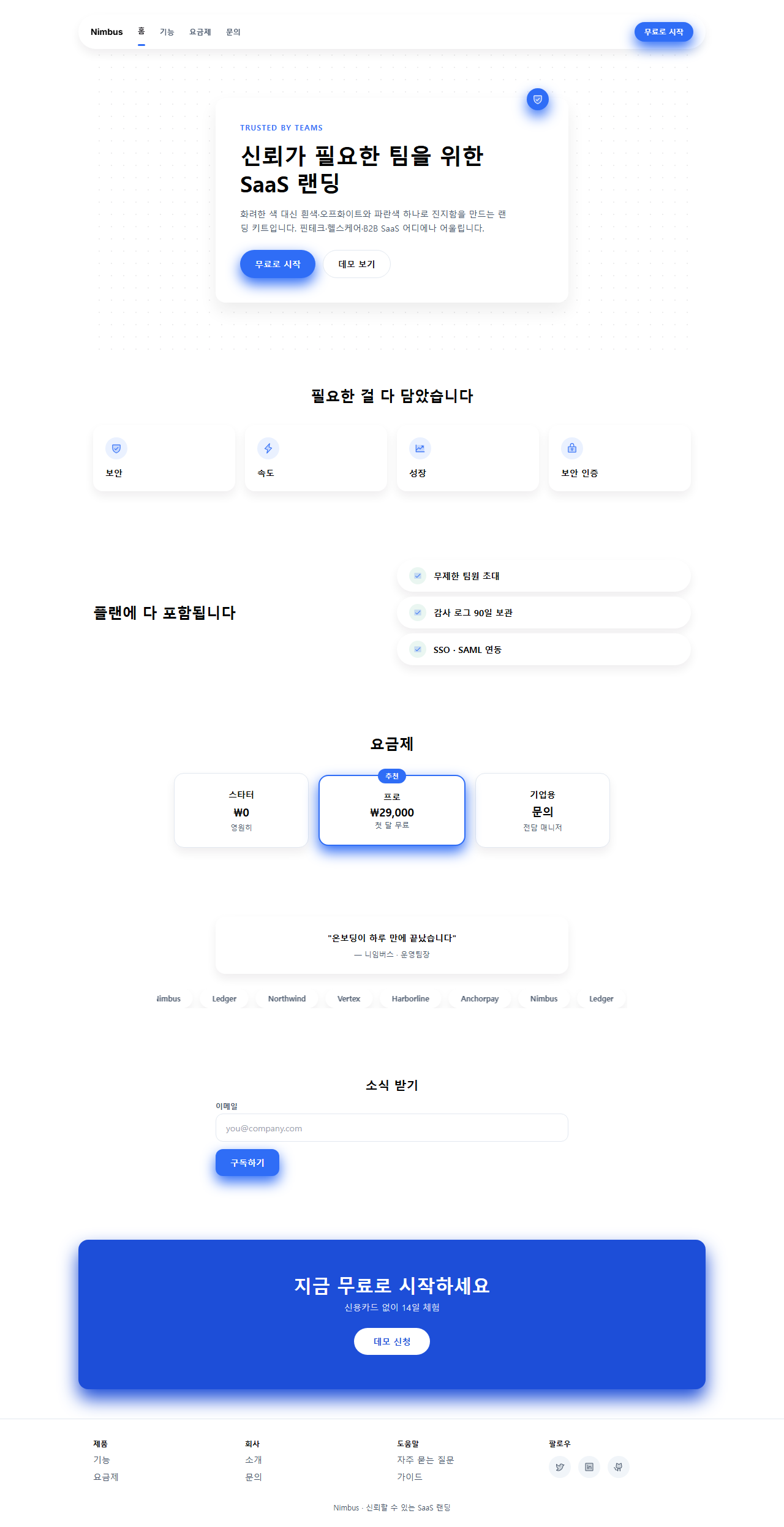
どこで壊れるか — 落とし穴
最初につまずいたのはナビインジケーターの動きでした。最初は3pxのアンダーライン1本だけを動かしていましたが、書き出したgifを見ると480×300の舞台でも動き自体が弱く、「動いているのか分からない」印象でした。実測すると線1本だけでは変化した面積が小さすぎ、タブの幅と同じ薄い青のハイライトブロックを線と同じ拍子で一緒に動かして、ようやく動きが目に入るようになりました。
2つ目は画面幅です。最初はナビのタブ3つをそれぞれ108pxにして左右の余白を足したところ、全体の幅が332pxになり、320pxのスマホ幅の基準を12pxも超えていました。タブ幅を92pxに縮め、全体を284pxに収めてから、320×200のレンダーで横のはみ出しが消えました。3つ目は料金プランの「エンタープライズ」という言葉でした — 92px幅のカードの中で単語の途中で改行されてしまい、「法人向け」という短い言葉に変えてからようやく1行に収まりました。この抑えた青がメール本文の中でどこまで保つかはメルマガ デザイン 9種で別に確かめました。この3つを直した完成版は、パスワード8h4q5uurのかかったzipを開けばそのまま確認できます。
9個のデモすべてがMDNのprefers-reduced-motionメディアクエリを検知すると動きを止め、各要素を静止状態(カードは浮く前の位置、リストの行は全部表示された状態、フォーカスリングは消えた状態)に固定します。動きを減らしたい訪問者には、カードの浮き沈みやロゴの流れは見えなくなりますが、カード・ボタン・入力欄そのものの情報は残ります。
アクセシビリティ
このスタイルがパステルやキャンディ系よりコントラストの面で有利なのは、背景がほぼ常に白かオフホワイトで、計算が単純になるからです。実際に計算すると、インク(#17141a)の文字は白背景で18.24:1、補助文字に使うスレート(#475569)は7.58:1と、どちらもWCAG 2.1の最低コントラスト基準である本文4.5:1を十分に超えています。一方、ブランドブルー(#2f6df6)を白背景の上に文字としてそのまま使うと4.53:1と基準線ぎりぎりになるため、このコードではブランドブルーを本文の文字色には使わず、面積や太さのあるボタン・アイコン・枠線だけに使っています。CTA帯のように青を背景に使う場面では、より濃いブルーディープ(#1d4ed8)に切り替え、白文字で6.70:1を確保しました。影はMDNのbox-shadow構文に沿って不透明度を0.07〜0.32に抑え、枠線の代わりにならないようにし、キーボードフォーカスは:focus-visibleのアウトラインと二重の青いリングで別途描いています。
信頼感のあるSaaS以外のホームページトレンドが気になる方はデザイントレンドカテゴリーをご覧いただき、このブログ全体が何を扱っているかは紹介ページにまとめてあります。
FAQ
saas ui デザインとして明るいトーンなのに、なぜパステルキャンディのようには見えないのですか?
明るさの由来が違うからです。パステルキャンディ系はピンク・レモン・ミント・ラベンダーのように、カードごとに違う色を使うことで明るく可愛く見えます。このキットは背景を中立な2トーンに固定し、ブランドカラーを1色だけ足すことで、色数を最小限に抑えたまま明るさを出しています。色が多いほどカジュアルに、少ないほど真面目に見えます。信頼を色ではなく他人の声で立ち上げる区間はお客様の声 デザインの型9選が受け持ちます。
青の代わりに別のブランドカラーを使ってもいいですか?
使えますが、白背景の上の文字として使うなら4.5:1のコントラストを自分で計算する必要があります。このキットの青(#2f6df6)は4.53:1と基準線ぎりぎりのため本文には使っていません。同じ明るさの緑や紫では基準を下回ることもあるので、計算せずにそのまま置き換えてはいけません。
カードごとに薄い色の背景を入れてもこのスタイルと言えますか?
カード自体の表面を色で塗った時点で、このスタイルからは外れます。このキットではカードは常に白のままで、薄い色は背景の広い部分やアイコンの円のような小さな強調にだけ使います。カードの背景まで色づけると、キャンディやフルーツ系の「かわいい明るさ」に近づいてしまいます。
こんな記事もどうぞ
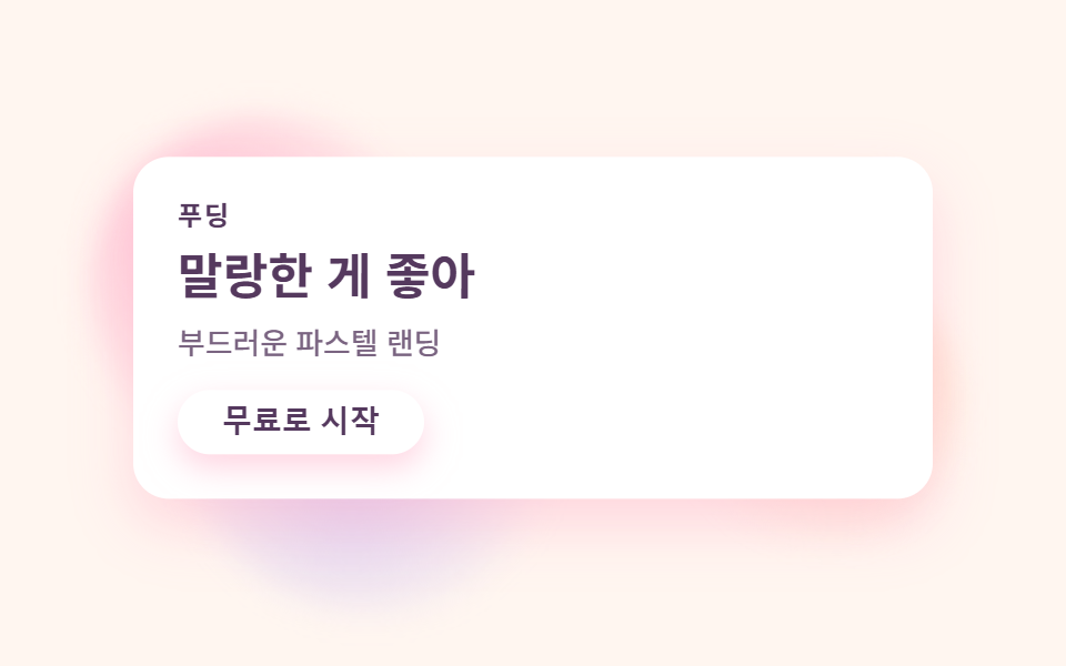 デザイントレンドパステル デザイン LPキット、キャンディカラーのセクション9選
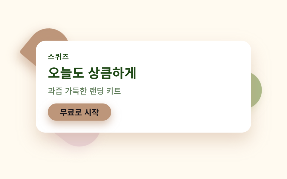 デザイントレンドビタミンカラー デザイン LPキット、シトラスカラーのセクション9選
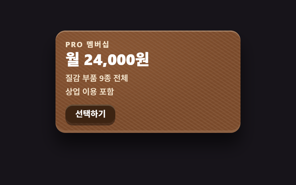 デザイントレンドスキューモーフィズムデザインの質感パーツ9選
 デザイントレンドai ランディングページ 光るオーブ デザインキット、セクション9選
 デザイントレンド【コピペOK】ベントグリッド 今どきのLPパーツ9選
 デザイントレンド現場で使う ダークモード デザインシステム LPパーツ9選
 デザイントレンドキネティックタイポグラフィをコードで分解してみた
 デザイントレンドクレイモーフィズムとは?丸くてぷっくりしたLPパーツ9選
 デザイントレンドメッシュグラデーションの上に、あえてグレインを残す
 デザイントレンドネオブルータリズム UI キット、影がにじまないLPパーツ9選