ビタミンカラー デザイン LPキット、シトラスカラーのセクション9選
ビタミンカラー デザインは、オレンジ・ライム・グレープフルーツ・レモンのように彩度の高いフルーツカラーをクリームの地に重ね、カードごとに同系色の影を落として、パステルより一段強く、夏のドリンクブランドのようにみずみずしく見せるスタイルです。
このスタイルで実際に組んだLPをそのまま下に埋め込みました。固定ナビから波形のフッターまで、実際に動かして全体の空気感を確認してください。

このLPを作る9つのパーツを1つずつ切り出し、下のグリッドに並べ直しました。訪問者の目が実際に動く順番 — 目を引く、見回す、価格を見る、信頼する、行動を促す、登録する — の並びです。うち5つ(ヒーロー・カードグリッド・機能リスト・CTA帯・フッター)は、ぼかした霧ではなくくっきりした水滴の形と色付きの影で、パステルと分かれる境目をアニメーションで直接示します。
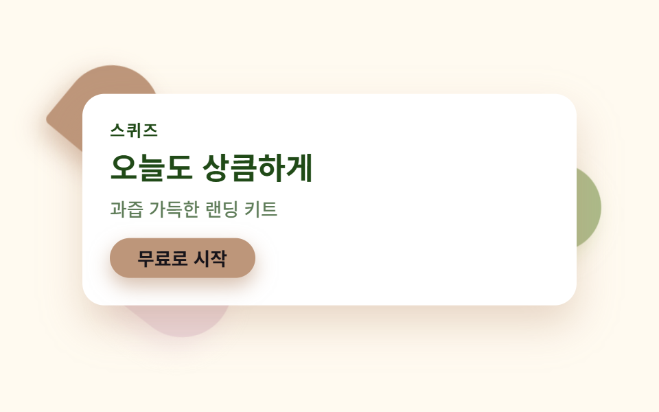 01 hero-citrus
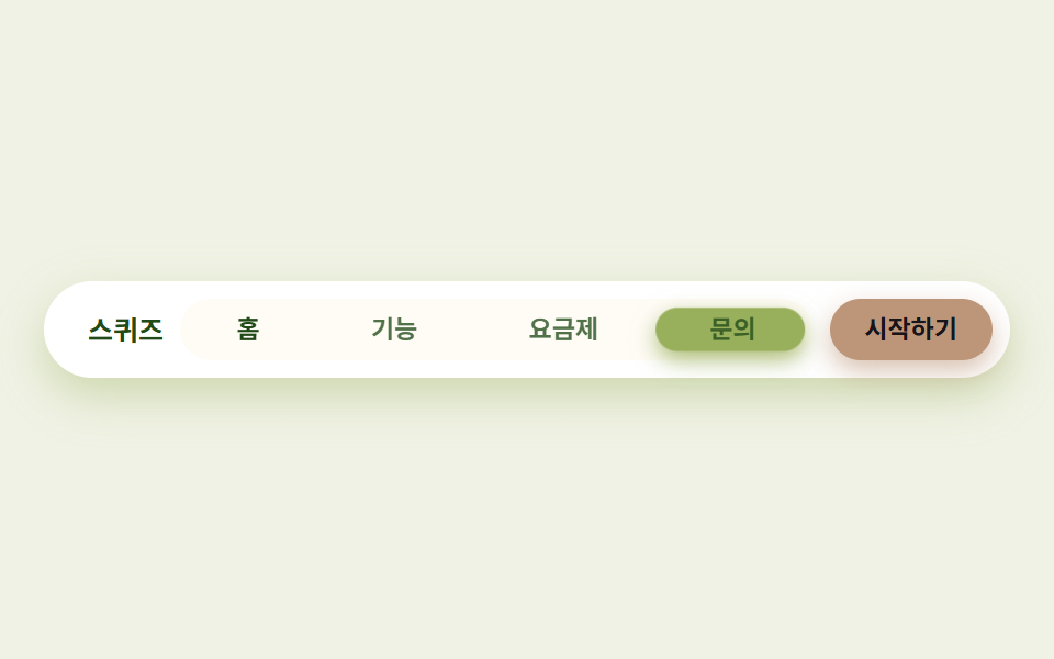 02 nav-citrus
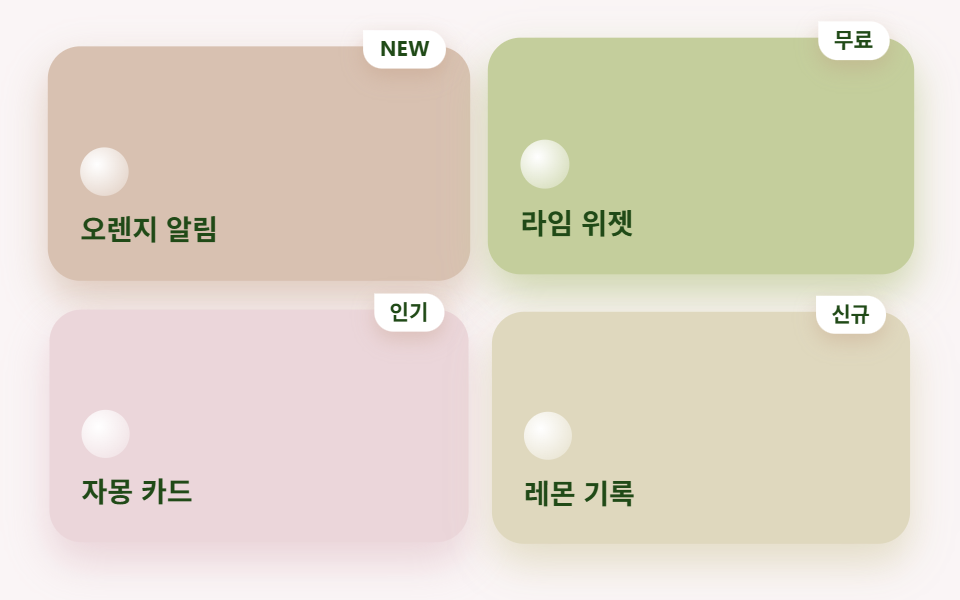 03 card-grid-citrus
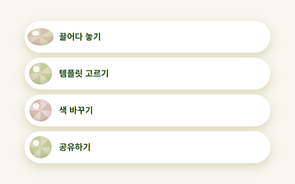 04 feature-list-citrus
 05 pricing-citrus
 06 testimonial-citrus
 07 cta-band-citrus
 08 footer-citrus
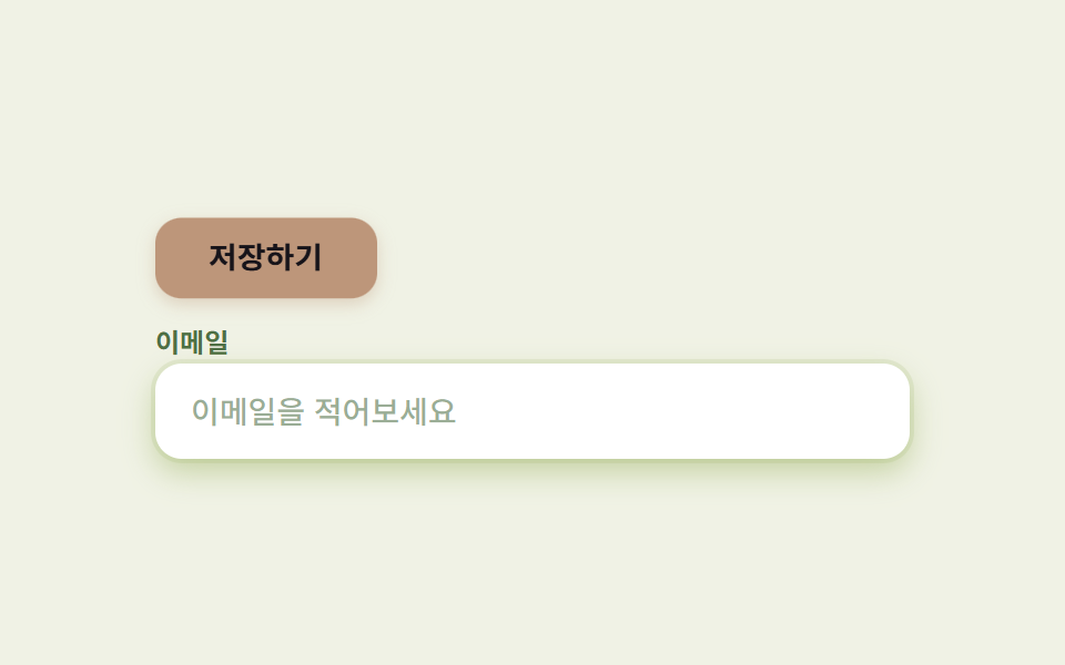 09 buttons-inputs-citrus
自動再生 · タイルを押すとその項目へ · すべて1つのzip
- 01 ジューススプラッシュのヒーロー
- 02 スライスインジケーターナビ
- 03 ウェッジバッジのカードグリッド
- 04 スクイーズドロップアイコンリスト
- 05 スムージー料金プラン
- 06 しずく吹き出しのレビュー
- 07 シトラスグラデーションCTA帯
- 08 ウェーブのフッター
- 09 ジューシーボタン・入力欄
キット全体の色は、夏 カラー デザインとしては少ない9色で、役割が2つに分かれます。文字を乗せるカード面には明るめのフルーツトーンを、影・グラデーション・小さいアイコンには彩度をそのまま残した濃いトーンを使います。同じdesign柱で彩度を沈めて柔らかくいく側は手書き風 デザイン LPキットとパステル デザイン LPキット、インクを光沢に替えた側がsaas サイト デザイン 信頼感キットです。
| 役割 | 色 | インクとのコントラスト | 使う場所 |
|---|---|---|---|
| クリーム | #fffaf0 |
9.83:1 | ページの背景全体 |
| オレンジ(カード面) | #ff9a52 |
4.87:1 | ヒーローのバッジ・カード |
| ライム(カード面) | #c8e84a |
7.35:1 | カード・入力欄のリング |
| グレープフルーツ(カード面) | #ff8fa3 |
4.73:1 | カード・吹き出しの影 |
| レモン(カード面) | #ffe066 |
7.84:1 | カード・料金プラン |
| オレンジ(濃色) | #ff6a00 |
3.56:1 | 影・グラデーション・ボタン地専用 |
| インク | #204a17 |
— | すべての文字(白地で10.23:1) |
01ジューススプラッシュのヒーロー
シトラス デザインとして何が見えるか
クリームの地の上で、オレンジ・ライム・グレープフルーツの水滴(非対称の border-radius を45度回転させた形)3つが跳ねながら位置を入れ替え、手前の白いカードは跳ねるたびに少し沈みます。
<main class="stage">
  <section class="herocitrus">
    <span class="herocitrus__drop herocitrus__drop--a" aria-hidden="true"></span>
    <span class="herocitrus__drop herocitrus__drop--b" aria-hidden="true"></span>
    <span class="herocitrus__drop herocitrus__drop--c" aria-hidden="true"></span>
    <div class="herocitrus__card">
      <p class="herocitrus__eyebrow">スクイーズ</p>
      <h1 class="herocitrus__title">今日も爽やかに</h1>
      <p class="herocitrus__desc">果汁たっぷりのランディングキット</p>
      <button class="herocitrus__cta" type="button">無料で始める</button>
    </div>
  </section>
</main>
@use "../../../../site/static/demo-tokens" as *;
$duration: $dur-loop; // 방울 세 개가 한 바퀴 튀어 도는 주기
$easing: $ease-spring; // 통통 튀어 오르는 곡선
$color: $stage-ink; // 글자 기본(토큰) — 아래 시트러스 잉크로 덮는다
// 시트러스 팔레트 — 값은 tailwind.config.js · tokens.css 와 같다. 카드류는 잉크 대비 4.5:1 이상 확보한 밝은 톤, 진한 톤은 그림자·그라디언트 전용(접근성 섹션 참고)
$citrus-cream: #fffaf0; // 크림 바탕
$citrus-orange: #d8c1b1; // 오렌지 — 카드 표면용(대비 4.9:1)
$citrus-orange-deep: #bd967a; // 오렌지 — 그림자·그라디언트 전용(진한 톤)
$citrus-lime: #c4ce9c; // 라임 — 카드 표면용
$citrus-grapefruit: #ebd6da; // 자몽 — 카드 표면용
$citrus-lemon: #dfd8be; // 레몬 — 카드 표면용
$citrus-ink: #204a17; // 잎사귀 잉크 — 글자는 항상 이 색(흰 배경 대비 10:1)
@include stage($citrus-cream);
.herocitrus {
position: relative;
width: clamp(220px, 76vw, 360px);
}
// 물방울 — 비대칭 반경(물방울 모양)을 45도 돌려 만든다. 위치·크기는 부모가, 모양 각도는 고정
.herocitrus__drop {
position: absolute;
width: clamp(46px, 16vw, 64px);
aspect-ratio: 1;
pointer-events: none;
}
.herocitrus__drop::before {
content: "";
display: block;
width: 100%;
height: 100%;
border-radius: 50% 50% 50% $r-xs;
transform: rotate(45deg);
}
.herocitrus__drop--a {
top: -18px;
left: -14px;
animation: dropA $duration $easing infinite;
}
.herocitrus__drop--a::before { background: $citrus-orange-deep; box-shadow: 0 8px 16px rgba($citrus-orange-deep, .55); }
.herocitrus__drop--b {
right: -18px;
top: 30%;
animation: dropB $duration $easing infinite;
animation-delay: calc($duration / -3);
}
.herocitrus__drop--b::before { background: mix($citrus-lime, $citrus-ink, 85%); box-shadow: 0 8px 16px rgba($citrus-lime, .6); }
.herocitrus__drop--c {
left: 10%;
bottom: -20px;
animation: dropA $duration $easing infinite;
animation-delay: calc($duration / -3 * 2);
}
.herocitrus__drop--c::before { background: $citrus-grapefruit; box-shadow: 0 8px 16px rgba($citrus-grapefruit, .55); }
.herocitrus__card {
position: relative;
box-sizing: border-box;
width: 100%;
display: flex;
flex-direction: column;
align-items: flex-start;
gap: $sp-2;
padding: $sp-5;
border-radius: $r-card;
background: $stage-paper;
box-shadow: 0 10px 24px rgba($citrus-orange-deep, .4);
animation: cardBob $duration $easing infinite;
}
.herocitrus__eyebrow {
margin: 0;
color: $citrus-ink;
font-weight: 700; font-size: clamp(10px, 2.6vw, 12px); line-height: 1;
font-family: inherit;
letter-spacing: .08em;
text-transform: uppercase;
}
.herocitrus__title {
margin: 0;
color: $citrus-ink;
font-weight: 700; font-size: clamp(18px, 4.6vw, 24px); line-height: 1.2;
font-family: inherit;
}
.herocitrus__desc {
margin: 0;
color: rgba($citrus-ink, .72);
font-weight: 500; font-size: clamp(12px, 2.8vw, 14px); line-height: 1.4;
font-family: inherit;
}
.herocitrus__cta {
margin-top: $sp-1;
border: 0;
border-radius: $r-pill;
background: $citrus-orange-deep;
color: $subject-ink;
padding: $sp-2 $sp-5;
font-weight: 700; font-size: clamp(12px, 2.8vw, 14px); line-height: 1;
font-family: inherit;
box-shadow: 0 6px 14px rgba($citrus-orange-deep, .6);
}
.herocitrus__cta:focus-visible {
outline: 3px solid $citrus-ink;
outline-offset: 2px;
}
// 데모: 물방울 세 개가 각자 다른 위상으로 튀어 오르고, 카드는 그때마다 살짝 눌렸다 뜬다 (WAAPI 시계가 잡을 수 있게 keyframes)
@keyframes dropA {
0%, 100% { transform: translate(0, 0) scale(1) rotate(0deg); }
50% { transform: translate(8%, -10%) scale(1.15) rotate(-8deg); }
}
@keyframes dropB {
0%, 100% { transform: translate(0, 0) scale(1) rotate(0deg); }
50% { transform: translate(-7%, 9%) scale(.86) rotate(10deg); }
}
@keyframes cardBob {
0%, 100% { transform: translateY(0); box-shadow: 0 10px 24px rgba($citrus-orange-deep, .4); }
50% { transform: translateY(-7px); box-shadow: 0 16px 30px rgba($citrus-orange-deep, .32); }
}
// 반응형: 320×200 처럼 세로가 짧은 화면에선 방울 크기와 카드 속을 줄인다(BD9 — 217 실측대로 카드 자체 높이가 넘침의 주 원인이라
// 패딩·글자·버튼까지 함께 줄인다. 217-01 은 mist 를 blur 원으로만 그려 카드 밖으로 안 삐져나왔지만 이 편은 물방울을 카드 모서리
// 밖으로 튀어나오게 그려 bottom 오프셋이 남으면 213px 로 넘쳤다 — 실측)
@media (max-width: 340px), (max-height: 220px) {
.herocitrus__drop { width: clamp(22px, 8vw, 30px); }
.herocitrus__drop--a { top: -4px; left: -4px; }
.herocitrus__drop--b { right: -4px; top: 12%; }
.herocitrus__drop--c { left: 8%; bottom: -4px; }
.herocitrus__card { padding: $sp-2 $sp-3; gap: $sp-1; }
.herocitrus__eyebrow { display: none; }
.herocitrus__title { font-size: 15px; line-height: 1.15; }
.herocitrus__desc { display: none; }
.herocitrus__cta { padding: $sp-1 $sp-4; margin-top: 0; }
}
@media (prefers-reduced-motion: reduce) {
.herocitrus__drop, .herocitrus__card { animation: none !important; transform: none; }
}html, body {
margin: 0;
overflow: hidden;
}
.stage {
box-sizing: border-box;
min-height: 100vh;
display: grid;
place-items: center;
margin: 0;
background: #fffaf0;
font-family: -apple-system, "Segoe UI", "Noto Sans KR", sans-serif;
padding: clamp(8px, 4vw, 24px);
}
.herocitrus {
position: relative;
width: clamp(220px, 76vw, 360px);
}
.herocitrus__drop {
position: absolute;
width: clamp(46px, 16vw, 64px);
aspect-ratio: 1;
pointer-events: none;
}
.herocitrus__drop::before {
content: "";
display: block;
width: 100%;
height: 100%;
border-radius: 50% 50% 50% 4px;
transform: rotate(45deg);
}
.herocitrus__drop--a {
top: -18px;
left: -14px;
animation: dropA 2s cubic-bezier(0.2, 0.8, 0.2, 1) infinite;
}
.herocitrus__drop--a::before {
background: #bd967a;
box-shadow: 0 8px 16px rgba(189, 150, 122, 0.55);
}
.herocitrus__drop--b {
right: -18px;
top: 30%;
animation: dropB 2s cubic-bezier(0.2, 0.8, 0.2, 1) infinite;
animation-delay: -0.6666666667s;
}
.herocitrus__drop--b::before {
background: rgb(67.2156862745%, 73.0196078431%, 53.3529411765%);
box-shadow: 0 8px 16px rgba(196, 206, 156, 0.6);
}
.herocitrus__drop--c {
left: 10%;
bottom: -20px;
animation: dropA 2s cubic-bezier(0.2, 0.8, 0.2, 1) infinite;
animation-delay: -1.3333333333s;
}
.herocitrus__drop--c::before {
background: #ebd6da;
box-shadow: 0 8px 16px rgba(235, 214, 218, 0.55);
}
.herocitrus__card {
position: relative;
box-sizing: border-box;
width: 100%;
display: flex;
flex-direction: column;
align-items: flex-start;
gap: 8px;
padding: 20px;
border-radius: 16px;
background: #ffffff;
box-shadow: 0 10px 24px rgba(189, 150, 122, 0.4);
animation: cardBob 2s cubic-bezier(0.2, 0.8, 0.2, 1) infinite;
}
.herocitrus__eyebrow {
margin: 0;
color: #204a17;
font-weight: 700;
font-size: clamp(10px, 2.6vw, 12px);
line-height: 1;
font-family: inherit;
letter-spacing: 0.08em;
text-transform: uppercase;
}
.herocitrus__title {
margin: 0;
color: #204a17;
font-weight: 700;
font-size: clamp(18px, 4.6vw, 24px);
line-height: 1.2;
font-family: inherit;
}
.herocitrus__desc {
margin: 0;
color: rgba(32, 74, 23, 0.72);
font-weight: 500;
font-size: clamp(12px, 2.8vw, 14px);
line-height: 1.4;
font-family: inherit;
}
.herocitrus__cta {
margin-top: 4px;
border: 0;
border-radius: 999px;
background: #bd967a;
color: #17141a;
padding: 8px 20px;
font-weight: 700;
font-size: clamp(12px, 2.8vw, 14px);
line-height: 1;
font-family: inherit;
box-shadow: 0 6px 14px rgba(189, 150, 122, 0.6);
}
.herocitrus__cta:focus-visible {
outline: 3px solid #204a17;
outline-offset: 2px;
}
@keyframes dropA {
0%, 100% {
transform: translate(0, 0) scale(1) rotate(0deg);
}
50% {
transform: translate(8%, -10%) scale(1.15) rotate(-8deg);
}
}
@keyframes dropB {
0%, 100% {
transform: translate(0, 0) scale(1) rotate(0deg);
}
50% {
transform: translate(-7%, 9%) scale(0.86) rotate(10deg);
}
}
@keyframes cardBob {
0%, 100% {
transform: translateY(0);
box-shadow: 0 10px 24px rgba(189, 150, 122, 0.4);
}
50% {
transform: translateY(-7px);
box-shadow: 0 16px 30px rgba(189, 150, 122, 0.32);
}
}
@media (max-width: 340px), (max-height: 220px) {
.herocitrus__drop {
width: clamp(22px, 8vw, 30px);
}
.herocitrus__drop--a {
top: -4px;
left: -4px;
}
.herocitrus__drop--b {
right: -4px;
top: 12%;
}
.herocitrus__drop--c {
left: 8%;
bottom: -4px;
}
.herocitrus__card {
padding: 8px 12px;
gap: 4px;
}
.herocitrus__eyebrow {
display: none;
}
.herocitrus__title {
font-size: 15px;
line-height: 1.15;
}
.herocitrus__desc {
display: none;
}
.herocitrus__cta {
padding: 4px 16px;
margin-top: 0;
}
}
@media (prefers-reduced-motion: reduce) {
.herocitrus__drop, .herocitrus__card {
animation: none !important;
transform: none;
}
}import type { CSSProperties } from "react";
import styles from "./HeroCitrus.module.scss";
export type HeroCitrusProps = {
eyebrow?: string;
title?: string;
desc?: string;
cta?: string;
/** 한 주기(기본 2000ms) */
duration?: number;
easing?: string;
color?: string;
};
type Vars = CSSProperties & { "--duration"?: string; "--easing"?: string; "--color"?: string };
export default function HeroCitrus({
eyebrow = "스퀴즈",
title = "오늘도 상큼하게",
desc = "과즙 가득한 랜딩 키트",
cta = "무료로 시작",
duration = 2000,
easing = "cubic-bezier(.2,.8,.2,1)",
color = "#ff6a00",
}: HeroCitrusProps) {
const vars: Vars = { "--duration": `${duration}ms`, "--easing": easing, "--color": color };
return (
<section className={styles.herocitrus} style={vars}>
<span className={`${styles.drop} ${styles.dropA}`} aria-hidden="true" />
<span className={`${styles.drop} ${styles.dropB}`} aria-hidden="true" />
<span className={`${styles.drop} ${styles.dropC}`} aria-hidden="true" />
<div className={styles.card}>
<p className={styles.eyebrow}>{eyebrow}</p>
<h1 className={styles.title}>{title}</h1>
<p className={styles.desc}>{desc}</p>
<button type="button" className={styles.cta}>{cta}</button>
</div>
</section>
);
}01 · ジューススプラッシュのヒーロー — 計測 累積面積 10.797% · 動いたフレーム 23/23GODRICH オリジナル · SCSS と React は zip に同梱 · パスワードを見る
コードのどこを見るか
ぼかした霧ではなくくっきりした水滴を使う点が、パステルの霧ヒーローと分かれる最初の合図です。
.drop::before {
  content: "";
  width: 100%; height: 100%;
  border-radius: 50% 50% 50% 4px;  /* 水滴の形 */
  transform: rotate(45deg);
}
@keyframes dropA {
  0%, 100% { transform: translate(0, 0) scale(1) rotate(0deg); }
  50%      { transform: translate(8%, -10%) scale(1.15) rotate(-8deg); }
}
02スライスインジケーターナビ
画面で起きること
アクティブなタブを示すライム色のウェッジが隣へ移動するとき横に伸び、到着すると弾力よく縮みます。
<main class="stage">
  <nav class="navcitrus" aria-label="メインメニュー">
    <span class="navcitrus__brand">スクイーズ</span>
    <div class="navcitrus__track">
      <span class="navcitrus__wedge" aria-hidden="true"></span>
      <span class="navcitrus__tab navcitrus__tab--on">ホーム</span>
      <span class="navcitrus__tab">機能</span>
      <span class="navcitrus__tab">料金</span>
      <span class="navcitrus__tab">お問い合わせ</span>
    </div>
    <button class="navcitrus__cta" type="button">はじめる</button>
  </nav>
</main>
@use "../../../../site/static/demo-tokens" as *;
$duration: $dur-loop; // 웨지가 네 칸을 한 바퀴 도는 주기
$easing: $ease-spring; // 도착할 때 탄력 있게 줄어드는 곡선
$color: $stage-ink; // 글자 기본(토큰) — 아래 잉크로 덮는다
$citrus-cream: #fffaf0;
$citrus-orange: #d8c1b1;
$citrus-orange-deep: #bd967a;
$citrus-lime: #c4ce9c;
$citrus-lime-deep: #98af5c;
$citrus-grapefruit: #ebd6da;
$citrus-ink: #204a17;
// 무대 — 라임 물색
@include stage(mix($citrus-lime, $stage-paper, 26%));
.navcitrus {
box-sizing: border-box;
width: clamp(280px, 92vw, 440px);
display: flex;
align-items: center;
gap: $sp-2;
padding: $sp-2;
border-radius: $r-pill;
background: $stage-paper;
box-shadow: 0 8px 20px rgba($citrus-lime-deep, .4);
}
.navcitrus__brand {
flex: 0 0 auto;
padding-left: $sp-3;
color: $citrus-ink;
font-weight: 700; font-size: clamp(11px, 2.6vw, 13px); line-height: 1;
font-family: inherit;
}
.navcitrus__track {
position: relative;
flex: 1 1 auto;
min-width: 0;
display: flex;
border-radius: $r-pill;
background: mix($citrus-cream, $stage-paper, 60%);
}
.navcitrus__wedge {
position: absolute;
top: $sp-1;
bottom: $sp-1;
left: $sp-1;
width: calc(25% - $sp-1);
box-sizing: border-box;
border-radius: $r-pill;
background: $citrus-lime-deep;
box-shadow: 0 4px 10px rgba($citrus-lime-deep, .8);
// 네 칸을 순서대로 옮겨 다니며 도착할 때마다 조각(웨지)처럼 세로로 살짝 눌린다
animation: wedgeWalk $duration $easing infinite;
}
.navcitrus__tab {
position: relative;
z-index: 1;
flex: 1 1 auto;
min-width: 0;
padding: $sp-2 0;
text-align: center;
color: rgba($citrus-ink, .78);
font-weight: 600; font-size: clamp(10px, 2.4vw, 12px); line-height: 1;
font-family: inherit;
white-space: nowrap;
overflow: hidden;
text-overflow: ellipsis;
}
.navcitrus__tab--on {
color: $citrus-ink;
font-weight: 700;
}
.navcitrus__cta {
flex: 0 0 auto;
border: 0;
border-radius: $r-pill;
background: $citrus-orange-deep;
color: $subject-ink;
padding: $sp-2 $sp-4;
font-weight: 700; font-size: clamp(10px, 2.4vw, 12px); line-height: 1;
font-family: inherit;
box-shadow: 0 5px 12px rgba($citrus-orange-deep, .6);
}
.navcitrus__cta:focus-visible {
outline: 3px solid $citrus-ink;
outline-offset: 2px;
}
// 데모: 칸 폭은 25% — translateX(100%) 가 정확히 한 칸. 도착 순간 scaleY 로 눌렸다 펴진다
// 데모: % 이동은 이 요소 자기 폭 기준 — 폭이 calc(25% - 4px) 라 한 칸(트랙의 25%)보다 4px 모자라
// 이동량을 calc(100% + 4px) 씩 보정한다(보정 없으면 세 칸을 지나며 12px 밀린다 — 217 nav-candy 와 같은 식으로 실측)
@keyframes wedgeWalk {
0%, 24% { transform: translateX(0) scaleY(1); }
30% { transform: translateX(0) scaleY(.82); }
36%, 49% { transform: translateX(calc(100% + 4px)) scaleY(1); }
55% { transform: translateX(calc(100% + 4px)) scaleY(.82); }
61%, 74% { transform: translateX(calc(200% + 8px)) scaleY(1); }
80% { transform: translateX(calc(200% + 8px)) scaleY(.82); }
86%, 100% { transform: translateX(calc(300% + 12px)) scaleY(1); }
}
@media (prefers-reduced-motion: reduce) {
.navcitrus__wedge { animation: none !important; transform: none; }
}html, body {
margin: 0;
overflow: hidden;
}
.stage {
box-sizing: border-box;
min-height: 100vh;
display: grid;
place-items: center;
margin: 0;
background: rgb(93.9843137255%, 95.0039215686%, 89.9058823529%);
font-family: -apple-system, "Segoe UI", "Noto Sans KR", sans-serif;
padding: clamp(8px, 4vw, 24px);
}
.navcitrus {
box-sizing: border-box;
width: clamp(280px, 92vw, 440px);
display: flex;
align-items: center;
gap: 8px;
padding: 8px;
border-radius: 999px;
background: #ffffff;
box-shadow: 0 8px 20px rgba(152, 175, 92, 0.4);
}
.navcitrus__brand {
flex: 0 0 auto;
padding-left: 12px;
color: #204a17;
font-weight: 700;
font-size: clamp(11px, 2.6vw, 13px);
line-height: 1;
font-family: inherit;
}
.navcitrus__track {
position: relative;
flex: 1 1 auto;
min-width: 0;
display: flex;
border-radius: 999px;
background: #fffcf6;
}
.navcitrus__wedge {
position: absolute;
top: 4px;
bottom: 4px;
left: 4px;
width: calc(25% - 4px);
box-sizing: border-box;
border-radius: 999px;
background: #98af5c;
box-shadow: 0 4px 10px rgba(152, 175, 92, 0.8);
animation: wedgeWalk 2s cubic-bezier(0.2, 0.8, 0.2, 1) infinite;
}
.navcitrus__tab {
position: relative;
z-index: 1;
flex: 1 1 auto;
min-width: 0;
padding: 8px 0;
text-align: center;
color: rgba(32, 74, 23, 0.78);
font-weight: 600;
font-size: clamp(10px, 2.4vw, 12px);
line-height: 1;
font-family: inherit;
white-space: nowrap;
overflow: hidden;
text-overflow: ellipsis;
}
.navcitrus__tab--on {
color: #204a17;
font-weight: 700;
}
.navcitrus__cta {
flex: 0 0 auto;
border: 0;
border-radius: 999px;
background: #bd967a;
color: #17141a;
padding: 8px 16px;
font-weight: 700;
font-size: clamp(10px, 2.4vw, 12px);
line-height: 1;
font-family: inherit;
box-shadow: 0 5px 12px rgba(189, 150, 122, 0.6);
}
.navcitrus__cta:focus-visible {
outline: 3px solid #204a17;
outline-offset: 2px;
}
@keyframes wedgeWalk {
0%, 24% {
transform: translateX(0) scaleY(1);
}
30% {
transform: translateX(0) scaleY(0.82);
}
36%, 49% {
transform: translateX(calc(100% + 4px)) scaleY(1);
}
55% {
transform: translateX(calc(100% + 4px)) scaleY(0.82);
}
61%, 74% {
transform: translateX(calc(200% + 8px)) scaleY(1);
}
80% {
transform: translateX(calc(200% + 8px)) scaleY(0.82);
}
86%, 100% {
transform: translateX(calc(300% + 12px)) scaleY(1);
}
}
@media (prefers-reduced-motion: reduce) {
.navcitrus__wedge {
animation: none !important;
transform: none;
}
}import type { CSSProperties } from "react";
import styles from "./NavCitrus.module.scss";
export type NavCitrusProps = {
brand?: string;
tabs?: string[];
active?: number;
cta?: string;
duration?: number;
easing?: string;
color?: string;
};
type Vars = CSSProperties & { "--duration"?: string; "--easing"?: string; "--color"?: string };
export default function NavCitrus({
brand = "스퀴즈",
tabs = ["홈", "기능", "요금제", "문의"],
active = 0,
cta = "시작하기",
duration = 2000,
easing = "cubic-bezier(.2,.8,.2,1)",
color = "#9ad200",
}: NavCitrusProps) {
const vars: Vars = { "--duration": `${duration}ms`, "--easing": easing, "--color": color };
return (
<nav className={styles.navcitrus} style={vars} aria-label="주요 메뉴">
<span className={styles.brand}>{brand}</span>
<div className={styles.track}>
<span className={styles.wedge} aria-hidden="true" style={{ "--activeIndex": active } as CSSProperties} />
{tabs.map((t, i) => (
<span key={t} className={`${styles.tab} ${i === active ? styles.tabOn : ""}`}>{t}</span>
))}
</div>
<button type="button" className={styles.cta}>{cta}</button>
</nav>
);
}02 · スライスインジケーターナビ — 計測 累積面積 6.292% · 動いたフレーム 12/23GODRICH オリジナル · SCSS と React は zip に同梱 · パスワードを見る
コードの読み方
幅がトラックの4分の1から左の余白4pxを引いた値なので、translateX の移動量にもその4pxを足し戻さないと少しずつずれていきます。
.wedge {
  width: calc(25% - 4px);
  animation: wedgeWalk 2s cubic-bezier(.2,.8,.2,1) infinite;
}
@keyframes wedgeWalk {
  0%, 24%  { transform: translateX(0) scaleY(1); }
  36%, 49% { transform: translateX(calc(100% + 4px)) scaleY(1); }
}
03ウェッジバッジのカードグリッド
どんな動きか
カードごとにオレンジ・ライム・グレープフルーツ・レモンそれぞれのトーンに同系色の影を重ね、隅には果肉ウェッジ型のバッジを付けます。
<main class="stage">
  <div class="gridcitrus">
    <div class="gridcitrus__card gridcitrus__card--org">
      <span class="gridcitrus__badge">NEW</span>
      <span class="gridcitrus__dot" aria-hidden="true"></span>
      <p class="gridcitrus__name">オレンジアラート</p>
    </div>
    <div class="gridcitrus__card gridcitrus__card--lim">
      <span class="gridcitrus__badge">無料</span>
      <span class="gridcitrus__dot" aria-hidden="true"></span>
      <p class="gridcitrus__name">ライムウィジェット</p>
    </div>
    <div class="gridcitrus__card gridcitrus__card--grp">
      <span class="gridcitrus__badge">人気</span>
      <span class="gridcitrus__dot" aria-hidden="true"></span>
      <p class="gridcitrus__name">グレープフルーツカード</p>
    </div>
    <div class="gridcitrus__card gridcitrus__card--lem">
      <span class="gridcitrus__badge">NEW</span>
      <span class="gridcitrus__dot" aria-hidden="true"></span>
      <p class="gridcitrus__name">レモンログ</p>
    </div>
  </div>
</main>
@use "../../../../site/static/demo-tokens" as *;
$duration: $dur-loop; // 카드 네 장이 한 바퀴 튀어 오르는 주기
$easing: $ease-spring;
$color: $stage-ink;
$citrus-cream: #fffaf0;
$citrus-orange: #d8c1b1;
$citrus-orange-deep: #bd967a;
$citrus-lime: #c4ce9c;
$citrus-grapefruit: #ebd6da;
$citrus-grapefruit-deep: #d1a3ad;
$citrus-lemon: #dfd8be;
$citrus-ink: #204a17;
// 무대 — 자몽 물색
@include stage(mix($citrus-grapefruit, $stage-paper, 24%));
.gridcitrus {
box-sizing: border-box;
width: clamp(280px, 92vw, 430px);
display: grid;
grid-template-columns: repeat(auto-fit, minmax(clamp(120px, 40vw, 160px), 1fr));
gap: $sp-3;
}
.gridcitrus__card {
position: relative;
box-sizing: border-box;
min-height: clamp(92px, 26vw, 116px);
display: flex;
flex-direction: column;
justify-content: flex-end;
gap: $sp-2;
padding: $sp-4;
border-radius: $r-card;
animation: cardPop $duration $easing infinite;
}
.gridcitrus__card--org { background: $citrus-orange; box-shadow: 0 10px 20px rgba($citrus-orange-deep, .45); }
.gridcitrus__card--lim { background: $citrus-lime; box-shadow: 0 10px 20px rgba($citrus-lime, .8); animation-delay: calc($duration / -4); }
.gridcitrus__card--grp { background: $citrus-grapefruit; box-shadow: 0 10px 20px rgba($citrus-grapefruit-deep, .4); animation-delay: calc($duration / -2); }
.gridcitrus__card--lem { background: $citrus-lemon; box-shadow: 0 10px 20px rgba($citrus-lemon, .85); animation-delay: calc($duration / -4 * 3); }
// 웨지 배지 — 카드 모서리에 붙는 과일 조각 모양(삼각형 위쪽을 둥글린 모양)
.gridcitrus__badge {
position: absolute;
top: calc($sp-2 * -1);
right: $sp-3;
padding: $sp-1 $sp-2;
border-radius: $sp-1 $r-pill $r-pill $r-pill;
background: $stage-paper;
color: $citrus-ink;
font-weight: 700; font-size: clamp(9px, 2.2vw, 11px); line-height: 1;
font-family: inherit;
box-shadow: 0 4px 10px rgba($citrus-orange-deep, .35);
}
.gridcitrus__dot {
width: $sp-6;
aspect-ratio: 1;
border-radius: 50%;
background: radial-gradient(circle at 35% 35%, $stage-paper, rgba($stage-paper, .4) 75%);
}
.gridcitrus__name {
margin: 0;
color: $citrus-ink;
font-weight: 700; font-size: clamp(12px, 3vw, 14px); line-height: 1.3;
font-family: inherit;
}
// 데모: 네 카드가 시작 시각을 1/4 주기씩 어긋내 순서대로 톡톡 튀어 오른다
@keyframes cardPop {
0%, 100% { transform: translateY(0) scale(1); }
30% { transform: translateY(-8px) scale(1.02); }
}
// 반응형: 320×200 처럼 세로가 짧은 화면에선 카드 속을 줄인다(BD9)
@media (max-width: 340px), (max-height: 220px) {
.gridcitrus { gap: $sp-2; }
.gridcitrus__card { min-height: 64px; padding: $sp-2 $sp-3; gap: $sp-1; }
.gridcitrus__badge { display: none; }
.gridcitrus__dot { width: $sp-4; }
.gridcitrus__name { font-size: 11px; }
}
@media (prefers-reduced-motion: reduce) {
.gridcitrus__card { animation: none !important; transform: none; }
}html, body {
margin: 0;
overflow: hidden;
}
.stage {
box-sizing: border-box;
min-height: 100vh;
display: grid;
place-items: center;
margin: 0;
background: rgb(98.1176470588%, 96.1411764706%, 96.5176470588%);
font-family: -apple-system, "Segoe UI", "Noto Sans KR", sans-serif;
padding: clamp(8px, 4vw, 24px);
}
.gridcitrus {
box-sizing: border-box;
width: clamp(280px, 92vw, 430px);
display: grid;
grid-template-columns: repeat(auto-fit, minmax(clamp(120px, 40vw, 160px), 1fr));
gap: 12px;
}
.gridcitrus__card {
position: relative;
box-sizing: border-box;
min-height: clamp(92px, 26vw, 116px);
display: flex;
flex-direction: column;
justify-content: flex-end;
gap: 8px;
padding: 16px;
border-radius: 16px;
animation: cardPop 2s cubic-bezier(0.2, 0.8, 0.2, 1) infinite;
}
.gridcitrus__card--org {
background: #d8c1b1;
box-shadow: 0 10px 20px rgba(189, 150, 122, 0.45);
}
.gridcitrus__card--lim {
background: #c4ce9c;
box-shadow: 0 10px 20px rgba(196, 206, 156, 0.8);
animation-delay: -0.5s;
}
.gridcitrus__card--grp {
background: #ebd6da;
box-shadow: 0 10px 20px rgba(209, 163, 173, 0.4);
animation-delay: -1s;
}
.gridcitrus__card--lem {
background: #dfd8be;
box-shadow: 0 10px 20px rgba(223, 216, 190, 0.85);
animation-delay: -1.5s;
}
.gridcitrus__badge {
position: absolute;
top: -8px;
right: 12px;
padding: 4px 8px;
border-radius: 4px 999px 999px 999px;
background: #ffffff;
color: #204a17;
font-weight: 700;
font-size: clamp(9px, 2.2vw, 11px);
line-height: 1;
font-family: inherit;
box-shadow: 0 4px 10px rgba(189, 150, 122, 0.35);
}
.gridcitrus__dot {
width: 24px;
aspect-ratio: 1;
border-radius: 50%;
background: radial-gradient(circle at 35% 35%, #ffffff, rgba(255, 255, 255, 0.4) 75%);
}
.gridcitrus__name {
margin: 0;
color: #204a17;
font-weight: 700;
font-size: clamp(12px, 3vw, 14px);
line-height: 1.3;
font-family: inherit;
}
@keyframes cardPop {
0%, 100% {
transform: translateY(0) scale(1);
}
30% {
transform: translateY(-8px) scale(1.02);
}
}
@media (max-width: 340px), (max-height: 220px) {
.gridcitrus {
gap: 8px;
}
.gridcitrus__card {
min-height: 64px;
padding: 8px 12px;
gap: 4px;
}
.gridcitrus__badge {
display: none;
}
.gridcitrus__dot {
width: 16px;
}
.gridcitrus__name {
font-size: 11px;
}
}
@media (prefers-reduced-motion: reduce) {
.gridcitrus__card {
animation: none !important;
transform: none;
}
}import type { CSSProperties } from "react";
import styles from "./CardGridCitrus.module.scss";
export type CardGridCitrusItem = { badge: string; name: string; tone: "org" | "lim" | "grp" | "lem" };
export type CardGridCitrusProps = {
items?: CardGridCitrusItem[];
duration?: number;
easing?: string;
color?: string;
};
type Vars = CSSProperties & { "--duration"?: string; "--easing"?: string; "--color"?: string };
const DEFAULT_ITEMS: CardGridCitrusItem[] = [
{ badge: "NEW", name: "오렌지 알림", tone: "org" },
{ badge: "무료", name: "라임 위젯", tone: "lim" },
{ badge: "인기", name: "자몽 카드", tone: "grp" },
{ badge: "신규", name: "레몬 기록", tone: "lem" },
];
const TONE_CLASS: Record<CardGridCitrusItem["tone"], string> = {
org: "cardOrg", lim: "cardLim", grp: "cardGrp", lem: "cardLem",
};
export default function CardGridCitrus({
items = DEFAULT_ITEMS,
duration = 2000,
easing = "cubic-bezier(.2,.8,.2,1)",
color = "#ff9a52",
}: CardGridCitrusProps) {
const vars: Vars = { "--duration": `${duration}ms`, "--easing": easing, "--color": color };
return (
<div className={styles.gridcitrus} style={vars}>
{items.map((it, i) => (
<div
key={it.name}
className={`${styles.card} ${styles[TONE_CLASS[it.tone]]}`}
style={{ animationDelay: `${(-duration / 4) * i}ms` } as CSSProperties}
>
<span className={styles.badge}>{it.badge}</span>
<span className={styles.dot} aria-hidden="true" />
<p className={styles.name}>{it.name}</p>
</div>
))}
</div>
);
}03 · ウェッジバッジのカードグリッド — 計測 累積面積 15.898% · 動いたフレーム 23/23GODRICH オリジナル · SCSS と React は zip に同梱 · パスワードを見る
どこを変えるか
4枚のカードが4分の1周期ずつずれて、順番にぽんと跳ねます。
.card { animation: cardPop 2s cubic-bezier(.2,.8,.2,1) infinite; }
.card--lim { background: #c8e84a; animation-delay: -500ms; }
@keyframes cardPop {
  0%, 100% { transform: translateY(0) scale(1); }
  30%      { transform: translateY(-8px) scale(1.02); }
}
04スクイーズドロップアイコンリスト
何が見えるか
各行は白い pill カードで、中の丸いアイコンは repeating-conic-gradient 1つで描いた果肉模様です。行ごとに開始時刻をずらすと水滴がそれぞれのリズムで押しつぶれます。
<main class="stage">
  <ul class="listcitrus">
    <li class="listcitrus__row">
      <span class="listcitrus__drop listcitrus__drop--a" aria-hidden="true"></span>
      <span class="listcitrus__label">ドラッグ&ドロップ</span>
    </li>
    <li class="listcitrus__row">
      <span class="listcitrus__drop listcitrus__drop--b" aria-hidden="true"></span>
      <span class="listcitrus__label">テンプレートを選ぶ</span>
    </li>
    <li class="listcitrus__row">
      <span class="listcitrus__drop listcitrus__drop--c" aria-hidden="true"></span>
      <span class="listcitrus__label">色を変える</span>
    </li>
    <li class="listcitrus__row">
      <span class="listcitrus__drop listcitrus__drop--d" aria-hidden="true"></span>
      <span class="listcitrus__label">共有する</span>
    </li>
  </ul>
</main>
@use "../../../../site/static/demo-tokens" as *;
$duration: $dur-loop; // 방울이 한 번 튀고 쉬는 주기
$easing: $ease-pop; // 튀어 오르는 감
$color: $stage-ink;
$citrus-cream: #fffaf0;
$citrus-orange: #d8c1b1;
$citrus-lime: #c4ce9c;
$citrus-grapefruit: #ebd6da;
$citrus-lemon: #dfd8be;
$citrus-lemon-deep: #bdb27a;
$citrus-ink: #204a17;
// 무대 — 레몬 물색
@include stage(mix($citrus-lemon, $stage-paper, 24%));
.listcitrus {
box-sizing: border-box;
width: clamp(260px, 88vw, 400px);
margin: 0;
padding: 0;
list-style: none;
display: flex;
flex-direction: column;
gap: $sp-2;
}
.listcitrus__row {
display: flex;
align-items: center;
gap: $sp-3;
padding: $sp-2 $sp-4 $sp-2 $sp-2;
border-radius: $r-pill;
background: $stage-paper;
box-shadow: 0 6px 16px rgba($citrus-lemon-deep, .45);
}
// 과육 무늬 — conic gradient 를 원으로 잘라 쓰고 하이라이트 점을 얹는다
.listcitrus__drop {
flex: 0 0 auto;
width: clamp(28px, 8vw, 36px);
aspect-ratio: 1;
border-radius: 50%;
position: relative;
box-shadow: inset 0 -3px 6px rgba($citrus-ink, .18);
}
.listcitrus__drop::after {
content: "";
position: absolute;
top: 18%;
left: 18%;
width: 26%;
aspect-ratio: 1;
border-radius: 50%;
background: rgba($stage-paper, .85);
}
.listcitrus__drop--a {
background: repeating-conic-gradient($citrus-orange 0deg 45deg, $citrus-lemon 45deg 90deg);
animation: dropSqueeze $duration $easing infinite;
}
.listcitrus__drop--b {
background: repeating-conic-gradient($citrus-lime 0deg 45deg, $citrus-lemon 45deg 90deg);
animation: dropSqueeze $duration $easing infinite;
animation-delay: calc($duration / -4);
}
.listcitrus__drop--c {
background: repeating-conic-gradient($citrus-grapefruit 0deg 45deg, $citrus-orange 45deg 90deg);
animation: dropSqueeze $duration $easing infinite;
animation-delay: calc($duration / -2);
}
.listcitrus__drop--d {
background: repeating-conic-gradient($citrus-lemon 0deg 45deg, $citrus-lime 45deg 90deg);
animation: dropSqueeze $duration $easing infinite;
animation-delay: calc($duration / -4 * 3);
}
.listcitrus__label {
color: $citrus-ink;
font-weight: 600; font-size: clamp(12px, 3vw, 14px); line-height: 1;
font-family: inherit;
}
// 데모: 방울 네 개가 시작 시각을 어긋내 각자 다른 박자로 눌렸다 튄다(스퀴즈)
@keyframes dropSqueeze {
0%, 40%, 100% { transform: scale(1, 1); }
15% { transform: scale(1.18, .78); }
28% { transform: scale(.92, 1.1); }
34% { transform: scale(1.05, .96); }
}
// 반응형: 320×200 처럼 세로가 짧은 화면에선 행 속을 줄인다(BD9)
@media (max-width: 340px), (max-height: 220px) {
.listcitrus { gap: $sp-1; }
.listcitrus__row { padding: $sp-1 $sp-3 $sp-1 $sp-1; gap: $sp-2; }
.listcitrus__drop { width: 20px; }
.listcitrus__label { font-size: 11px; }
}
@media (prefers-reduced-motion: reduce) {
.listcitrus__drop { animation: none !important; transform: none; }
}html, body {
margin: 0;
overflow: hidden;
}
.stage {
box-sizing: border-box;
min-height: 100vh;
display: grid;
place-items: center;
margin: 0;
background: rgb(96.9882352941%, 96.3294117647%, 93.8823529412%);
font-family: -apple-system, "Segoe UI", "Noto Sans KR", sans-serif;
padding: clamp(8px, 4vw, 24px);
}
.listcitrus {
box-sizing: border-box;
width: clamp(260px, 88vw, 400px);
margin: 0;
padding: 0;
list-style: none;
display: flex;
flex-direction: column;
gap: 8px;
}
.listcitrus__row {
display: flex;
align-items: center;
gap: 12px;
padding: 8px 16px 8px 8px;
border-radius: 999px;
background: #ffffff;
box-shadow: 0 6px 16px rgba(189, 178, 122, 0.45);
}
.listcitrus__drop {
flex: 0 0 auto;
width: clamp(28px, 8vw, 36px);
aspect-ratio: 1;
border-radius: 50%;
position: relative;
box-shadow: inset 0 -3px 6px rgba(32, 74, 23, 0.18);
}
.listcitrus__drop::after {
content: "";
position: absolute;
top: 18%;
left: 18%;
width: 26%;
aspect-ratio: 1;
border-radius: 50%;
background: rgba(255, 255, 255, 0.85);
}
.listcitrus__drop--a {
background: repeating-conic-gradient(#d8c1b1 0deg 45deg, #dfd8be 45deg 90deg);
animation: dropSqueeze 2s cubic-bezier(0.2, 1.4, 0.4, 1) infinite;
}
.listcitrus__drop--b {
background: repeating-conic-gradient(#c4ce9c 0deg 45deg, #dfd8be 45deg 90deg);
animation: dropSqueeze 2s cubic-bezier(0.2, 1.4, 0.4, 1) infinite;
animation-delay: -0.5s;
}
.listcitrus__drop--c {
background: repeating-conic-gradient(#ebd6da 0deg 45deg, #d8c1b1 45deg 90deg);
animation: dropSqueeze 2s cubic-bezier(0.2, 1.4, 0.4, 1) infinite;
animation-delay: -1s;
}
.listcitrus__drop--d {
background: repeating-conic-gradient(#dfd8be 0deg 45deg, #c4ce9c 45deg 90deg);
animation: dropSqueeze 2s cubic-bezier(0.2, 1.4, 0.4, 1) infinite;
animation-delay: -1.5s;
}
.listcitrus__label {
color: #204a17;
font-weight: 600;
font-size: clamp(12px, 3vw, 14px);
line-height: 1;
font-family: inherit;
}
@keyframes dropSqueeze {
0%, 40%, 100% {
transform: scale(1, 1);
}
15% {
transform: scale(1.18, 0.78);
}
28% {
transform: scale(0.92, 1.1);
}
34% {
transform: scale(1.05, 0.96);
}
}
@media (max-width: 340px), (max-height: 220px) {
.listcitrus {
gap: 4px;
}
.listcitrus__row {
padding: 4px 12px 4px 4px;
gap: 8px;
}
.listcitrus__drop {
width: 20px;
}
.listcitrus__label {
font-size: 11px;
}
}
@media (prefers-reduced-motion: reduce) {
.listcitrus__drop {
animation: none !important;
transform: none;
}
}import type { CSSProperties } from "react";
import styles from "./FeatureListCitrus.module.scss";
export type FeatureListCitrusItem = { label: string; tone: "a" | "b" | "c" | "d" };
export type FeatureListCitrusProps = {
items?: FeatureListCitrusItem[];
duration?: number;
easing?: string;
color?: string;
};
type Vars = CSSProperties & { "--duration"?: string; "--easing"?: string; "--color"?: string };
const DEFAULT_ITEMS: FeatureListCitrusItem[] = [
{ label: "끌어다 놓기", tone: "a" },
{ label: "템플릿 고르기", tone: "b" },
{ label: "색 바꾸기", tone: "c" },
{ label: "공유하기", tone: "d" },
];
export default function FeatureListCitrus({
items = DEFAULT_ITEMS,
duration = 2000,
easing = "cubic-bezier(.2,1.4,.4,1)",
color = "#ff9a52",
}: FeatureListCitrusProps) {
const vars: Vars = { "--duration": `${duration}ms`, "--easing": easing, "--color": color };
return (
<ul className={styles.listcitrus} style={vars}>
{items.map((it, i) => (
<li key={it.label} className={styles.row}>
<span
className={`${styles.drop} ${styles[`drop${it.tone.toUpperCase()}`]}`}
aria-hidden="true"
style={{ animationDelay: `${(-duration / 4) * i}ms` } as CSSProperties}
/>
<span className={styles.label}>{it.label}</span>
</li>
))}
</ul>
);
}04 · スクイーズドロップアイコンリスト — 計測 累積面積 2.135% · 動いたフレーム 23/23GODRICH オリジナル · SCSS と React は zip に同梱 · パスワードを見る
コードのどこを見るか
9項目の中で変化するピクセル面積が2.1%と最も小さい項目ですが、強度は35.4あり、白いカードの上でもはっきり読み取れます。
.drop {
  background: repeating-conic-gradient(#ff9a52 0deg 45deg, #ffe066 45deg 90deg);
  animation: dropSqueeze 2s cubic-bezier(.2,1.4,.4,1) infinite;
}
@keyframes dropSqueeze {
  0%, 40%, 100% { transform: scale(1, 1); }
  15%           { transform: scale(1.18, .78); }
}
05スムージー料金プラン
画面で起きること
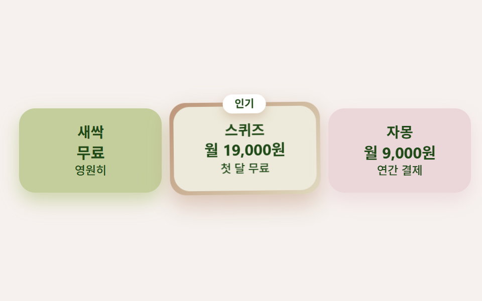
3つのプランをライム・オレンジ(おすすめ)・グレープフルーツのスムージーのように並べ、おすすめプランだけにオレンジからレモンへのグラデーションリングとバッジを付けて、少し大きくゆっくり揺らします。
<main class="stage">
  <div class="pricecitrus">
    <div class="pricecitrus__plan pricecitrus__plan--lime">
      <p class="pricecitrus__name">スプラウト</p>
      <p class="pricecitrus__price">無料</p>
      <p class="pricecitrus__per">永久に</p>
    </div>
    <div class="pricecitrus__plan pricecitrus__plan--pick">
      <span class="pricecitrus__badge">人気</span>
      <div class="pricecitrus__inner">
        <p class="pricecitrus__name">スクイーズ</p>
        <p class="pricecitrus__price">月19,000円</p>
        <p class="pricecitrus__per">初月無料</p>
      </div>
    </div>
    <div class="pricecitrus__plan pricecitrus__plan--grp">
      <p class="pricecitrus__name">グレープフルーツ</p>
      <p class="pricecitrus__price">月9,000円</p>
      <p class="pricecitrus__per">年払い</p>
    </div>
  </div>
</main>
@use "../../../../site/static/demo-tokens" as *;
$duration: $dur-loop; // 추천 플랜이 한 번 통통거리는 주기
$easing: $ease-spring;
$color: $stage-ink;
$citrus-cream: #fffaf0;
$citrus-orange: #d8c1b1;
$citrus-orange-deep: #bd967a;
$citrus-lime: #c4ce9c;
$citrus-grapefruit: #ebd6da;
$citrus-lemon: #dfd8be;
$citrus-ink: #204a17;
// 무대 — 오렌지 물색
@include stage(mix($citrus-orange, $stage-paper, 22%));
.pricecitrus {
box-sizing: border-box;
width: clamp(280px, 94vw, 450px);
display: flex;
align-items: center;
gap: $sp-2;
}
.pricecitrus__plan {
position: relative;
box-sizing: border-box;
flex: 1 1 0;
min-width: 0;
display: flex;
flex-direction: column;
gap: $sp-1;
padding: $sp-4 $sp-3;
border-radius: $r-card;
text-align: center;
}
.pricecitrus__plan--lime {
background: $citrus-lime;
box-shadow: 0 8px 18px rgba($citrus-lime, .8);
}
.pricecitrus__plan--grp {
background: $citrus-grapefruit;
box-shadow: 0 8px 18px rgba($citrus-grapefruit, .75);
}
// 추천 플랜 — 오렌지 그라디언트 테두리(겉을 감싼 알약) + 살짝 크게
.pricecitrus__plan--pick {
flex: 1.2 1 0;
padding: $sp-1;
background: linear-gradient(135deg, $citrus-orange-deep, $citrus-lemon);
box-shadow: 0 10px 22px rgba($citrus-orange-deep, .5);
animation: pickJiggle $duration $easing infinite;
}
.pricecitrus__inner {
display: flex;
flex-direction: column;
gap: $sp-1;
padding: $sp-4 $sp-3;
border-radius: $r-card;
background: mix($citrus-lemon, $stage-paper, 55%);
}
.pricecitrus__badge {
position: absolute;
top: calc($sp-2 * -1);
left: 50%;
transform: translateX(-50%);
z-index: 1;
padding: $sp-1 $sp-3;
border-radius: $r-pill;
background: $stage-paper;
color: $citrus-ink;
font-weight: 700; font-size: clamp(9px, 2.2vw, 11px); line-height: 1;
font-family: inherit;
box-shadow: 0 4px 10px rgba($citrus-orange-deep, .45);
}
.pricecitrus__name {
margin: 0;
color: $citrus-ink;
font-weight: 700; font-size: clamp(12px, 3vw, 15px); line-height: 1;
font-family: inherit;
}
.pricecitrus__price {
margin: 0;
color: $citrus-ink;
font-weight: 700; font-size: clamp(12px, 3.2vw, 16px); line-height: 1.15;
font-family: inherit;
}
.pricecitrus__per {
margin: 0;
color: $citrus-ink;
font-weight: 500; font-size: clamp(10px, 2.4vw, 12px); line-height: 1;
font-family: inherit;
}
// 데모: 추천 플랜만 살짝 흔들리며 통통거린다 — 색과 크기가 이미 주인공임을 움직임도 돕는다
@keyframes pickJiggle {
0%, 100% { transform: rotate(0deg) translateY(0); }
25% { transform: rotate(-1.6deg) translateY(-5px); }
50% { transform: rotate(0deg) translateY(0); }
75% { transform: rotate(1.6deg) translateY(-5px); }
}
@media (prefers-reduced-motion: reduce) {
.pricecitrus__plan--pick { animation: none !important; transform: none; }
}html, body {
margin: 0;
overflow: hidden;
}
.stage {
box-sizing: border-box;
min-height: 100vh;
display: grid;
place-items: center;
margin: 0;
background: rgb(96.6352941176%, 94.6509803922%, 93.2705882353%);
font-family: -apple-system, "Segoe UI", "Noto Sans KR", sans-serif;
padding: clamp(8px, 4vw, 24px);
}
.pricecitrus {
box-sizing: border-box;
width: clamp(280px, 94vw, 450px);
display: flex;
align-items: center;
gap: 8px;
}
.pricecitrus__plan {
position: relative;
box-sizing: border-box;
flex: 1 1 0;
min-width: 0;
display: flex;
flex-direction: column;
gap: 4px;
padding: 16px 12px;
border-radius: 16px;
text-align: center;
}
.pricecitrus__plan--lime {
background: #c4ce9c;
box-shadow: 0 8px 18px rgba(196, 206, 156, 0.8);
}
.pricecitrus__plan--grp {
background: #ebd6da;
box-shadow: 0 8px 18px rgba(235, 214, 218, 0.75);
}
.pricecitrus__plan--pick {
flex: 1.2 1 0;
padding: 4px;
background: linear-gradient(135deg, #bd967a, #dfd8be);
box-shadow: 0 10px 22px rgba(189, 150, 122, 0.5);
animation: pickJiggle 2s cubic-bezier(0.2, 0.8, 0.2, 1) infinite;
}
.pricecitrus__inner {
display: flex;
flex-direction: column;
gap: 4px;
padding: 16px 12px;
border-radius: 16px;
background: rgb(93.0980392157%, 91.5882352941%, 85.9803921569%);
}
.pricecitrus__badge {
position: absolute;
top: -8px;
left: 50%;
transform: translateX(-50%);
z-index: 1;
padding: 4px 12px;
border-radius: 999px;
background: #ffffff;
color: #204a17;
font-weight: 700;
font-size: clamp(9px, 2.2vw, 11px);
line-height: 1;
font-family: inherit;
box-shadow: 0 4px 10px rgba(189, 150, 122, 0.45);
}
.pricecitrus__name {
margin: 0;
color: #204a17;
font-weight: 700;
font-size: clamp(12px, 3vw, 15px);
line-height: 1;
font-family: inherit;
}
.pricecitrus__price {
margin: 0;
color: #204a17;
font-weight: 700;
font-size: clamp(12px, 3.2vw, 16px);
line-height: 1.15;
font-family: inherit;
}
.pricecitrus__per {
margin: 0;
color: #204a17;
font-weight: 500;
font-size: clamp(10px, 2.4vw, 12px);
line-height: 1;
font-family: inherit;
}
@keyframes pickJiggle {
0%, 100% {
transform: rotate(0deg) translateY(0);
}
25% {
transform: rotate(-1.6deg) translateY(-5px);
}
50% {
transform: rotate(0deg) translateY(0);
}
75% {
transform: rotate(1.6deg) translateY(-5px);
}
}
@media (prefers-reduced-motion: reduce) {
.pricecitrus__plan--pick {
animation: none !important;
transform: none;
}
}import type { CSSProperties } from "react";
import styles from "./PricingCitrus.module.scss";
export type PricingCitrusProps = {
duration?: number;
easing?: string;
color?: string;
};
type Vars = CSSProperties & { "--duration"?: string; "--easing"?: string; "--color"?: string };
export default function PricingCitrus({
duration = 2000,
easing = "cubic-bezier(.2,.8,.2,1)",
color = "#ff6a00",
}: PricingCitrusProps) {
const vars: Vars = { "--duration": `${duration}ms`, "--easing": easing, "--color": color };
return (
<div className={styles.pricecitrus} style={vars}>
<div className={`${styles.plan} ${styles.planLime}`}>
<p className={styles.name}>새싹</p>
<p className={styles.price}>무료</p>
<p className={styles.per}>영원히</p>
</div>
<div className={`${styles.plan} ${styles.planPick}`}>
<span className={styles.badge}>인기</span>
<div className={styles.inner}>
<p className={styles.name}>스퀴즈</p>
<p className={styles.price}>월 19,000원</p>
<p className={styles.per}>첫 달 무료</p>
</div>
</div>
<div className={`${styles.plan} ${styles.planGrp}`}>
<p className={styles.name}>자몽</p>
<p className={styles.price}>월 9,000원</p>
<p className={styles.per}>연간 결제</p>
</div>
</div>
);
}05 · スムージー料金プラン — 計測 累積面積 4.617% · 動いたフレーム 21/23GODRICH オリジナル · SCSS と React は zip に同梱 · パスワードを見る
コードの読み方
表なしで色と大きさだけで主役が伝わります。
.plan--pick {
  flex: 1.2 1 0;
  background: linear-gradient(135deg, #ff6a00, #ffe066);
  animation: pickJiggle 2s cubic-bezier(.2,.8,.2,1) infinite;
}
@keyframes pickJiggle {
  0%, 100% { transform: rotate(0deg) translateY(0); }
  25%      { transform: rotate(-1.6deg) translateY(-5px); }
}
06しずく吹き出しのレビュー
どんな動きか
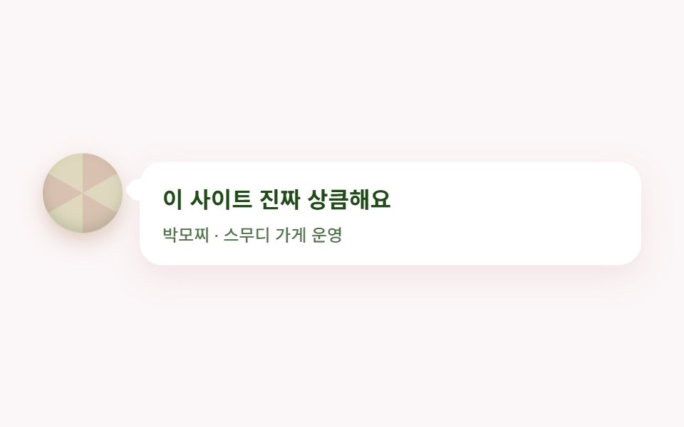
レビューはしずく型のしっぽが付いた丸い吹き出しに入れ、隣のアバターは果肉模様の円です。
<main class="stage">
  <figure class="quotecitrus">
    <span class="quotecitrus__avatar" aria-hidden="true"></span>
    <div class="quotecitrus__bubble">
      <blockquote class="quotecitrus__text">
        <p class="quotecitrus__line">このサイト、本当に爽やかです</p>
      </blockquote>
      <figcaption class="quotecitrus__who">パク・モチ ・ スムージー店主</figcaption>
    </div>
  </figure>
</main>
@use "../../../../site/static/demo-tokens" as *;
$duration: $dur-loop; // 말풍선이 한 번 눌렸다 펴지는 주기
$easing: $ease-spring;
$color: $stage-ink;
$citrus-cream: #fffaf0;
$citrus-orange: #d8c1b1;
$citrus-orange-deep: #bd967a;
$citrus-lime: #c4ce9c;
$citrus-grapefruit: #ebd6da;
$citrus-lemon: #dfd8be;
$citrus-ink: #204a17;
// 무대 — 자몽 물색
@include stage(mix($citrus-grapefruit, $stage-paper, 22%));
.quotecitrus {
box-sizing: border-box;
width: clamp(280px, 90vw, 420px);
margin: 0;
display: flex;
align-items: flex-start;
gap: $sp-3;
}
// 과육 무늬 아바타
.quotecitrus__avatar {
flex: 0 0 auto;
width: clamp(44px, 12vw, 56px);
aspect-ratio: 1;
border-radius: 50%;
background: repeating-conic-gradient($citrus-orange 0deg 60deg, $citrus-lemon 60deg 120deg);
box-shadow: inset 0 -4px 8px rgba($citrus-ink, .16), 0 6px 14px rgba($citrus-orange-deep, .45);
animation: avatarBob $duration $easing infinite;
animation-delay: calc($duration / -2);
}
.quotecitrus__bubble {
position: relative;
flex: 1 1 auto;
min-width: 0;
box-sizing: border-box;
padding: $sp-4;
border-radius: $r-card;
background: $stage-paper;
box-shadow: 0 8px 20px rgba($citrus-grapefruit, .55);
animation: bubbleSquish $duration $easing infinite;
}
// 말풍선 꼬리 — 물방울 모양(비대칭 반경) 하나를 45도 돌려 붙인다
.quotecitrus__bubble::before {
content: "";
position: absolute;
top: $sp-3;
left: calc($sp-2 * -1);
width: $sp-4;
aspect-ratio: 1;
border-radius: 50% 50% 50% $r-xs;
background: $stage-paper;
transform: rotate(45deg);
}
.quotecitrus__text {
margin: 0;
}
.quotecitrus__line {
margin: 0;
color: $citrus-ink;
font-weight: 700; font-size: clamp(13px, 3.4vw, 16px); line-height: 1.4;
font-family: inherit;
}
.quotecitrus__who {
margin: $sp-2 0 0;
color: rgba($citrus-ink, .78);
font-weight: 500; font-size: clamp(10px, 2.6vw, 12px); line-height: 1;
font-family: inherit;
}
// 데모: 말풍선은 젤리처럼 세로로 살짝 눌렸다 펴지고, 아바타는 반대 위상으로 떠오른다
@keyframes bubbleSquish {
0%, 100% { transform: scaleY(1); }
50% { transform: scaleY(.94); }
}
@keyframes avatarBob {
0%, 100% { transform: translateY(0); }
50% { transform: translateY(-8px); }
}
@media (prefers-reduced-motion: reduce) {
.quotecitrus__bubble, .quotecitrus__avatar { animation: none !important; transform: none; }
}html, body {
margin: 0;
overflow: hidden;
}
.stage {
box-sizing: border-box;
min-height: 100vh;
display: grid;
place-items: center;
margin: 0;
background: rgb(98.2745098039%, 96.462745098%, 96.8078431373%);
font-family: -apple-system, "Segoe UI", "Noto Sans KR", sans-serif;
padding: clamp(8px, 4vw, 24px);
}
.quotecitrus {
box-sizing: border-box;
width: clamp(280px, 90vw, 420px);
margin: 0;
display: flex;
align-items: flex-start;
gap: 12px;
}
.quotecitrus__avatar {
flex: 0 0 auto;
width: clamp(44px, 12vw, 56px);
aspect-ratio: 1;
border-radius: 50%;
background: repeating-conic-gradient(#d8c1b1 0deg 60deg, #dfd8be 60deg 120deg);
box-shadow: inset 0 -4px 8px rgba(32, 74, 23, 0.16), 0 6px 14px rgba(189, 150, 122, 0.45);
animation: avatarBob 2s cubic-bezier(0.2, 0.8, 0.2, 1) infinite;
animation-delay: -1s;
}
.quotecitrus__bubble {
position: relative;
flex: 1 1 auto;
min-width: 0;
box-sizing: border-box;
padding: 16px;
border-radius: 16px;
background: #ffffff;
box-shadow: 0 8px 20px rgba(235, 214, 218, 0.55);
animation: bubbleSquish 2s cubic-bezier(0.2, 0.8, 0.2, 1) infinite;
}
.quotecitrus__bubble::before {
content: "";
position: absolute;
top: 12px;
left: -8px;
width: 16px;
aspect-ratio: 1;
border-radius: 50% 50% 50% 4px;
background: #ffffff;
transform: rotate(45deg);
}
.quotecitrus__text {
margin: 0;
}
.quotecitrus__line {
margin: 0;
color: #204a17;
font-weight: 700;
font-size: clamp(13px, 3.4vw, 16px);
line-height: 1.4;
font-family: inherit;
}
.quotecitrus__who {
margin: 8px 0 0;
color: rgba(32, 74, 23, 0.78);
font-weight: 500;
font-size: clamp(10px, 2.6vw, 12px);
line-height: 1;
font-family: inherit;
}
@keyframes bubbleSquish {
0%, 100% {
transform: scaleY(1);
}
50% {
transform: scaleY(0.94);
}
}
@keyframes avatarBob {
0%, 100% {
transform: translateY(0);
}
50% {
transform: translateY(-8px);
}
}
@media (prefers-reduced-motion: reduce) {
.quotecitrus__bubble, .quotecitrus__avatar {
animation: none !important;
transform: none;
}
}import type { CSSProperties } from "react";
import styles from "./TestimonialCitrus.module.scss";
export type TestimonialCitrusProps = {
quote?: string;
who?: string;
duration?: number;
easing?: string;
color?: string;
};
type Vars = CSSProperties & { "--duration"?: string; "--easing"?: string; "--color"?: string };
export default function TestimonialCitrus({
quote = "이 사이트 진짜 상큼해요",
who = "박모찌 · 스무디 가게 운영",
duration = 2000,
easing = "cubic-bezier(.2,.8,.2,1)",
color = "#ff9a52",
}: TestimonialCitrusProps) {
const vars: Vars = { "--duration": `${duration}ms`, "--easing": easing, "--color": color };
return (
<figure className={styles.quotecitrus} style={vars}>
<span className={styles.avatar} aria-hidden="true" />
<div className={styles.bubble}>
<blockquote className={styles.text}>
<p className={styles.line}>{quote}</p>
</blockquote>
<figcaption className={styles.who}>{who}</figcaption>
</div>
</figure>
);
}06 · しずく吹き出しのレビュー — 計測 累積面積 3.087% · 動いたフレーム 12/23GODRICH オリジナル · SCSS と React は zip に同梱 · パスワードを見る
どこを変えるか
吹き出しの縦幅がゆっくり息をするように伸び縮みし、箸でつまんだゼリーのような弾力がページ全体に伝わります。
.bubble::before {
  content: "";
  width: 16px; height: 16px;
  border-radius: 50% 50% 50% 4px;  /* しっぽも水滴の形 */
  background: #fff;
  transform: rotate(45deg);
}
07シトラスグラデーションCTA帯
何が見えるか
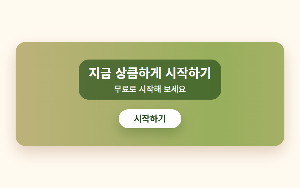
帯1つにオレンジからレモン、ライムへ抜けるグラデーションを敷き、その位置をゆっくり流します。上の白いボタンは押し込まれては弾んで戻ります。
<main class="stage">
  <section class="ctacitrus">
    <div class="ctacitrus__scrim">
      <h2 class="ctacitrus__title">今すぐ爽やかに始めよう</h2>
      <p class="ctacitrus__sub">無料で試してみましょう</p>
    </div>
    <button class="ctacitrus__btn" type="button">はじめる</button>
  </section>
</main>
@use "../../../../site/static/demo-tokens" as *;
$duration: $dur-loop; // 그라디언트가 한 바퀴 흐르는 주기
$easing: $ease-spring; // 버튼이 눌렸다 튕겨 돌아오는 곡선
$color: $stage-ink;
$citrus-cream: #fffaf0;
$citrus-orange-deep: #bd967a;
$citrus-lime-deep: #98af5c;
$citrus-lemon-deep: #bdb27a;
$citrus-ink: #204a17;
// 무대 — 크림
@include stage($citrus-cream);
.ctacitrus {
box-sizing: border-box;
width: clamp(280px, 90vw, 430px);
display: flex;
flex-direction: column;
align-items: center;
gap: $sp-2;
padding: clamp($sp-5, 6vw, $sp-8) $sp-5;
border-radius: $r-card;
// 시트러스 그라디언트 — 색이 이어지도록 양 끝을 같은 색으로 두고 300% 폭으로 깔아 위치를 흘린다
background: linear-gradient(90deg, $citrus-orange-deep, $citrus-lemon-deep, $citrus-lime-deep, $citrus-lemon-deep, $citrus-orange-deep);
background-size: 300% 100%;
box-shadow: 0 10px 24px rgba($citrus-orange-deep, .45);
animation: gradFlow $duration linear infinite;
}
// 스크림 — 그라디언트가 흐르며 레몬 구간을 지날 때 흰 글자 대비가 1.4:1까지 떨어진다(실측, 접근성 섹션 참고).
// 잉크 65% 스크림을 글자 뒤에 깔면 세 색 전 구간에서 흰 글자 대비가 4.7:1 이상으로 유지된다
.ctacitrus__scrim {
display: flex;
flex-direction: column;
align-items: center;
gap: $sp-1;
padding: $sp-2 $sp-4;
border-radius: $r-card;
background: rgba($citrus-ink, .65);
}
.ctacitrus__title {
margin: 0;
color: $stage-paper;
font-weight: 700; font-size: clamp(16px, 4.2vw, 21px); line-height: 1.25;
font-family: inherit;
text-align: center;
}
.ctacitrus__sub {
margin: 0;
color: rgba($stage-paper, .92);
font-weight: 500; font-size: clamp(11px, 2.8vw, 13px); line-height: 1.4;
font-family: inherit;
text-align: center;
}
.ctacitrus__btn {
margin-top: $sp-2;
border: 0;
border-radius: $r-pill;
background: $stage-paper;
color: $citrus-ink;
padding: $sp-2 $sp-6;
font-weight: 700; font-size: clamp(12px, 3vw, 14px); line-height: 1;
font-family: inherit;
box-shadow: 0 8px 18px rgba($citrus-ink, .28);
animation: btnPress $duration $easing infinite;
}
.ctacitrus__btn:focus-visible {
outline: 3px solid $stage-paper;
outline-offset: 2px;
}
// 데모: 그라디언트는 왼쪽으로 천천히 흐르고, 버튼은 살짝 눌렸다 통통 튕겨 돌아온다
@keyframes gradFlow {
0% { background-position: 0% 50%; }
100% { background-position: -300% 50%; }
}
@keyframes btnPress {
0%, 55%, 100% { transform: translateY(0); box-shadow: 0 8px 18px rgba($citrus-ink, .28); }
65% { transform: translateY(4px) scaleY(.96); box-shadow: 0 2px 6px rgba($citrus-ink, .2); }
82% { transform: translateY(-3px); box-shadow: 0 11px 22px rgba($citrus-ink, .3); }
}
@media (prefers-reduced-motion: reduce) {
.ctacitrus, .ctacitrus__btn { animation: none !important; transform: none; }
}html, body {
margin: 0;
overflow: hidden;
}
.stage {
box-sizing: border-box;
min-height: 100vh;
display: grid;
place-items: center;
margin: 0;
background: #fffaf0;
font-family: -apple-system, "Segoe UI", "Noto Sans KR", sans-serif;
padding: clamp(8px, 4vw, 24px);
}
.ctacitrus {
box-sizing: border-box;
width: clamp(280px, 90vw, 430px);
display: flex;
flex-direction: column;
align-items: center;
gap: 8px;
padding: clamp(20px, 6vw, 32px) 20px;
border-radius: 16px;
background: linear-gradient(90deg, #bd967a, #bdb27a, #98af5c, #bdb27a, #bd967a);
background-size: 300% 100%;
box-shadow: 0 10px 24px rgba(189, 150, 122, 0.45);
animation: gradFlow 2s linear infinite;
}
.ctacitrus__scrim {
display: flex;
flex-direction: column;
align-items: center;
gap: 4px;
padding: 8px 16px;
border-radius: 16px;
background: rgba(32, 74, 23, 0.65);
}
.ctacitrus__title {
margin: 0;
color: #ffffff;
font-weight: 700;
font-size: clamp(16px, 4.2vw, 21px);
line-height: 1.25;
font-family: inherit;
text-align: center;
}
.ctacitrus__sub {
margin: 0;
color: rgba(255, 255, 255, 0.92);
font-weight: 500;
font-size: clamp(11px, 2.8vw, 13px);
line-height: 1.4;
font-family: inherit;
text-align: center;
}
.ctacitrus__btn {
margin-top: 8px;
border: 0;
border-radius: 999px;
background: #ffffff;
color: #204a17;
padding: 8px 24px;
font-weight: 700;
font-size: clamp(12px, 3vw, 14px);
line-height: 1;
font-family: inherit;
box-shadow: 0 8px 18px rgba(32, 74, 23, 0.28);
animation: btnPress 2s cubic-bezier(0.2, 0.8, 0.2, 1) infinite;
}
.ctacitrus__btn:focus-visible {
outline: 3px solid #ffffff;
outline-offset: 2px;
}
@keyframes gradFlow {
0% {
background-position: 0% 50%;
}
100% {
background-position: -300% 50%;
}
}
@keyframes btnPress {
0%, 55%, 100% {
transform: translateY(0);
box-shadow: 0 8px 18px rgba(32, 74, 23, 0.28);
}
65% {
transform: translateY(4px) scaleY(0.96);
box-shadow: 0 2px 6px rgba(32, 74, 23, 0.2);
}
82% {
transform: translateY(-3px);
box-shadow: 0 11px 22px rgba(32, 74, 23, 0.3);
}
}
@media (prefers-reduced-motion: reduce) {
.ctacitrus, .ctacitrus__btn {
animation: none !important;
transform: none;
}
}import type { CSSProperties } from "react";
import styles from "./CtaBandCitrus.module.scss";
export type CtaBandCitrusProps = {
title?: string;
sub?: string;
cta?: string;
duration?: number;
easing?: string;
color?: string;
};
type Vars = CSSProperties & { "--duration"?: string; "--easing"?: string; "--color"?: string };
export default function CtaBandCitrus({
title = "지금 상큼하게 시작하기",
sub = "무료로 시작해 보세요",
cta = "시작하기",
duration = 2000,
easing = "cubic-bezier(.2,.8,.2,1)",
color = "#ff6a00",
}: CtaBandCitrusProps) {
const vars: Vars = { "--duration": `${duration}ms`, "--easing": easing, "--color": color };
return (
<section className={styles.ctacitrus} style={vars}>
<div className={styles.scrim}>
<h2 className={styles.title}>{title}</h2>
<p className={styles.sub}>{sub}</p>
</div>
<button type="button" className={styles.btn}>{cta}</button>
</section>
);
}07 · シトラスグラデーションCTA帯 — 計測 累積面積 41.17% · 動いたフレーム 21/23GODRICH オリジナル · SCSS と React は zip に同梱 · パスワードを見る
コードのどこを見るか
この項目は後の落とし穴の節でもう一度出てきます — 最初のバージョンは白文字をグラデーションの上に直接置いていて、レモンの箇所でコントラストが崩れていました。
.ctacitrus {
  background: linear-gradient(90deg, #ff6a00, #ffd400, #9ad200, #ffd400, #ff6a00);
  background-size: 300% 100%;
  animation: gradFlow 2s linear infinite;
}
@keyframes gradFlow {
  0%   { background-position: 0% 50%; }
  100% { background-position: -300% 50%; }
}
08ウェーブのフッター
画面で起きること
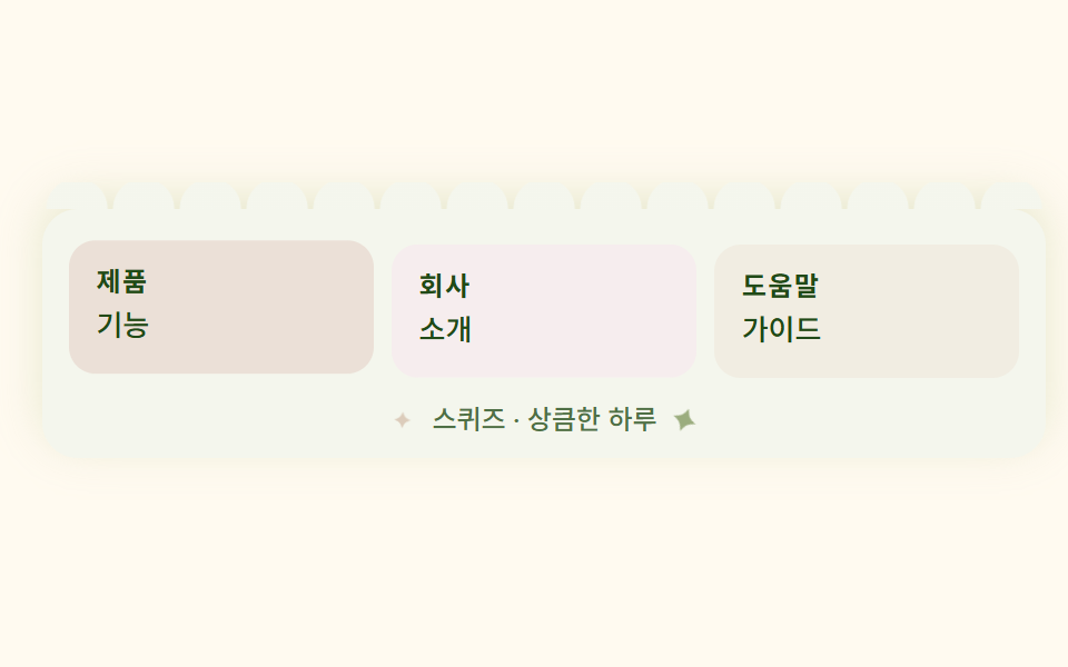
フッターの上辺は波が連なる模様で、波を1つずつ要素として置かず、背景の繰り返し1つだけで描きます。
<main class="stage">
  <footer class="footercitrus">
    <span class="footercitrus__wave" aria-hidden="true"></span>
    <div class="footercitrus__cols">
      <div class="footercitrus__col footercitrus__col--org">
        <p class="footercitrus__head">製品</p>
        <p class="footercitrus__link">機能</p>
      </div>
      <div class="footercitrus__col footercitrus__col--grp">
        <p class="footercitrus__head">会社</p>
        <p class="footercitrus__link">紹介</p>
      </div>
      <div class="footercitrus__col footercitrus__col--lem">
        <p class="footercitrus__head">ヘルプ</p>
        <p class="footercitrus__link">ガイド</p>
      </div>
    </div>
    <p class="footercitrus__copy">
      <span class="footercitrus__spark" aria-hidden="true">✦</span>
      スクイーズ・爽やかな一日
      <span class="footercitrus__spark footercitrus__spark--b" aria-hidden="true">✦</span>
    </p>
  </footer>
</main>
@use "../../../../site/static/demo-tokens" as *;
$duration: $dur-loop; // 방울이 한 번 반짝이는 주기
$easing: $ease-out;
$color: $stage-ink;
$citrus-cream: #fffaf0;
$citrus-orange-deep: #bd967a;
$citrus-lime: #c4ce9c;
$citrus-grapefruit: #ebd6da;
$citrus-lemon: #dfd8be;
$citrus-ink: #204a17;
// 푸터 패널 색 — 크림보다 살짝 진한 라임 우유크림
$panel: mix($citrus-lime, $stage-paper, 18%);
@include stage($citrus-cream);
.footercitrus {
position: relative;
box-sizing: border-box;
width: clamp(300px, 94vw, 460px);
padding: $sp-4 $sp-3 $sp-3;
border-radius: $r-card;
background: $panel;
box-shadow: 0 -6px 20px rgba($citrus-lime, .4);
}
// 웨이브 가장자리 — 물결 하나하나를 요소로 그리지 않고 배경 반복 하나로 그린다.
// 각 타일(30×15px) 아래변 중심에 반원을 그리면 윗반원만 남아 물결치는 가장자리가 된다
.footercitrus__wave {
position: absolute;
top: calc($sp-3 * -1);
left: 0;
width: 100%;
height: $sp-3;
background-image: radial-gradient(circle at 50% 100%, $panel 0 64%, transparent 66%);
background-size: 30px 15px;
background-repeat: repeat-x;
background-position: bottom center;
}
.footercitrus__cols {
display: grid;
grid-template-columns: repeat(auto-fit, minmax(clamp(84px, 26vw, 120px), 1fr));
gap: $sp-2;
}
.footercitrus__col {
box-sizing: border-box;
display: flex;
flex-direction: column;
gap: $sp-1;
padding: $sp-3;
border-radius: $r-control;
}
.footercitrus__col--org { background: mix($citrus-orange-deep, $stage-paper, 30%); animation: colRipple $duration $easing infinite; }
.footercitrus__col--grp { background: mix($citrus-grapefruit, $stage-paper, 45%); animation: colRipple $duration $easing infinite; animation-delay: calc($duration / -3); }
.footercitrus__col--lem { background: mix($citrus-lemon, $stage-paper, 45%); animation: colRipple $duration $easing infinite; animation-delay: calc($duration / -3 * 2); }
.footercitrus__head {
margin: 0;
color: $citrus-ink;
font-weight: 700; font-size: clamp(10px, 2.6vw, 12px); line-height: 1;
font-family: inherit;
letter-spacing: .06em;
}
.footercitrus__link {
margin: 0;
color: $citrus-ink;
font-weight: 500; font-size: clamp(11px, 2.8vw, 13px); line-height: 1.5;
font-family: inherit;
}
.footercitrus__copy {
display: flex;
align-items: center;
justify-content: center;
gap: $sp-2;
margin: $sp-3 0 0;
color: rgba($citrus-ink, .78);
font-weight: 500; font-size: clamp(10px, 2.6vw, 12px); line-height: 1;
font-family: inherit;
}
.footercitrus__spark {
color: $citrus-orange-deep;
animation: dropTwinkle $duration $easing infinite;
}
.footercitrus__spark--b {
animation-delay: calc($duration / -2);
color: mix($citrus-lime, $citrus-ink, 70%);
}
// 데모: 세 칸이 순서대로 살짝 들썩이는 물결을 만들고, 방울 두 개는 어긋나게 반짝인다
@keyframes colRipple {
0%, 40%, 100% { transform: translateY(0); }
20% { transform: translateY(-6px); }
}
@keyframes dropTwinkle {
0%, 100% { opacity: .35; transform: scale(.8) rotate(0deg); }
50% { opacity: 1; transform: scale(1.3) rotate(25deg); }
}
// 반응형: 320×200 처럼 세로가 짧은 화면에선 칸 속과 웨이브 번짐을 줄인다(BD9)
@media (max-width: 340px), (max-height: 220px) {
.footercitrus { padding: $sp-3 $sp-2 $sp-2; }
.footercitrus__wave { top: calc($sp-2 * -1); height: $sp-2; background-size: 22px 11px; }
.footercitrus__cols { gap: $sp-1; }
.footercitrus__col { padding: $sp-2; }
.footercitrus__link { display: none; }
.footercitrus__copy { margin-top: $sp-2; font-size: 9px; }
}
@media (prefers-reduced-motion: reduce) {
.footercitrus__col, .footercitrus__spark { animation: none !important; transform: none; }
.footercitrus__spark { opacity: .8; }
}html, body {
margin: 0;
overflow: hidden;
}
.stage {
box-sizing: border-box;
min-height: 100vh;
display: grid;
place-items: center;
margin: 0;
background: #fffaf0;
font-family: -apple-system, "Segoe UI", "Noto Sans KR", sans-serif;
padding: clamp(8px, 4vw, 24px);
}
.footercitrus {
position: relative;
box-sizing: border-box;
width: clamp(300px, 94vw, 460px);
padding: 16px 12px 12px;
border-radius: 16px;
background: rgb(95.8352941176%, 96.5411764706%, 93.0117647059%);
box-shadow: 0 -6px 20px rgba(196, 206, 156, 0.4);
}
.footercitrus__wave {
position: absolute;
top: -12px;
left: 0;
width: 100%;
height: 12px;
background-image: radial-gradient(circle at 50% 100%, rgb(95.8352941176%, 96.5411764706%, 93.0117647059%) 0 64%, transparent 66%);
background-size: 30px 15px;
background-repeat: repeat-x;
background-position: bottom center;
}
.footercitrus__cols {
display: grid;
grid-template-columns: repeat(auto-fit, minmax(clamp(84px, 26vw, 120px), 1fr));
gap: 8px;
}
.footercitrus__col {
box-sizing: border-box;
display: flex;
flex-direction: column;
gap: 4px;
padding: 12px;
border-radius: 12px;
}
.footercitrus__col--org {
background: rgb(92.2352941176%, 87.6470588235%, 84.3529411765%);
animation: colRipple 2s ease-out infinite;
}
.footercitrus__col--grp {
background: rgb(96.4705882353%, 92.7647058824%, 93.4705882353%);
animation: colRipple 2s ease-out infinite;
animation-delay: -0.6666666667s;
}
.footercitrus__col--lem {
background: rgb(94.3529411765%, 93.1176470588%, 88.5294117647%);
animation: colRipple 2s ease-out infinite;
animation-delay: -1.3333333333s;
}
.footercitrus__head {
margin: 0;
color: #204a17;
font-weight: 700;
font-size: clamp(10px, 2.6vw, 12px);
line-height: 1;
font-family: inherit;
letter-spacing: 0.06em;
}
.footercitrus__link {
margin: 0;
color: #204a17;
font-weight: 500;
font-size: clamp(11px, 2.8vw, 13px);
line-height: 1.5;
font-family: inherit;
}
.footercitrus__copy {
display: flex;
align-items: center;
justify-content: center;
gap: 8px;
margin: 12px 0 0;
color: rgba(32, 74, 23, 0.78);
font-weight: 500;
font-size: clamp(10px, 2.6vw, 12px);
line-height: 1;
font-family: inherit;
}
.footercitrus__spark {
color: #bd967a;
animation: dropTwinkle 2s ease-out infinite;
}
.footercitrus__spark--b {
animation-delay: -1s;
color: rgb(57.568627451%, 65.2549019608%, 45.5294117647%);
}
@keyframes colRipple {
0%, 40%, 100% {
transform: translateY(0);
}
20% {
transform: translateY(-6px);
}
}
@keyframes dropTwinkle {
0%, 100% {
opacity: 0.35;
transform: scale(0.8) rotate(0deg);
}
50% {
opacity: 1;
transform: scale(1.3) rotate(25deg);
}
}
@media (max-width: 340px), (max-height: 220px) {
.footercitrus {
padding: 12px 8px 8px;
}
.footercitrus__wave {
top: -8px;
height: 8px;
background-size: 22px 11px;
}
.footercitrus__cols {
gap: 4px;
}
.footercitrus__col {
padding: 8px;
}
.footercitrus__link {
display: none;
}
.footercitrus__copy {
margin-top: 8px;
font-size: 9px;
}
}
@media (prefers-reduced-motion: reduce) {
.footercitrus__col, .footercitrus__spark {
animation: none !important;
transform: none;
}
.footercitrus__spark {
opacity: 0.8;
}
}import type { CSSProperties } from "react";
import styles from "./FooterCitrus.module.scss";
export type FooterCitrusProps = {
brand?: string;
duration?: number;
easing?: string;
color?: string;
};
type Vars = CSSProperties & { "--duration"?: string; "--easing"?: string; "--color"?: string };
export default function FooterCitrus({
brand = "스퀴즈 · 상큼한 하루",
duration = 2000,
easing = "ease-out",
color = "#ff6a00",
}: FooterCitrusProps) {
const vars: Vars = { "--duration": `${duration}ms`, "--easing": easing, "--color": color };
return (
<footer className={styles.footercitrus} style={vars}>
<span className={styles.wave} aria-hidden="true" />
<div className={styles.cols}>
<div className={`${styles.col} ${styles.colOrg}`}>
<p className={styles.head}>제품</p>
<p className={styles.link}>기능</p>
</div>
<div className={`${styles.col} ${styles.colGrp}`}>
<p className={styles.head}>회사</p>
<p className={styles.link}>소개</p>
</div>
<div className={`${styles.col} ${styles.colLem}`}>
<p className={styles.head}>도움말</p>
<p className={styles.link}>가이드</p>
</div>
</div>
<p className={styles.copy}>
<span className={styles.spark} aria-hidden="true">✦</span>
{brand}
<span className={`${styles.spark} ${styles.sparkB}`} aria-hidden="true">✦</span>
</p>
</footer>
);
}08 · ウェーブのフッター — 計測 累積面積 2.668% · 動いたフレーム 23/23GODRICH オリジナル · SCSS と React は zip に同梱 · パスワードを見る
コードの読み方
下の3つのカラムはオレンジ・グレープフルーツ・レモンに分かれて順番に浮き、しずく型の光が2つ、位相をずらして瞬きます。
.wave {
  height: 12px;
  background-image: radial-gradient(circle at 50% 100%, #eef7d3 0 64%, transparent 66%);
  background-size: 30px 15px;
  background-repeat: repeat-x;
}
09ジューシーボタン・入力欄
どんな動きか
ボタンは押すと体と影が一緒に沈んで手応えが出て、入力欄はフォーカスでライム色の太いリングがふわっと広がります。
<main class="stage">
  <div class="ctrlcitrus">
    <button class="ctrlcitrus__btn" type="button">保存する</button>
    <label class="ctrlcitrus__field">
      <span class="ctrlcitrus__label">メール</span>
      <input class="ctrlcitrus__input" type="email" placeholder="メールアドレスを入力">
    </label>
  </div>
</main>
@use "../../../../site/static/demo-tokens" as *;
$duration: $dur-loop; // 버튼이 눌렸다 돌아오는 주기
$easing: $ease-spring;
$color: $stage-ink;
$citrus-cream: #fffaf0;
$citrus-orange-deep: #bd967a;
$citrus-lime: #c4ce9c;
$citrus-lime-deep: #98af5c;
$citrus-ink: #204a17;
// 무대 — 라임 물색
@include stage(mix($citrus-lime, $stage-paper, 26%));
.ctrlcitrus {
box-sizing: border-box;
width: clamp(260px, 84vw, 340px);
display: flex;
flex-direction: column;
gap: $sp-4;
}
.ctrlcitrus__btn {
align-self: flex-start;
border: 0;
border-radius: $r-control;
background: $citrus-orange-deep;
color: $subject-ink;
padding: $sp-3 $sp-6;
font-weight: 700; font-size: clamp(12px, 3vw, 14px); line-height: 1;
font-family: inherit;
box-shadow: 0 8px 18px rgba($citrus-orange-deep, .5);
// 데모에서는 눌림을 보여주기 위해 자동 루프를 건다
animation: citrusPress $duration $easing infinite;
}
.ctrlcitrus__btn:focus-visible {
outline: 3px solid $citrus-ink;
outline-offset: 2px;
}
.ctrlcitrus__field {
display: flex;
flex-direction: column;
gap: $sp-1;
}
.ctrlcitrus__label {
color: rgba($citrus-ink, .78);
font-weight: 600; font-size: clamp(10px, 2.6vw, 12px); line-height: 1;
font-family: inherit;
}
.ctrlcitrus__input {
box-sizing: border-box;
width: 100%;
border: 0;
border-radius: $r-control;
background: $stage-paper;
color: $citrus-ink;
padding: $sp-3 $sp-4;
font-weight: 500; font-size: clamp(12px, 3vw, 14px); line-height: 1;
font-family: inherit;
box-shadow: 0 6px 14px rgba($citrus-lime-deep, .5);
// 데모: 포커스를 받은 것처럼 라임 링이 부드럽게 퍼졌다 줄어들기를 반복
animation: ringPulse $duration $easing infinite;
}
.ctrlcitrus__input::placeholder {
color: rgba($citrus-ink, .45);
}
// 데모: 버튼은 몸과 그림자가 함께 눌렸다 튕기고, 입력창은 라임 링이 숨쉰다
@keyframes citrusPress {
0%, 55%, 100% { transform: translateY(0) scaleY(1); box-shadow: 0 8px 18px rgba($citrus-orange-deep, .5); }
65% { transform: translateY(4px) scaleY(.95); box-shadow: 0 2px 6px rgba($citrus-orange-deep, .35); }
82% { transform: translateY(-3px); box-shadow: 0 12px 24px rgba($citrus-orange-deep, .55); }
}
@keyframes ringPulse {
0%, 100% { box-shadow: 0 6px 14px rgba($citrus-lime-deep, .5); }
50% { box-shadow: 0 6px 14px rgba($citrus-lime-deep, .5), 0 0 0 5px rgba($citrus-lime-deep, .4); }
}
@media (prefers-reduced-motion: reduce) {
.ctrlcitrus__btn, .ctrlcitrus__input { animation: none !important; transform: none; }
}html, body {
margin: 0;
overflow: hidden;
}
.stage {
box-sizing: border-box;
min-height: 100vh;
display: grid;
place-items: center;
margin: 0;
background: rgb(93.9843137255%, 95.0039215686%, 89.9058823529%);
font-family: -apple-system, "Segoe UI", "Noto Sans KR", sans-serif;
padding: clamp(8px, 4vw, 24px);
}
.ctrlcitrus {
box-sizing: border-box;
width: clamp(260px, 84vw, 340px);
display: flex;
flex-direction: column;
gap: 16px;
}
.ctrlcitrus__btn {
align-self: flex-start;
border: 0;
border-radius: 12px;
background: #bd967a;
color: #17141a;
padding: 12px 24px;
font-weight: 700;
font-size: clamp(12px, 3vw, 14px);
line-height: 1;
font-family: inherit;
box-shadow: 0 8px 18px rgba(189, 150, 122, 0.5);
animation: citrusPress 2s cubic-bezier(0.2, 0.8, 0.2, 1) infinite;
}
.ctrlcitrus__btn:focus-visible {
outline: 3px solid #204a17;
outline-offset: 2px;
}
.ctrlcitrus__field {
display: flex;
flex-direction: column;
gap: 4px;
}
.ctrlcitrus__label {
color: rgba(32, 74, 23, 0.78);
font-weight: 600;
font-size: clamp(10px, 2.6vw, 12px);
line-height: 1;
font-family: inherit;
}
.ctrlcitrus__input {
box-sizing: border-box;
width: 100%;
border: 0;
border-radius: 12px;
background: #ffffff;
color: #204a17;
padding: 12px 16px;
font-weight: 500;
font-size: clamp(12px, 3vw, 14px);
line-height: 1;
font-family: inherit;
box-shadow: 0 6px 14px rgba(152, 175, 92, 0.5);
animation: ringPulse 2s cubic-bezier(0.2, 0.8, 0.2, 1) infinite;
}
.ctrlcitrus__input::placeholder {
color: rgba(32, 74, 23, 0.45);
}
@keyframes citrusPress {
0%, 55%, 100% {
transform: translateY(0) scaleY(1);
box-shadow: 0 8px 18px rgba(189, 150, 122, 0.5);
}
65% {
transform: translateY(4px) scaleY(0.95);
box-shadow: 0 2px 6px rgba(189, 150, 122, 0.35);
}
82% {
transform: translateY(-3px);
box-shadow: 0 12px 24px rgba(189, 150, 122, 0.55);
}
}
@keyframes ringPulse {
0%, 100% {
box-shadow: 0 6px 14px rgba(152, 175, 92, 0.5);
}
50% {
box-shadow: 0 6px 14px rgba(152, 175, 92, 0.5), 0 0 0 5px rgba(152, 175, 92, 0.4);
}
}
@media (prefers-reduced-motion: reduce) {
.ctrlcitrus__btn, .ctrlcitrus__input {
animation: none !important;
transform: none;
}
}import type { CSSProperties } from "react";
import styles from "./ButtonsInputsCitrus.module.scss";
export type ButtonsInputsCitrusProps = {
buttonLabel?: string;
fieldLabel?: string;
placeholder?: string;
duration?: number;
easing?: string;
color?: string;
};
type Vars = CSSProperties & { "--duration"?: string; "--easing"?: string; "--color"?: string };
export default function ButtonsInputsCitrus({
buttonLabel = "저장하기",
fieldLabel = "이메일",
placeholder = "이메일을 적어보세요",
duration = 2000,
easing = "cubic-bezier(.2,.8,.2,1)",
color = "#ff6a00",
}: ButtonsInputsCitrusProps) {
const vars: Vars = { "--duration": `${duration}ms`, "--easing": easing, "--color": color };
return (
<div className={styles.ctrlcitrus} style={vars}>
<button type="button" className={styles.btn}>{buttonLabel}</button>
<label className={styles.field}>
<span className={styles.label}>{fieldLabel}</span>
<input className={styles.input} type="email" placeholder={placeholder} />
</label>
</div>
);
}09 · ジューシーボタン・入力欄 — 計測 累積面積 4.938% · 動いたフレーム 15/23GODRICH オリジナル · SCSS と React は zip に同梱 · パスワードを見る
どこを変えるか
キット全体の手触りを1つにまとめた項目です。
.btn { animation: citrusPress 2s cubic-bezier(.2,.8,.2,1) infinite; }
@keyframes citrusPress {
  0%, 55%, 100% { transform: translateY(0) scaleY(1); }
  65%           { transform: translateY(4px) scaleY(.95); }
  82%           { transform: translateY(-3px); }
}
tailwind.config カスタム
カード面用の4色と、影・グラデーション専用の濃色をこの1か所にまとめておくと、LPと9つのパーツが全部同じコントラストの規則に従います。-deep の接尾語は「文字を乗せない」という約束を名前に埋め込んだものです。
theme: {
  extend: {
    colors: {
      cream: "#fffaf0", orange: "#ff9a52", "orange-deep": "#ff6a00",
      lime: "#c8e84a", grapefruit: "#ff8fa3", lemon: "#ffe066",
      ink: "#204a17",
    },
    borderRadius: { citrus: "24px", control: "12px", pill: "999px" },
    boxShadow: {
      "citrus-orange": "0 10px 24px rgba(255,106,0,.4)",
      "citrus-lime": "0 10px 24px rgba(200,232,74,.8)",
    },
  },
},
バイブコーディング プロンプト
config をプロジェクトに入れたあと、Claude Code・Cursor に渡す言葉は下だけです。彩度が高い色ほどコントラストが厳しくなるという規則を明記しておくと、ツールがカード面に濃色を選んで文字を読めなくする失敗を減らせます。11個の規則からなる指示文の全文は zip の prompt.md に入っています。
背景を cream(#fffaf0) に統一する。カードごとに orange・lime・grapefruit・
lemon のどれか1色を与える(濃い -deep トーンは影・グラデーション専用で、
文字は乗せない)。影は同系色でグレーにしない。文字は常に ink(#204a17)。
この指示を page/index.html に実際に適用し、1280px 画面全体を撮ったのが下の図です。
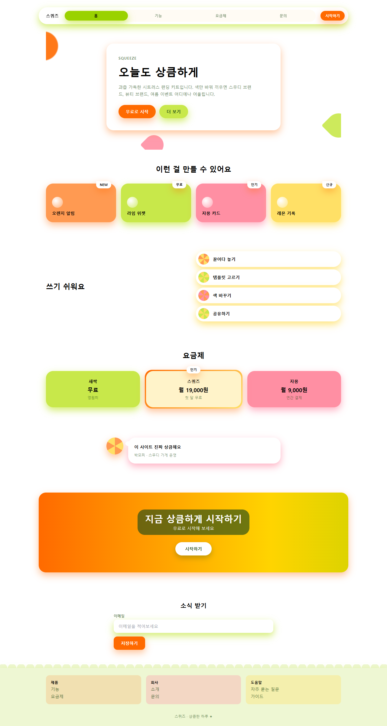
どこで壊れるか — 落とし穴
最初に実際に壊れたのは、320px描画でヒーローカードが画面をはみ出した問題でした。水滴3つをカードの端からはみ出すように配置したところ、480×300のステージでは問題なくても、320×200に縮めると document.documentElement.scrollHeight が213pxとなり、innerHeight の200pxを超えていました。カードの余白・見出しの文字サイズ・水滴の負のオフセットをphone用のメディアクエリでまとめて縮小し、213pxがちょうど200pxに収まりました。このタイプFの記事は check.py のBD9ゲートが項目まとめ形式の記事にしか適用されず自動では検出されないため、Playwrightで document.documentElement と document.body の両方の幅・高さを直接測って確認する必要がありました。
2つ目は07番のCTA帯の文字コントラストでした。白文字をオレンジ→レモン→ライムのグラデーションに直接乗せたところ、グラデーションがレモンの箇所(#ffd400)を通るとき白文字のコントラストが1.43:1まで落ち、ライムの箇所でも1.81:1と、WCAG 2.1 の最低基準である4.5:1に遠く及びませんでした。文字の背後にインク65%の半透明スクリムを敷いて計算し直すと、3色のどの箇所でも最低4.7:1まで上がり、その値で実際のデモを直しました。この果物色がメール本文の中でどんな顔をするかはメールテンプレート デザイン9選で別に測りました。この2つを直した完成版は、パスワード 52ppc9vv の zip を開けばそのまま確認できます。
9つのデモはすべて MDN の prefers-reduced-motion 解説が定義するメディアクエリを検知すると動きを止め、各要素をアニメーションが始まる前の静止状態に戻して固定します。
アクセシビリティ
ビタミンカラーのスタイルがパステルより先にぶつかる問題は彩度です。カード面の色をそのまま濃く使うと、インクの文字とのコントラストがオレンジの濃色で3.56:1、グレープフルーツの濃色で2.98:1まで落ち、本文の基準4.5:1を通りません。そこでこのキットではカード面用の4色をインクとのコントラスト4.73〜7.84:1の範囲で別に用意し、彩度をそのまま残した濃色は影・グラデーション・小さいアイコンにだけ使います。07番のCTA帯のように白文字をグラデーションに乗せる必要がある場合は、落とし穴の節で説明したインク65%のスクリムで補正しました。色付きの影は MDN の box-shadow 解説と同じ書き方で不透明度を0.4〜0.85に抑え、キーボードのフォーカスは影に頼らず :focus-visible のインク色のアウトラインを別に描きました。
ビタミンカラー以外のホームページの流行が気になる方はデザイントレンドのカテゴリを、このブログ全体が何を配布しているかは紹介ページにまとめてあります。
FAQ
ビタミンカラーとパステルキャンディは何が違いますか?
パステルキャンディはラベンダー・ミントのように彩度を落とした柔らかいトーンを使い、影も淡く敷いて優しい雰囲気を出します。ビタミンカラーはオレンジ・ライム・グレープフルーツのように彩度をそのまま残しつつ、カード面と影用の色の明るさを分けてコントラストを守ります。同系色の影という原則は同じでも、パステルは柔らかく、ビタミンカラーは鮮やかに振れる点が違います。色を紙に移して層を重ねる側はペーパーカット デザインのLPパーツがその隣の席です。
フレッシュ デザインでカードの背景を濃くしてはいけないのはなぜですか?
色の彩度・明度が下がって濃くなるほど、上に乗せるインクの文字との明るさの差が縮まり、コントラスト比が下がります。このキットで測ったオレンジの濃色(#ff6a00)はインクとのコントラストが3.56:1で、本文基準の4.5:1に届きません。カード面は常にその色系統の中で明るい方を使い、濃い方は文字を乗せない影やグラデーションだけに使います。
グラデーションの上に文字を置く必要がある場合はどうしますか?
グラデーションは位置によって色が変わり続けるため、1箇所だけ見てコントラストを合わせても別の箇所で失敗します。この記事のCTA帯のように、文字の背後に半透明の暗いスクリム(このキットはインク65%)を敷けば、グラデーションのどの箇所を通っても最低限のコントラストを保証できます。スクリムなしで白文字をグラデーションに直接乗せる方法は、明るい箇所を通るたびにほぼ確実に失敗します。
こんな記事もどうぞ
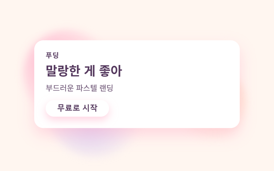 デザイントレンドパステル デザイン LPキット、キャンディカラーのセクション9選
 デザイントレンドsaas サイト デザイン 信頼感キット、クリーンなセクション9選
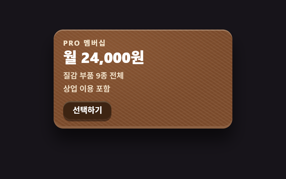 デザイントレンドスキューモーフィズムデザインの質感パーツ9選
 デザイントレンドai ランディングページ 光るオーブ デザインキット、セクション9選
 デザイントレンド【コピペOK】ベントグリッド 今どきのLPパーツ9選
 デザイントレンド現場で使う ダークモード デザインシステム LPパーツ9選
 デザイントレンドキネティックタイポグラフィをコードで分解してみた
 デザイントレンドクレイモーフィズムとは?丸くてぷっくりしたLPパーツ9選
 デザイントレンドメッシュグラデーションの上に、あえてグレインを残す
 デザイントレンドネオブルータリズム UI キット、影がにじまないLPパーツ9選