02ブラッシュドメタルナビ
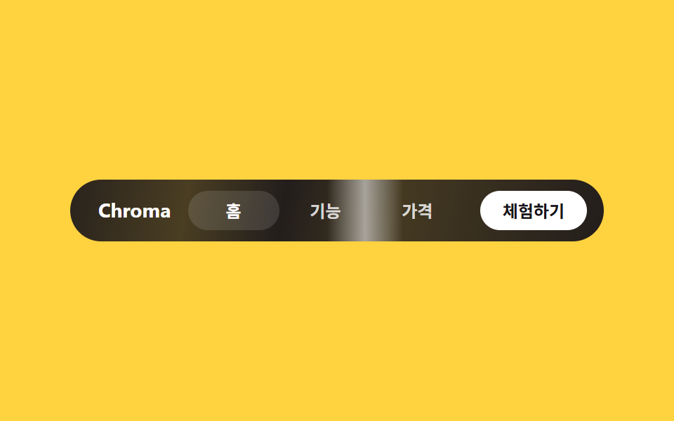
メニューバー全体がブラッシュドメタルの質感をまとい、細いハイライトの線が左右にゆっくり行き来して光がかすめる瞬間を作ります。
使いどころLP上部バー・ヒーローに重ねるナビ
linear-gradient(100deg라인 스윕 하이라이트pill 인디케이터
<main class="stage">
  <nav class="nav-c">
    <span class="nav-c__brand">Chroma</span>
    <div class="nav-c__menu">
      <span class="nav-c__label nav-c__label--active">ホーム</span>
      <span class="nav-c__label">機能</span>
      <span class="nav-c__label">料金</span>
    </div>
    <button class="nav-c__cta" type="button">無料で試す</button>
  </nav>
</main>
@use "../../../../site/static/demo-tokens" as *;
$duration: $dur-loop;
$easing: linear;
$color: $subject-blue;
@include stage($stage-yellow);
.nav-c {
position: relative;
overflow: hidden;
box-sizing: border-box;
display: flex;
align-items: center;
gap: $sp-3;
width: clamp(240px, 84vw, 380px);
padding: $sp-2 $sp-3;
border-radius: $r-pill;
background: linear-gradient(100deg, rgba($stage-ink, .92) 0%, rgba($stage-ink, .78) 22%, rgba($stage-ink, .95) 40%, rgba($stage-ink, .8) 60%, rgba($stage-ink, .95) 100%);
}
// 브러시드 메탈 하이라이트 — 가는 빛줄기가 바 전체를 좌우로 훑는다 (이 항목의 유일한 애니메이션)
.nav-c::after {
content: "";
position: absolute;
top: 0;
left: -20%;
width: 14%;
height: 100%;
background: linear-gradient(90deg, transparent, rgba($stage-paper, .55), transparent);
animation: glint $duration $easing infinite;
}
.nav-c__brand {
position: relative;
z-index: 1;
flex-shrink: 0;
white-space: nowrap;
padding-left: $sp-2;
color: $stage-paper;
font-weight: 700;
font-size: clamp(12px, 3vw, 14px);
line-height: 1;
font-family: -apple-system, "Segoe UI", "Noto Sans KR", sans-serif;
}
.nav-c__menu { position: relative; z-index: 1; min-width: 0; flex: 1; display: flex; }
.nav-c__label {
flex: 1;
white-space: nowrap;
text-align: center;
padding: $sp-2 0;
color: rgba($stage-paper, .8);
font-weight: 600;
font-size: clamp(10.5px, 2.6vw, 12px);
line-height: 1;
font-family: inherit;
}
.nav-c__label--active { color: $stage-paper; border-radius: $r-pill; background: rgba($stage-paper, .12); }
.nav-c__cta {
position: relative;
z-index: 1;
flex-shrink: 0;
white-space: nowrap;
border: 0;
border-radius: $r-pill;
background: $stage-paper;
color: $stage-ink;
padding: $sp-2 $sp-4;
font-weight: 700;
font-size: clamp(10.5px, 2.6vw, 12px);
line-height: 1;
font-family: inherit;
}
@keyframes glint { 0% { left: -20%; } 100% { left: 106%; } }
@media (prefers-reduced-motion: reduce) {
.nav-c::after { animation: none; opacity: 0; }
}html, body {
margin: 0;
overflow: hidden;
}
.stage {
box-sizing: border-box;
min-height: 100vh;
display: grid;
place-items: center;
margin: 0;
background: #ffd23f;
font-family: -apple-system, "Segoe UI", "Noto Sans KR", sans-serif;
padding: clamp(8px, 4vw, 24px);
}
.nav-c {
position: relative;
overflow: hidden;
box-sizing: border-box;
display: flex;
align-items: center;
gap: 12px;
width: clamp(240px, 84vw, 380px);
padding: 8px 12px;
border-radius: 999px;
background: linear-gradient(100deg, rgba(23, 20, 26, 0.92) 0%, rgba(23, 20, 26, 0.78) 22%, rgba(23, 20, 26, 0.95) 40%, rgba(23, 20, 26, 0.8) 60%, rgba(23, 20, 26, 0.95) 100%);
}
.nav-c::after {
content: "";
position: absolute;
top: 0;
left: -20%;
width: 14%;
height: 100%;
background: linear-gradient(90deg, transparent, rgba(255, 255, 255, 0.55), transparent);
animation: glint 2s linear infinite;
}
.nav-c__brand {
position: relative;
z-index: 1;
flex-shrink: 0;
white-space: nowrap;
padding-left: 8px;
color: #ffffff;
font-weight: 700;
font-size: clamp(12px, 3vw, 14px);
line-height: 1;
font-family: -apple-system, "Segoe UI", "Noto Sans KR", sans-serif;
}
.nav-c__menu {
position: relative;
z-index: 1;
min-width: 0;
flex: 1;
display: flex;
}
.nav-c__label {
flex: 1;
white-space: nowrap;
text-align: center;
padding: 8px 0;
color: rgba(255, 255, 255, 0.8);
font-weight: 600;
font-size: clamp(10.5px, 2.6vw, 12px);
line-height: 1;
font-family: inherit;
}
.nav-c__label--active {
color: #ffffff;
border-radius: 999px;
background: rgba(255, 255, 255, 0.12);
}
.nav-c__cta {
position: relative;
z-index: 1;
flex-shrink: 0;
white-space: nowrap;
border: 0;
border-radius: 999px;
background: #ffffff;
color: #17141a;
padding: 8px 16px;
font-weight: 700;
font-size: clamp(10.5px, 2.6vw, 12px);
line-height: 1;
font-family: inherit;
}
@keyframes glint {
0% {
left: -20%;
}
100% {
left: 106%;
}
}
@media (prefers-reduced-motion: reduce) {
.nav-c::after {
animation: none;
opacity: 0;
}
}import type { CSSProperties } from "react";
import styles from "./NavChrome.module.scss";
export type NavChromeProps = {
brand?: string;
links?: string[];
activeIndex?: number;
cta?: string;
/** 한 주기(기본 2000ms) */
duration?: number;
easing?: string;
color?: string;
};
type Vars = CSSProperties & { "--duration"?: string; "--easing"?: string; "--color"?: string };
export default function NavChrome({
brand = "Chroma",
links = ["Home", "Features", "Pricing"],
activeIndex = 0,
cta = "Try it free",
duration = 2000,
easing = "linear",
color = "#2f6df6",
}: NavChromeProps) {
const vars: Vars = { "--duration": `${duration}ms`, "--easing": easing, "--color": color };
return (
<nav className={styles.nav} style={vars}>
<span className={styles.brand}>{brand}</span>
<div className={styles.menu}>
{links.map((label, i) => (
<span key={label} className={i === activeIndex ? `${styles.label} ${styles.labelActive}` : styles.label}>
{label}
</span>
))}
</div>
<button type="button" className={styles.cta}>{cta}</button>
</nav>
);
}02 ブラッシュドメタルナビ — 計測 累積面積 9.886% · 動いたフレーム 22/23GODRICH オリジナル · SCSS と React は zip に同梱 · y2k webデザインとは?クロムとホログラフィックのLPパーツ9選
このデモが属する記事
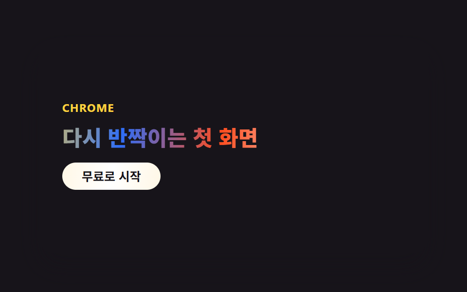 y2k webデザインとは?クロムとホログラフィックのLPパーツ9選y2k webデザインとは、2000年代のCDやホログラム包装紙にあったクロムの輝きと虹色の反射を、CSSだけで蘇らせるスタイルです。CDの裏で虹色ににじんでいたあの光が、今度はボタンや見出しの中に入ってきました。 この記事のデモをすべて見る