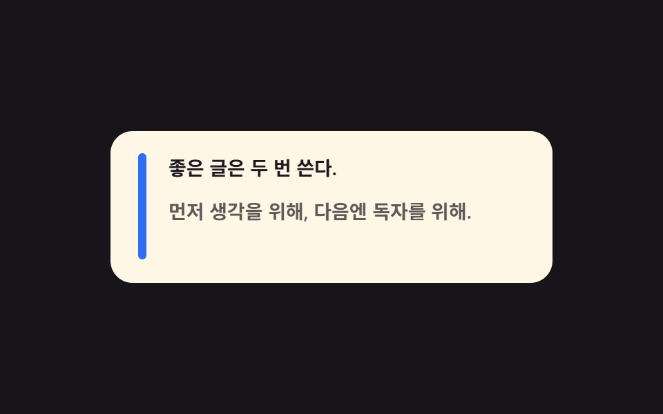
01왼쪽 막대가 자라며 열리는 인용구
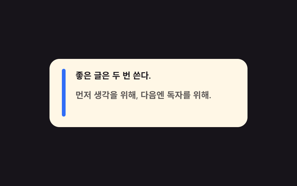
왼쪽의 굵은 막대가 위에서 아래로 차게 자라고, 그 뒤를 따라 인용 문장 두 줄이 한 박자 차이로 내려앉습니다.
쓰임블로그 본문 기본 인용구, 매거진 기사
scaleYtranslateYopacity
<main class="stage">
  <figure class="qb is-demo" aria-label="막대가 자라며 열리는 인용구">
    <span class="qb__bar" aria-hidden="true"></span>
    <div class="qb__content">
      <blockquote class="qb__body">
        <p class="qb__l1">좋은 글은 두 번 쓴다.</p>
        <p class="qb__l2">먼저 생각을 위해, 다음엔 독자를 위해.</p>
      </blockquote>
      <figcaption class="qb__cite">— 편집실 수칙</figcaption>
    </div>
  </figure>
</main>
@use "../../../../site/static/demo-tokens" as *;
// 블로그 본문 기본 인용구 — 왼쪽 굵은 막대가 scaleY 로 위에서 아래로 자라며 자리를 만들고,
// 문장 둘과 출처가 한 박자씩 차이 나게 내려앉는다. 실제 글에서는 화면에 들어올 때 한 번 재생.
// 격자 미리보기는 .is-demo 가 2초 루프로 돌리고, 복귀는 요소별로 잘게 나눠 흘린다(273-01 선례) —
// 막대+문장이 동시에 움직이는 입장 순간이 최대 변화 프레임으로 남아야 대표 이미지가 산다.
$duration: $dur-loop;
$easing: $ease-spring;
$color: $subject-blue;
@include stage($stage-ink);
.qb {
box-sizing: border-box;
width: min(320px, 92vw);
margin: 0;
padding: $sp-4 $sp-5;
border-radius: $r-card;
background: $subject-cream;
color: $subject-ink;
display: grid;
grid-template-columns: 6px 1fr;
gap: $sp-4;
font-family: inherit;
}
.qb * { box-sizing: border-box; }
.qb__bar {
border-radius: $r-pill;
background: $color;
}
.qb__content { display: grid; }
.qb__body {
margin: 0;
display: grid;
gap: $sp-2;
}
.qb__l1,
.qb__l2 {
margin: 0;
font-size: 14px;
font-weight: 600;
line-height: 1.5;
}
.qb__cite {
margin: $sp-3 0 0;
font-size: 11px;
font-weight: 500;
line-height: 1.4;
color: rgba(23, 20, 26, .62);
}
// ── 미리보기 루프(정적 규칙 먼저, 그 위에 덧씌움) ─────────────────
.qb.is-demo .qb__bar {
transform-origin: top center; // 규칙8: 채움 방향 — 인용 막대는 위에서 아래로 scaleY 로 차오른다(중심이면 가운데서 벌어진다)
animation-name: qbBar;
animation-duration: $duration;
animation-timing-function: $easing;
animation-iteration-count: infinite;
}
.qb.is-demo .qb__l1 {
animation-name: qbLine1;
animation-duration: $duration;
animation-timing-function: $easing;
animation-iteration-count: infinite;
}
.qb.is-demo .qb__l2 {
animation-name: qbLine2;
animation-duration: $duration;
animation-timing-function: $easing;
animation-iteration-count: infinite;
}
.qb.is-demo .qb__cite {
animation-name: qbCite;
animation-duration: $duration;
animation-timing-function: $easing;
animation-iteration-count: infinite;
}
// 막대: 0~26% 자람 → 80~90% 걷어냄(한 프레임 컷이 아니라 scaleY 로 흘려 면적 분할)
@keyframes qbBar {
0% { transform: scaleY(0); }
26%, 80% { transform: scaleY(1); }
90%, 100% { transform: scaleY(0); }
}
// 문장 1: 막대가 반쯤 찬 10%부터 출발
@keyframes qbLine1 {
0%, 10% { opacity: 0; transform: translateY(8px); }
34%, 76% { opacity: 1; transform: translateY(0); }
80%, 100% { opacity: 0; }
}
// 문장 2: 한 박자 뒤(20%)
@keyframes qbLine2 {
0%, 20% { opacity: 0; transform: translateY(8px); }
44%, 72% { opacity: 1; transform: translateY(0); }
76%, 100% { opacity: 0; }
}
// 출처: 마지막에 짧게
@keyframes qbCite {
0%, 30% { opacity: 0; transform: translateY(6px); }
52%, 68% { opacity: 1; transform: translateY(0); }
72%, 100% { opacity: 0; }
}
@media (prefers-reduced-motion: reduce) {
.qb.is-demo .qb__bar,
.qb.is-demo .qb__l1,
.qb.is-demo .qb__l2,
.qb.is-demo .qb__cite {
animation: none !important;
}
}
@media (max-width: 340px) {
.qb { padding: $sp-3 $sp-4; }
.qb__l1, .qb__l2 { font-size: 13px; }
.qb__cite { margin-top: $sp-2; }
}html, body {
margin: 0;
overflow: hidden;
}
.stage {
box-sizing: border-box;
min-height: 100vh;
display: grid;
place-items: center;
margin: 0;
background: #17141a;
font-family: -apple-system, "Segoe UI", "Noto Sans KR", sans-serif;
padding: clamp(8px, 4vw, 24px);
}
.qb {
box-sizing: border-box;
width: min(320px, 92vw);
margin: 0;
padding: 16px 20px;
border-radius: 16px;
background: #fff7e6;
color: #17141a;
display: grid;
grid-template-columns: 6px 1fr;
gap: 16px;
font-family: inherit;
}
.qb * {
box-sizing: border-box;
}
.qb__bar {
border-radius: 999px;
background: #2f6df6;
}
.qb__content {
display: grid;
}
.qb__body {
margin: 0;
display: grid;
gap: 8px;
}
.qb__l1,
.qb__l2 {
margin: 0;
font-size: 14px;
font-weight: 600;
line-height: 1.5;
}
.qb__cite {
margin: 12px 0 0;
font-size: 11px;
font-weight: 500;
line-height: 1.4;
color: rgba(23, 20, 26, 0.62);
}
.qb.is-demo .qb__bar {
transform-origin: top center;
animation-name: qbBar;
animation-duration: 2s;
animation-timing-function: cubic-bezier(0.2, 0.8, 0.2, 1);
animation-iteration-count: infinite;
}
.qb.is-demo .qb__l1 {
animation-name: qbLine1;
animation-duration: 2s;
animation-timing-function: cubic-bezier(0.2, 0.8, 0.2, 1);
animation-iteration-count: infinite;
}
.qb.is-demo .qb__l2 {
animation-name: qbLine2;
animation-duration: 2s;
animation-timing-function: cubic-bezier(0.2, 0.8, 0.2, 1);
animation-iteration-count: infinite;
}
.qb.is-demo .qb__cite {
animation-name: qbCite;
animation-duration: 2s;
animation-timing-function: cubic-bezier(0.2, 0.8, 0.2, 1);
animation-iteration-count: infinite;
}
@keyframes qbBar {
0% {
transform: scaleY(0);
}
26%, 80% {
transform: scaleY(1);
}
90%, 100% {
transform: scaleY(0);
}
}
@keyframes qbLine1 {
0%, 10% {
opacity: 0;
transform: translateY(8px);
}
34%, 76% {
opacity: 1;
transform: translateY(0);
}
80%, 100% {
opacity: 0;
}
}
@keyframes qbLine2 {
0%, 20% {
opacity: 0;
transform: translateY(8px);
}
44%, 72% {
opacity: 1;
transform: translateY(0);
}
76%, 100% {
opacity: 0;
}
}
@keyframes qbCite {
0%, 30% {
opacity: 0;
transform: translateY(6px);
}
52%, 68% {
opacity: 1;
transform: translateY(0);
}
72%, 100% {
opacity: 0;
}
}
@media (prefers-reduced-motion: reduce) {
.qb.is-demo .qb__bar,
.qb.is-demo .qb__l1,
.qb.is-demo .qb__l2,
.qb.is-demo .qb__cite {
animation: none !important;
}
}
@media (max-width: 340px) {
.qb {
padding: 12px 16px;
}
.qb__l1, .qb__l2 {
font-size: 13px;
}
.qb__cite {
margin-top: 8px;
}
}// QuoteBarRise — vanilla 판(run/282/demo/01-quote-bar-rise) 의 React 포트.
// 변수 3개(duration·easing·color)는 props 로 받아 CSS 변수(var(--duration) 등)로 들어온다.
import { useState } from "react";
import type { CSSProperties, MouseEvent as ReactMouseEvent } from "react";
import styles from "./QuoteBarRise.module.scss";
export type QuoteBarRiseProps = {
line1?: string;
line2?: string;
cite?: string;
groupLabel?: string;
/** 격자 미리보기용 2초 자동 루프. 사람이 손대면 꺼진다 */
demo?: boolean;
duration?: number;
easing?: string;
color?: string;
};
type Vars = CSSProperties & { "--duration"?: string; "--easing"?: string; "--color"?: string };
export default function QuoteBarRise({
line1 = "좋은 글은 두 번 쓴다.",
line2 = "먼저 생각을 위해, 다음엔 독자를 위해.",
cite = "— 편집실 수칙",
groupLabel = "막대가 자라며 열리는 인용구",
demo = true,
duration = 2000,
easing = "cubic-bezier(.2, .8, .2, 1)",
color = "#2f6df6",
}: QuoteBarRiseProps) {
const [live, setLive] = useState(demo);
const vars: Vars = { "--duration": `${duration}ms`, "--easing": easing, "--color": color };
// 실사용에서는 카드에 손을 얹는 순간 루프를 뗀다(정적 상태 = 완성된 인용구)
function onEnter() {
setLive(false);
}
const cls = [styles.qb, live ? styles.isDemo : ""].filter(Boolean).join(" ");
return (
<figure className={cls} style={vars} aria-label={groupLabel} onMouseEnter={onEnter}>
<span className={styles.bar} aria-hidden="true"></span>
<div className={styles.content}>
<blockquote className={styles.body}>
<p className={styles.l1}>{line1}</p>
<p className={styles.l2}>{line2}</p>
</blockquote>
<figcaption className={styles.cite}>{cite}</figcaption>
</div>
</figure>
);
}01 왼쪽 막대가 자라며 열리는 인용구 — 측정 누적면적 3.683% · 움직인 프레임 17/23GODRICH 원작 · zip 에 SCSS·React 포함 · 인용구 디자인 CSS 9종 — 블로그에 바로 붙이는 인용구 박스 코드
이 데모가 속한 글
 인용구 디자인 CSS 9종 — 블로그에 바로 붙이는 인용구 박스 코드인용구 디자인은 남의 문장을 내 글 사이에 예쁘게 앉히는 인용구 박스를 말합니다. 이 페이지에는 그 박스 아홉 벌이 실제로 돌아가는 채로 들어 있고, 격자 아래 코드를 통째로 복사해 블로그에 바로 붙이는 데 씁니다. 이 글의 데모 전부 보기