인용구 디자인 CSS 9종 — 블로그에 바로 붙이는 인용구 박스 코드
인용구 디자인은 남의 문장을 내 글 사이에 예쁘게 앉히는 인용구 박스를 말합니다. 이 페이지에는 그 박스 아홉 벌이 실제로 돌아가는 채로 들어 있고, 격자 아래 코드를 통째로 복사해 블로그에 바로 붙이는 데 씁니다.
 01 quote-bar-rise
 02 quote-mark-pop
 03 quote-pull-center
 04 quote-tint-fill
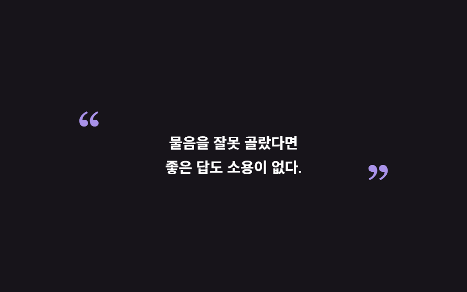 05 quote-bracket-slide
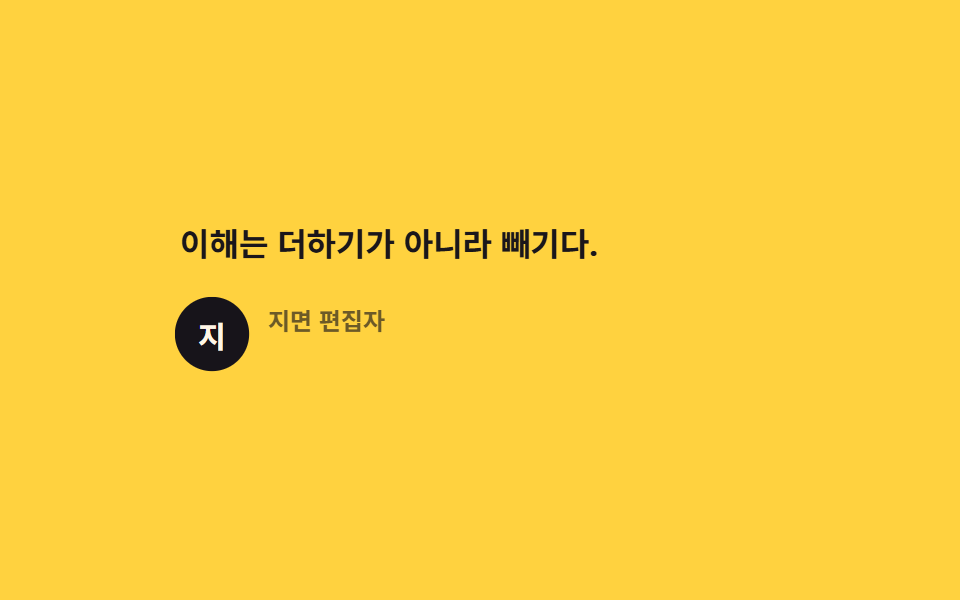 06 quote-cite-reveal
 07 quote-ink-invert
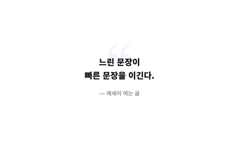 08 quote-watermark-fade
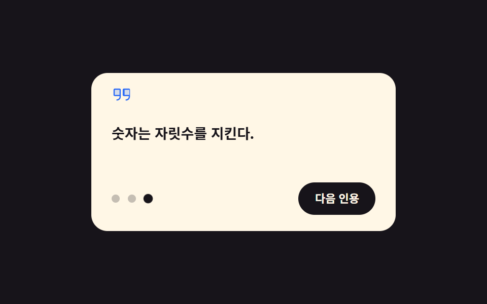 09 quote-hover-swap
자동 재생 · 눌러서 해당 항목으로 · 전부 한 zip
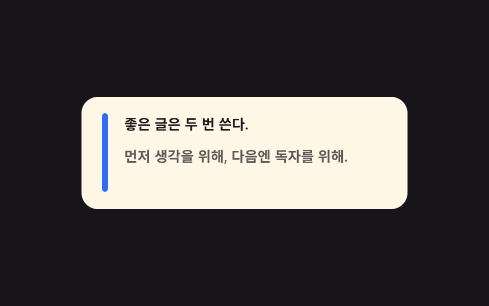
- 01 왼쪽 막대가 자라며 열리는 인용구
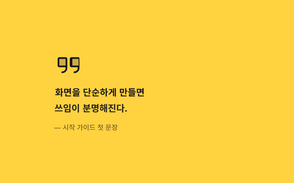
- 02 큰따옴표가 통 튀어나오는 인용구
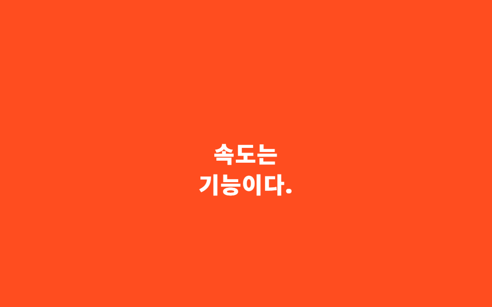
- 03 본문 한가운데로 내려앉는 pull quote
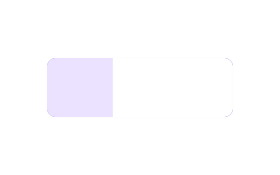
- 04 배경이 좌에서 우로 차오르는 인용 박스
- 05 양 끝 따옴표가 안으로 미끄러지는 인용구
- 06 말한 사람이 한 박자 늦게 드러나는 출처 줄
- 07 검은 잉크 덩어리로 뒤집히는 인용구
- 08 등 뒤에 커다란 따옴표가 떠오르는 인용구
- 09 손을 얹으면 다음 문장으로 바뀌는 인용구
아홉 개는 디자인 관련 명언을 예쁘게 보여 주는 순서가 아니라 인용구가 글에서 일하는 순서로 놓았습니다. 독자가 제일 먼저 만나는 기본형인 왼쪽 막대(01)에서 시작해, 장식이 문장보다 앞서 나오고(02), 문장이 본문을 가로지르며(03), 상자가 색으로 차오르고(04), 틀이 양 끝에서 조여들고(05), 말한 사람이 한 박자 늦게 마저 드러나고(06), 색이 아예 뒤집히며 무게가 실리고(07), 배경이 깊어지다가(08), 마지막에야 손이 닿으면 살아 움직입니다(09). 아홉 벌이 같은 색·간격·이징 토큰을 나눠 쓰므로 한 글에 몇 개를 섞어도 톤이 어긋나지 않습니다. 인용이 한 문장이 아니라 사람의 말로 커지면 고객 후기 섹션이 되고, 같은 종이 상자를 잘라 혜택을 담으면 쿠폰 디자인이 됩니다.
01왼쪽 막대가 자라며 열리는 인용구
명언 디자인에서 무엇이 보이나
블로그 본문의 기본 인용구입니다. 왼쪽의 굵은 막대가 scaleY 로 위에서 아래로 차게 자라 자리를 만들면 문장 둘과 출처가 한 박자씩 차이 나게 내려앉습니다.
<main class="stage">
  <figure class="qb is-demo" aria-label="막대가 자라며 열리는 인용구">
    <span class="qb__bar" aria-hidden="true"></span>
    <div class="qb__content">
      <blockquote class="qb__body">
        <p class="qb__l1">좋은 글은 두 번 쓴다.</p>
        <p class="qb__l2">먼저 생각을 위해, 다음엔 독자를 위해.</p>
      </blockquote>
      <figcaption class="qb__cite">— 편집실 수칙</figcaption>
    </div>
  </figure>
</main>
@use "../../../../site/static/demo-tokens" as *;
// 블로그 본문 기본 인용구 — 왼쪽 굵은 막대가 scaleY 로 위에서 아래로 자라며 자리를 만들고,
// 문장 둘과 출처가 한 박자씩 차이 나게 내려앉는다. 실제 글에서는 화면에 들어올 때 한 번 재생.
// 격자 미리보기는 .is-demo 가 2초 루프로 돌리고, 복귀는 요소별로 잘게 나눠 흘린다(273-01 선례) —
// 막대+문장이 동시에 움직이는 입장 순간이 최대 변화 프레임으로 남아야 대표 이미지가 산다.
$duration: $dur-loop;
$easing: $ease-spring;
$color: $subject-blue;
@include stage($stage-ink);
.qb {
box-sizing: border-box;
width: min(320px, 92vw);
margin: 0;
padding: $sp-4 $sp-5;
border-radius: $r-card;
background: $subject-cream;
color: $subject-ink;
display: grid;
grid-template-columns: 6px 1fr;
gap: $sp-4;
font-family: inherit;
}
.qb * { box-sizing: border-box; }
.qb__bar {
border-radius: $r-pill;
background: $color;
}
.qb__content { display: grid; }
.qb__body {
margin: 0;
display: grid;
gap: $sp-2;
}
.qb__l1,
.qb__l2 {
margin: 0;
font-size: 14px;
font-weight: 600;
line-height: 1.5;
}
.qb__cite {
margin: $sp-3 0 0;
font-size: 11px;
font-weight: 500;
line-height: 1.4;
color: rgba(23, 20, 26, .62);
}
// ── 미리보기 루프(정적 규칙 먼저, 그 위에 덧씌움) ─────────────────
.qb.is-demo .qb__bar {
transform-origin: top center; // 규칙8: 채움 방향 — 인용 막대는 위에서 아래로 scaleY 로 차오른다(중심이면 가운데서 벌어진다)
animation-name: qbBar;
animation-duration: $duration;
animation-timing-function: $easing;
animation-iteration-count: infinite;
}
.qb.is-demo .qb__l1 {
animation-name: qbLine1;
animation-duration: $duration;
animation-timing-function: $easing;
animation-iteration-count: infinite;
}
.qb.is-demo .qb__l2 {
animation-name: qbLine2;
animation-duration: $duration;
animation-timing-function: $easing;
animation-iteration-count: infinite;
}
.qb.is-demo .qb__cite {
animation-name: qbCite;
animation-duration: $duration;
animation-timing-function: $easing;
animation-iteration-count: infinite;
}
// 막대: 0~26% 자람 → 80~90% 걷어냄(한 프레임 컷이 아니라 scaleY 로 흘려 면적 분할)
@keyframes qbBar {
0% { transform: scaleY(0); }
26%, 80% { transform: scaleY(1); }
90%, 100% { transform: scaleY(0); }
}
// 문장 1: 막대가 반쯤 찬 10%부터 출발
@keyframes qbLine1 {
0%, 10% { opacity: 0; transform: translateY(8px); }
34%, 76% { opacity: 1; transform: translateY(0); }
80%, 100% { opacity: 0; }
}
// 문장 2: 한 박자 뒤(20%)
@keyframes qbLine2 {
0%, 20% { opacity: 0; transform: translateY(8px); }
44%, 72% { opacity: 1; transform: translateY(0); }
76%, 100% { opacity: 0; }
}
// 출처: 마지막에 짧게
@keyframes qbCite {
0%, 30% { opacity: 0; transform: translateY(6px); }
52%, 68% { opacity: 1; transform: translateY(0); }
72%, 100% { opacity: 0; }
}
@media (prefers-reduced-motion: reduce) {
.qb.is-demo .qb__bar,
.qb.is-demo .qb__l1,
.qb.is-demo .qb__l2,
.qb.is-demo .qb__cite {
animation: none !important;
}
}
@media (max-width: 340px) {
.qb { padding: $sp-3 $sp-4; }
.qb__l1, .qb__l2 { font-size: 13px; }
.qb__cite { margin-top: $sp-2; }
}html, body {
margin: 0;
overflow: hidden;
}
.stage {
box-sizing: border-box;
min-height: 100vh;
display: grid;
place-items: center;
margin: 0;
background: #17141a;
font-family: -apple-system, "Segoe UI", "Noto Sans KR", sans-serif;
padding: clamp(8px, 4vw, 24px);
}
.qb {
box-sizing: border-box;
width: min(320px, 92vw);
margin: 0;
padding: 16px 20px;
border-radius: 16px;
background: #fff7e6;
color: #17141a;
display: grid;
grid-template-columns: 6px 1fr;
gap: 16px;
font-family: inherit;
}
.qb * {
box-sizing: border-box;
}
.qb__bar {
border-radius: 999px;
background: #2f6df6;
}
.qb__content {
display: grid;
}
.qb__body {
margin: 0;
display: grid;
gap: 8px;
}
.qb__l1,
.qb__l2 {
margin: 0;
font-size: 14px;
font-weight: 600;
line-height: 1.5;
}
.qb__cite {
margin: 12px 0 0;
font-size: 11px;
font-weight: 500;
line-height: 1.4;
color: rgba(23, 20, 26, 0.62);
}
.qb.is-demo .qb__bar {
transform-origin: top center;
animation-name: qbBar;
animation-duration: 2s;
animation-timing-function: cubic-bezier(0.2, 0.8, 0.2, 1);
animation-iteration-count: infinite;
}
.qb.is-demo .qb__l1 {
animation-name: qbLine1;
animation-duration: 2s;
animation-timing-function: cubic-bezier(0.2, 0.8, 0.2, 1);
animation-iteration-count: infinite;
}
.qb.is-demo .qb__l2 {
animation-name: qbLine2;
animation-duration: 2s;
animation-timing-function: cubic-bezier(0.2, 0.8, 0.2, 1);
animation-iteration-count: infinite;
}
.qb.is-demo .qb__cite {
animation-name: qbCite;
animation-duration: 2s;
animation-timing-function: cubic-bezier(0.2, 0.8, 0.2, 1);
animation-iteration-count: infinite;
}
@keyframes qbBar {
0% {
transform: scaleY(0);
}
26%, 80% {
transform: scaleY(1);
}
90%, 100% {
transform: scaleY(0);
}
}
@keyframes qbLine1 {
0%, 10% {
opacity: 0;
transform: translateY(8px);
}
34%, 76% {
opacity: 1;
transform: translateY(0);
}
80%, 100% {
opacity: 0;
}
}
@keyframes qbLine2 {
0%, 20% {
opacity: 0;
transform: translateY(8px);
}
44%, 72% {
opacity: 1;
transform: translateY(0);
}
76%, 100% {
opacity: 0;
}
}
@keyframes qbCite {
0%, 30% {
opacity: 0;
transform: translateY(6px);
}
52%, 68% {
opacity: 1;
transform: translateY(0);
}
72%, 100% {
opacity: 0;
}
}
@media (prefers-reduced-motion: reduce) {
.qb.is-demo .qb__bar,
.qb.is-demo .qb__l1,
.qb.is-demo .qb__l2,
.qb.is-demo .qb__cite {
animation: none !important;
}
}
@media (max-width: 340px) {
.qb {
padding: 12px 16px;
}
.qb__l1, .qb__l2 {
font-size: 13px;
}
.qb__cite {
margin-top: 8px;
}
}// QuoteBarRise — vanilla 판(run/282/demo/01-quote-bar-rise) 의 React 포트.
// 변수 3개(duration·easing·color)는 props 로 받아 CSS 변수(var(--duration) 등)로 들어온다.
import { useState } from "react";
import type { CSSProperties, MouseEvent as ReactMouseEvent } from "react";
import styles from "./QuoteBarRise.module.scss";
export type QuoteBarRiseProps = {
line1?: string;
line2?: string;
cite?: string;
groupLabel?: string;
/** 격자 미리보기용 2초 자동 루프. 사람이 손대면 꺼진다 */
demo?: boolean;
duration?: number;
easing?: string;
color?: string;
};
type Vars = CSSProperties & { "--duration"?: string; "--easing"?: string; "--color"?: string };
export default function QuoteBarRise({
line1 = "좋은 글은 두 번 쓴다.",
line2 = "먼저 생각을 위해, 다음엔 독자를 위해.",
cite = "— 편집실 수칙",
groupLabel = "막대가 자라며 열리는 인용구",
demo = true,
duration = 2000,
easing = "cubic-bezier(.2, .8, .2, 1)",
color = "#2f6df6",
}: QuoteBarRiseProps) {
const [live, setLive] = useState(demo);
const vars: Vars = { "--duration": `${duration}ms`, "--easing": easing, "--color": color };
// 실사용에서는 카드에 손을 얹는 순간 루프를 뗀다(정적 상태 = 완성된 인용구)
function onEnter() {
setLive(false);
}
const cls = [styles.qb, live ? styles.isDemo : ""].filter(Boolean).join(" ");
return (
<figure className={cls} style={vars} aria-label={groupLabel} onMouseEnter={onEnter}>
<span className={styles.bar} aria-hidden="true"></span>
<div className={styles.content}>
<blockquote className={styles.body}>
<p className={styles.l1}>{line1}</p>
<p className={styles.l2}>{line2}</p>
</blockquote>
<figcaption className={styles.cite}>{cite}</figcaption>
</div>
</figure>
);
}01 · 왼쪽 막대가 자라며 열리는 인용구 — 측정 누적면적 3.683% · 움직인 프레임 17/23GODRICH 원작 · zip 에 SCSS·React 포함 · 비밀번호 보기
코드에서 볼 곳
막대와 문장이 동시에 움직이는 구간의 누적 변화 면적은 화면의 3.683% 로 측정됐고, 매거진 기사에 그대로 쓸 수 있는 무난한 첫 벌입니다.
// 막대 — 위에서 아래로 자란다(scaleY). 컷이 아니라 스케일이라 면적이 프레임마다 나뉘어 들어온다
.qb__bar {
  border-radius: $r-pill;
  background: $color;
}
.qb.is-demo .qb__bar {
  transform-origin: top center;
  animation-name: qbBar;
  animation-duration: $duration;   // 2s 루프
  animation-timing-function: $easing;
  animation-iteration-count: infinite;
}
@keyframes qbBar {
  0%        { transform: scaleY(0); }
  26%, 80%  { transform: scaleY(1); }
  90%, 100% { transform: scaleY(0); }
}
// 문장 둘은 같은 keyframes 에 백분율만 밀어 시차를 낸다 — animation-delay 를 안 써도 한 박자 차가 난다
@keyframes qbLine1 {
  0%, 10%   { opacity: 0; transform: translateY(8px); }
  34%, 76%  { opacity: 1; transform: translateY(0); }
  80%, 100% { opacity: 0; }
}
02큰따옴표가 통 튀어나오는 인용구
화면에서 일어나는 일
도움말·가이드의 첫머리에 어울리는 벌입니다.
<main class="stage">
  <figure class="qm is-demo" aria-label="따옴표가 튀어나오는 인용구">
    <svg class="qm__mark" viewBox="0 0 256 256" width="44" height="44" fill="currentColor" aria-hidden="true"><g><path d="M108 72v72H40a8 8 0 0 1-8-8V72a8 8 0 0 1 8-8h60a8 8 0 0 1 8 8m108-8h-60a8 8 0 0 0-8 8v64a8 8 0 0 0 8 8h68V72a8 8 0 0 0-8-8" opacity=".2"/><path d="M100 56H40a16 16 0 0 0-16 16v64a16 16 0 0 0 16 16h60v8a32 32 0 0 1-32 32a8 8 0 0 0 0 16a48.05 48.05 0 0 0 48-48V72a16 16 0 0 0-16-16m0 80H40V72h60Zm116-80h-60a16 16 0 0 0-16 16v64a16 16 0 0 0 16 16h60v8a32 32 0 0 1-32 32a8 8 0 0 0 0 16a48.05 48.05 0 0 0 48-48V72a16 16 0 0 0-8-16m0 80h-60V72h60Z"/></g></svg>
    <blockquote class="qm__body">
      <p class="qm__l1">화면을 단순하게 만들면</p>
      <p class="qm__l2">쓰임이 분명해진다.</p>
    </blockquote>
    <figcaption class="qm__cite">— 시작 가이드 첫 문장</figcaption>
  </figure>
</main>
@use "../../../../site/static/demo-tokens" as *;
// 큰따옴표 아이콘(Phosphor Duotone quotes)이 scale 로 한 번 튀어 올라 자리를 잡고,
// 본문 두 줄이 오른쪽에서 밀려 들어오는 도움말 첫머리용 인용구.
// 아이콘의 overshoot 는 $ease-pop(cubic-bezier(.2,1.4,.4,1)) — y 가 1을 넘는 커브로 튕김을 만든다.
// 복귀는 아이콘 걷어냄+문장 컷을 서로 다른 지점에 두고, 입장(튐+슬라이드 동시)이 최대 변화로 남게.
$duration: $dur-loop;
$easing: $ease-spring;
$color: $subject-ink;
@include stage($stage-yellow);
.qm {
box-sizing: border-box;
width: min(300px, 92vw);
margin: 0;
display: grid;
justify-items: start;
gap: $sp-3;
color: $color;
font-family: inherit;
}
.qm * { box-sizing: border-box; }
.qm__mark {
display: block;
color: $subject-ink;
}
.qm__body {
margin: 0;
display: grid;
gap: $sp-1;
}
.qm__l1,
.qm__l2 {
margin: 0;
font-size: 15px;
font-weight: 700;
line-height: 1.5;
}
.qm__cite {
margin: 0;
font-size: 11px;
font-weight: 500;
line-height: 1.4;
color: rgba($subject-ink, .72);
}
// ── 미리보기 루프 ─────────────────
.qm.is-demo .qm__mark {
transform-origin: left bottom; // 규칙8: 붙는 지점 — 본문과 공유하는 왼쪽 정렬선·본문 위 모서리에 뿌리박은 채 1.14 로 튄다(중심이면 작을 때 정렬선에서 떠오르고 overshoot 에서 정렬선을 왼쪽으로 넘는다)
animation-name: qmMark;
animation-duration: $duration;
animation-timing-function: $ease-pop;
animation-iteration-count: infinite;
}
.qm.is-demo .qm__l1,
.qm.is-demo .qm__l2 {
animation-name: qmLine;
animation-duration: $duration;
animation-timing-function: $easing;
animation-iteration-count: infinite;
}
.qm.is-demo .qm__l1 { animation-delay: 80ms; animation-fill-mode: backwards; }
.qm.is-demo .qm__l2 { animation-delay: 180ms; animation-fill-mode: backwards; }
.qm.is-demo .qm__cite {
animation-name: qmCite;
animation-duration: $duration;
animation-timing-function: $easing;
animation-iteration-count: infinite;
}
// 아이콘: 0~6% 나타나며 22%까지 1.14 배로 튀었다가 30%에 1 로 착지 → 78~90% 걷어냄
@keyframes qmMark {
0% { opacity: 0; transform: scale(.2); }
6% { opacity: 1; transform: scale(.92); }
22% { transform: scale(1.14); }
30%, 78% { opacity: 1; transform: scale(1); }
90%, 100% { opacity: 0; transform: scale(.9); }
}
// 본문: 왼쪽에서 밀려 들어옴(delay 로 한 박자 차이 — 무한 루프에서도 위상이 그대로 유지된다)
@keyframes qmLine {
0%, 4% { opacity: 0; transform: translateX(-14px); }
30%, 74% { opacity: 1; transform: translateX(0); }
80%, 100% { opacity: 0; }
}
@keyframes qmCite {
0%, 18% { opacity: 0; transform: translateX(-10px); }
42%, 70% { opacity: 1; transform: translateX(0); }
76%, 100% { opacity: 0; }
}
@media (prefers-reduced-motion: reduce) {
.qm.is-demo .qm__mark,
.qm.is-demo .qm__l1,
.qm.is-demo .qm__l2,
.qm.is-demo .qm__cite {
animation: none !important;
}
}
@media (max-width: 340px) {
.qm { gap: $sp-2; }
.qm__l1, .qm__l2 { font-size: 14px; }
.qm__mark { width: 36px; height: 36px; }
}html, body {
margin: 0;
overflow: hidden;
}
.stage {
box-sizing: border-box;
min-height: 100vh;
display: grid;
place-items: center;
margin: 0;
background: #ffd23f;
font-family: -apple-system, "Segoe UI", "Noto Sans KR", sans-serif;
padding: clamp(8px, 4vw, 24px);
}
.qm {
box-sizing: border-box;
width: min(300px, 92vw);
margin: 0;
display: grid;
justify-items: start;
gap: 12px;
color: #17141a;
font-family: inherit;
}
.qm * {
box-sizing: border-box;
}
.qm__mark {
display: block;
color: #17141a;
}
.qm__body {
margin: 0;
display: grid;
gap: 4px;
}
.qm__l1,
.qm__l2 {
margin: 0;
font-size: 15px;
font-weight: 700;
line-height: 1.5;
}
.qm__cite {
margin: 0;
font-size: 11px;
font-weight: 500;
line-height: 1.4;
color: rgba(23, 20, 26, 0.72);
}
.qm.is-demo .qm__mark {
transform-origin: left bottom;
animation-name: qmMark;
animation-duration: 2s;
animation-timing-function: cubic-bezier(0.2, 1.4, 0.4, 1);
animation-iteration-count: infinite;
}
.qm.is-demo .qm__l1,
.qm.is-demo .qm__l2 {
animation-name: qmLine;
animation-duration: 2s;
animation-timing-function: cubic-bezier(0.2, 0.8, 0.2, 1);
animation-iteration-count: infinite;
}
.qm.is-demo .qm__l1 {
animation-delay: 80ms;
animation-fill-mode: backwards;
}
.qm.is-demo .qm__l2 {
animation-delay: 180ms;
animation-fill-mode: backwards;
}
.qm.is-demo .qm__cite {
animation-name: qmCite;
animation-duration: 2s;
animation-timing-function: cubic-bezier(0.2, 0.8, 0.2, 1);
animation-iteration-count: infinite;
}
@keyframes qmMark {
0% {
opacity: 0;
transform: scale(0.2);
}
6% {
opacity: 1;
transform: scale(0.92);
}
22% {
transform: scale(1.14);
}
30%, 78% {
opacity: 1;
transform: scale(1);
}
90%, 100% {
opacity: 0;
transform: scale(0.9);
}
}
@keyframes qmLine {
0%, 4% {
opacity: 0;
transform: translateX(-14px);
}
30%, 74% {
opacity: 1;
transform: translateX(0);
}
80%, 100% {
opacity: 0;
}
}
@keyframes qmCite {
0%, 18% {
opacity: 0;
transform: translateX(-10px);
}
42%, 70% {
opacity: 1;
transform: translateX(0);
}
76%, 100% {
opacity: 0;
}
}
@media (prefers-reduced-motion: reduce) {
.qm.is-demo .qm__mark,
.qm.is-demo .qm__l1,
.qm.is-demo .qm__l2,
.qm.is-demo .qm__cite {
animation: none !important;
}
}
@media (max-width: 340px) {
.qm {
gap: 8px;
}
.qm__l1, .qm__l2 {
font-size: 14px;
}
.qm__mark {
width: 36px;
height: 36px;
}
}// QuoteMarkPop — vanilla 판(run/282/demo/02-quote-mark-pop) 의 React 포트.
import { useState } from "react";
import type { CSSProperties } from "react";
import styles from "./QuoteMarkPop.module.scss";
export type QuoteMarkPopProps = {
line1?: string;
line2?: string;
cite?: string;
groupLabel?: string;
demo?: boolean;
duration?: number;
easing?: string;
color?: string;
};
type Vars = CSSProperties & { "--duration"?: string; "--easing"?: string; "--color"?: string };
function QuotesMark() {
return (
<svg className={styles.mark} viewBox="0 0 256 256" width="44" height="44" fill="currentColor" aria-hidden="true"><g><path d="M108 72v72H40a8 8 0 0 1-8-8V72a8 8 0 0 1 8-8h60a8 8 0 0 1 8 8m108-8h-60a8 8 0 0 0-8 8v64a8 8 0 0 0 8 8h68V72a8 8 0 0 0-8-8" opacity=".2"/><path d="M100 56H40a16 16 0 0 0-16 16v64a16 16 0 0 0 16 16h60v8a32 32 0 0 1-32 32a8 8 0 0 0 0 16a48.05 48.05 0 0 0 48-48V72a16 16 0 0 0-16-16m0 80H40V72h60Zm116-80h-60a16 16 0 0 0-16 16v64a16 16 0 0 0 16 16h60v8a32 32 0 0 1-32 32a8 8 0 0 0 0 16a48.05 48.05 0 0 0 48-48V72a16 16 0 0 0-8-16m0 80h-60V72h60Z"/></g></svg>
);
}
export default function QuoteMarkPop({
line1 = "화면을 단순하게 만들면",
line2 = "쓰임이 분명해진다.",
cite = "— 시작 가이드 첫 문장",
groupLabel = "따옴표가 튀어나오는 인용구",
demo = true,
duration = 2000,
easing = "cubic-bezier(.2, .8, .2, 1)",
color = "#17141a",
}: QuoteMarkPopProps) {
const [live, setLive] = useState(demo);
const vars: Vars = { "--duration": `${duration}ms`, "--easing": easing, "--color": color };
function onEnter() {
setLive(false);
}
const cls = [styles.qm, live ? styles.isDemo : ""].filter(Boolean).join(" ");
return (
<figure className={cls} style={vars} aria-label={groupLabel} onMouseEnter={onEnter}>
<QuotesMark />
<blockquote className={styles.body}>
<p className={styles.l1}>{line1}</p>
<p className={styles.l2}>{line2}</p>
</blockquote>
<figcaption className={styles.cite}>{cite}</figcaption>
</figure>
);
}02 · 큰따옴표가 통 튀어나오는 인용구 — 측정 누적면적 3.84% · 움직인 프레임 14/23GODRICH 원작 · zip 에 SCSS·React 포함 · 비밀번호 보기
코드 읽는 법
인용문 왼쪽의 큰따옴표 아이콘이 cubic-bezier(.2, 1.4, .4, 1) 커브로 한 번 튀어 올라 1.14배를 넘었다가 착지하고, 본문 두 줄이 왼쪽에서 밀려 들어옵니다(누적면적 3.828% · 강도 71.7). 튕김 커브는 y 값이 1을 넘는 특수한 이징이라 transform-origin: left bottom 을 함께 묶어야 뿌리가 박힌 채로 튑니다.
// 아이콘 팝 — y 가 1.4 를 넘는 커브로 지나쳤다 돌아온다(overshoot)
.qm.is-demo .qm__mark {
  transform-origin: left bottom;
  animation-name: qmMark;
  animation-duration: $duration;
  animation-timing-function: $ease-pop;   // cubic-bezier(.2, 1.4, .4, 1)
  animation-iteration-count: infinite;
}
@keyframes qmMark {
  0%        { opacity: 0; transform: scale(.2); }
  6%        { opacity: 1; transform: scale(.92); }
  22%       { transform: scale(1.14); }   // 착지 전 한 번 넘치는 지점
  30%, 78%  { opacity: 1; transform: scale(1); }
  90%, 100% { opacity: 0; transform: scale(.9); }
}
// 본문 슬라이드는 animation-delay 로 시차 — 무한 루프에서도 위상이 그대로 유지된다
.qm.is-demo .qm__l2 { animation-delay: 180ms; animation-fill-mode: backwards; }
03본문 한가운데로 내려앉는 pull quote
어떤 움직임인가
매거진이 본문 사이에 박아 넣는 큰 문장입니다.
<main class="stage">
  <section class="qp is-demo" aria-label="본문 한가운데 내려앉는 강조 문장">
    <p class="qp__ctx qp__ctx--pre">문서를 읽는 사람은 위에서 아래로 한 줄씩 내려온다.</p>
    <blockquote class="qp__pull" >
      <span class="qp__a">속도는</span>
      <span class="qp__b">기능이다.</span>
    </blockquote>
    <p class="qp__ctx qp__ctx--post">그 흐름 속에서 큰 문장 하나가 숨을 고르게 한다.</p>
  </section>
</main>
@use "../../../../site/static/demo-tokens" as *;
// 매거진 pull quote — 본문 사이에 낀 큰 문장 두 줄이 animation-delay 로 한 박자씩 차이 나게 내려앉는다.
// 지연은 무한 루프에서도 위상차로 유지되고, animation-fill-mode: backwards 로 지연 구간에 첫 프레임(숨김)을 채운다
// (252-08 함정: fill 이 없으면 완성 상태가 0프레임에 번쩍한다).
$duration: $dur-loop;
$easing: $ease-spring;
$color: $stage-paper;
@include stage($stage-orange);
.qp {
box-sizing: border-box;
width: min(320px, 92vw);
margin: 0;
display: grid;
gap: $sp-4;
text-align: center;
font-family: inherit;
}
.qp * { box-sizing: border-box; }
.qp__ctx {
margin: 0;
font-size: 11px;
font-weight: 400;
line-height: 1.6;
color: $subject-ink;
}
.qp__pull {
margin: 0;
display: grid;
gap: $sp-1;
}
.qp__a,
.qp__b {
display: block;
font-size: 22px;
font-weight: 800;
line-height: 1.35;
color: $color;
letter-spacing: .04em;
}
// ── 미리보기 루프 ─────────────────
.qp.is-demo .qp__a,
.qp.is-demo .qp__b {
animation-duration: $duration;
animation-timing-function: $easing;
animation-iteration-count: infinite;
animation-fill-mode: backwards;
}
.qp.is-demo .qp__a { animation-name: qpDropA; animation-delay: 60ms; }
.qp.is-demo .qp__b { animation-name: qpDropB; animation-delay: 160ms; }
// 맥락 줄(앞·뒤 지문)은 steps 컷 — 페이드 중간값이 poster 에 반투명 유령으로 남는다(237 함정)
.qp.is-demo .qp__ctx {
animation-duration: $duration;
animation-timing-function: steps(1, end);
animation-iteration-count: infinite;
animation-fill-mode: backwards;
}
.qp.is-demo .qp__ctx--pre { animation-name: qpCtxPre; }
.qp.is-demo .qp__ctx--post { animation-name: qpCtxPost; }
// 큰 문장 두 줄은 opacity 램프 없이 translateY 로만 내려앉는다(처음부터 불투명 — 텍스트 페이드의
// 중간값이 poster 에 유령으로 남는다). 두 줄이 겹쳐 내려오는 입장(60~400ms)이 최대 변화 프레임.
// 복귀는 다시 위로 올라갔다가 줄마다 다른 지점(86%·90%)에 멈춘다 — 마지막 샘플(95.8%) 전에 끝난다.
@keyframes qpDropA {
0%, 2% { opacity: 1; transform: translateY(18px); }
16%, 80% { opacity: 1; transform: translateY(0); }
86%, 100% { opacity: 1; transform: translateY(18px); }
}
@keyframes qpDropB {
0%, 6% { opacity: 1; transform: translateY(18px); }
22%, 76% { opacity: 1; transform: translateY(0); }
90%, 100% { opacity: 1; transform: translateY(18px); }
}
// 앞 지문: 큰 문장이 자리 잡기 전 컷, 큰 문장보다 먼저 물러난다
@keyframes qpCtxPre {
0%, 8% { opacity: 0; }
9%, 56% { opacity: 1; }
57%, 100% { opacity: 0; }
}
// 뒷 지문: 큰 문장이 다 내려앉은 뒤 컷, 앞 지문 다음에 물러난다
@keyframes qpCtxPost {
0%, 26% { opacity: 0; }
27%, 50% { opacity: 1; }
51%, 100% { opacity: 0; }
}
@media (prefers-reduced-motion: reduce) {
.qp.is-demo .qp__a,
.qp.is-demo .qp__b,
.qp.is-demo .qp__ctx {
animation: none !important;
}
}
@media (max-width: 340px) {
.qp { gap: $sp-3; }
.qp__a, .qp__b { font-size: 20px; }
.qp__ctx { font-size: 10px; }
}html, body {
margin: 0;
overflow: hidden;
}
.stage {
box-sizing: border-box;
min-height: 100vh;
display: grid;
place-items: center;
margin: 0;
background: #ff4d1f;
font-family: -apple-system, "Segoe UI", "Noto Sans KR", sans-serif;
padding: clamp(8px, 4vw, 24px);
}
.qp {
box-sizing: border-box;
width: min(320px, 92vw);
margin: 0;
display: grid;
gap: 16px;
text-align: center;
font-family: inherit;
}
.qp * {
box-sizing: border-box;
}
.qp__ctx {
margin: 0;
font-size: 11px;
font-weight: 400;
line-height: 1.6;
color: #17141a;
}
.qp__pull {
margin: 0;
display: grid;
gap: 4px;
}
.qp__a,
.qp__b {
display: block;
font-size: 22px;
font-weight: 800;
line-height: 1.35;
color: #ffffff;
letter-spacing: 0.04em;
}
.qp.is-demo .qp__a,
.qp.is-demo .qp__b {
animation-duration: 2s;
animation-timing-function: cubic-bezier(0.2, 0.8, 0.2, 1);
animation-iteration-count: infinite;
animation-fill-mode: backwards;
}
.qp.is-demo .qp__a {
animation-name: qpDropA;
animation-delay: 60ms;
}
.qp.is-demo .qp__b {
animation-name: qpDropB;
animation-delay: 160ms;
}
.qp.is-demo .qp__ctx {
animation-duration: 2s;
animation-timing-function: steps(1, end);
animation-iteration-count: infinite;
animation-fill-mode: backwards;
}
.qp.is-demo .qp__ctx--pre {
animation-name: qpCtxPre;
}
.qp.is-demo .qp__ctx--post {
animation-name: qpCtxPost;
}
@keyframes qpDropA {
0%, 2% {
opacity: 1;
transform: translateY(18px);
}
16%, 80% {
opacity: 1;
transform: translateY(0);
}
86%, 100% {
opacity: 1;
transform: translateY(18px);
}
}
@keyframes qpDropB {
0%, 6% {
opacity: 1;
transform: translateY(18px);
}
22%, 76% {
opacity: 1;
transform: translateY(0);
}
90%, 100% {
opacity: 1;
transform: translateY(18px);
}
}
@keyframes qpCtxPre {
0%, 8% {
opacity: 0;
}
9%, 56% {
opacity: 1;
}
57%, 100% {
opacity: 0;
}
}
@keyframes qpCtxPost {
0%, 26% {
opacity: 0;
}
27%, 50% {
opacity: 1;
}
51%, 100% {
opacity: 0;
}
}
@media (prefers-reduced-motion: reduce) {
.qp.is-demo .qp__a,
.qp.is-demo .qp__b,
.qp.is-demo .qp__ctx {
animation: none !important;
}
}
@media (max-width: 340px) {
.qp {
gap: 12px;
}
.qp__a, .qp__b {
font-size: 20px;
}
.qp__ctx {
font-size: 10px;
}
}// QuotePullCenter — vanilla 판(run/282/demo/03-quote-pull-center) 의 React 포트.
import { useState } from "react";
import type { CSSProperties } from "react";
import styles from "./QuotePullCenter.module.scss";
export type QuotePullCenterProps = {
preContext?: string;
pullA?: string;
pullB?: string;
postContext?: string;
groupLabel?: string;
demo?: boolean;
duration?: number;
easing?: string;
color?: string;
};
type Vars = CSSProperties & { "--duration"?: string; "--easing"?: string; "--color"?: string };
export default function QuotePullCenter({
preContext = "문서를 읽는 사람은 위에서 아래로 한 줄씩 내려온다.",
pullA = "속도는",
pullB = "기능이다.",
postContext = "그 흐름 속에서 큰 문장 하나가 숨을 고르게 한다.",
groupLabel = "본문 한가운데 내려앉는 강조 문장",
demo = true,
duration = 2000,
easing = "cubic-bezier(.2, .8, .2, 1)",
color = "#ffffff",
}: QuotePullCenterProps) {
const [live, setLive] = useState(demo);
const vars: Vars = { "--duration": `${duration}ms`, "--easing": easing, "--color": color };
function onEnter() {
setLive(false);
}
const cls = [styles.qp, live ? styles.isDemo : ""].filter(Boolean).join(" ");
return (
<section className={cls} style={vars} aria-label={groupLabel} onMouseEnter={onEnter}>
<p className={[styles.ctx, styles.ctxPre].join(" ")}>{preContext}</p>
<blockquote className={styles.pull}>
<span className={styles.a}>{pullA}</span>
<span className={styles.b}>{pullB}</span>
</blockquote>
<p className={[styles.ctx, styles.ctxPost].join(" ")}>{postContext}</p>
</section>
);
}03 · 본문 한가운데로 내려앉는 pull quote — 측정 누적면적 4.517% · 움직인 프레임 12/23GODRICH 원작 · zip 에 SCSS·React 포함 · 비밀번호 보기
어디를 바꾸면 되나
앞뒤 지문(맥락 줄)은 steps(1, end) 컷으로 먼저 깔리고, 큰 문장 두 줄이 animation-delay 60ms·160ms 의 시차로 내려앉습니다(누적면적 4.747% · 강도 119.7). 두 줄 모두 opacity 램프를 쓰지 않고 translateY 로만 움직이는데, 그 이유는 함정 절에서 측정값과 함께 적습니다.
// 큰 문장 — 처음부터 불투명하게 18px 위에서 내려앉는다(페이드 중간값이 없다)
.qp.is-demo .qp__a { animation-name: qpDropA; animation-delay: 60ms; }
.qp.is-demo .qp__b { animation-name: qpDropB; animation-delay: 160ms; }
.qp.is-demo .qp__a,
.qp.is-demo .qp__b {
  animation-duration: $duration;
  animation-timing-function: $easing;
  animation-iteration-count: infinite;
  animation-fill-mode: backwards;   // 지연 구간에 첫 프레임을 채운다
}
@keyframes qpDropA {
  0%, 2%    { opacity: 1; transform: translateY(18px); }
  16%, 80%  { opacity: 1; transform: translateY(0); }
  86%, 100% { opacity: 1; transform: translateY(18px); }
}
04배경이 좌에서 우로 차오르는 인용 박스
무엇이 보이나
요점·팁 박스에 가까운 벌입니다.
<main class="stage">
  <figure class="qt is-demo" aria-label="배경이 차오르는 인용 박스">
    <figcaption class="qt__label">작업 요점</figcaption>
    <blockquote class="qt__body">값을 바꾸기 전에<br>먼저 화면에 있는 값을 읽어라.</blockquote>
  </figure>
</main>
@use "../../../../site/static/demo-tokens" as *;
// 요점 박스형 인용구 — ::before 로 깔린 옅은 배경이 scaleX(transform-origin: left) 로 좌에서 우로 차오르고,
// 채워진 만큼 문장이 뒤따라 드러난다. 실사용에서는 상자에 손을 올리면 라벨 색이 한 박자 늦게 깊어진다
// (transition-delay — 채워지는 리듬을 호버에서도 유지하는 소질).
// 복귀: 배경은 우에서 좌로 scaleX 로 흘러 나가고(컷 아님 — 한 프레임 면적이 입장보다 작게),
// 라벨·문장은 서로 다른 지점에 컷. 입장(배경 채움+문장 등장이 겹치는 구간)이 최대 변화 프레임.
$duration: $dur-loop;
$easing: $ease-out;
$color: $subject-lilac;
@include stage($stage-paper);
.qt {
box-sizing: border-box;
position: relative;
width: min(320px, 92vw);
margin: 0;
padding: $sp-4 $sp-5;
border: 1px solid rgba(185, 160, 255, .55);
border-radius: $r-card;
overflow: hidden;
font-family: inherit;
isolation: isolate;
}
.qt * { box-sizing: border-box; }
// 차오르는 배경 — 내용보다 아래 층에 깔고 z-index 로 순서를 못박는다
.qt::before {
content: "";
position: absolute;
inset: 0;
z-index: 0;
background: $color;
opacity: .3;
}
.qt__label,
.qt__body {
position: relative;
z-index: 1;
margin: 0;
display: block;
}
.qt__label {
font-size: 11px;
font-weight: 700;
line-height: 1.4;
letter-spacing: .08em;
color: rgba(85, 55, 180, .9);
transition-property: color;
transition-duration: 140ms;
transition-delay: 80ms;
}
.qt__body {
margin-top: $sp-2;
font-size: 14px;
font-weight: 600;
line-height: 1.6;
color: $subject-ink;
}
// 실사용 호버 — 라벨이 채워지는 리듬처럼 한 박자 늦게 깊어진다
.qt:hover .qt__label { color: rgba(60, 30, 150, 1); }
// ── 미리보기 루프 ─────────────────
.qt.is-demo::before {
transform-origin: left center; // 규칙8: 채움 방향 — 옅은 배경이 왼쪽 변에서 scaleX 로 차오른다
animation-name: qtFill;
animation-duration: $duration;
animation-timing-function: $easing;
animation-iteration-count: infinite;
}
.qt.is-demo .qt__label {
animation-name: qtLabel;
animation-duration: $duration;
animation-timing-function: steps(1, end);
animation-iteration-count: infinite;
}
.qt.is-demo .qt__body {
animation-name: qtBody;
animation-duration: $duration;
animation-timing-function: $easing;
animation-iteration-count: infinite;
}
// 배경: 0~18% 좌→우 채움(입장이 프레임당 더 넓게), 74~96% 우에서 좌로 흘러 나가감(컷 아님)
@keyframes qtFill {
0% { transform: scaleX(0); }
18%, 74% { transform: scaleX(1); }
96%, 100% { transform: scaleX(0); }
}
// 라벨: 채움이 절반 지날 때 컷 — 채우는 프레임과 겹쳐 입장이 최대 변화가 되게
@keyframes qtLabel {
0%, 7% { opacity: 0; }
8%, 68% { opacity: 1; }
72%, 100% { opacity: 0; }
}
// 문장: 채움을 따라 슬라이드하며 드러남
@keyframes qtBody {
0%, 10% { opacity: 0; transform: translateX(-10px); }
26%, 70% { opacity: 1; transform: translateX(0); }
76%, 100% { opacity: 0; }
}
@media (prefers-reduced-motion: reduce) {
.qt.is-demo::before,
.qt.is-demo .qt__label,
.qt.is-demo .qt__body {
animation: none !important;
}
}
@media (max-width: 340px) {
.qt { padding: $sp-3 $sp-4; }
.qt__body { font-size: 13px; }
}html, body {
margin: 0;
overflow: hidden;
}
.stage {
box-sizing: border-box;
min-height: 100vh;
display: grid;
place-items: center;
margin: 0;
background: #ffffff;
font-family: -apple-system, "Segoe UI", "Noto Sans KR", sans-serif;
padding: clamp(8px, 4vw, 24px);
}
.qt {
box-sizing: border-box;
position: relative;
width: min(320px, 92vw);
margin: 0;
padding: 16px 20px;
border: 1px solid rgba(185, 160, 255, 0.55);
border-radius: 16px;
overflow: hidden;
font-family: inherit;
isolation: isolate;
}
.qt * {
box-sizing: border-box;
}
.qt::before {
content: "";
position: absolute;
inset: 0;
z-index: 0;
background: #b9a0ff;
opacity: 0.3;
}
.qt__label,
.qt__body {
position: relative;
z-index: 1;
margin: 0;
display: block;
}
.qt__label {
font-size: 11px;
font-weight: 700;
line-height: 1.4;
letter-spacing: 0.08em;
color: rgba(85, 55, 180, 0.9);
transition-property: color;
transition-duration: 140ms;
transition-delay: 80ms;
}
.qt__body {
margin-top: 8px;
font-size: 14px;
font-weight: 600;
line-height: 1.6;
color: #17141a;
}
.qt:hover .qt__label {
color: rgb(60, 30, 150);
}
.qt.is-demo::before {
transform-origin: left center;
animation-name: qtFill;
animation-duration: 2s;
animation-timing-function: ease-out;
animation-iteration-count: infinite;
}
.qt.is-demo .qt__label {
animation-name: qtLabel;
animation-duration: 2s;
animation-timing-function: steps(1, end);
animation-iteration-count: infinite;
}
.qt.is-demo .qt__body {
animation-name: qtBody;
animation-duration: 2s;
animation-timing-function: ease-out;
animation-iteration-count: infinite;
}
@keyframes qtFill {
0% {
transform: scaleX(0);
}
18%, 74% {
transform: scaleX(1);
}
96%, 100% {
transform: scaleX(0);
}
}
@keyframes qtLabel {
0%, 7% {
opacity: 0;
}
8%, 68% {
opacity: 1;
}
72%, 100% {
opacity: 0;
}
}
@keyframes qtBody {
0%, 10% {
opacity: 0;
transform: translateX(-10px);
}
26%, 70% {
opacity: 1;
transform: translateX(0);
}
76%, 100% {
opacity: 0;
}
}
@media (prefers-reduced-motion: reduce) {
.qt.is-demo::before,
.qt.is-demo .qt__label,
.qt.is-demo .qt__body {
animation: none !important;
}
}
@media (max-width: 340px) {
.qt {
padding: 12px 16px;
}
.qt__body {
font-size: 13px;
}
}// QuoteTintFill — vanilla 판(run/282/demo/04-quote-tint-fill) 의 React 포트.
import { useState } from "react";
import type { CSSProperties } from "react";
import styles from "./QuoteTintFill.module.scss";
export type QuoteTintFillProps = {
label?: string;
line1?: string;
line2?: string;
groupLabel?: string;
demo?: boolean;
duration?: number;
easing?: string;
color?: string;
};
type Vars = CSSProperties & { "--duration"?: string; "--easing"?: string; "--color"?: string };
export default function QuoteTintFill({
label = "작업 요점",
line1 = "값을 바꾸기 전에",
line2 = "먼저 화면에 있는 값을 읽어라.",
groupLabel = "배경이 차오르는 인용 박스",
demo = true,
duration = 2000,
easing = "ease-out",
color = "#b9a0ff",
}: QuoteTintFillProps) {
const [live, setLive] = useState(demo);
const vars: Vars = { "--duration": `${duration}ms`, "--easing": easing, "--color": color };
function onEnter() {
setLive(false);
}
const cls = [styles.qt, live ? styles.isDemo : ""].filter(Boolean).join(" ");
return (
<figure className={cls} style={vars} aria-label={groupLabel} onMouseEnter={onEnter}>
<figcaption className={styles.label}>{label}</figcaption>
<blockquote className={styles.body}>{line1}<br />{line2}</blockquote>
</figure>
);
}04 · 배경이 좌에서 우로 차오르는 인용 박스 — 측정 누적면적 21.95% · 움직인 프레임 14/23GODRICH 원작 · zip 에 SCSS·React 포함 · 비밀번호 보기
코드에서 볼 곳
::before 로 깔아 둔 옅은 배경이 scaleX 에 transform-origin: left 를 얹어 왼쪽 끝에서부터 오른쪽으로 차오르고, 라벨은 채움이 절반 지날 때 컷으로, 문장은 채움을 따라 슬라이드하며 드러납니다(채움 면적이 커서 누적면적 21.95% 로 아홉 벌 중 가장 큽니다). 실사용에서는 상자에 손을 올리면 라벨 색이 transition-delay 80ms 로 한 박자 늦게 깊어지는 소질도 붙어 있습니다.
// 차오르는 배경 — 내용보다 아래 층(z-index)에 깔고 좌측 원점에서 scaleX 로 채운다
.qt::before {
  content: "";
  position: absolute;
  inset: 0;
  z-index: 0;
  background: $color;          // 라일락
  opacity: .3;
}
.qt.is-demo::before {
  transform-origin: left center;
  animation-name: qtFill;
  animation-duration: $duration;
  animation-timing-function: $ease-out;
  animation-iteration-count: infinite;
}
@keyframes qtFill {
  0%        { transform: scaleX(0); }
  18%, 74%  { transform: scaleX(1); }
  96%, 100% { transform: scaleX(0); }   // 걷어냄은 입장(18%)보다 느리게 — 퇴장 프레임이 poster 를 이기지 않게
}
05양 끝 따옴표가 안으로 미끄러지는 인용구
화면에서 일어나는 일
인터뷰 기사·리서치 리포트용입니다.
<main class="stage">
  <figure class="qs is-demo" aria-label="양 끝 따옴표가 닫히는 인용구">
    <blockquote class="qs__body">물음을 잘못 골랐다면<br>좋은 답도 소용이 없다.</blockquote>
  </figure>
</main>
@use "../../../../site/static/demo-tokens" as *;
// 인터뷰용 인용구 — ::before/::after 로 얹은 커다란 따옴표 글리프가 바깥에서 안으로 미끄러져
// 들어와 문장을 틀 안에 가두고, 문장은 가운데서 한 번 떠오른다.
// 따옴표는 아이콘이 아니라 타이포그래피 글리프(세리프) — 문장보다 크게 벌려 두는 게 핵심.
$duration: $dur-loop;
$easing: $ease-spring;
$color: $stage-paper;
@include stage($stage-ink);
.qs {
box-sizing: border-box;
width: min(320px, 92vw);
margin: 0;
padding: $sp-6 $sp-8;
font-family: inherit;
}
.qs * { box-sizing: border-box; }
.qs__body {
position: relative;
z-index: 1;
margin: 0;
font-size: 15px;
font-weight: 600;
line-height: 1.7;
text-align: center;
color: $color;
}
// 양 끝 따옴표 — 문장보다 위·아래로 크게 벌어져 있는 글리프
.qs__body::before,
.qs__body::after {
position: absolute;
z-index: -1;
font-family: Georgia, "Times New Roman", serif;
font-size: 52px;
font-weight: 700;
line-height: 1;
color: $subject-lilac;
opacity: .9;
pointer-events: none;
}
.qs__body::before { content: "\201C"; top: -28px; left: -20px; }
.qs__body::after { content: "\201D"; bottom: -28px; right: -20px; }
// ── 미리보기 루프 ─────────────────
.qs.is-demo .qs__body {
animation-name: qsLift;
animation-duration: $duration;
animation-timing-function: $easing;
animation-iteration-count: infinite;
}
.qs.is-demo .qs__body::before {
animation-name: qsMarkBefore;
animation-duration: $duration;
animation-timing-function: $easing;
animation-iteration-count: infinite;
}
.qs.is-demo .qs__body::after {
animation-name: qsMarkAfter;
animation-duration: $duration;
animation-timing-function: $easing;
animation-iteration-count: infinite;
}
// 문장·따옴표 모두 opacity 램프를 쓰지 않는다 — 텍스트 페이드의 중간값이 poster 에
// 반투명 유령으로 남는다(237 계열 함정). 문장은 translateY 로, 따옴표는 슬라이드+스케일로
// 처음부터 불투명하게 움직인다. 복귀: 문장은 되돌아 내려가고, 따옴표는 바깥으로 슬라이드.
@keyframes qsLift {
0%, 20% { opacity: 1; transform: translateY(10px); }
32%, 68% { opacity: 1; transform: translateY(0); }
74%, 100% { opacity: 1; transform: translateY(10px); }
}
// 여는 따옴표: 왼바깥 → 제자리 → 다시 바깥으로(불투명 유지)
@keyframes qsMarkBefore {
0% { opacity: .9; transform: translateX(-30px) scale(.7); }
28%, 68% { opacity: .9; transform: translateX(0) scale(1); }
92%, 100% { opacity: .9; transform: translateX(-30px) scale(.7); }
}
// 닫는 따옴표: 오른바깥 → 제자리 → 다시 바깥으로(같은 시간, 반대 방향 — 두 글리프가
// 동시에 움직이는 입장 프레임이 최대 변화)
@keyframes qsMarkAfter {
0% { opacity: .9; transform: translateX(30px) scale(.7); }
28%, 68% { opacity: .9; transform: translateX(0) scale(1); }
92%, 100% { opacity: .9; transform: translateX(30px) scale(.7); }
}
@media (prefers-reduced-motion: reduce) {
.qs.is-demo .qs__body,
.qs.is-demo .qs__body::before,
.qs.is-demo .qs__body::after {
animation: none !important;
}
}
@media (max-width: 340px) {
.qs { padding: $sp-5 $sp-6; }
.qs__body { font-size: 14px; }
.qs__body::before, .qs__body::after { font-size: 44px; }
.qs__body::before { top: -24px; left: -16px; }
.qs__body::after { bottom: -24px; right: -16px; }
}@charset "UTF-8";
html, body {
margin: 0;
overflow: hidden;
}
.stage {
box-sizing: border-box;
min-height: 100vh;
display: grid;
place-items: center;
margin: 0;
background: #17141a;
font-family: -apple-system, "Segoe UI", "Noto Sans KR", sans-serif;
padding: clamp(8px, 4vw, 24px);
}
.qs {
box-sizing: border-box;
width: min(320px, 92vw);
margin: 0;
padding: 24px 32px;
font-family: inherit;
}
.qs * {
box-sizing: border-box;
}
.qs__body {
position: relative;
z-index: 1;
margin: 0;
font-size: 15px;
font-weight: 600;
line-height: 1.7;
text-align: center;
color: #ffffff;
}
.qs__body::before,
.qs__body::after {
position: absolute;
z-index: -1;
font-family: Georgia, "Times New Roman", serif;
font-size: 52px;
font-weight: 700;
line-height: 1;
color: #b9a0ff;
opacity: 0.9;
pointer-events: none;
}
.qs__body::before {
content: "“";
top: -28px;
left: -20px;
}
.qs__body::after {
content: "”";
bottom: -28px;
right: -20px;
}
.qs.is-demo .qs__body {
animation-name: qsLift;
animation-duration: 2s;
animation-timing-function: cubic-bezier(0.2, 0.8, 0.2, 1);
animation-iteration-count: infinite;
}
.qs.is-demo .qs__body::before {
animation-name: qsMarkBefore;
animation-duration: 2s;
animation-timing-function: cubic-bezier(0.2, 0.8, 0.2, 1);
animation-iteration-count: infinite;
}
.qs.is-demo .qs__body::after {
animation-name: qsMarkAfter;
animation-duration: 2s;
animation-timing-function: cubic-bezier(0.2, 0.8, 0.2, 1);
animation-iteration-count: infinite;
}
@keyframes qsLift {
0%, 20% {
opacity: 1;
transform: translateY(10px);
}
32%, 68% {
opacity: 1;
transform: translateY(0);
}
74%, 100% {
opacity: 1;
transform: translateY(10px);
}
}
@keyframes qsMarkBefore {
0% {
opacity: 0.9;
transform: translateX(-30px) scale(0.7);
}
28%, 68% {
opacity: 0.9;
transform: translateX(0) scale(1);
}
92%, 100% {
opacity: 0.9;
transform: translateX(-30px) scale(0.7);
}
}
@keyframes qsMarkAfter {
0% {
opacity: 0.9;
transform: translateX(30px) scale(0.7);
}
28%, 68% {
opacity: 0.9;
transform: translateX(0) scale(1);
}
92%, 100% {
opacity: 0.9;
transform: translateX(30px) scale(0.7);
}
}
@media (prefers-reduced-motion: reduce) {
.qs.is-demo .qs__body,
.qs.is-demo .qs__body::before,
.qs.is-demo .qs__body::after {
animation: none !important;
}
}
@media (max-width: 340px) {
.qs {
padding: 20px 24px;
}
.qs__body {
font-size: 14px;
}
.qs__body::before, .qs__body::after {
font-size: 44px;
}
.qs__body::before {
top: -24px;
left: -16px;
}
.qs__body::after {
bottom: -24px;
right: -16px;
}
}// QuoteBracketSlide — vanilla 판(run/282/demo/05-quote-bracket-slide) 의 React 포트.
import { useState } from "react";
import type { CSSProperties } from "react";
import styles from "./QuoteBracketSlide.module.scss";
export type QuoteBracketSlideProps = {
line1?: string;
line2?: string;
groupLabel?: string;
demo?: boolean;
duration?: number;
easing?: string;
color?: string;
};
type Vars = CSSProperties & { "--duration"?: string; "--easing"?: string; "--color"?: string };
export default function QuoteBracketSlide({
line1 = "물음을 잘못 골랐다면",
line2 = "좋은 답도 소용이 없다.",
groupLabel = "양 끝 따옴표가 닫히는 인용구",
demo = true,
duration = 2000,
easing = "cubic-bezier(.2, .8, .2, 1)",
color = "#ffffff",
}: QuoteBracketSlideProps) {
const [live, setLive] = useState(demo);
const vars: Vars = { "--duration": `${duration}ms`, "--easing": easing, "--color": color };
function onEnter() {
setLive(false);
}
const cls = [styles.qs, live ? styles.isDemo : ""].filter(Boolean).join(" ");
return (
<figure className={cls} style={vars} aria-label={groupLabel} onMouseEnter={onEnter}>
<blockquote className={styles.body}>{line1}<br />{line2}</blockquote>
</figure>
);
}05 · 양 끝 따옴표가 안으로 미끄러지는 인용구 — 측정 누적면적 4.822% · 움직인 프레임 14/23GODRICH 원작 · zip 에 SCSS·React 포함 · 비밀번호 보기
코드 읽는 법
인용문 양 끝에 ::before·::after 로 얹은 커다란 세리프 따옴표 글리프가 바깥에서 안으로 미끄러져 들어와 문장을 틀 안에 가두고, 문장은 가운데서 한 번 떠오릅니다(누적면적 4.822%). 따옴표는 아이콘이 아니라 타이포그래피 글리프라 font-family: Georgia 로 폰트를 바꿨고, 문장보다 위·아래로 크게 벌려 두는 게 이 벌의 핵심입니다.
// 양 끝 따옴표 — 절대배치 글리프가 안으로 조여든다(불투명 유지, 페이드 없음)
.qs__body::before,
.qs__body::after {
  position: absolute;
  z-index: -1;
  font-family: Georgia, "Times New Roman", serif;
  font-size: 52px;
  color: $subject-lilac;
  opacity: .9;
}
.qs__body::before { content: "\201C"; top: -28px; left: -20px; }
.qs__body::after  { content: "\201D"; bottom: -28px; right: -20px; }
@keyframes qsMarkBefore {
  0%        { opacity: .9; transform: translateX(-30px) scale(.7); }
  28%, 68%  { opacity: .9; transform: translateX(0) scale(1); }
  92%, 100% { opacity: .9; transform: translateX(-30px) scale(.7); }
}
// 닫는 따옴표(qsMarkAfter)는 방향만 +30px 로 반대 — 두 글리프가 같은 프레임에 움직여 입장이 최대 변화가 된다
06말한 사람이 한 박자 늦게 드러나는 출처 줄
어떤 움직임인가
에디토리얼 인터뷰·고객 문구에 쓰는 벌입니다.
<main class="stage">
  <figure class="qc is-demo" aria-label="출처가 늦게 드러나는 인용구">
    <blockquote class="qc__body">이해는 더하기가 아니라 빼기다.</blockquote>
    <figcaption class="qc__src">
      <span class="qc__disc" aria-hidden="true">지</span>
      <span class="qc__who">
        <span class="qc__name">지면 편집자</span>
        <span class="qc__role">월간 잡지 인터뷰</span>
      </span>
    </figcaption>
  </figure>
</main>
@use "../../../../site/static/demo-tokens" as *;
// 에디토리얼 인용구 — 본문이 먼저 자리 잡고, 출처가 한 박자 늦게 마저 드러난다:
// 이니셜 원이 튀어나오고(scale) 이름·소속이 따라 올라오며(translateY), 밑줄이 좌에서 우로 차오른다(scaleX).
// 실사용에서는 출처 줄에 손을 올리면 이름 색이 깊어진다(color transition — 화면에 있는 값만 바꾼다).
$duration: $dur-loop;
$easing: $ease-spring;
$color: $subject-ink;
@include stage($stage-yellow);
.qc {
box-sizing: border-box;
width: min(300px, 92vw);
margin: 0;
display: grid;
gap: $sp-4;
font-family: inherit;
}
.qc * { box-sizing: border-box; }
.qc__body {
margin: 0;
font-size: 16px;
font-weight: 700;
line-height: 1.6;
color: $color;
}
.qc__src {
display: flex;
align-items: center;
gap: $sp-3;
padding-bottom: $sp-2;
position: relative;
}
// 밑줄 — 출처 줄 아래 가장자리에서 좌에서 우로
.qc__src::after {
content: "";
position: absolute;
left: 0;
right: 0;
bottom: 0;
height: 2px;
border-radius: $r-pill;
background: rgba(23, 20, 26, .8);
transform-origin: left center; // 규칙8: 채움 방향 — 밑줄은 왼쪽 변에서 scaleX 로 그어진다
}
.qc__disc {
display: grid;
place-items: center;
width: 32px;
height: 32px;
border-radius: 50%;
background: $subject-ink;
color: $subject-cream;
font-size: 13px;
font-weight: 700;
line-height: 1;
}
.qc__who {
display: grid;
gap: $sp-1;
}
.qc__name {
font-size: 12px;
font-weight: 700;
line-height: 1.3;
color: $subject-ink;
transition-property: color;
transition-duration: 160ms;
}
.qc__role {
font-size: 10px;
font-weight: 500;
line-height: 1.3;
color: rgba($subject-ink, .72);
}
// 실사용 호버 — 이름 색이 한 단계 깊어진다
.qc__src:hover .qc__name { color: rgba(60, 40, 10, 1); }
// ── 미리보기 루프 ─────────────────
.qc.is-demo .qc__body {
animation-name: qcBody;
animation-duration: $duration;
animation-timing-function: $easing;
animation-iteration-count: infinite;
}
.qc.is-demo .qc__disc {
animation-name: qcDisc;
animation-duration: $duration;
animation-timing-function: $ease-pop;
animation-iteration-count: infinite;
}
.qc.is-demo .qc__name,
.qc.is-demo .qc__role {
animation-name: qcWho;
animation-duration: $duration;
animation-timing-function: $easing;
animation-iteration-count: infinite;
}
.qc.is-demo .qc__role { animation-delay: 60ms; animation-fill-mode: backwards; }
.qc.is-demo .qc__src::after {
transform-origin: left center; // 규칙8: 채움 방향 — 밑줄은 왼쪽 변에서 scaleX 로 그어진다
animation-name: qcRule;
animation-duration: $duration;
animation-timing-function: $easing;
animation-iteration-count: infinite;
}
// 입장: 본문·이니셜 원·이름이 6~24% 구간에 겹쳐 움직인다(273 선례 — 여럿이 동시에 움직이는
// 입장 프레임이 개별 요소의 퇴장 프레임보다 커야 poster 가 산다). 밑줄은 마지막에 좌→우.
// 퇴장: 넷을 서로 다른 구간에 12%+ 걸쳐 느긋한 페이드로 흘린다(한 프레임 컷 금지 —
// 본문 통째로 사라지는 프레임의 면적이 입장을 이기고 빈 화면이 poster 가 된다, 248-09 함정).
@keyframes qcBody {
0%, 4% { opacity: 0; transform: translateY(8px); }
16%, 58% { opacity: 1; transform: translateY(0); }
70%, 100% { opacity: 0; }
}
// 이니셜 원: 본문과 겹쳐 튀어나옴(overshoot)
@keyframes qcDisc {
0%, 6% { opacity: 0; transform: scale(.3); }
18% { opacity: 1; transform: scale(1.12); }
24%, 62% { opacity: 1; transform: scale(1); }
76%, 100% { opacity: 0; }
}
// 이름·소속: 원 뒤로 따라 올라옴(같은 구간에 겹침)
@keyframes qcWho {
0%, 10% { opacity: 0; transform: translateY(6px); }
24%, 60% { opacity: 1; transform: translateY(0); }
74%, 100% { opacity: 0; }
}
// 밑줄: 마지막에 좌→우, 퇴장은 우에서 좌로 scaleX 로 흘러 사라짐(면적이 점진적으로 줄어든다)
@keyframes qcRule {
0%, 28% { transform: scaleX(0); }
46%, 66% { transform: scaleX(1); }
82%, 100% { transform: scaleX(0); }
}
@media (prefers-reduced-motion: reduce) {
.qc.is-demo .qc__body,
.qc.is-demo .qc__disc,
.qc.is-demo .qc__name,
.qc.is-demo .qc__role,
.qc.is-demo .qc__src::after {
animation: none !important;
}
}
@media (max-width: 340px) {
.qc { gap: $sp-3; }
.qc__body { font-size: 15px; }
.qc__disc { width: 28px; height: 28px; font-size: 12px; }
}html, body {
margin: 0;
overflow: hidden;
}
.stage {
box-sizing: border-box;
min-height: 100vh;
display: grid;
place-items: center;
margin: 0;
background: #ffd23f;
font-family: -apple-system, "Segoe UI", "Noto Sans KR", sans-serif;
padding: clamp(8px, 4vw, 24px);
}
.qc {
box-sizing: border-box;
width: min(300px, 92vw);
margin: 0;
display: grid;
gap: 16px;
font-family: inherit;
}
.qc * {
box-sizing: border-box;
}
.qc__body {
margin: 0;
font-size: 16px;
font-weight: 700;
line-height: 1.6;
color: #17141a;
}
.qc__src {
display: flex;
align-items: center;
gap: 12px;
padding-bottom: 8px;
position: relative;
}
.qc__src::after {
content: "";
position: absolute;
left: 0;
right: 0;
bottom: 0;
height: 2px;
border-radius: 999px;
background: rgba(23, 20, 26, 0.8);
transform-origin: left center;
}
.qc__disc {
display: grid;
place-items: center;
width: 32px;
height: 32px;
border-radius: 50%;
background: #17141a;
color: #fff7e6;
font-size: 13px;
font-weight: 700;
line-height: 1;
}
.qc__who {
display: grid;
gap: 4px;
}
.qc__name {
font-size: 12px;
font-weight: 700;
line-height: 1.3;
color: #17141a;
transition-property: color;
transition-duration: 160ms;
}
.qc__role {
font-size: 10px;
font-weight: 500;
line-height: 1.3;
color: rgba(23, 20, 26, 0.72);
}
.qc__src:hover .qc__name {
color: rgb(60, 40, 10);
}
.qc.is-demo .qc__body {
animation-name: qcBody;
animation-duration: 2s;
animation-timing-function: cubic-bezier(0.2, 0.8, 0.2, 1);
animation-iteration-count: infinite;
}
.qc.is-demo .qc__disc {
animation-name: qcDisc;
animation-duration: 2s;
animation-timing-function: cubic-bezier(0.2, 1.4, 0.4, 1);
animation-iteration-count: infinite;
}
.qc.is-demo .qc__name,
.qc.is-demo .qc__role {
animation-name: qcWho;
animation-duration: 2s;
animation-timing-function: cubic-bezier(0.2, 0.8, 0.2, 1);
animation-iteration-count: infinite;
}
.qc.is-demo .qc__role {
animation-delay: 60ms;
animation-fill-mode: backwards;
}
.qc.is-demo .qc__src::after {
transform-origin: left center;
animation-name: qcRule;
animation-duration: 2s;
animation-timing-function: cubic-bezier(0.2, 0.8, 0.2, 1);
animation-iteration-count: infinite;
}
@keyframes qcBody {
0%, 4% {
opacity: 0;
transform: translateY(8px);
}
16%, 58% {
opacity: 1;
transform: translateY(0);
}
70%, 100% {
opacity: 0;
}
}
@keyframes qcDisc {
0%, 6% {
opacity: 0;
transform: scale(0.3);
}
18% {
opacity: 1;
transform: scale(1.12);
}
24%, 62% {
opacity: 1;
transform: scale(1);
}
76%, 100% {
opacity: 0;
}
}
@keyframes qcWho {
0%, 10% {
opacity: 0;
transform: translateY(6px);
}
24%, 60% {
opacity: 1;
transform: translateY(0);
}
74%, 100% {
opacity: 0;
}
}
@keyframes qcRule {
0%, 28% {
transform: scaleX(0);
}
46%, 66% {
transform: scaleX(1);
}
82%, 100% {
transform: scaleX(0);
}
}
@media (prefers-reduced-motion: reduce) {
.qc.is-demo .qc__body,
.qc.is-demo .qc__disc,
.qc.is-demo .qc__name,
.qc.is-demo .qc__role,
.qc.is-demo .qc__src::after {
animation: none !important;
}
}
@media (max-width: 340px) {
.qc {
gap: 12px;
}
.qc__body {
font-size: 15px;
}
.qc__disc {
width: 28px;
height: 28px;
font-size: 12px;
}
}// QuoteCiteReveal — vanilla 판(run/282/demo/06-quote-cite-reveal) 의 React 포트.
import { useState } from "react";
import type { CSSProperties } from "react";
import styles from "./QuoteCiteReveal.module.scss";
export type QuoteCiteRevealProps = {
quote?: string;
initial?: string;
name?: string;
role?: string;
groupLabel?: string;
demo?: boolean;
duration?: number;
easing?: string;
color?: string;
};
type Vars = CSSProperties & { "--duration"?: string; "--easing"?: string; "--color"?: string };
export default function QuoteCiteReveal({
quote = "이해는 더하기가 아니라 빼기다.",
initial = "지",
name = "지면 편집자",
role = "월간 잡지 인터뷰",
groupLabel = "출처가 늦게 드러나는 인용구",
demo = true,
duration = 2000,
easing = "cubic-bezier(.2, .8, .2, 1)",
color = "#17141a",
}: QuoteCiteRevealProps) {
const [live, setLive] = useState(demo);
const vars: Vars = { "--duration": `${duration}ms`, "--easing": easing, "--color": color };
function onEnter() {
setLive(false);
}
const cls = [styles.qc, live ? styles.isDemo : ""].filter(Boolean).join(" ");
return (
<figure className={cls} style={vars} aria-label={groupLabel} onMouseEnter={onEnter}>
<blockquote className={styles.body}>{quote}</blockquote>
<figcaption className={styles.src}>
<span className={styles.disc} aria-hidden="true">{initial}</span>
<span className={styles.who}>
<span className={styles.name}>{name}</span>
<span className={styles.role}>{role}</span>
</span>
</figcaption>
</figure>
);
}06 · 말한 사람이 한 박자 늦게 드러나는 출처 줄 — 측정 누적면적 3.441% · 움직인 프레임 18/23GODRICH 원작 · zip 에 SCSS·React 포함 · 비밀번호 보기
어디를 바꾸면 되나
본문이 먼저 자리를 잡은 뒤 이니셜 원이 scale 로 튀어나오고 이름·소속이 따라 올라오며, 마지막에 밑줄이 좌에서 우로 scaleX 차오릅니다(누적면적 3.433% · 강도 111.5). 본문·원·이름의 등장이 6~24% 구간에 겹쳐 있어 한 프레임에 여럿이 함께 움직이고, 밑줄만 28% 까지 기다렸다 뒤따릅니다 — 이 배치가 왜 필요한지는 함정 절의 첫 이야기입니다.
// 출처 줄 — 원(좌)과 이름·소속(우)을 가로로 잇고 아래 가장자리에 밑줄을 둔다
.qc__src {
  display: flex;
  align-items: center;
  gap: $sp-3;
  padding-bottom: $sp-2;
  position: relative;
}
.qc__src::after {           // 밑줄 — 좌측 원점에서 채워진다
  content: "";
  position: absolute;
  left: 0; right: 0; bottom: 0;
  height: 2px;
  border-radius: $r-pill;
  background: rgba(23, 20, 26, .8);
  transform-origin: left center;
}
@keyframes qcDisc {          // 이니셜 원 — 본문과 겹쳐 튀어나옴(overshoot)
  0%, 6%    { opacity: 0; transform: scale(.3); }
  18%       { opacity: 1; transform: scale(1.12); }
  24%, 62%  { opacity: 1; transform: scale(1); }
  76%, 100% { opacity: 0; }
}
07검은 잉크 덩어리로 뒤집히는 인용구
무엇이 보이나
포트폴리오 선언문·제품 철학처럼 무게를 실어 말하고 싶을 때의 벌입니다. 잉크색 블록이 clip-path inset 으로 좌에서 우로 닦이며 나타나고, 그 위의 흰 문장이 steps(1, end) 컷으로 한 번에 뒤집힙니다 — steps 타이밍과 clip-path 를 한 keyframes 에 섞으면 보간이 죽으므로 블록(위프)과 문장(컷)을 애니메이션 둘로 나눴습니다.
<main class="stage">
  <figure class="qi is-demo" aria-label="잉크 블록으로 뒤집히는 인용구">
    <blockquote class="qi__body">
      <span class="qi__l1">나는 어제의 화면을 고치지 않고,</span>
      <span class="qi__l2">내일의 화면을 더 잘 만든다.</span>
    </blockquote>
  </figure>
</main>
@use "../../../../site/static/demo-tokens" as *;
// 포트폴리오 선언문용 인용구 — 잉크색 블록이 clip-path inset 으로 좌에서 우로 닦이며 나타나고,
// 그 위의 흰 문장이 steps(1, end) 컷으로 한 번에 뒤집힌다(잉크 배경 위 흰 글자 — 대비 18.24:1).
// 266-09 함정: steps 타이밍과 clip-path 를 한 keyframes 에 섞으면 보간이 죽는다 — 블록(ease 위프)과
// 문장(steps 컷)을 애니메이션 둘로 분리했다. 복귀: 문장 컷 → 블록 위프로 우에서 좌로 닦아 나감(입장 16% vs 퇴장 18%).
$duration: $dur-loop;
$easing: $ease-out;
$color: $subject-ink;
@include stage($stage-orange);
.qi {
box-sizing: border-box;
width: min(320px, 92vw);
margin: 0;
padding: $sp-5 $sp-6;
border-radius: $r-card;
background: $color;
color: $stage-paper;
font-family: inherit;
}
.qi * { box-sizing: border-box; }
.qi__body {
margin: 0;
display: grid;
gap: $sp-2;
}
.qi__l1,
.qi__l2 {
display: block;
font-size: 14px;
font-weight: 700;
line-height: 1.6;
color: inherit;
}
// ── 미리보기 루프 ─────────────────
.qi.is-demo {
animation-name: qiWipe;
animation-duration: $duration;
animation-timing-function: $easing;
animation-iteration-count: infinite;
}
.qi.is-demo .qi__l1,
.qi.is-demo .qi__l2 {
animation-name: qiCut1;
animation-duration: $duration;
animation-timing-function: steps(1, end);
animation-iteration-count: infinite;
}
.qi.is-demo .qi__l2 { animation-name: qiCut2; }
// 잉크 블록: 0~16% 좌→우 위프로 닦여 나타남(빠르게 — 문장 컷과 겹치는 프레임이 최대 변화)
@keyframes qiWipe {
0% { clip-path: inset(0 100% 0 0 round 16px); }
16%, 74% { clip-path: inset(0 0 0 0 round 16px); }
92%, 100% { clip-path: inset(0 100% 0 0 round 16px); }
}
// 문장 1: 블록이 다 찬 직후 한 프레임 컷
@keyframes qiCut1 {
0%, 17% { opacity: 0; }
21%, 70% { opacity: 1; }
74%, 100% { opacity: 0; }
}
// 문장 2: 한 프레임 뒤
@keyframes qiCut2 {
0%, 19% { opacity: 0; }
23%, 68% { opacity: 1; }
72%, 100% { opacity: 0; }
}
@media (prefers-reduced-motion: reduce) {
.qi.is-demo,
.qi.is-demo .qi__l1,
.qi.is-demo .qi__l2 {
animation: none !important;
}
}
@media (max-width: 340px) {
.qi { padding: $sp-4 $sp-5; }
.qi__l1, .qi__l2 { font-size: 13px; }
}html, body {
margin: 0;
overflow: hidden;
}
.stage {
box-sizing: border-box;
min-height: 100vh;
display: grid;
place-items: center;
margin: 0;
background: #ff4d1f;
font-family: -apple-system, "Segoe UI", "Noto Sans KR", sans-serif;
padding: clamp(8px, 4vw, 24px);
}
.qi {
box-sizing: border-box;
width: min(320px, 92vw);
margin: 0;
padding: 20px 24px;
border-radius: 16px;
background: #17141a;
color: #ffffff;
font-family: inherit;
}
.qi * {
box-sizing: border-box;
}
.qi__body {
margin: 0;
display: grid;
gap: 8px;
}
.qi__l1,
.qi__l2 {
display: block;
font-size: 14px;
font-weight: 700;
line-height: 1.6;
color: inherit;
}
.qi.is-demo {
animation-name: qiWipe;
animation-duration: 2s;
animation-timing-function: ease-out;
animation-iteration-count: infinite;
}
.qi.is-demo .qi__l1,
.qi.is-demo .qi__l2 {
animation-name: qiCut1;
animation-duration: 2s;
animation-timing-function: steps(1, end);
animation-iteration-count: infinite;
}
.qi.is-demo .qi__l2 {
animation-name: qiCut2;
}
@keyframes qiWipe {
0% {
clip-path: inset(0 100% 0 0 round 16px);
}
16%, 74% {
clip-path: inset(0 0 0 0 round 16px);
}
92%, 100% {
clip-path: inset(0 100% 0 0 round 16px);
}
}
@keyframes qiCut1 {
0%, 17% {
opacity: 0;
}
21%, 70% {
opacity: 1;
}
74%, 100% {
opacity: 0;
}
}
@keyframes qiCut2 {
0%, 19% {
opacity: 0;
}
23%, 68% {
opacity: 1;
}
72%, 100% {
opacity: 0;
}
}
@media (prefers-reduced-motion: reduce) {
.qi.is-demo,
.qi.is-demo .qi__l1,
.qi.is-demo .qi__l2 {
animation: none !important;
}
}
@media (max-width: 340px) {
.qi {
padding: 16px 20px;
}
.qi__l1, .qi__l2 {
font-size: 13px;
}
}// QuoteInkInvert — vanilla 판(run/282/demo/07-quote-ink-invert) 의 React 포트.
import { useState } from "react";
import type { CSSProperties } from "react";
import styles from "./QuoteInkInvert.module.scss";
export type QuoteInkInvertProps = {
line1?: string;
line2?: string;
groupLabel?: string;
demo?: boolean;
duration?: number;
easing?: string;
color?: string;
};
type Vars = CSSProperties & { "--duration"?: string; "--easing"?: string; "--color"?: string };
export default function QuoteInkInvert({
line1 = "나는 어제의 화면을 고치지 않고,",
line2 = "내일의 화면을 더 잘 만든다.",
groupLabel = "잉크 블록으로 뒤집히는 인용구",
demo = true,
duration = 2000,
easing = "ease-out",
color = "#17141a",
}: QuoteInkInvertProps) {
const [live, setLive] = useState(demo);
const vars: Vars = { "--duration": `${duration}ms`, "--easing": easing, "--color": color };
function onEnter() {
setLive(false);
}
const cls = [styles.qi, live ? styles.isDemo : ""].filter(Boolean).join(" ");
return (
<figure className={cls} style={vars} aria-label={groupLabel} onMouseEnter={onEnter}>
<blockquote className={styles.body}>
<span className={styles.l1}>{line1}</span>
<span className={styles.l2}>{line2}</span>
</blockquote>
</figure>
);
}07 · 검은 잉크 덩어리로 뒤집히는 인용구 — 측정 누적면적 20.317% · 움직인 프레임 11/23GODRICH 원작 · zip 에 SCSS·React 포함 · 비밀번호 보기
코드에서 볼 곳
잉크 배경 위 흰 글자의 대비는 18.24:1 이고, 누적면적은 20.317% 이며 강도 203.3 은 아홉 벌 중 가장 강합니다.
// 잉크 블록 위프와 문장 컷은 애니메이션을 나눈다 — steps 와 clip-path 를 섞으면 보간이 조용히 죽는다
.qi.is-demo {
  animation-name: qiWipe;                        // ease 위프
  animation-timing-function: $ease-out;
}
.qi.is-demo .qi__l1,
.qi.is-demo .qi__l2 {
  animation-name: qiCut1;
  animation-timing-function: steps(1, end);      // 한 프레임 컷
  animation-iteration-count: infinite;
}
@keyframes qiWipe {
  0%        { clip-path: inset(0 100% 0 0 round 16px); }
  16%, 74%  { clip-path: inset(0 0 0 0 round 16px); }
  92%, 100% { clip-path: inset(0 100% 0 0 round 16px); }
}
@keyframes qiCut1 {
  0%, 17%   { opacity: 0; }
  21%, 70%  { opacity: 1; }
  74%, 100% { opacity: 0; }
}
08등 뒤에 커다란 따옴표가 떠오르는 인용구
화면에서 일어나는 일
에세이의 여는 글·책 표지 문구에 어울리는 벌입니다.
<main class="stage">
<figure class="qw is-demo" aria-label="뒤에 큰 따옴표가 떠오르는 인용구">
<span class="qw__mark" aria-hidden="true">“</span>
<blockquote class="qw__body">느린 문장이<br>빠른 문장을 이긴다.</blockquote>
<figcaption class="qw__cite">— 에세이 여는 글</figcaption>
</figure>
</main>@use "../../../../site/static/demo-tokens" as *;
// 에세이 리드용 인용구 — 등 뒤로 커다란 따옴표 글리프가 서서히 떠올라(scale+opacity) 배경 무늬가 되고,
// 전경 문장은 z-index 로 한 층 위에 또렷하게 남는다. 워터마크는 아주 연하게(라일락 22%) —
// 글자가 아니라 '자리'를 만드는 역할이므로 대비를 낮춘다.
$duration: $dur-loop;
$easing: $ease-out;
$color: $subject-ink;
@include stage($stage-paper);
.qw {
box-sizing: border-box;
position: relative;
width: min(280px, 92vw);
margin: 0;
padding: $sp-8 $sp-4;
display: grid;
justify-items: center;
gap: $sp-3;
text-align: center;
font-family: inherit;
}
.qw * { box-sizing: border-box; }
// 거대 따옴표 — 문장 뒤 한 층 아래
.qw__mark {
position: absolute;
z-index: 0;
top: -8px;
left: 50%;
translate: -50% 0;
font-family: Georgia, "Times New Roman", serif;
font-size: 120px;
font-weight: 700;
line-height: 1;
color: $subject-lilac;
opacity: .22;
pointer-events: none;
}
.qw__body {
position: relative;
z-index: 1;
margin: 0;
font-size: 17px;
font-weight: 800;
line-height: 1.6;
color: $color;
}
.qw__cite {
position: relative;
z-index: 1;
margin: 0;
font-size: 11px;
font-weight: 500;
line-height: 1.4;
color: rgba(23, 20, 26, .6);
}
// ── 미리보기 루프 ─────────────────
.qw.is-demo .qw__mark {
animation-name: qwMark;
animation-duration: $duration;
animation-timing-function: $easing;
animation-iteration-count: infinite;
}
.qw.is-demo .qw__body {
animation-name: qwBody;
animation-duration: $duration;
animation-timing-function: $ease-spring;
animation-iteration-count: infinite;
}
.qw.is-demo .qw__cite {
animation-name: qwCite;
animation-duration: $duration;
animation-timing-function: $ease-spring;
animation-iteration-count: infinite;
}
// 워터마크: 0~46% 천천히 확장하며 떠오름 — 문장 컷 등장과 겹치는 초반 프레임이 최대 변화.
// 문장·출처는 opacity 램프가 아니라 steps 컷으로 등장한 뒤 translateY 로 떠오른다
// (키프레임 안 animation-timing-function 으로 속성 구간별 타이밍을 나눈다 — 텍스트 페이드의
// 중간값이 poster 에 유령으로 남는다, 237 계열 함정).
// 퇴장은 셋을 서로 먼 구간에 12%+ 페이드로 — 통째로 사라지는 컷 프레임이 입장을 이기고
// 빈 화면이 poster 가 되는 것을 막는다(248-09 함정).
@keyframes qwMark {
0% { opacity: 0; transform: scale(.6); }
46%, 70% { opacity: .22; transform: scale(1); }
92%, 100% { opacity: 0; transform: scale(.8); }
}
@keyframes qwBody {
0% { opacity: 0; transform: translateY(10px); animation-timing-function: steps(1, end); }
10% { opacity: 1; transform: translateY(10px); animation-timing-function: $easing; }
30%, 60% { opacity: 1; transform: translateY(0); }
74%, 100% { opacity: 0; }
}
@keyframes qwCite {
0% { opacity: 0; transform: translateY(8px); animation-timing-function: steps(1, end); }
16% { opacity: 1; transform: translateY(8px); animation-timing-function: $easing; }
36%, 58% { opacity: 1; transform: translateY(0); }
70%, 100% { opacity: 0; }
}
@media (prefers-reduced-motion: reduce) {
.qw.is-demo .qw__mark,
.qw.is-demo .qw__body,
.qw.is-demo .qw__cite {
animation: none !important;
}
}
@media (max-width: 340px) {
.qw { padding: $sp-6 $sp-3; }
.qw__body { font-size: 16px; }
.qw__mark { font-size: 104px; }
}html, body {
margin: 0;
overflow: hidden;
}
.stage {
box-sizing: border-box;
min-height: 100vh;
display: grid;
place-items: center;
margin: 0;
background: #ffffff;
font-family: -apple-system, "Segoe UI", "Noto Sans KR", sans-serif;
padding: clamp(8px, 4vw, 24px);
}
.qw {
box-sizing: border-box;
position: relative;
width: min(280px, 92vw);
margin: 0;
padding: 32px 16px;
display: grid;
justify-items: center;
gap: 12px;
text-align: center;
font-family: inherit;
}
.qw * {
box-sizing: border-box;
}
.qw__mark {
position: absolute;
z-index: 0;
top: -8px;
left: 50%;
translate: -50% 0;
font-family: Georgia, "Times New Roman", serif;
font-size: 120px;
font-weight: 700;
line-height: 1;
color: #b9a0ff;
opacity: 0.22;
pointer-events: none;
}
.qw__body {
position: relative;
z-index: 1;
margin: 0;
font-size: 17px;
font-weight: 800;
line-height: 1.6;
color: #17141a;
}
.qw__cite {
position: relative;
z-index: 1;
margin: 0;
font-size: 11px;
font-weight: 500;
line-height: 1.4;
color: rgba(23, 20, 26, 0.6);
}
.qw.is-demo .qw__mark {
animation-name: qwMark;
animation-duration: 2s;
animation-timing-function: ease-out;
animation-iteration-count: infinite;
}
.qw.is-demo .qw__body {
animation-name: qwBody;
animation-duration: 2s;
animation-timing-function: cubic-bezier(0.2, 0.8, 0.2, 1);
animation-iteration-count: infinite;
}
.qw.is-demo .qw__cite {
animation-name: qwCite;
animation-duration: 2s;
animation-timing-function: cubic-bezier(0.2, 0.8, 0.2, 1);
animation-iteration-count: infinite;
}
@keyframes qwMark {
0% {
opacity: 0;
transform: scale(0.6);
}
46%, 70% {
opacity: 0.22;
transform: scale(1);
}
92%, 100% {
opacity: 0;
transform: scale(0.8);
}
}
@keyframes qwBody {
0% {
opacity: 0;
transform: translateY(10px);
animation-timing-function: steps(1, end);
}
10% {
opacity: 1;
transform: translateY(10px);
animation-timing-function: ease-out;
}
30%, 60% {
opacity: 1;
transform: translateY(0);
}
74%, 100% {
opacity: 0;
}
}
@keyframes qwCite {
0% {
opacity: 0;
transform: translateY(8px);
animation-timing-function: steps(1, end);
}
16% {
opacity: 1;
transform: translateY(8px);
animation-timing-function: ease-out;
}
36%, 58% {
opacity: 1;
transform: translateY(0);
}
70%, 100% {
opacity: 0;
}
}
@media (prefers-reduced-motion: reduce) {
.qw.is-demo .qw__mark,
.qw.is-demo .qw__body,
.qw.is-demo .qw__cite {
animation: none !important;
}
}
@media (max-width: 340px) {
.qw {
padding: 24px 12px;
}
.qw__body {
font-size: 16px;
}
.qw__mark {
font-size: 104px;
}
}// QuoteWatermarkFade — vanilla 판(run/282/demo/08-quote-watermark-fade) 의 React 포트.
import { useState } from "react";
import type { CSSProperties } from "react";
import styles from "./QuoteWatermarkFade.module.scss";
export type QuoteWatermarkFadeProps = {
line1?: string;
line2?: string;
cite?: string;
groupLabel?: string;
demo?: boolean;
duration?: number;
easing?: string;
color?: string;
};
type Vars = CSSProperties & { "--duration"?: string; "--easing"?: string; "--color"?: string };
export default function QuoteWatermarkFade({
line1 = "느린 문장이",
line2 = "빠른 문장을 이긴다.",
cite = "— 에세이 여는 글",
groupLabel = "뒤에 큰 따옴표가 떠오르는 인용구",
demo = true,
duration = 2000,
easing = "ease-out",
color = "#17141a",
}: QuoteWatermarkFadeProps) {
const [live, setLive] = useState(demo);
const vars: Vars = { "--duration": `${duration}ms`, "--easing": easing, "--color": color };
function onEnter() {
setLive(false);
}
const cls = [styles.qw, live ? styles.isDemo : ""].filter(Boolean).join(" ");
return (
<figure className={cls} style={vars} aria-label={groupLabel} onMouseEnter={onEnter}>
<span className={styles.mark} aria-hidden="true">“</span>
<blockquote className={styles.body}>{line1}<br />{line2}</blockquote>
<figcaption className={styles.cite}>{cite}</figcaption>
</figure>
);
}08 · 등 뒤에 커다란 따옴표가 떠오르는 인용구 — 측정 누적면적 4.192% · 움직인 프레임 14/23GODRICH 원작 · zip 에 SCSS·React 포함 · 비밀번호 보기
코드 읽는 법
등 뒤로 120px짜리 큰따옴표 글리프가 서서히 떠올라(라일락 22%) 배경 무늬가 되고, 전경 문장은 z-index 로 한 층 위에 또렷하게 남습니다(누적면적 4.192%). 워터마크가 천천히 자라는 46% 동안 문장이 먼저 컷으로 등장해 겹치는 프레임을 만드는 것이 이 벌의 설계입니다.
// 거대 따옴표 — 문장 뒤 한 층 아래(z-index: 0)에서 천천히 떠오른다
.qw__mark {
  position: absolute;
  z-index: 0;
  font-family: Georgia, "Times New Roman", serif;
  font-size: 120px;
  color: $subject-lilac;
  opacity: .22;
}
// 문장은 steps 컷 등장 + translateY 상승 — 키프레임 안 timing-function 으로 구간별 타이밍을 나눈다
@keyframes qwBody {
  0%        { opacity: 0; transform: translateY(10px); animation-timing-function: steps(1, end); }
  10%       { opacity: 1; transform: translateY(10px); animation-timing-function: $easing; }
  30%, 60%  { opacity: 1; transform: translateY(0); }
  74%, 100% { opacity: 0; }
}
09손을 얹으면 다음 문장으로 바뀌는 인용구
어떤 움직임인가
랜딩 히어로 아래에서 돌아가는 문구입니다.
<main class="stage">
  <figure class="qx is-demo" id="qx" aria-label="손을 얹으면 바뀌는 인용구">
    <svg class="qx__mark" id="qx-mark" viewBox="0 0 256 256" width="20" height="20" fill="currentColor" aria-hidden="true"><g><path d="M108 72v72H40a8 8 0 0 1-8-8V72a8 8 0 0 1 8-8h60a8 8 0 0 1 8 8m108-8h-60a8 8 0 0 0-8 8v64a8 8 0 0 0 8 8h68V72a8 8 0 0 0-8-8" opacity=".2"/><path d="M100 56H40a16 16 0 0 0-16 16v64a16 16 0 0 0 16 16h60v8a32 32 0 0 1-32 32a8 8 0 0 0 0 16a48.05 48.05 0 0 0 48-48V72a16 16 0 0 0-16-16m0 80H40V72h60Zm116-80h-60a16 16 0 0 0-16 16v64a16 16 0 0 0 16 16h60v8a32 32 0 0 1-32 32a8 8 0 0 0 0 16a48.05 48.05 0 0 0 48-48V72a16 16 0 0 0-8-16m0 80h-60V72h60Z"/></g></svg>
    <div class="qx__swap" aria-live="polite">
      <p class="qx__line is-on" aria-hidden="false">코드는 읽히기 위해 쓴다.</p>
      <p class="qx__line" aria-hidden="true">화면은 기다리는 사람을 배려한다.</p>
      <p class="qx__line" aria-hidden="true">숫자는 자릿수를 지킨다.</p>
    </div>
    <figcaption class="qx__foot">
      <span class="qx__dots" aria-hidden="true">
        <span class="qx__dot is-on"></span>
        <span class="qx__dot"></span>
        <span class="qx__dot"></span>
      </span>
      <button class="qx__next" id="qx-next" type="button">다음 인용</button>
    </figcaption>
  </figure>
</main>
@use "../../../../site/static/demo-tokens" as *;
// 랜딩 히어로 아래 도는 문구 — 세 인용을 같은 칸에 겹쳐 두고(grid-area 1/1) 한 번에 하나만 보이게 한다.
// 격자 미리보기 루프는 steps(1, end) 컷으로 세 문장을 2초에 세 번 바꾼다(33%·67% 지점).
// 실사용은 hover 와 버튼이 JS 로 is-on 을 옮긴다 — 크로스페이드가 아니라 짧은 오퍼시티 전환.
$duration: $dur-loop;
$easing: $ease-spring;
$color: $subject-ink;
@include stage($stage-ink);
.qx {
box-sizing: border-box;
width: min(300px, 92vw);
margin: 0;
padding: $sp-4 $sp-5;
border-radius: $r-card;
background: $subject-cream;
color: $subject-ink;
display: grid;
gap: $sp-3;
font-family: inherit;
}
.qx * { box-sizing: border-box; }
.qx__mark { color: $subject-blue; }
.qx__swap {
display: grid;
min-height: 48px;
}
// 세 문장을 한 칸에 겹친다 — 높이는 제일 긴 문장이 결정한다
.qx__line {
grid-area: 1 / 1;
margin: 0;
font-size: 14px;
font-weight: 700;
line-height: 1.7;
color: $subject-ink;
opacity: 0;
transition-property: opacity;
transition-duration: 140ms;
}
.qx__line.is-on { opacity: 1; }
.qx__foot {
display: flex;
align-items: center;
justify-content: space-between;
gap: $sp-3;
}
.qx__dots {
display: flex;
gap: $sp-2;
}
.qx__dot {
width: 8px;
height: 8px;
border-radius: 50%;
background: rgba(23, 20, 26, .25);
transition-property: transform, background-color;
transition-duration: 140ms;
}
.qx__dot.is-on {
background: $subject-ink;
transform: scale(1.15);
}
.qx__next {
border: 0;
border-radius: $r-pill;
padding: $sp-2 $sp-4;
background: $subject-ink;
color: $subject-cream;
font-family: inherit;
font-size: 11px;
font-weight: 700;
line-height: 1.4;
cursor: pointer;
}
.qx__next:focus-visible {
outline: 2px solid $subject-blue;
outline-offset: 2px;
}
// 실사용: 교체를 알리는 따옴표 튕김(240ms 한 번)
.qx__mark.is-bump {
animation-name: qxBumpOnce;
animation-duration: 240ms;
animation-timing-function: $easing;
animation-iteration-count: 1;
}
@keyframes qxBumpOnce {
0% { transform: translateY(0); }
40% { transform: translateY(-5px); }
100% { transform: translateY(0); }
}
// ── 미리보기 루프(정적 규칙 먼저, 그 위에 덧씌움) ─────────────────
.qx.is-demo .qx__line {
transition: none;
}
.qx.is-demo .qx__line { animation-timing-function: steps(1, end); animation-duration: $duration; animation-iteration-count: infinite; }
.qx.is-demo .qx__line:nth-child(1) { animation-name: qxLine1; }
.qx.is-demo .qx__line:nth-child(2) { animation-name: qxLine2; }
.qx.is-demo .qx__line:nth-child(3) { animation-name: qxLine3; }
.qx.is-demo .qx__dot { animation-timing-function: steps(1, end); animation-duration: $duration; animation-iteration-count: infinite; }
.qx.is-demo .qx__dot:nth-child(1) { animation-name: qxDot1; }
.qx.is-demo .qx__dot:nth-child(2) { animation-name: qxDot2; }
.qx.is-demo .qx__dot:nth-child(3) { animation-name: qxDot3; }
.qx.is-demo .qx__mark {
animation-name: qxMarkLoop;
animation-duration: $duration;
animation-timing-function: $easing;
animation-iteration-count: infinite;
}
// 세 문장 — 33%·67% 정각에 동시 교체(중간 반투명 프레임도, 한 프레임 빈 칸도 없다)
@keyframes qxLine1 {
0% { opacity: 1; }
33%, 100% { opacity: 0; }
}
@keyframes qxLine2 {
0% { opacity: 0; }
33% { opacity: 1; }
67%, 100% { opacity: 0; }
}
@keyframes qxLine3 {
0%, 66% { opacity: 0; }
67%, 100% { opacity: 1; }
}
// 점 표시 — 문장과 같은 지점에 컷(크기와 색을 함께 바꾼다 — 색을 안 넣으면 어두운 점이 그대로 남는다)
@keyframes qxDot1 {
0% { transform: scale(1.15); background-color: rgba(23, 20, 26, 1); }
33%, 100% { transform: scale(1); background-color: rgba(23, 20, 26, .25); }
}
@keyframes qxDot2 {
0%, 33% { transform: scale(1); background-color: rgba(23, 20, 26, .25); }
33.01% { transform: scale(1.15); background-color: rgba(23, 20, 26, 1); }
67%, 100% { transform: scale(1); background-color: rgba(23, 20, 26, .25); }
}
@keyframes qxDot3 {
0%, 66% { transform: scale(1); background-color: rgba(23, 20, 26, .25); }
67%, 100% { transform: scale(1.15); background-color: rgba(23, 20, 26, 1); }
}
// 따옴표 — 컷 직후마다 짧게 튄다(컷만 있으면 움직인 프레임이 모자란다 — 252 함정)
@keyframes qxMarkLoop {
0% { transform: translateY(0); }
3% { transform: translateY(-5px); }
7%, 34% { transform: translateY(0); }
37% { transform: translateY(-5px); }
41%, 68% { transform: translateY(0); }
71% { transform: translateY(-5px); }
75%, 100% { transform: translateY(0); }
}
@media (prefers-reduced-motion: reduce) {
.qx.is-demo .qx__line,
.qx.is-demo .qx__dot,
.qx.is-demo .qx__mark {
animation: none !important;
}
.qx__line, .qx__dot { transition: none !important; }
}
@media (max-width: 340px) {
.qx { padding: $sp-3 $sp-4; }
.qx__line { font-size: 13px; }
.qx__swap { min-height: 44px; }
}html, body {
margin: 0;
overflow: hidden;
}
.stage {
box-sizing: border-box;
min-height: 100vh;
display: grid;
place-items: center;
margin: 0;
background: #17141a;
font-family: -apple-system, "Segoe UI", "Noto Sans KR", sans-serif;
padding: clamp(8px, 4vw, 24px);
}
.qx {
box-sizing: border-box;
width: min(300px, 92vw);
margin: 0;
padding: 16px 20px;
border-radius: 16px;
background: #fff7e6;
color: #17141a;
display: grid;
gap: 12px;
font-family: inherit;
}
.qx * {
box-sizing: border-box;
}
.qx__mark {
color: #2f6df6;
}
.qx__swap {
display: grid;
min-height: 48px;
}
.qx__line {
grid-area: 1/1;
margin: 0;
font-size: 14px;
font-weight: 700;
line-height: 1.7;
color: #17141a;
opacity: 0;
transition-property: opacity;
transition-duration: 140ms;
}
.qx__line.is-on {
opacity: 1;
}
.qx__foot {
display: flex;
align-items: center;
justify-content: space-between;
gap: 12px;
}
.qx__dots {
display: flex;
gap: 8px;
}
.qx__dot {
width: 8px;
height: 8px;
border-radius: 50%;
background: rgba(23, 20, 26, 0.25);
transition-property: transform, background-color;
transition-duration: 140ms;
}
.qx__dot.is-on {
background: #17141a;
transform: scale(1.15);
}
.qx__next {
border: 0;
border-radius: 999px;
padding: 8px 16px;
background: #17141a;
color: #fff7e6;
font-family: inherit;
font-size: 11px;
font-weight: 700;
line-height: 1.4;
cursor: pointer;
}
.qx__next:focus-visible {
outline: 2px solid #2f6df6;
outline-offset: 2px;
}
.qx__mark.is-bump {
animation-name: qxBumpOnce;
animation-duration: 240ms;
animation-timing-function: cubic-bezier(0.2, 0.8, 0.2, 1);
animation-iteration-count: 1;
}
@keyframes qxBumpOnce {
0% {
transform: translateY(0);
}
40% {
transform: translateY(-5px);
}
100% {
transform: translateY(0);
}
}
.qx.is-demo .qx__line {
transition: none;
}
.qx.is-demo .qx__line {
animation-timing-function: steps(1, end);
animation-duration: 2s;
animation-iteration-count: infinite;
}
.qx.is-demo .qx__line:nth-child(1) {
animation-name: qxLine1;
}
.qx.is-demo .qx__line:nth-child(2) {
animation-name: qxLine2;
}
.qx.is-demo .qx__line:nth-child(3) {
animation-name: qxLine3;
}
.qx.is-demo .qx__dot {
animation-timing-function: steps(1, end);
animation-duration: 2s;
animation-iteration-count: infinite;
}
.qx.is-demo .qx__dot:nth-child(1) {
animation-name: qxDot1;
}
.qx.is-demo .qx__dot:nth-child(2) {
animation-name: qxDot2;
}
.qx.is-demo .qx__dot:nth-child(3) {
animation-name: qxDot3;
}
.qx.is-demo .qx__mark {
animation-name: qxMarkLoop;
animation-duration: 2s;
animation-timing-function: cubic-bezier(0.2, 0.8, 0.2, 1);
animation-iteration-count: infinite;
}
@keyframes qxLine1 {
0% {
opacity: 1;
}
33%, 100% {
opacity: 0;
}
}
@keyframes qxLine2 {
0% {
opacity: 0;
}
33% {
opacity: 1;
}
67%, 100% {
opacity: 0;
}
}
@keyframes qxLine3 {
0%, 66% {
opacity: 0;
}
67%, 100% {
opacity: 1;
}
}
@keyframes qxDot1 {
0% {
transform: scale(1.15);
background-color: rgb(23, 20, 26);
}
33%, 100% {
transform: scale(1);
background-color: rgba(23, 20, 26, 0.25);
}
}
@keyframes qxDot2 {
0%, 33% {
transform: scale(1);
background-color: rgba(23, 20, 26, 0.25);
}
33.01% {
transform: scale(1.15);
background-color: rgb(23, 20, 26);
}
67%, 100% {
transform: scale(1);
background-color: rgba(23, 20, 26, 0.25);
}
}
@keyframes qxDot3 {
0%, 66% {
transform: scale(1);
background-color: rgba(23, 20, 26, 0.25);
}
67%, 100% {
transform: scale(1.15);
background-color: rgb(23, 20, 26);
}
}
@keyframes qxMarkLoop {
0% {
transform: translateY(0);
}
3% {
transform: translateY(-5px);
}
7%, 34% {
transform: translateY(0);
}
37% {
transform: translateY(-5px);
}
41%, 68% {
transform: translateY(0);
}
71% {
transform: translateY(-5px);
}
75%, 100% {
transform: translateY(0);
}
}
@media (prefers-reduced-motion: reduce) {
.qx.is-demo .qx__line,
.qx.is-demo .qx__dot,
.qx.is-demo .qx__mark {
animation: none !important;
}
.qx__line, .qx__dot {
transition: none !important;
}
}
@media (max-width: 340px) {
.qx {
padding: 12px 16px;
}
.qx__line {
font-size: 13px;
}
.qx__swap {
min-height: 44px;
}
}// 손을 얹거나(hover) 버튼을 누르면 다음 인용으로 바뀐다 — 격자 루프의 steps 컷과 달리
// 실사용에서는 is-on 클래스가 움직이는 문장을 결정하고, 따옴표가 짧게 튀어 교체를 알린다.
var qxRoot = document.getElementById('qx');
var qxLines = qxRoot.querySelectorAll('.qx__line');
var qxDots = qxRoot.querySelectorAll('.qx__dot');
var qxMark = document.getElementById('qx-mark');
var qxIndex = 0;
function qxDraw() {
for (var i = 0; i < qxLines.length; i++) {
qxLines[i].classList.toggle('is-on', i === qxIndex);
qxLines[i].setAttribute('aria-hidden', i === qxIndex ? 'false' : 'true');
qxDots[i].classList.toggle('is-on', i === qxIndex);
}
qxMark.classList.remove('is-bump');
void qxMark.offsetWidth; // 리플로우를 한 번 걸어 튕김 애니메이션을 다시 시작하게 한다
qxMark.classList.add('is-bump');
}
function qxGo() {
qxIndex = (qxIndex + 1) % qxLines.length;
qxDraw();
}
// 카드에 손을 얹으면 격자 루프(.is-demo)를 뗀다 — 이때부터 클래스가 곧 상태다
qxRoot.addEventListener('mouseenter', function () {
qxRoot.classList.remove('is-demo');
qxGo();
});
// 버튼은 키보드 경로다 — 마우스 클릭(event.detail > 0)은 진입(hover)에서 이미 한 번
// 진행됐으므로 무시한다. 두 번 건너뛰는 것을 막는다.
document.getElementById('qx-next').addEventListener('click', function (event) {
if (event.detail > 0) return;
qxGo();
});// QuoteHoverSwap — vanilla 판(run/282/demo/09-quote-hover-swap) 의 React 포트.
import { useState } from "react";
import type { CSSProperties, MouseEvent as ReactMouseEvent } from "react";
import styles from "./QuoteHoverSwap.module.scss";
export type QuoteLine = { id: string; text: string };
export type QuoteHoverSwapProps = {
lines?: QuoteLine[];
nextLabel?: string;
groupLabel?: string;
/** 격자 미리보기용 2초 자동 루프. 사람이 손대면 꺼진다 */
demo?: boolean;
duration?: number;
easing?: string;
color?: string;
};
type Vars = CSSProperties & { "--duration"?: string; "--easing"?: string; "--color"?: string };
const DEFAULT_LINES: QuoteLine[] = [
{ id: "read", text: "코드는 읽히기 위해 쓴다." },
{ id: "wait", text: "화면은 기다리는 사람을 배려한다." },
{ id: "digits", text: "숫자는 자릿수를 지킨다." },
];
function QuotesMark({ bump }: { bump: boolean }) {
const cls = [styles.mark, bump ? styles.isBump : ""].filter(Boolean).join(" ");
return (
<svg className={cls} viewBox="0 0 256 256" width="20" height="20" fill="currentColor" aria-hidden="true"><g><path d="M108 72v72H40a8 8 0 0 1-8-8V72a8 8 0 0 1 8-8h60a8 8 0 0 1 8 8m108-8h-60a8 8 0 0 0-8 8v64a8 8 0 0 0 8 8h68V72a8 8 0 0 0-8-8" opacity=".2"/><path d="M100 56H40a16 16 0 0 0-16 16v64a16 16 0 0 0 16 16h60v8a32 32 0 0 1-32 32a8 8 0 0 0 0 16a48.05 48.05 0 0 0 48-48V72a16 16 0 0 0-16-16m0 80H40V72h60Zm116-80h-60a16 16 0 0 0-16 16v64a16 16 0 0 0 16 16h60v8a32 32 0 0 1-32 32a8 8 0 0 0 0 16a48.05 48.05 0 0 0 48-48V72a16 16 0 0 0-8-16m0 80h-60V72h60Z"/></g></svg>
);
}
export default function QuoteHoverSwap({
lines = DEFAULT_LINES,
nextLabel = "다음 인용",
groupLabel = "손을 얹으면 바뀌는 인용구",
demo = true,
duration = 2000,
easing = "cubic-bezier(.2, .8, .2, 1)",
color = "#2f6df6",
}: QuoteHoverSwapProps) {
const [live, setLive] = useState(demo);
const [index, setIndex] = useState(0);
const [bump, setBump] = useState(false);
const vars: Vars = { "--duration": `${duration}ms`, "--easing": easing, "--color": color };
// 다음 인용으로 — 교체를 알리는 따옴표 튕김을 한 번 되돌렸다 켠다
function applyNext(next: number) {
setIndex(next);
setBump(false);
setTimeout(() => setBump(true), 0);
}
function goNext() {
applyNext((index + 1) % lines.length);
}
// 카드에 손을 얹으면 격자 루프를 뗀다 — 이때부터 상태가 곧 화면이다
function onEnter() {
setLive(false);
applyNext((index + 1) % lines.length);
}
// 버튼은 키보드 경로다 — 마우스 클릭(detail > 0)은 진입(hover)에서 이미 한 번
// 진행됐으므로 무시한다. 두 번 건너뛰는 것을 막는다.
function onNextClick(event: ReactMouseEvent<HTMLButtonElement>) {
if (event.detail > 0) return;
goNext();
}
const cls = [styles.qx, live ? styles.isDemo : ""].filter(Boolean).join(" ");
return (
<figure className={cls} style={vars} aria-label={groupLabel} onMouseEnter={onEnter}>
<QuotesMark bump={bump} />
<div className={styles.swap} aria-live="polite">
{lines.map((line, i) => (
<p
key={line.id}
className={[styles.line, i === index ? styles.isOn : ""].filter(Boolean).join(" ")}
aria-hidden={i === index ? "false" : "true"}
>
{line.text}
</p>
))}
</div>
<figcaption className={styles.foot}>
<span className={styles.dots} aria-hidden="true">
{lines.map((line, i) => (
<span key={line.id} className={[styles.dot, i === index ? styles.isOn : ""].filter(Boolean).join(" ")}></span>
))}
</span>
<button className={styles.next} type="button" onClick={onNextClick}>{nextLabel}</button>
</figcaption>
</figure>
);
}09 · 손을 얹으면 다음 문장으로 바뀌는 인용구 — 측정 누적면적 1.697% · 움직인 프레임 7/23GODRICH 원작 · zip 에 SCSS·React 포함 · 비밀번호 보기
어디를 바꾸면 되나
세 인용을 grid-area: 1 / 1 로 한 칸에 겹쳐 두고 한 번에 하나만 보이는데, 격자 미리보기에서는 steps(1, end) 컷이 33%·67% 지점에 문장을 갈아 끼웁니다(누적면적 1.697% 로 가장 조용하지만 강도 96.7 로 선명). 카드에 마우스를 올리면 JS 가 격자 루프를 떼고 다음 문장으로 넘기고, 「다음 인용」 버튼은 키보드 경로로 남아 있습니다.
// 세 문장을 한 칸에 겹친다 — 높이는 제일 긴 문장이 결정한다
.qx__swap { display: grid; min-height: 48px; }
.qx__line {
  grid-area: 1 / 1;
  opacity: 0;
  transition-property: opacity;
  transition-duration: 140ms;      // 실사용 교체는 짧은 오퍼시티 전환
}
.qx__line.is-on { opacity: 1; }
// 격자 미리보기 루프는 컷 교체 — 33% 정각에 두 문장이 동시에 바뀐다(반투명 겹침도 빈 칸도 없다)
@keyframes qxLine1 {
  0%        { opacity: 1; }
  33%, 100% { opacity: 0; }
}
@keyframes qxLine2 {
  0%        { opacity: 0; }
  33%       { opacity: 1; }
  67%, 100% { opacity: 0; }
}
어디서 깨지는가 — 함정
가장 먼저 걸린 것은 대표 이미지가 텅 빈 화면이 되는 것이었습니다. 06 의 첫 판은 미리보기 루프에서 네 요소(본문·원·이름·밑줄)를 순서대로 하나씩만 세우다가, 본문이 한 프레임 컷으로 통째로 사라지는 순간의 변화량이 입장 전체를 이겨 누적 변화 면적 0.1% 짜리 빈 무대가 poster 로 나갔습니다. 고친 방법은 두 가지입니다 — 등장을 6~24% 구간에 겹쳐 여럿이 같은 프레임에 움직이게 하고, 물러남은 요소마다 서로 다른 구간에 12% 이상 걸친 페이드로 흘렸습니다. 다시 잰 06 은 누적면적 3.433% 에 움직인 프레임 18/23 으로 돌아왔습니다(24 장을 찍어 앞뒤를 견주므로 견줄 칸은 23 개입니다).
두 번째는 텍스트 페이드의 반투명 유령이었습니다. 03 의 큰 문장을 처음엔 opacity 램프로 띄웠다가, 프레임마다 반쯤 투명한 글자가 겹쳐 읽히는 장면이 그대로 poster 로 뽑혔습니다 — 픽셀로 되짚으니 그 프레임의 문장 혼합률이 0.5 안팎이었습니다. 글자가 들어가는 자리는 램프를 통째로 버렸습니다. 03 은 문장이 처음부터 불투명한 채 translateY 로만 내려앉고, 08 은 steps(1, end) 컷으로 등장한 뒤 움직이고, 맥락 줄도 전부 컷입니다. 고친 뒤 03 의 문장 혼합률은 0.87 이상으로 올라왔습니다.
세 번째는 09 의 이중 진행이었습니다. 카드에 마우스를 올리면 다음 문장으로 넘기고 버튼도 같은 일을 하게 했더니, 마우스로 버튼을 누르는 순간 진입(진행 1)과 클릭(진행 2)이 연달아 붙어 두 문장을 건너뛰었습니다. 버튼은 event.detail 이 0 인 키보드 활성화만 받도록 가려놨습니다 — 마우스 진입은 hover 가, 키보드는 버튼이 각자 한 번씩 담당합니다. 격자 미리보기의 컷 지점을 33%·67% 정각으로 맞춘 것도 같은 계열입니다 — 한쪽 문장이 사라진 뒤 다른 쪽이 나타나면 한 프레임짜리 빈 칸이 생겨 깜빡입니다.
마지막으로 무대 색이 아니라 무대 밖이었습니다. 05 의 큰 따옴표 글리프는 position: absolute 로 문장 위아래에 삐져나와 있는데, 회전·확대로 커진 경계 상자는 overflow: hidden 이 걸려 있어도 scrollHeight 에 그대로 잡힙니다. 글리프의 오프셋을 위아래 28px 안에 묶어 320px 폰 화면(세로 여유 174px)에서도 넘침이 0 이 되게 미리 계산해 두었습니다. 회전·확대한 도형의 경계 상자가 칸 밖으로 새는 이 문제는 SVG 그래프 그리기에서도 축 라벨을 두고 똑같이 되풀이됩니다. 아홉 벌의 소스는 이 글이 잰 값 그대로 zip 에 들어 있고, 여는 비밀번호는 zqpvs5yk 입니다.
접근성
움직임을 줄여 달라는 설정(prefers-reduced-motion: reduce)에서 아홉 벌은 전부 같은 원칙을 따릅니다 — 스스로 도는 등장 연출은 끄고, 인용구 자체는 완성된 상태로 남깁니다. 정적 규칙을 먼저 쓰고 그 위에 .is-demo 루프를 덧씌우는 구조라서 애니메이션을 꺼도 01 의 막대는 차 있고, 04 의 박스는 채워져 있고, 08 의 워터마크는 떠 있습니다. reduce 블록의 선언에는 전부 !important 가 붙어 있는데, 미리보기 루프 쪽이 클래스를 겹쳐 쌓은 모양이라 특이도에서 밀리지 않게 하려는 것입니다. 09 는 컷 교체 대신 첫 문장이 고정되고 버튼 경로는 그대로 살아 있습니다. 기준은 MDN 의 prefers-reduced-motion 설명을 따랐습니다.
글자 대비는 픽셀 값을 직접 잤습니다.
| 자리 | 앞·뒤 색 | 실측 대비 | 기준 |
|---|---|---|---|
| 01 카드 글자 | 잉크 / 크림 | 17.11:1 | AA · AAA 통과 |
| 02·06 무대 글자 | 잉크 / 옐로 | 12.63:1 | AA · AAA 통과 |
| 03 큰 문장(22px 800) | 흰 / 오렌지 | 3.32:1 | AA 큰 글자 통과 |
| 07 블록 글자 | 흰 / 잉크 | 18.24:1 | AA · AAA 통과 |
| 04·08 무대 글자 | 잉크 / 흰 | 18.24:1 | AA · AAA 통과 |
| 03 맥락 줄(11px) | 잉크 / 오렌지 | 5.5:1 | 본문 기준 통과(2026-09-13 수리) |
03 의 맥락 줄은 데모 무대를 꾸미는 지문이지만 본문 크기(11px)라 잉크로 바꿔 일반 AA(4.5:1)까지 맞췄습니다. 큰 문장도 22px 굵은 글자라 AA 큰 글자 기준(3:1)을 넘습니다. 인용 자체의 의미는 HTML 이 갖고 있으므로 — <blockquote> 로 감싸고 09 처럼 바뀌는 문장에는 aria-live="polite" 를, 안 보이는 겹침 문장에는 aria-hidden 을 붙이는 것이 이 페이지의 원칙입니다. 인용 요소의 표준은 MDN 의 blockquote 문서에 정리되어 있습니다.
글자를 움직이는 더 많은 방법은 CSS 텍스트 애니메이션 9종에, 남의 후기를 진열하는 섹션은 후기·소셜 프루프 섹션 9종에 각각 모여 있고, 이 사이트가 데모를 어떻게 렌더하고 잰 뒤에 글을 쓰는지는 소개에 적어 두었습니다.
FAQ
인용 부호와 css 텍스트 애니메이션 효과는 CSS ::before 로 넣어도 되나요?
됩니다. 05 처럼 content: "\201C" 로 넣으면 HTML 이 깨끗해지고, CSS 가 만든 글자를 낭독기마다 다르게 다루므로 순전한 장식은 본문 밖에 두는 편이 낫습니다. 다만 따옴표가 문장의 뜻에 필요하다면 HTML 안에 직접 넣는 쪽이 안전합니다. 인용 상자의 두 색이 어두운 화면에서 갈리는 문제는 다크모드 토글이 전환 쪽에서 먼저 다뤘습니다.
pull quote 와 blockquote 는 다른 태그인가요?
아닙니다. HTML 태그는 <blockquote> 하나이고, pull quote 는 그 쓰임의 이름입니다 — 남의 글을 인용하는지(01·02·04), 내 글에서 한 문장을 크게 뽑아 강조하는지(03·07·08)의 차이일 뿐입니다. 아홉 벌 사이에서 달라지는 것은 크기와 자리이지 고르는 요소가 아닙니다 — 바깥 껍질까지 같지는 않아서 09 는 <blockquote> 없이 <figure> 안에 <p> 세 줄을 두었고, 03 은 앞뒤 맥락 문장까지 <section> 으로 감쌌습니다.
제 블로그 색에 맞게 바꾸려면 어디를 고치나요?
각 벌의 style.scss 맨 위에 있는 $duration·$easing·$color 세 변수만 바꾸면 됩니다. $color 가 막대(01)·채움 배경(04)·블록(07)의 색이 되고, React 판은 같은 자리를 props 로 받습니다. 무대 색은 건드리지 않아도 됩니다 — 부품 색만 갈아 끼우는 구조입니다.
이런 글이랑 어울려요
 랜딩 섹션CSS 카드 디자인 9종 — 도시·팀원·바로가기부터
 랜딩 섹션랜딩페이지 히어로섹션 디자인 9종 — 통계 카운터까지
 랜딩 섹션이벤트 페이지 템플릿 9종 — 그대로 붙이는 섹션
 랜딩 섹션언론보도 페이지 템플릿 9종 — 프레스룸 섹션 모음
 랜딩 섹션프로젝트 포트폴리오 템플릿 9종 — 쇼케이스 섹션 모음
 랜딩 섹션프로모션 페이지 랜딩 섹션 템플릿 9종
 랜딩 섹션믿음 가는 랜딩 페이지 섹션 템플릿 9종
 랜딩 섹션프로필 카드 디자인 9종 — 복붙하면 되는 스타일 모음
 랜딩 섹션쿠폰 디자인 9종 — 도장부터 돌림판까지 복붙 코드
 랜딩 섹션팀 소개 페이지 UI 9종 — 인원수·소개글 길이·시차까지 계산해서 보여주는