07폭이 바뀌는 대로 배치가 갈아입는 카드
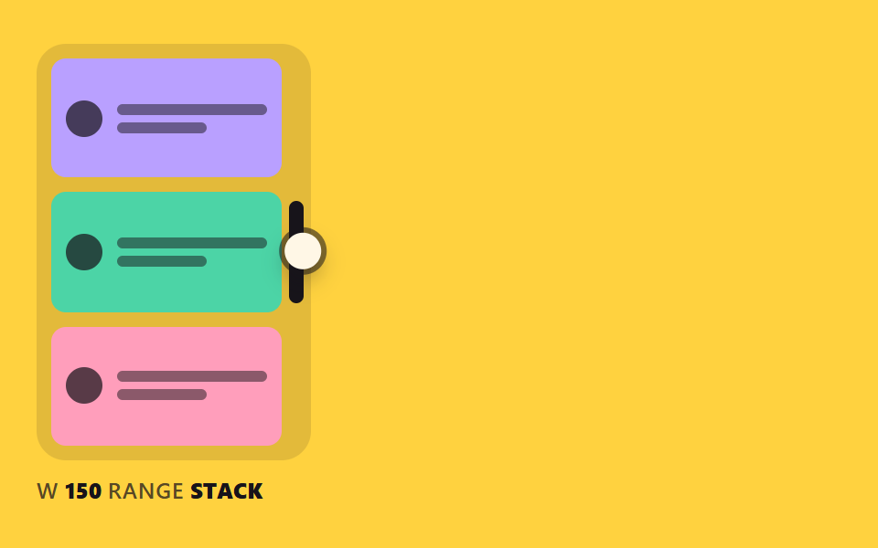
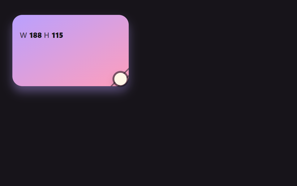
카드 폭을 컨테이너 기준 폭 조건으로 읽어 세 구간마다 세로·가로·격자로 바뀌고, 현재 폭과 구간 이름이 화면 아래에 실시간으로 뜬다.
쓰임반응형 컴포넌트 검수
BREAK_ABREAK_BRANGE_LABELcontainer-type
<main class="stage">
<div class="rh is-demo" id="rh" data-demo="1">
  <div class="rh__box" data-r="box">
    <div class="rh__cards">
      <div class="rh__card"><i></i><span><b></b><b></b></span></div>
      <div class="rh__card"><i></i><span><b></b><b></b></span></div>
      <div class="rh__card"><i></i><span><b></b><b></b></span></div>
    </div>
    <button class="rh__grip" data-r="grip" type="button" aria-label="크기 조절 손잡이"></button>
  </div>
  <p class="rh__meta"><span class="rh__tag">W</span> <b data-r="w">0</b> <span class="rh__tag">RANGE</span> <b data-r="range">STACK</b></p>
  <i class="rh__cursor" data-r="cursor"></i>
</div>
</main>
@use "../../../../site/static/demo-tokens" as *;
// 핵심: 상자 폭이 container-type: inline-size 의 기준이다. 폭 구간(150px, 250px)마다 카드 배치가 CSS 만으로 바뀐다.
@include stage($stage-yellow);
.rh {
position: relative;
box-sizing: border-box;
width: min(100%, 440px);
height: min(252px, calc(100vh - 2 * clamp(8px, 4vw, 24px)));
color: $subject-ink;
font-size: 12px;
line-height: 16px;
font-weight: 600;
user-select: none;
}
.rh b { font-weight: 800; font-variant-numeric: tabular-nums; }
.rh__tag { color: rgba($subject-ink, .72); letter-spacing: .5px; }
.rh__cursor {
position: absolute;
left: -10px;
top: -10px;
width: 20px;
height: 20px;
border-radius: 50%;
background: $subject-cream;
box-shadow: 0 0 0 3px rgba($subject-ink, .55), $shadow-press;
opacity: 0;
pointer-events: none;
z-index: 6;
}
.rh[data-demo] .rh__cursor { opacity: 1; }
.rh button:focus-visible { outline: 3px solid $subject-ink; outline-offset: 2px; }
@media (prefers-reduced-motion: reduce) {
.rh__cursor { display: none; }
}
// JS 의 BREAK_A·BREAK_B 와 아래 두 @container 경계는 같은 숫자다.
.rh__box {
position: absolute;
left: 0;
top: 0;
box-sizing: border-box;
height: calc(100% - 24px);
container-type: inline-size;
border-radius: $r-card;
background: rgba($subject-ink, .12);
}
.rh__cards {
position: absolute;
inset: $sp-2 $sp-4 $sp-2 $sp-2;
display: grid;
grid-template-columns: 1fr;
grid-auto-rows: 1fr;
gap: $sp-2;
overflow: hidden;
}
.rh__card {
box-sizing: border-box;
min-width: 0;
min-height: 0;
display: flex;
flex-direction: row;
align-items: center;
gap: $sp-2;
padding: $sp-2;
overflow: hidden;
border-radius: $r-sm;
background: $subject-lilac;
}
.rh__card:nth-child(2) { background: $subject-mint; }
.rh__card:nth-child(3) { background: $subject-pink; }
.rh__card i {
flex: none;
width: 20px;
height: 20px;
border-radius: 50%;
background: rgba($subject-ink, .72);
}
.rh__card span { display: grid; gap: $sp-1; min-width: 0; flex: 1; }
.rh__card b { display: block; height: 6px; border-radius: $r-xs; background: rgba($subject-ink, .5); }
.rh__card b:last-child { width: 60%; }
@container (min-width: 150px) {
.rh__cards { grid-template-columns: repeat(3, 1fr); grid-auto-rows: auto; }
.rh__card { flex-direction: column; align-items: flex-start; justify-content: flex-start; }
.rh__card span { width: 100%; flex: none; }
}
@container (min-width: 250px) {
.rh__cards { grid-template-columns: 1fr 1fr; grid-template-rows: 1.2fr 1fr; }
.rh__card:first-child { grid-column: 1 / -1; flex-direction: row; align-items: center; }
.rh__card:first-child i { width: 40px; height: 40px; }
.rh__card span { flex: 1; width: auto; }
}
.rh__grip {
position: absolute;
right: $sp-1;
top: 50%;
width: 8px;
height: 56px;
padding: 0;
border: 0;
border-radius: $r-pill;
background: $subject-ink;
transform: translateY(-50%);
cursor: ew-resize;
touch-action: none;
}
.rh__meta { position: absolute; left: 0; bottom: 0; margin: 0; }html, body {
margin: 0;
overflow: hidden;
}
.stage {
box-sizing: border-box;
min-height: 100vh;
display: grid;
place-items: center;
margin: 0;
background: #ffd23f;
font-family: -apple-system, "Segoe UI", "Noto Sans KR", sans-serif;
padding: clamp(8px, 4vw, 24px);
}
.rh {
position: relative;
box-sizing: border-box;
width: min(100%, 440px);
height: min(252px, 100vh - 2 * clamp(8px, 4vw, 24px));
color: #17141a;
font-size: 12px;
line-height: 16px;
font-weight: 600;
user-select: none;
}
.rh b {
font-weight: 800;
font-variant-numeric: tabular-nums;
}
.rh__tag {
color: rgba(23, 20, 26, 0.72);
letter-spacing: 0.5px;
}
.rh__cursor {
position: absolute;
left: -10px;
top: -10px;
width: 20px;
height: 20px;
border-radius: 50%;
background: #fff7e6;
box-shadow: 0 0 0 3px rgba(23, 20, 26, 0.55), 0 6px 12px rgba(23, 20, 26, 0.32);
opacity: 0;
pointer-events: none;
z-index: 6;
}
.rh[data-demo] .rh__cursor {
opacity: 1;
}
.rh button:focus-visible {
outline: 3px solid #17141a;
outline-offset: 2px;
}
@media (prefers-reduced-motion: reduce) {
.rh__cursor {
display: none;
}
}
.rh__box {
position: absolute;
left: 0;
top: 0;
box-sizing: border-box;
height: calc(100% - 24px);
container-type: inline-size;
border-radius: 16px;
background: rgba(23, 20, 26, 0.12);
}
.rh__cards {
position: absolute;
inset: 8px 16px 8px 8px;
display: grid;
grid-template-columns: 1fr;
grid-auto-rows: 1fr;
gap: 8px;
overflow: hidden;
}
.rh__card {
box-sizing: border-box;
min-width: 0;
min-height: 0;
display: flex;
flex-direction: row;
align-items: center;
gap: 8px;
padding: 8px;
overflow: hidden;
border-radius: 8px;
background: #b9a0ff;
}
.rh__card:nth-child(2) {
background: #4cd4a6;
}
.rh__card:nth-child(3) {
background: #ff9ebb;
}
.rh__card i {
flex: none;
width: 20px;
height: 20px;
border-radius: 50%;
background: rgba(23, 20, 26, 0.72);
}
.rh__card span {
display: grid;
gap: 4px;
min-width: 0;
flex: 1;
}
.rh__card b {
display: block;
height: 6px;
border-radius: 4px;
background: rgba(23, 20, 26, 0.5);
}
.rh__card b:last-child {
width: 60%;
}
@container (min-width: 150px) {
.rh__cards {
grid-template-columns: repeat(3, 1fr);
grid-auto-rows: auto;
}
.rh__card {
flex-direction: column;
align-items: flex-start;
justify-content: flex-start;
}
.rh__card span {
width: 100%;
flex: none;
}
}
@container (min-width: 250px) {
.rh__cards {
grid-template-columns: 1fr 1fr;
grid-template-rows: 1.2fr 1fr;
}
.rh__card:first-child {
grid-column: 1/-1;
flex-direction: row;
align-items: center;
}
.rh__card:first-child i {
width: 40px;
height: 40px;
}
.rh__card span {
flex: 1;
width: auto;
}
}
.rh__grip {
position: absolute;
right: 4px;
top: 50%;
width: 8px;
height: 56px;
padding: 0;
border: 0;
border-radius: 999px;
background: #17141a;
transform: translateY(-50%);
cursor: ew-resize;
touch-action: none;
}
.rh__meta {
position: absolute;
left: 0;
bottom: 0;
margin: 0;
}(function () {
const root = document.getElementById("rh");
const reduce = window.matchMedia("(prefers-reduced-motion: reduce)").matches;
let demo = !reduce;
let raf = 0;
let t0 = -1;
let last = -1;
const offs = [];
function q(sel) {
return root.querySelector(sel);
}
function clamp(v, lo, hi) {
return Math.max(lo, Math.min(hi, v));
}
function seg(t, a, b) {
const c = clamp((t - a) / (b - a), 0, 1);
return c * c * (3 - 2 * c);
}
function on(el, type, fn) {
el.addEventListener(type, fn);
offs.push(() => el.removeEventListener(type, fn));
}
function stopDemo() {
demo = false;
root.removeAttribute("data-demo");
root.classList.remove("is-demo");
}
function pos(e) {
const r = root.getBoundingClientRect();
return { x: e.clientX - r.left, y: e.clientY - r.top };
}
function spring(x, v, to, k, c, dt) {
const n = Math.max(1, Math.ceil(dt / 0.008));
const h = dt / n;
for (let i = 0; i < n; i += 1) {
v += (-k * (x - to) - c * v) * h;
x += v * h;
}
return [x, v];
}
function sync() {
if (reduce) {
snap();
render();
}
}
// 기법: 상자 너비 하나(cw)를 JS 가 끌고, 안쪽 배치는 CSS @container 가 너비 구간으로 바꾼다.
// 구간 이름은 JS 가 같은 경계값(BREAK_A, BREAK_B)으로 읽어 화면 밑에 적는다.
const BREAK_A = 150;
const BREAK_B = 250;
const RANGE_LABEL = ["STACK", "ROW", "GRID"];
const MIN_W = 96;
const FOLLOW = 16;
const box = q("[data-r=box]");
const grip = q("[data-r=grip]");
const wEl = q("[data-r=w]");
const rangeEl = q("[data-r=range]");
const cursor = q("[data-r=cursor]");
let cw = 0;
let tw = 0;
let px = 0;
let py = 0;
let gx = 0;
let dragging = false;
let ready = false;
function maxW() { return root.clientWidth - 8; }
function init() {
if (ready)
return;
ready = true;
tw = cw = root.clientWidth * 0.34;
}
function rangeOf(width) { return width < BREAK_A ? 0 : width < BREAK_B ? 1 : 2; }
function userTakes() {
stopDemo();
dragging = false;
init();
}
function script(now) {
const W = root.clientWidth;
const ph = now % 2000;
const a = W * 0.34;
const b = maxW();
let x = a;
if (ph >= 200 && ph < 760)
x = a + (b - a) * seg(ph, 200, 760);
else if (ph >= 760 && ph < 1100)
x = b;
else if (ph >= 1100 && ph < 1800)
x = b + (a - b) * seg(ph, 1100, 1800);
dragging = true;
px = x - 4;
py = root.clientHeight * 0.45;
gx = 4;
}
function snap() {
init();
cw = tw;
}
function step(dt, now) {
init();
if (demo)
script(now);
if (dragging)
tw = clamp(px + gx, MIN_W, maxW());
cw += (tw - cw) * (1 - Math.exp(-FOLLOW * dt));
}
function render() {
box.style.width = cw.toFixed(1) + "px";
wEl.textContent = String(Math.round(cw));
rangeEl.textContent = RANGE_LABEL[rangeOf(cw)];
cursor.style.transform = "translate(" + px.toFixed(1) + "px," + py.toFixed(1) + "px)";
}
on(grip, "pointerdown", (e) => {
userTakes();
grip.setPointerCapture(e.pointerId);
const p = pos(e);
px = p.x;
py = p.y;
gx = cw - p.x;
dragging = true;
});
on(grip, "pointermove", (e) => {
if (!dragging)
return;
px = pos(e).x;
tw = clamp(px + gx, MIN_W, maxW());
sync();
});
on(grip, "pointerup", () => { dragging = false; });
on(grip, "pointercancel", () => { dragging = false; });
on(grip, "keydown", (e) => {
if (e.key !== "ArrowLeft" && e.key !== "ArrowRight")
return;
e.preventDefault();
userTakes();
tw = clamp(tw + (e.key === "ArrowRight" ? 16 : -16), MIN_W, maxW());
sync();
});
function frame(ts) {
if (t0 < 0) {
t0 = ts;
last = ts;
}
const dt = Math.min(0.05, (ts - last) / 1000);
last = ts;
step(dt, ts - t0);
render();
raf = requestAnimationFrame(frame);
}
if (reduce) {
stopDemo();
snap();
render();
}
else {
raf = requestAnimationFrame(frame);
}
return () => {
cancelAnimationFrame(raf);
offs.forEach((f) => f());
};
})();// ContainerReflowReadout - vanilla 판(07-rh-container-reflow-readout) 의 React 포트. 같은 계산을 useEffect 안에서 돌린다.
import { useEffect, useRef } from "react";
import styles from "./ContainerReflowReadout.module.scss";
export default function ContainerReflowReadout() {
const rootRef = useRef<HTMLDivElement | null>(null);
useEffect(() => {
const rootEl = rootRef.current;
if (!rootEl) return;
const root: HTMLElement = rootEl;
const reduce = window.matchMedia("(prefers-reduced-motion: reduce)").matches;
let demo = !reduce;
let raf = 0;
let t0 = -1;
let last = -1;
const offs: Array<() => void> = [];
function q<T extends Element>(sel: string): T {
return root.querySelector(sel) as T;
}
function clamp(v: number, lo: number, hi: number): number {
return Math.max(lo, Math.min(hi, v));
}
function seg(t: number, a: number, b: number): number {
const c = clamp((t - a) / (b - a), 0, 1);
return c * c * (3 - 2 * c);
}
function on(el: EventTarget, type: string, fn: (e: any) => void): void {
el.addEventListener(type, fn);
offs.push(() => el.removeEventListener(type, fn));
}
function stopDemo(): void {
demo = false;
root.removeAttribute("data-demo");
root.classList.remove("is-demo");
}
function pos(e: PointerEvent): { x: number; y: number } {
const r = root.getBoundingClientRect();
return { x: e.clientX - r.left, y: e.clientY - r.top };
}
function spring(x: number, v: number, to: number, k: number, c: number, dt: number): number[] {
const n = Math.max(1, Math.ceil(dt / 0.008));
const h = dt / n;
for (let i = 0; i < n; i += 1) {
v += (-k * (x - to) - c * v) * h;
x += v * h;
}
return [x, v];
}
function sync(): void {
if (reduce) {
snap();
render();
}
}
// 기법: 상자 너비 하나(cw)를 JS 가 끌고, 안쪽 배치는 CSS @container 가 너비 구간으로 바꾼다.
// 구간 이름은 JS 가 같은 경계값(BREAK_A, BREAK_B)으로 읽어 화면 밑에 적는다.
const BREAK_A = 150;
const BREAK_B = 250;
const RANGE_LABEL = ["STACK", "ROW", "GRID"];
const MIN_W = 96;
const FOLLOW = 16;
const box = q<HTMLElement>("[data-r=box]");
const grip = q<HTMLElement>("[data-r=grip]");
const wEl = q<HTMLElement>("[data-r=w]");
const rangeEl = q<HTMLElement>("[data-r=range]");
const cursor = q<HTMLElement>("[data-r=cursor]");
let cw = 0;
let tw = 0;
let px = 0;
let py = 0;
let gx = 0;
let dragging = false;
let ready = false;
function maxW(): number { return root.clientWidth - 8; }
function init(): void {
if (ready) return;
ready = true;
tw = cw = root.clientWidth * 0.34;
}
function rangeOf(width: number): number { return width < BREAK_A ? 0 : width < BREAK_B ? 1 : 2; }
function userTakes(): void {
stopDemo();
dragging = false;
init();
}
function script(now: number): void {
const W = root.clientWidth;
const ph = now % 2000;
const a = W * 0.34;
const b = maxW();
let x = a;
if (ph >= 200 && ph < 760) x = a + (b - a) * seg(ph, 200, 760);
else if (ph >= 760 && ph < 1100) x = b;
else if (ph >= 1100 && ph < 1800) x = b + (a - b) * seg(ph, 1100, 1800);
dragging = true;
px = x - 4;
py = root.clientHeight * 0.45;
gx = 4;
}
function snap(): void {
init();
cw = tw;
}
function step(dt: number, now: number): void {
init();
if (demo) script(now);
if (dragging) tw = clamp(px + gx, MIN_W, maxW());
cw += (tw - cw) * (1 - Math.exp(-FOLLOW * dt));
}
function render(): void {
box.style.width = cw.toFixed(1) + "px";
wEl.textContent = String(Math.round(cw));
rangeEl.textContent = RANGE_LABEL[rangeOf(cw)];
cursor.style.transform = "translate(" + px.toFixed(1) + "px," + py.toFixed(1) + "px)";
}
on(grip, "pointerdown", (e: PointerEvent) => {
userTakes();
grip.setPointerCapture(e.pointerId);
const p = pos(e);
px = p.x;
py = p.y;
gx = cw - p.x;
dragging = true;
});
on(grip, "pointermove", (e: PointerEvent) => {
if (!dragging) return;
px = pos(e).x;
tw = clamp(px + gx, MIN_W, maxW());
sync();
});
on(grip, "pointerup", () => { dragging = false; });
on(grip, "pointercancel", () => { dragging = false; });
on(grip, "keydown", (e: KeyboardEvent) => {
if (e.key !== "ArrowLeft" && e.key !== "ArrowRight") return;
e.preventDefault();
userTakes();
tw = clamp(tw + (e.key === "ArrowRight" ? 16 : -16), MIN_W, maxW());
sync();
});
function frame(ts: number): void {
if (t0 < 0) {
t0 = ts;
last = ts;
}
const dt = Math.min(0.05, (ts - last) / 1000);
last = ts;
step(dt, ts - t0);
render();
raf = requestAnimationFrame(frame);
}
if (reduce) {
stopDemo();
snap();
render();
} else {
raf = requestAnimationFrame(frame);
}
return () => {
cancelAnimationFrame(raf);
offs.forEach((f) => f());
};
}, []);
return (
<main className={styles["stage"]}>
<div ref={rootRef} className={styles["rh"] + " is-demo"} data-demo="1">
<div className={styles["rh__box"]} data-r="box">
<div className={styles["rh__cards"]}>
<div className={styles["rh__card"]}><i></i><span><b></b><b></b></span></div>
<div className={styles["rh__card"]}><i></i><span><b></b><b></b></span></div>
<div className={styles["rh__card"]}><i></i><span><b></b><b></b></span></div>
</div>
<button className={styles["rh__grip"]} data-r="grip" type="button" aria-label="크기 조절 손잡이"></button>
</div>
<p className={styles["rh__meta"]}><span className={styles["rh__tag"]}>W</span> <b data-r="w">0</b> <span className={styles["rh__tag"]}>RANGE</span> <b data-r="range">STACK</b></p>
<i className={styles["rh__cursor"]} data-r="cursor"></i>
</div>
</main>
);
}07 폭이 바뀌는 대로 배치가 갈아입는 카드 — 측정 누적면적 65.505% · 움직인 프레임 23/23GODRICH 원작 · zip 에 SCSS·React 포함 · css resize handle 9가지 — 모서리를 끌면 상자가 손에 붙어 따라온다
이 데모가 속한 글
 css resize handle 9가지 — 모서리를 끌면 상자가 손에 붙어 따라온다css resize handle 을 resize 속성 하나로만 두면 손잡이 모양은 못 바꾸고, 줄 높이에 안 맞고, 한계를 넘기면 그냥 막힌다 — 09번·02번·06번이 계산으로 푼다. 아래 아홉 장면은 상자·표 열 이 글의 데모 전부 보기