06고개 젓는 실패
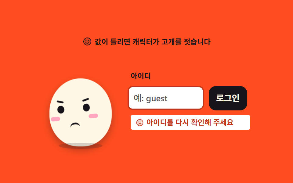
값이 틀리면 캐릭터가 고개를 좌우로 젓고 입력칸이 같은 박자로 흔들립니다. 표정은 한 프레임에 바뀌어 중간 얼굴이 생기지 않습니다.
쓰임비밀번호 오류·중복 아이디처럼 다시 입력해야 하는 폼 실패 자리
translateXsteps(1, end)aria-liveanimation-name
<svg width="0" height="0" style="position:absolute" aria-hidden="true">
  <defs>
    <symbol id="ico-smiley" viewBox="0 0 256 256" fill="currentColor"><path d="M224 128a96 96 0 1 1-96-96a96 96 0 0 1 96 96" opacity=".2"/><path d="M128 24a104 104 0 1 0 104 104A104.11 104.11 0 0 0 128 24m0 192a88 88 0 1 1 88-88a88.1 88.1 0 0 1-88 88M80 108a12 12 0 1 1 12 12a12 12 0 0 1-12-12m96 0a12 12 0 1 1-12-12a12 12 0 0 1 12 12m-1.08 48c-10.29 17.79-27.39 28-46.92 28s-36.63-10.2-46.92-28a8 8 0 1 1 13.84-8c7.47 12.91 19.21 20 33.08 20s25.61-7.1 33.08-20a8 8 0 1 1 13.84 8"/></symbol>
    <symbol id="ico-smiley-sad" viewBox="0 0 256 256" fill="currentColor"><path d="M224 128a96 96 0 1 1-96-96a96 96 0 0 1 96 96" opacity=".2"/><path d="M128 24a104 104 0 1 0 104 104A104.11 104.11 0 0 0 128 24m0 192a88 88 0 1 1 88-88a88.1 88.1 0 0 1-88 88M80 108a12 12 0 1 1 12 12a12 12 0 0 1-12-12m96 0a12 12 0 1 1-12-12a12 12 0 0 1 12 12m-1.08 64a8 8 0 1 1-13.84 8c-7.47-12.91-19.21-20-33.08-20s-25.61 7.1-33.08 20a8 8 0 1 1-13.84-8c10.29-17.79 27.39-28 46.92-28s36.63 10.2 46.92 28"/></symbol>
  </defs>
</svg>
<main class="stage">
<div class="mb is-demo" id="mb">
  <p class="mb__hint">
    <svg class="mb__ico" aria-hidden="true"><use href="#ico-smiley"/></svg>
    <span>값이 틀리면 캐릭터가 고개를 젓습니다</span>
  </p>

  <div class="mb__row">
    <!-- 캐릭터는 아이콘이 아니라 이 데모의 피사체라 손으로 그린다 (01 과 같은 몸·이목구비).
         얼굴은 두 벌(웃는·슬픈)을 겹쳐 두고 steps(1, end) 로 한 프레임에 갈아 끼운다. -->
    <div class="mb__char" aria-label="고개를 젓는 마스코트" role="img">
      <span class="mb__body">
        <span class="mb__head">
          <span class="mb__face mb__face--ok">
            <i class="mb__eye mb__eye--l"></i>
            <i class="mb__eye mb__eye--r"></i>
            <i class="mb__cheek mb__cheek--l"></i>
            <i class="mb__cheek mb__cheek--r"></i>
            <i class="mb__mouth mb__mouth--smile"></i>
          </span>
          <span class="mb__face mb__face--no">
            <i class="mb__eye mb__eye--l"></i>
            <i class="mb__eye mb__eye--r"></i>
            <i class="mb__brow mb__brow--l"></i>
            <i class="mb__brow mb__brow--r"></i>
            <i class="mb__cheek mb__cheek--l"></i>
            <i class="mb__cheek mb__cheek--r"></i>
            <i class="mb__mouth mb__mouth--frown"></i>
          </span>
        </span>
      </span>
      <span class="mb__shadow"></span>
    </div>

    <div class="mb__form">
      <label class="mb__label" for="mbField">아이디</label>
      <div class="mb__box">
        <input class="mb__input" id="mbField" type="text" placeholder="예: guest" autocomplete="off">
        <button class="mb__go" id="mbGo" type="button">로그인</button>
      </div>
      <!-- 오류는 색(테두리)만으로 알리지 않고 글자로도 말한다 (WCAG 1.4.1).
           role="alert" 는 assertive 실시간 영역 — 글이 나타나는 순간 스크린 리더가 읽는다.
           자리는 처음부터 확보(visibility 토글)해 등장할 때 줄이 튀지 않게 한다. -->
      <p class="mb__error" id="mbErr" role="alert" aria-live="assertive">
        <svg class="mb__errIco" aria-hidden="true"><use href="#ico-smiley-sad"/></svg>
        <span>아이디를 다시 확인해 주세요</span>
      </p>
    </div>
  </div>
</div>
</main>@use "../../../../site/static/demo-tokens" as *;
// 고개 젓는 실패 — 값이 틀리면 얼굴이 좌우로 흔들리고 입력칸이 같은 박자로 덜컹인다.
// 표정 교체(웃는 얼굴 → 슬픈 얼굴)와 오류 문구·테두리는 steps(1, end) 로 한 프레임에 컷 —
// 반쯤 섞인 중간 얼굴이 유령 프레임으로 남지 않게 한다(237 실측).
// 컷만 있으면 움직인 프레임이 두세 장으로 떨어지므로(BD3), 컷은 상태(큰 면적)에만 쓰고
// 흔들림(transform)은 보간으로 채워 프레임을 만든다.
$duration: $dur-loop;
$easing: $ease-spring;
$color: $subject-cream; // 몸색 — 주황 무대 위 크림 몸 (01 과 같은 캐릭터)
@include stage($stage-orange);
.mb { display: flex; flex-direction: column; align-items: center; gap: $sp-3; width: 100%; max-width: 340px; }
.mb__hint {
display: flex; align-items: center; gap: $sp-1; margin: 0;
font-weight: 700; font-size: clamp(10px, 2.8vw, 12px); line-height: 1.4; color: $subject-ink;
}
.mb__ico { width: 16px; height: 16px; flex: 0 0 auto; color: $subject-ink; }
.mb__row { display: flex; align-items: center; justify-content: center; gap: $sp-5; width: 100%; }
// ── 캐릭터 (01 과 같은 몸 — 타원 하나에 이목구비) ───────────────────
.mb__char { position: relative; width: 124px; height: 152px; display: grid; place-items: end center; flex: 0 0 auto; }
.mb__body {
position: relative; display: block; width: 100px; height: 114px;
border-radius: 50% 50% 46% 46%;
background: $color;
transform-origin: 50% 100%; // 발바닥이 바닥에 붙어 있다 — 붙는 지점이 있는 요소라 중심 아님 (규칙 8 예외)
box-shadow: $shadow-press;
}
// 고개 — 얼굴 두 벌을 겹쳐 담는 그룹. 흔들림(translateX + rotate)은 이 그룹에.
.mb__head { position: absolute; inset: 0; transform-origin: 50% 86%; // 원점은 목 — 고개를 젓는 축이라 중심 아님 (규칙 8 예외)
}
.mb__face { position: absolute; inset: 0; }
.mb__eye {
position: absolute; top: 44px; width: 11px; height: 13px;
border-radius: 50%; background: $subject-ink;
}
.mb__eye--l { left: 24px; }
.mb__eye--r { right: 24px; }
.mb__brow {
position: absolute; top: 36px; width: 11px; height: 3px;
border-radius: $r-pill; background: $subject-ink;
}
.mb__brow--l { left: 24px; transform: rotate(16deg); }
.mb__brow--r { right: 24px; transform: rotate(-16deg); }
.mb__cheek {
position: absolute; top: 62px; width: 15px; height: 7px;
border-radius: $r-pill; background: $subject-pink; opacity: .9;
}
.mb__cheek--l { left: 12px; }
.mb__cheek--r { right: 12px; }
.mb__mouth {
position: absolute; left: 50%; margin-left: -8px; width: 16px; height: 9px;
}
.mb__mouth--smile { top: 68px; border-bottom: 3px solid $subject-ink; border-radius: 0 0 $r-pill $r-pill; }
.mb__mouth--frown { top: 74px; border-top: 3px solid $subject-ink; border-radius: $r-pill $r-pill 0 0; }
.mb__shadow {
position: absolute; left: 50%; bottom: -4px; width: 72px; height: 10px; margin-left: -36px;
border-radius: 50%;
background: rgba(23, 20, 26, .18);
}
// ── 폼 ───────────────────────────────────────────────────────
.mb__form { display: flex; flex-direction: column; gap: $sp-2; flex: 1 1 auto; min-width: 0; }
.mb__label { margin: 0; font-weight: 700; font-size: clamp(10px, 2.6vw, 12px); line-height: 1.4; color: $subject-ink; }
.mb__box { display: flex; align-items: stretch; gap: $sp-2; }
.mb__input {
flex: 1 1 auto; min-width: 0; box-sizing: border-box;
padding: $sp-2; border: 2px solid rgba($subject-ink, .25); border-radius: $r-sm;
background: $stage-paper; color: $subject-ink;
font-weight: 500; font-size: clamp(12px, 3vw, 14px); line-height: 1.4; font-family: inherit;
}
.mb__input::placeholder { color: rgba($subject-ink, .72); } // 알파 흐림이 아니라 7.27:1 색으로 (대비 규칙)
.mb__go {
flex: 0 0 auto; padding: $sp-2 $sp-3; border: 0; border-radius: $r-control;
background: $subject-ink; color: $subject-cream; cursor: pointer;
font-weight: 700; font-size: clamp(12px, 3vw, 14px); line-height: 1.4; font-family: inherit;
}
.mb__input:focus-visible, .mb__go:focus-visible { outline: 2px solid $subject-ink; outline-offset: 2px; }
// 오류 문구 — 페이퍼 면을 깔고 그 위에 $error 글자(5.37:1). 색만이 아니라 글자로도 알린다.
// 자리는 visibility 로 토글 — display 바꾸면 폭이 무너진다 (274 실측).
.mb__error {
display: flex; align-items: center; gap: $sp-1; margin: 0;
padding: $sp-1 $sp-2; border-radius: $r-xs;
background: $stage-paper; color: $error;
font-weight: 700; font-size: clamp(10px, 2.6vw, 12px); line-height: 1.4;
visibility: hidden;
}
.mb__errIco { width: 14px; height: 14px; flex: 0 0 auto; color: $error; }
// 정적 경로 — JS 가 붙이는 is-no / is-shake 로만 상태가 바뀐다 (.is-demo 를 떼고도 성립)
.mb.is-no .mb__face--ok { visibility: hidden; }
.mb.is-no .mb__face--no { visibility: visible; }
.mb.is-no .mb__error { visibility: visible; }
.mb.is-no .mb__input { border-color: $error; }
// ── 미리보기 루프 (2초 안에: 확인 누름 → 컷 → 고개 젓기 + 칸 흔들림) ──
// 시차를 주지 않으므로 animation: 단축 대신 낱개 속성만 쓴다 (240 실측: 단축은 delay 를 0으로 리셋).
@keyframes sePress { // 버튼 누름 신호 — 이 장면의 방아쇠
0% { transform: scale(1); }
3% { transform: scale(.94); }
7%, 100% { transform: scale(1); }
}
@keyframes seBody { // 몸은 얼굴과 반대 위상으로 살짝 눌린다 (흔들림의 무게중심)
0% { transform: scale(1, 1); }
6% { transform: scale(.99, 1.02); }
11% { transform: scale(1, 1); }
18% { transform: scale(1.03, .97); }
26% { transform: scale(1, 1); }
34% { transform: scale(1.02, .98); }
42%, 100% { transform: scale(1, 1); }
}
@keyframes seHead { // 고개 젓기 — 상태 컷(12%)과 동시에 시작해 72% 에 진정
0%, 11% { transform: translateX(0) rotate(0deg); }
18% { transform: translateX(-10px) rotate(-7deg); }
26% { transform: translateX(10px) rotate(7deg); }
34% { transform: translateX(-9px) rotate(-6deg); }
42% { transform: translateX(9px) rotate(6deg); }
48% { transform: translateX(-7px) rotate(-5deg); }
54% { transform: translateX(7px) rotate(5deg); }
60% { transform: translateX(-4px) rotate(-3deg); }
66% { transform: translateX(4px) rotate(3deg); }
72%, 100% { transform: translateX(0) rotate(0deg); }
}
@keyframes seBox { // 입력칸 — 고개와 같은 박자(18·26·34·42·48·54·60%) 로 덜컹인다
0%, 11% { transform: translateX(0); }
18% { transform: translateX(-7px); }
26% { transform: translateX(7px); }
34% { transform: translateX(-6px); }
42% { transform: translateX(6px); }
48% { transform: translateX(-4px); }
54% { transform: translateX(4px); }
60% { transform: translateX(-2px); }
66% { transform: translateX(2px); }
72%, 100% { transform: translateX(0); }
}
// 상태 교체는 전부 같은 지점(11% → 12%)에서 한 프레임에 컷 — steps(1, end) 가 지켜 준다
@keyframes seFaceOk { 0%, 11% { visibility: visible; } 12%, 100% { visibility: hidden; } }
@keyframes seFaceNo { 0%, 11% { visibility: hidden; } 12%, 100% { visibility: visible; } }
@keyframes seErrIn { 0%, 11% { visibility: hidden; } 12%, 100% { visibility: visible; } }
@keyframes seEdge { 0%, 11% { border-color: rgba($subject-ink, .25); } 12%, 100% { border-color: $error; } }
// 진정한 뒤(78%) 슬픈 얼굴로 한 번 깜빡인다 — 뒤반의 프레임을 채우는 컷 (반쯤 감긴 유령 없음)
@keyframes seBlink2 {
0%, 76% { transform: scaleY(1); }
78%, 82% { transform: scaleY(.08); }
84%, 100% { transform: scaleY(1); }
}
.mb.is-demo .mb__go {
animation-name: sePress;
animation-duration: $duration;
animation-timing-function: $ease-pop;
animation-iteration-count: infinite;
}
.mb.is-demo .mb__body {
animation-name: seBody;
animation-duration: $duration;
animation-timing-function: $easing;
animation-iteration-count: infinite;
}
.mb.is-demo .mb__head {
animation-name: seHead;
animation-duration: $duration;
animation-timing-function: $easing;
animation-iteration-count: infinite;
}
.mb.is-demo .mb__box {
animation-name: seBox;
animation-duration: $duration;
animation-timing-function: $easing;
animation-iteration-count: infinite;
}
.mb.is-demo .mb__face--ok { animation-name: seFaceOk; animation-duration: $duration; animation-timing-function: steps(1, end); animation-iteration-count: infinite; }
.mb.is-demo .mb__face--no { animation-name: seFaceNo; animation-duration: $duration; animation-timing-function: steps(1, end); animation-iteration-count: infinite; }
.mb.is-demo .mb__error { animation-name: seErrIn; animation-duration: $duration; animation-timing-function: steps(1, end); animation-iteration-count: infinite; }
.mb.is-demo .mb__input { animation-name: seEdge; animation-duration: $duration; animation-timing-function: steps(1, end); animation-iteration-count: infinite; }
.mb.is-demo .mb__eye {
transform-origin: 50% 50%;
animation-name: seBlink2;
animation-duration: $duration;
animation-timing-function: steps(1, end);
animation-iteration-count: infinite;
}
// 실제 조작 — 확인을 누르면 640ms 흔들림이 한 번 재생되고 animationend 로 클래스가 떨어진다
@keyframes seHeadQ {
0% { transform: translateX(-10px) rotate(-7deg); }
9% { transform: translateX(10px) rotate(7deg); }
18% { transform: translateX(-9px) rotate(-6deg); }
27% { transform: translateX(9px) rotate(6deg); }
36% { transform: translateX(-7px) rotate(-5deg); }
45% { transform: translateX(7px) rotate(5deg); }
55% { transform: translateX(-4px) rotate(-3deg); }
64% { transform: translateX(4px) rotate(3deg); }
73%, 100% { transform: translateX(0) rotate(0deg); }
}
@keyframes seBoxQ {
0% { transform: translateX(-7px); }
9% { transform: translateX(7px); }
18% { transform: translateX(-6px); }
27% { transform: translateX(6px); }
36% { transform: translateX(-4px); }
45% { transform: translateX(4px); }
55% { transform: translateX(-2px); }
64% { transform: translateX(2px); }
73%, 100% { transform: translateX(0); }
}
@keyframes seBodyQ {
0% { transform: scale(1.03, .97); }
9% { transform: scale(1, 1); }
18% { transform: scale(1.02, .98); }
27%, 100% { transform: scale(1, 1); }
}
.mb.is-shake .mb__head {
animation-name: seHeadQ; animation-duration: 640ms; animation-timing-function: $easing; animation-iteration-count: 1;
}
.mb.is-shake .mb__box {
animation-name: seBoxQ; animation-duration: 640ms; animation-timing-function: $easing; animation-iteration-count: 1;
}
.mb.is-shake .mb__body {
animation-name: seBodyQ; animation-duration: 640ms; animation-timing-function: $easing; animation-iteration-count: 1;
}
@media (max-width: 340px) {
.mb { gap: $sp-2; }
.mb__row { gap: $sp-3; }
// 무대가 grid 라 .mb 는 grid item 의 자동 최소크기(min-content)로 버틴다 — 풀지 않으면
// 폼·input 이 아무리 줄어도 줄 전체가 309px 로 고정돼 320px 무대에서 가로로 넘친다 (BD9 실측 328px).
// input 의 size 속성 내재 최소폭(약 177px)도 함께 푼다. 흔들림 translateX 여유까지 이 안에 든다.
.mb { min-width: 0; }
.mb__form, .mb__box, .mb__input { min-width: 0; }
.mb__error, .mb__label { overflow-wrap: anywhere; }
.mb__char { width: 96px; height: 122px; }
.mb__body { width: 78px; height: 90px; }
.mb__eye { top: 34px; width: 9px; height: 11px; }
.mb__eye--l { left: 17px; }
.mb__eye--r { right: 17px; }
.mb__brow { top: 27px; width: 9px; }
.mb__brow--l { left: 17px; }
.mb__brow--r { right: 17px; }
.mb__cheek { top: 49px; width: 12px; }
.mb__cheek--l { left: 9px; }
.mb__cheek--r { right: 9px; }
.mb__mouth--smile { top: 54px; }
.mb__mouth--frown { top: 58px; }
.mb__shadow { width: 56px; margin-left: -28px; }
.mb__go { padding: $sp-1 $sp-2; }
.mb__error { padding: $sp-1; }
}
// reduce — 미리보기 운동을 끊고 '틀렸을 때' 한 장으로 보여 준다. 특이도를 이기려 !important
@media (prefers-reduced-motion: reduce) {
.mb.is-demo .mb__go,
.mb.is-demo .mb__body,
.mb.is-demo .mb__head,
.mb.is-demo .mb__box,
.mb.is-demo .mb__face--ok,
.mb.is-demo .mb__face--no,
.mb.is-demo .mb__error,
.mb.is-demo .mb__input,
.mb.is-demo .mb__eye,
.mb.is-shake .mb__head,
.mb.is-shake .mb__box,
.mb.is-shake .mb__body { animation: none !important; }
.mb.is-demo .mb__error { visibility: visible !important; }
.mb.is-demo .mb__face--ok { visibility: hidden !important; }
.mb.is-demo .mb__face--no { visibility: visible !important; }
.mb.is-demo .mb__input { border-color: $error !important; }
}html, body {
margin: 0;
overflow: hidden;
}
.stage {
box-sizing: border-box;
min-height: 100vh;
display: grid;
place-items: center;
margin: 0;
background: #ff4d1f;
font-family: -apple-system, "Segoe UI", "Noto Sans KR", sans-serif;
padding: clamp(8px, 4vw, 24px);
}
.mb {
display: flex;
flex-direction: column;
align-items: center;
gap: 12px;
width: 100%;
max-width: 340px;
}
.mb__hint {
display: flex;
align-items: center;
gap: 4px;
margin: 0;
font-weight: 700;
font-size: clamp(10px, 2.8vw, 12px);
line-height: 1.4;
color: #17141a;
}
.mb__ico {
width: 16px;
height: 16px;
flex: 0 0 auto;
color: #17141a;
}
.mb__row {
display: flex;
align-items: center;
justify-content: center;
gap: 20px;
width: 100%;
}
.mb__char {
position: relative;
width: 124px;
height: 152px;
display: grid;
place-items: end center;
flex: 0 0 auto;
}
.mb__body {
position: relative;
display: block;
width: 100px;
height: 114px;
border-radius: 50% 50% 46% 46%;
background: #fff7e6;
transform-origin: 50% 100%;
box-shadow: 0 6px 12px rgba(23, 20, 26, 0.32);
}
.mb__head {
position: absolute;
inset: 0;
transform-origin: 50% 86%;
}
.mb__face {
position: absolute;
inset: 0;
}
.mb__eye {
position: absolute;
top: 44px;
width: 11px;
height: 13px;
border-radius: 50%;
background: #17141a;
}
.mb__eye--l {
left: 24px;
}
.mb__eye--r {
right: 24px;
}
.mb__brow {
position: absolute;
top: 36px;
width: 11px;
height: 3px;
border-radius: 999px;
background: #17141a;
}
.mb__brow--l {
left: 24px;
transform: rotate(16deg);
}
.mb__brow--r {
right: 24px;
transform: rotate(-16deg);
}
.mb__cheek {
position: absolute;
top: 62px;
width: 15px;
height: 7px;
border-radius: 999px;
background: #ff9ebb;
opacity: 0.9;
}
.mb__cheek--l {
left: 12px;
}
.mb__cheek--r {
right: 12px;
}
.mb__mouth {
position: absolute;
left: 50%;
margin-left: -8px;
width: 16px;
height: 9px;
}
.mb__mouth--smile {
top: 68px;
border-bottom: 3px solid #17141a;
border-radius: 0 0 999px 999px;
}
.mb__mouth--frown {
top: 74px;
border-top: 3px solid #17141a;
border-radius: 999px 999px 0 0;
}
.mb__shadow {
position: absolute;
left: 50%;
bottom: -4px;
width: 72px;
height: 10px;
margin-left: -36px;
border-radius: 50%;
background: rgba(23, 20, 26, 0.18);
}
.mb__form {
display: flex;
flex-direction: column;
gap: 8px;
flex: 1 1 auto;
min-width: 0;
}
.mb__label {
margin: 0;
font-weight: 700;
font-size: clamp(10px, 2.6vw, 12px);
line-height: 1.4;
color: #17141a;
}
.mb__box {
display: flex;
align-items: stretch;
gap: 8px;
}
.mb__input {
flex: 1 1 auto;
min-width: 0;
box-sizing: border-box;
padding: 8px;
border: 2px solid rgba(23, 20, 26, 0.25);
border-radius: 8px;
background: #ffffff;
color: #17141a;
font-weight: 500;
font-size: clamp(12px, 3vw, 14px);
line-height: 1.4;
font-family: inherit;
}
.mb__input::placeholder {
color: rgba(23, 20, 26, 0.72);
}
.mb__go {
flex: 0 0 auto;
padding: 8px 12px;
border: 0;
border-radius: 12px;
background: #17141a;
color: #fff7e6;
cursor: pointer;
font-weight: 700;
font-size: clamp(12px, 3vw, 14px);
line-height: 1.4;
font-family: inherit;
}
.mb__input:focus-visible, .mb__go:focus-visible {
outline: 2px solid #17141a;
outline-offset: 2px;
}
.mb__error {
display: flex;
align-items: center;
gap: 4px;
margin: 0;
padding: 4px 8px;
border-radius: 4px;
background: #ffffff;
color: #c2361a;
font-weight: 700;
font-size: clamp(10px, 2.6vw, 12px);
line-height: 1.4;
visibility: hidden;
}
.mb__errIco {
width: 14px;
height: 14px;
flex: 0 0 auto;
color: #c2361a;
}
.mb.is-no .mb__face--ok {
visibility: hidden;
}
.mb.is-no .mb__face--no {
visibility: visible;
}
.mb.is-no .mb__error {
visibility: visible;
}
.mb.is-no .mb__input {
border-color: #c2361a;
}
@keyframes sePress {
0% {
transform: scale(1);
}
3% {
transform: scale(0.94);
}
7%, 100% {
transform: scale(1);
}
}
@keyframes seBody {
0% {
transform: scale(1, 1);
}
6% {
transform: scale(0.99, 1.02);
}
11% {
transform: scale(1, 1);
}
18% {
transform: scale(1.03, 0.97);
}
26% {
transform: scale(1, 1);
}
34% {
transform: scale(1.02, 0.98);
}
42%, 100% {
transform: scale(1, 1);
}
}
@keyframes seHead {
0%, 11% {
transform: translateX(0) rotate(0deg);
}
18% {
transform: translateX(-10px) rotate(-7deg);
}
26% {
transform: translateX(10px) rotate(7deg);
}
34% {
transform: translateX(-9px) rotate(-6deg);
}
42% {
transform: translateX(9px) rotate(6deg);
}
48% {
transform: translateX(-7px) rotate(-5deg);
}
54% {
transform: translateX(7px) rotate(5deg);
}
60% {
transform: translateX(-4px) rotate(-3deg);
}
66% {
transform: translateX(4px) rotate(3deg);
}
72%, 100% {
transform: translateX(0) rotate(0deg);
}
}
@keyframes seBox {
0%, 11% {
transform: translateX(0);
}
18% {
transform: translateX(-7px);
}
26% {
transform: translateX(7px);
}
34% {
transform: translateX(-6px);
}
42% {
transform: translateX(6px);
}
48% {
transform: translateX(-4px);
}
54% {
transform: translateX(4px);
}
60% {
transform: translateX(-2px);
}
66% {
transform: translateX(2px);
}
72%, 100% {
transform: translateX(0);
}
}
@keyframes seFaceOk {
0%, 11% {
visibility: visible;
}
12%, 100% {
visibility: hidden;
}
}
@keyframes seFaceNo {
0%, 11% {
visibility: hidden;
}
12%, 100% {
visibility: visible;
}
}
@keyframes seErrIn {
0%, 11% {
visibility: hidden;
}
12%, 100% {
visibility: visible;
}
}
@keyframes seEdge {
0%, 11% {
border-color: rgba(23, 20, 26, 0.25);
}
12%, 100% {
border-color: #c2361a;
}
}
@keyframes seBlink2 {
0%, 76% {
transform: scaleY(1);
}
78%, 82% {
transform: scaleY(0.08);
}
84%, 100% {
transform: scaleY(1);
}
}
.mb.is-demo .mb__go {
animation-name: sePress;
animation-duration: 2s;
animation-timing-function: cubic-bezier(0.2, 1.4, 0.4, 1);
animation-iteration-count: infinite;
}
.mb.is-demo .mb__body {
animation-name: seBody;
animation-duration: 2s;
animation-timing-function: cubic-bezier(0.2, 0.8, 0.2, 1);
animation-iteration-count: infinite;
}
.mb.is-demo .mb__head {
animation-name: seHead;
animation-duration: 2s;
animation-timing-function: cubic-bezier(0.2, 0.8, 0.2, 1);
animation-iteration-count: infinite;
}
.mb.is-demo .mb__box {
animation-name: seBox;
animation-duration: 2s;
animation-timing-function: cubic-bezier(0.2, 0.8, 0.2, 1);
animation-iteration-count: infinite;
}
.mb.is-demo .mb__face--ok {
animation-name: seFaceOk;
animation-duration: 2s;
animation-timing-function: steps(1, end);
animation-iteration-count: infinite;
}
.mb.is-demo .mb__face--no {
animation-name: seFaceNo;
animation-duration: 2s;
animation-timing-function: steps(1, end);
animation-iteration-count: infinite;
}
.mb.is-demo .mb__error {
animation-name: seErrIn;
animation-duration: 2s;
animation-timing-function: steps(1, end);
animation-iteration-count: infinite;
}
.mb.is-demo .mb__input {
animation-name: seEdge;
animation-duration: 2s;
animation-timing-function: steps(1, end);
animation-iteration-count: infinite;
}
.mb.is-demo .mb__eye {
transform-origin: 50% 50%;
animation-name: seBlink2;
animation-duration: 2s;
animation-timing-function: steps(1, end);
animation-iteration-count: infinite;
}
@keyframes seHeadQ {
0% {
transform: translateX(-10px) rotate(-7deg);
}
9% {
transform: translateX(10px) rotate(7deg);
}
18% {
transform: translateX(-9px) rotate(-6deg);
}
27% {
transform: translateX(9px) rotate(6deg);
}
36% {
transform: translateX(-7px) rotate(-5deg);
}
45% {
transform: translateX(7px) rotate(5deg);
}
55% {
transform: translateX(-4px) rotate(-3deg);
}
64% {
transform: translateX(4px) rotate(3deg);
}
73%, 100% {
transform: translateX(0) rotate(0deg);
}
}
@keyframes seBoxQ {
0% {
transform: translateX(-7px);
}
9% {
transform: translateX(7px);
}
18% {
transform: translateX(-6px);
}
27% {
transform: translateX(6px);
}
36% {
transform: translateX(-4px);
}
45% {
transform: translateX(4px);
}
55% {
transform: translateX(-2px);
}
64% {
transform: translateX(2px);
}
73%, 100% {
transform: translateX(0);
}
}
@keyframes seBodyQ {
0% {
transform: scale(1.03, 0.97);
}
9% {
transform: scale(1, 1);
}
18% {
transform: scale(1.02, 0.98);
}
27%, 100% {
transform: scale(1, 1);
}
}
.mb.is-shake .mb__head {
animation-name: seHeadQ;
animation-duration: 640ms;
animation-timing-function: cubic-bezier(0.2, 0.8, 0.2, 1);
animation-iteration-count: 1;
}
.mb.is-shake .mb__box {
animation-name: seBoxQ;
animation-duration: 640ms;
animation-timing-function: cubic-bezier(0.2, 0.8, 0.2, 1);
animation-iteration-count: 1;
}
.mb.is-shake .mb__body {
animation-name: seBodyQ;
animation-duration: 640ms;
animation-timing-function: cubic-bezier(0.2, 0.8, 0.2, 1);
animation-iteration-count: 1;
}
@media (max-width: 340px) {
.mb {
gap: 8px;
}
.mb__row {
gap: 12px;
}
.mb {
min-width: 0;
}
.mb__form, .mb__box, .mb__input {
min-width: 0;
}
.mb__error, .mb__label {
overflow-wrap: anywhere;
}
.mb__char {
width: 96px;
height: 122px;
}
.mb__body {
width: 78px;
height: 90px;
}
.mb__eye {
top: 34px;
width: 9px;
height: 11px;
}
.mb__eye--l {
left: 17px;
}
.mb__eye--r {
right: 17px;
}
.mb__brow {
top: 27px;
width: 9px;
}
.mb__brow--l {
left: 17px;
}
.mb__brow--r {
right: 17px;
}
.mb__cheek {
top: 49px;
width: 12px;
}
.mb__cheek--l {
left: 9px;
}
.mb__cheek--r {
right: 9px;
}
.mb__mouth--smile {
top: 54px;
}
.mb__mouth--frown {
top: 58px;
}
.mb__shadow {
width: 56px;
margin-left: -28px;
}
.mb__go {
padding: 4px 8px;
}
.mb__error {
padding: 4px;
}
}
@media (prefers-reduced-motion: reduce) {
.mb.is-demo .mb__go,
.mb.is-demo .mb__body,
.mb.is-demo .mb__head,
.mb.is-demo .mb__box,
.mb.is-demo .mb__face--ok,
.mb.is-demo .mb__face--no,
.mb.is-demo .mb__error,
.mb.is-demo .mb__input,
.mb.is-demo .mb__eye,
.mb.is-shake .mb__head,
.mb.is-shake .mb__box,
.mb.is-shake .mb__body {
animation: none !important;
}
.mb.is-demo .mb__error {
visibility: visible !important;
}
.mb.is-demo .mb__face--ok {
visibility: hidden !important;
}
.mb.is-demo .mb__face--no {
visibility: visible !important;
}
.mb.is-demo .mb__input {
border-color: #c2361a !important;
}
}// 확인을 누르면 루트에 is-shake 를 붙이고, 애니메이션이 끝나면(animationend) 뗀다.
// 정답은 가짜 값 guest — 실제 계정·비밀번호 문자열은 이 데모에 없다.
(function () {
var root = document.getElementById('mb');
var field = document.getElementById('mbField');
var err = document.getElementById('mbErr');
var go = document.getElementById('mbGo');
var ANSWER = 'guest';
function judge() {
root.classList.remove('is-demo');
var ok = field.value.trim().toLowerCase() === ANSWER;
root.classList.toggle('is-no', !ok);
if (ok) return;
root.classList.remove('is-shake');
void root.offsetWidth; // 클래스를 뗐다 붙여 흔들림을 처음 프레임부터 다시 튀긴다
root.classList.add('is-shake');
field.focus({ preventScroll: true });
}
function wake() { root.classList.remove('is-demo'); }
go.addEventListener('click', judge);
field.addEventListener('keydown', function (e) { if (e.key === 'Enter') judge(); });
field.addEventListener('pointerdown', wake);
// 흔들림이 끝나면 상태만 남기고 운동 클래스를 뗀다 — 다시 누르면 또 흔들린다
root.addEventListener('animationend', function (e) {
if (e.target.classList.contains('mb__box')) root.classList.remove('is-shake');
});
}());// ShakeError — 고개 젓는 실패. vanilla 판과 같은 마크업·타이밍.
// 정답은 가짜 값 guest — 실제 계정·비밀번호 문자열은 이 데모에 없다.
import { useState } from "react";
import type { CSSProperties } from "react";
import styles from "./ShakeError.module.scss";
export type ShakeErrorProps = {
duration?: number;
easing?: string;
color?: string;
};
type Vars = CSSProperties & { "--duration"?: string; "--easing"?: string; "--color"?: string };
type KeyEvt = { key: string };
type InpEvt = { target: { value: string } };
const ANSWER = "guest";
const HINT_TEXT = "값이 틀리면 캐릭터가 고개를 젓습니다";
const CHAR_LABEL = "고개를 젓는 마스코트";
const LABEL_TEXT = "아이디";
const PLACEHOLDER = "예: guest";
const GO_TEXT = "로그인";
const ERROR_TEXT = "아이디를 다시 확인해 주세요";
export default function ShakeError({
duration = 2000,
easing = "cubic-bezier(.2, .8, .2, 1)",
color = "#fff7e6",
}: ShakeErrorProps) {
const [value, setValue] = useState("");
const [demo, setDemo] = useState(true);
const [no, setNo] = useState(false);
const [shake, setShake] = useState(false);
const vars: Vars = {
"--duration": `${duration}ms`,
"--easing": easing,
"--color": color,
};
function judge() {
setDemo(false);
const ok = value.trim().toLowerCase() === ANSWER;
setNo(!ok);
if (ok) return;
setShake(false);
// 두 프레임을 건너 뛰어 흔들림을 처음부터 다시 튀긴다 (vanilla 의 void offsetWidth 와 같은 역할)
requestAnimationFrame(() => { requestAnimationFrame(() => setShake(true)); });
}
const cls = [
styles.root,
demo ? styles.isDemo : "",
no ? styles.no : "",
shake ? styles.shake : "",
].filter(Boolean).join(" ");
return (
<main className={styles.stage}>
<svg width="0" height="0" style={{ position: "absolute" }} aria-hidden="true">
<defs>
<symbol id="ico-smiley" viewBox="0 0 256 256" fill="currentColor"><path d="M224 128a96 96 0 1 1-96-96a96 96 0 0 1 96 96" opacity=".2"/><path d="M128 24a104 104 0 1 0 104 104A104.11 104.11 0 0 0 128 24m0 192a88 88 0 1 1 88-88a88.1 88.1 0 0 1-88 88M80 108a12 12 0 1 1 12 12a12 12 0 0 1-12-12m96 0a12 12 0 1 1-12-12a12 12 0 0 1 12 12m-1.08 48c-10.29 17.79-27.39 28-46.92 28s-36.63-10.2-46.92-28a8 8 0 1 1 13.84-8c7.47 12.91 19.21 20 33.08 20s25.61-7.1 33.08-20a8 8 0 1 1 13.84 8"/></symbol>
<symbol id="ico-smiley-sad" viewBox="0 0 256 256" fill="currentColor"><path d="M224 128a96 96 0 1 1-96-96a96 96 0 0 1 96 96" opacity=".2"/><path d="M128 24a104 104 0 1 0 104 104A104.11 104.11 0 0 0 128 24m0 192a88 88 0 1 1 88-88a88.1 88.1 0 0 1-88 88M80 108a12 12 0 1 1 12 12a12 12 0 0 1-12-12m96 0a12 12 0 1 1-12-12a12 12 0 0 1 12 12m-1.08 64a8 8 0 1 1-13.84 8c-7.47-12.91-19.21-20-33.08-20s-25.61 7.1-33.08 20a8 8 0 1 1-13.84-8c10.29-17.79 27.39-28 46.92-28s36.63 10.2 46.92 28"/></symbol>
</defs>
</svg>
<div className={cls} style={vars}>
<p className={styles.hint}>
<svg className={styles.ico} aria-hidden="true"><use href="#ico-smiley" /></svg>
<span>{HINT_TEXT}</span>
</p>
<div className={styles.row}>
<div className={styles.char} aria-label={CHAR_LABEL} role="img">
<span className={styles.body}>
<span className={styles.head}>
<span className={`${styles.face} ${styles.faceOk}`}>
<i className={`${styles.eye} ${styles.eyeL}`}></i>
<i className={`${styles.eye} ${styles.eyeR}`}></i>
<i className={`${styles.cheek} ${styles.cheekL}`}></i>
<i className={`${styles.cheek} ${styles.cheekR}`}></i>
<i className={`${styles.mouth} ${styles.mouthSmile}`}></i>
</span>
<span className={`${styles.face} ${styles.faceNo}`}>
<i className={`${styles.eye} ${styles.eyeL}`}></i>
<i className={`${styles.eye} ${styles.eyeR}`}></i>
<i className={`${styles.brow} ${styles.browL}`}></i>
<i className={`${styles.brow} ${styles.browR}`}></i>
<i className={`${styles.cheek} ${styles.cheekL}`}></i>
<i className={`${styles.cheek} ${styles.cheekR}`}></i>
<i className={`${styles.mouth} ${styles.mouthFrown}`}></i>
</span>
</span>
</span>
<span className={styles.shadow}></span>
</div>
<div className={styles.form}>
<label className={styles.label} htmlFor="mbField">{LABEL_TEXT}</label>
<div className={styles.box} onAnimationEnd={() => setShake(false)}>
<input
className={styles.input}
id="mbField"
type="text"
placeholder={PLACEHOLDER}
autoComplete="off"
value={value}
onChange={(e: InpEvt) => { setValue(e.target.value); setDemo(false); }}
onKeyDown={(e: KeyEvt) => { if (e.key === "Enter") judge(); }}
/>
<button className={styles.go} type="button" onClick={judge}>{GO_TEXT}</button>
</div>
<p className={styles.error} role="alert" aria-live="assertive">
<svg className={styles.errIco} aria-hidden="true"><use href="#ico-smiley-sad" /></svg>
<span>{ERROR_TEXT}</span>
</p>
</div>
</div>
</div>
</main>
);
}06 고개 젓는 실패 — 측정 누적면적 9.047% · 움직인 프레임 19/23GODRICH 원작 · zip 에 SCSS·React 포함 · 마스코트 애니메이션 9종 — 인사부터 잠들기까지
이 데모가 속한 글
 마스코트 애니메이션 9종 — 인사부터 잠들기까지마스코트 애니메이션은 서비스 화면에 사는 캐릭터가 상황마다 다른 몸짓과 표정으로 사람에게 말을 거는 움직임입니다. 여기 실은 아홉 개는 그림 파일도 라이브러리도 없이 타원 하나에 눈·볼·입만 얹어 CSS 로 그렸고, 이 글의 데모 전부 보기