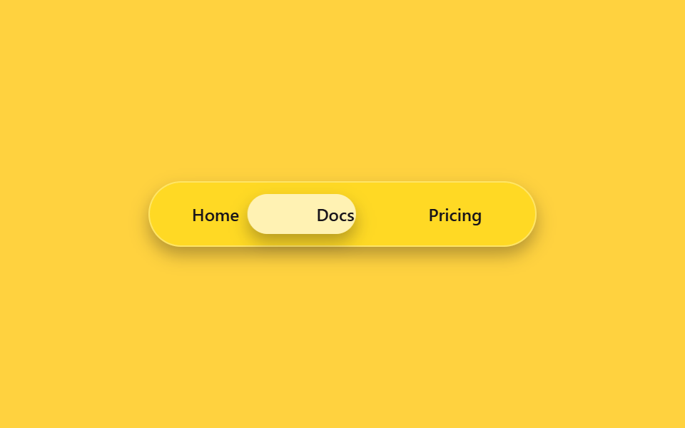
02Thanh điều hướng pill bo tròn
Toàn bộ menu nằm gọn trong một pill, còn chip bên trong trôi theo mục đang chọn để báo vị trí hiện tại.
Dùng choThanh trên cùng trang landing, chuyển tab trong ứng dụng
radius 999padding 6px그림자 얕게
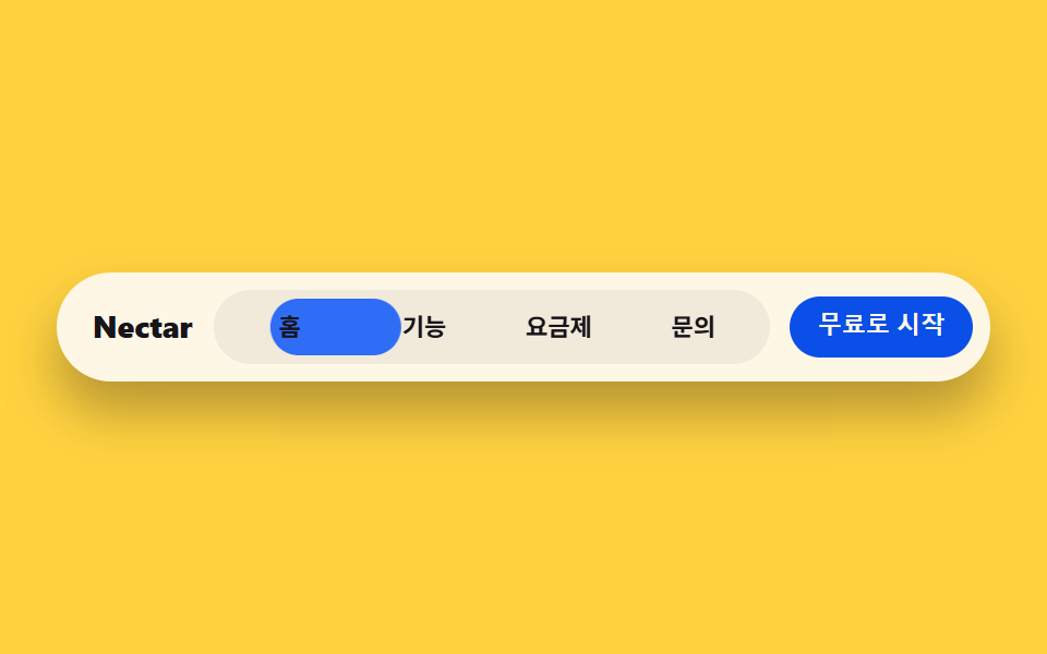
<main class="stage">
  <nav class="navbar">
    <span class="navbar__brand">Nectar</span>
    <div class="navbar__pill is-demo">
      <span class="navbar__indicator" aria-hidden="true"></span>
      <span class="navbar__item">Trang chủ</span>
      <span class="navbar__item">Tính năng</span>
      <span class="navbar__item">Bảng giá</span>
      <span class="navbar__item">Liên hệ</span>
    </div>
    <button class="navbar__cta" type="button">Bắt đầu miễn phí</button>
  </nav>
</main>
@use "../../../../site/static/demo-tokens" as *;
$duration: $dur-loop; // 표시등이 네 항목을 도는 한 주기
$easing: $ease-spring; // 이동 곡선
$color: $subject-blue; // 표시등 색
@include stage($stage-yellow);
.navbar {
width: clamp(260px, 84vw, 420px);
display: flex;
align-items: center;
gap: clamp(8px, 2vw, 14px);
background: $subject-cream;
border-radius: $r-pill;
padding: 8px 8px 8px 16px;
box-shadow: $shadow-raised;
}
.navbar__brand {
color: $subject-ink;
font-weight: 800; font-size: clamp(12px, 3vw, 14px); line-height: 1;
flex: none;
}
.navbar__pill {
position: relative;
flex: 1;
display: grid;
grid-template-columns: repeat(4, 1fr);
background: rgba($subject-ink, .06);
border-radius: $r-pill;
padding: 4px;
}
.navbar__indicator {
position: absolute;
inset: 4px auto 4px 4px;
width: calc(25% - 4px);
border-radius: $r-pill;
background: $color;
animation: navSlide $duration $easing infinite;
}
.navbar__item {
position: relative;
z-index: 1;
text-align: center;
color: $subject-ink;
font-weight: 600; font-size: clamp(9.5px, 2.3vw, 11.5px); line-height: 1;
padding: clamp(6px, 1.6vw, 8px) 2px;
}
.navbar__cta {
flex: none;
border: 0;
border-radius: $r-pill;
background: $subject-blue-deep;
color: $subject-cream;
padding: clamp(7px, 1.8vw, 9px) clamp(12px, 2.6vw, 15px);
font-weight: 700; font-size: clamp(9.5px, 2.3vw, 11.5px); line-height: 1;
}
// 데모: 표시등이 홈 → 기능 → 요금제 → 문의 순으로 옮겨간 뒤 처음으로 돌아온다
@keyframes navSlide {
0% { transform: translateX(0%); }
12% { transform: translateX(0%); }
25% { transform: translateX(100%); }
37% { transform: translateX(100%); }
50% { transform: translateX(200%); }
62% { transform: translateX(200%); }
75% { transform: translateX(300%); }
87% { transform: translateX(300%); }
100% { transform: translateX(0%); }
}
@media (prefers-reduced-motion: reduce) {
.navbar__indicator {
animation: none !important;
transform: translateX(0%);
}
}html, body {
margin: 0;
overflow: hidden;
}
.stage {
box-sizing: border-box;
min-height: 100vh;
display: grid;
place-items: center;
margin: 0;
background: #ffd23f;
font-family: -apple-system, "Segoe UI", "Noto Sans KR", sans-serif;
padding: clamp(8px, 4vw, 24px);
}
.navbar {
width: clamp(260px, 84vw, 420px);
display: flex;
align-items: center;
gap: clamp(8px, 2vw, 14px);
background: #fff7e6;
border-radius: 999px;
padding: 8px 8px 8px 16px;
box-shadow: 0 14px 24px rgba(23, 20, 26, 0.32);
}
.navbar__brand {
color: #17141a;
font-weight: 800;
font-size: clamp(12px, 3vw, 14px);
line-height: 1;
flex: none;
}
.navbar__pill {
position: relative;
flex: 1;
display: grid;
grid-template-columns: repeat(4, 1fr);
background: rgba(23, 20, 26, 0.06);
border-radius: 999px;
padding: 4px;
}
.navbar__indicator {
position: absolute;
inset: 4px auto 4px 4px;
width: calc(25% - 4px);
border-radius: 999px;
background: #2f6df6;
animation: navSlide 2s cubic-bezier(0.2, 0.8, 0.2, 1) infinite;
}
.navbar__item {
position: relative;
z-index: 1;
text-align: center;
color: #17141a;
font-weight: 600;
font-size: clamp(9.5px, 2.3vw, 11.5px);
line-height: 1;
padding: clamp(6px, 1.6vw, 8px) 2px;
}
.navbar__cta {
flex: none;
border: 0;
border-radius: 999px;
background: #0a4fe8;
color: #fff7e6;
padding: clamp(7px, 1.8vw, 9px) clamp(12px, 2.6vw, 15px);
font-weight: 700;
font-size: clamp(9.5px, 2.3vw, 11.5px);
line-height: 1;
}
@keyframes navSlide {
0% {
transform: translateX(0%);
}
12% {
transform: translateX(0%);
}
25% {
transform: translateX(100%);
}
37% {
transform: translateX(100%);
}
50% {
transform: translateX(200%);
}
62% {
transform: translateX(200%);
}
75% {
transform: translateX(300%);
}
87% {
transform: translateX(300%);
}
100% {
transform: translateX(0%);
}
}
@media (prefers-reduced-motion: reduce) {
.navbar__indicator {
animation: none !important;
transform: translateX(0%);
}
}import type { CSSProperties } from "react";
import styles from "./BentoNav.module.scss";
export type BentoNavProps = {
brand?: string;
items?: string[];
cta?: string;
duration?: number;
easing?: string;
color?: string;
};
type Vars = CSSProperties & { "--duration"?: string; "--easing"?: string; "--color"?: string };
export default function BentoNav({
brand = "Nectar",
items = ["Home", "Features", "Pricing", "Contact"],
cta = "Start for free",
duration = 2000,
easing = "cubic-bezier(.2,.8,.2,1)",
color = "#2f6df6",
}: BentoNavProps) {
const vars: Vars = { "--duration": `${duration}ms`, "--easing": easing, "--color": color };
return (
<nav className={styles.navbar} style={vars}>
<span className={styles.brand}>{brand}</span>
<div className={styles.pill}>
<span className={styles.indicator} aria-hidden="true" />
{items.map((label) => (
<span key={label} className={styles.item}>{label}</span>
))}
</div>
<button type="button" className={styles.cta}>{cta}</button>
</nav>
);
}02 Thanh điều hướng pill bo tròn — Diện tích đo được 4.193% · khung hình chuyển động 15/23Nguyên tác GODRICH · SCSS và React nằm trong tệp zip · Bento grid design — 9 phần landing đang thịnh
Bài viết chứa demo này
 Bento grid design — 9 phần landing đang thịnhBento grid design là cách xếp các ô vuông to nhỏ khác nhau vào một grid như hộp cơm Nhật, đang thịnh trên Pinterest nhờ Xem tất cả demo trong bài này