06Coverflow
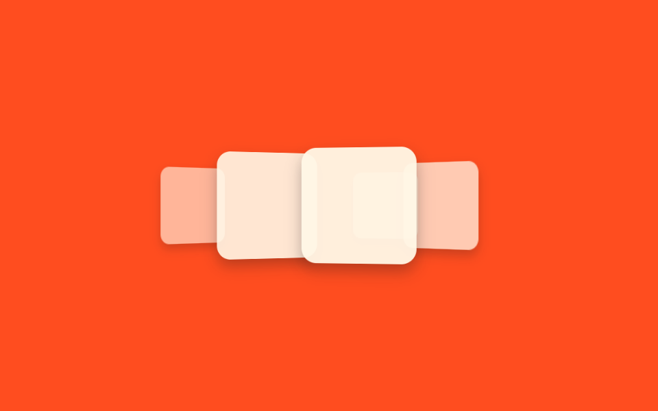
5 thẻ dùng chung một keyframes nhưng lệch nhau bằng animation-delay âm, nên thẻ giữa to và thẳng mặt còn hai bên nhỏ và nghiêng dần ra xa. Toàn bộ chu kỳ chạy chỉ bằng CSS, JS 0 dòng.
Dùng choSlider cover album, portfolio
rotateY + translateZ음수 animation-delayJS 0줄
<main class="stage">
  <ul class="flow is-demo">
    <li class="flow__card" style="--i: 0;" aria-label="Bìa album"></li>
    <li class="flow__card" style="--i: 1;" aria-label="Bìa album"></li>
    <li class="flow__card" style="--i: 2;" aria-label="Bìa album"></li>
    <li class="flow__card" style="--i: 3;" aria-label="Bìa album"></li>
    <li class="flow__card" style="--i: 4;" aria-label="Bìa album"></li>
  </ul>
</main>
@use "../../../../site/static/demo-tokens" as *;
// ── 변수 3개 ──────────────────────────────
$duration: $dur-loop; // 카드 5장이 한 바퀴 흐르는 시간
$easing: $ease-out;
$color: $subject-cream; // 카드 배경
@include stage($stage-orange);
.flow {
position: relative;
width: 92px;
height: 92px;
list-style: none;
margin: 0;
padding: 0;
perspective: 640px;
}
.flow__card {
position: absolute;
inset: 0;
border-radius: $r-control;
background: $color;
box-shadow: $shadow-press;
// CSS 만으로 5장을 다른 위치에서 출발시킨다 — JS 없이 같은 keyframes 를 음수 delay 로 어긋나게 돈다
animation: flow $duration $easing infinite;
animation-delay: calc(var(--i) * -0.4s);
}
// 슬롯 5개(뒤 → 왼쪽 → 가운데 → 오른쪽 → 뒤)를 한 바퀴로. 100% 가 0% 와 같아 이음새 없이 돈다
@keyframes flow {
0% { transform: translateX(-130px) translateZ(-90px) rotateY(45deg) scale(.6); opacity: .5; z-index: 1; }
20% { transform: translateX(-68px) translateZ(-40px) rotateY(35deg) scale(.82); opacity: .85; z-index: 2; }
40% { transform: translateX(0) translateZ(0) rotateY(0deg) scale(1); opacity: 1; z-index: 3; }
60% { transform: translateX(68px) translateZ(-40px) rotateY(-35deg) scale(.82); opacity: .85; z-index: 2; }
80% { transform: translateX(130px) translateZ(-90px) rotateY(-45deg) scale(.6); opacity: .5; z-index: 1; }
100% { transform: translateX(-130px) translateZ(-90px) rotateY(45deg) scale(.6); opacity: .5; z-index: 1; }
}
// ── 접근성: 움직임 줄이기 설정이면 다섯 장을 가운데로 모아 고정 ────────
@media (prefers-reduced-motion: reduce) {
.flow__card { animation: none; transform: translateX(0) translateZ(0) rotateY(0deg) scale(1); opacity: 1; }
}html, body {
margin: 0;
overflow: hidden;
}
.stage {
box-sizing: border-box;
min-height: 100vh;
display: grid;
place-items: center;
margin: 0;
background: #ff4d1f;
font-family: -apple-system, "Segoe UI", "Noto Sans KR", sans-serif;
padding: clamp(8px, 4vw, 24px);
}
.flow {
position: relative;
width: 92px;
height: 92px;
list-style: none;
margin: 0;
padding: 0;
perspective: 640px;
}
.flow__card {
position: absolute;
inset: 0;
border-radius: 12px;
background: #fff7e6;
box-shadow: 0 6px 12px rgba(23, 20, 26, 0.32);
animation: flow 2s ease-out infinite;
animation-delay: calc(var(--i) * -0.4s);
}
@keyframes flow {
0% {
transform: translateX(-130px) translateZ(-90px) rotateY(45deg) scale(0.6);
opacity: 0.5;
z-index: 1;
}
20% {
transform: translateX(-68px) translateZ(-40px) rotateY(35deg) scale(0.82);
opacity: 0.85;
z-index: 2;
}
40% {
transform: translateX(0) translateZ(0) rotateY(0deg) scale(1);
opacity: 1;
z-index: 3;
}
60% {
transform: translateX(68px) translateZ(-40px) rotateY(-35deg) scale(0.82);
opacity: 0.85;
z-index: 2;
}
80% {
transform: translateX(130px) translateZ(-90px) rotateY(-45deg) scale(0.6);
opacity: 0.5;
z-index: 1;
}
100% {
transform: translateX(-130px) translateZ(-90px) rotateY(45deg) scale(0.6);
opacity: 0.5;
z-index: 1;
}
}
@media (prefers-reduced-motion: reduce) {
.flow__card {
animation: none;
transform: translateX(0) translateZ(0) rotateY(0deg) scale(1);
opacity: 1;
}
}import type { CSSProperties } from "react";
import styles from "./Coverflow.module.scss";
export type CoverflowProps = {
/** 카드 5장이 한 바퀴 흐르는 시간 (기본 2000ms) */
duration?: number;
easing?: string;
/** 카드 배경 */
color?: string;
count?: number;
};
type Vars = CSSProperties & { "--duration"?: string; "--easing"?: string; "--color"?: string; "--i"?: number };
// JS 없이 같은 keyframes 를 음수 animation-delay 로 어긋나게 돌려 흐름을 만든다
export default function Coverflow({
duration = 2000,
easing = "ease-out",
color = "#fff7e6",
count = 5,
}: CoverflowProps) {
const base: Vars = { "--duration": `${duration}ms`, "--easing": easing, "--color": color };
return (
<ul className={styles.flow}>
{Array.from({ length: count }, (_, i) => (
<li key={i} className={styles.card} style={{ ...base, "--i": i } as Vars} aria-label="앨범 커버" />
))}
</ul>
);
}06 Coverflow — Diện tích đo được 15.591% · khung hình chuyển động 23/23Nguyên tác GODRICH · SCSS và React nằm trong tệp zip · 9 CSS 3D Cube Effects — dán 1 dòng là chạy
Bài viết chứa demo này
 9 CSS 3D Cube Effects — dán 1 dòng là chạyCSS 3D cube là nhóm hiệu ứng khối lập phương xoay, carousel hình trụ và card nghiêng khi hover, dựng bằng perspective và Xem tất cả demo trong bài này