07Sân khấu xoay
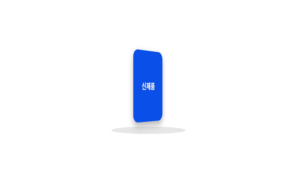
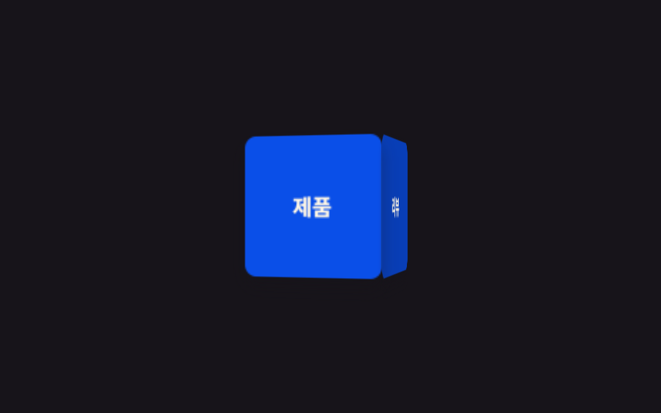
Vật thể xoay chậm một vòng mỗi 5 giây trên sàn hình elip nghiêng bên dưới. Chậm hơn cube xoay ở mục 01 và có thêm sàn nên trông như một bàn xoay turntable.
Dùng choPreview sản phẩm mới 360 độ, trang chi tiết e-commerce
perspectivebackface-visibility타원 바닥 rotateX
<main class="stage">
  <div class="turntable">
    <div class="turntable__floor"></div>
    <div class="turntable__object is-demo">
      <div class="turntable__face turntable__face--front">Sản phẩm mới</div>
      <div class="turntable__face turntable__face--back"></div>
    </div>
  </div>
</main>
@use "../../../../site/static/demo-tokens" as *;
// ── 변수 3개 ──────────────────────────────
$duration: 5s; // 한 바퀴 도는 시간 — 제품 회전은 느릴수록 고급스럽다
$easing: linear;
$color: $subject-blue-deep; // 오브젝트 색 (크림 글자가 얹히므로 진한 파랑)
@include stage($stage-paper);
.turntable {
position: relative;
width: 130px;
height: 160px;
perspective: 700px;
}
// 바닥 원반은 고정. transform-style 없이도 perspective 안에서 타원으로 눌려 입체 바닥처럼 보인다
.turntable__floor {
position: absolute;
left: 50%;
bottom: 6px;
width: 120px;
height: 28px;
border-radius: 50%;
background: rgba($subject-ink, .1);
transform: translateX(-50%) rotateX(70deg);
transform-style: preserve-3d;
}
.turntable__object {
position: absolute;
inset: 12px 25px 34px;
transform-style: preserve-3d;
animation: turn $duration $easing infinite;
}
.turntable__face {
position: absolute;
inset: 0;
display: grid;
place-items: center;
border-radius: $r-control;
color: $subject-cream;
font-weight: 700;
font-size: 13px;
line-height: 1.2;
font-family: inherit;
text-align: center;
box-shadow: $shadow-press;
backface-visibility: hidden; // 뒤로 돈 면의 글자가 비치지 않게
}
.turntable__face--front { background: $color; }
.turntable__face--back { background: darken($color, 16%); transform: rotateY(180deg); }
@keyframes turn {
from { transform: rotateY(0deg); }
to { transform: rotateY(360deg); }
}
// ── 접근성: 움직임 줄이기 설정이면 정면에서 고정 ────────────
@media (prefers-reduced-motion: reduce) {
.turntable__object { animation: none; transform: rotateY(-20deg); }
}html, body {
margin: 0;
overflow: hidden;
}
.stage {
box-sizing: border-box;
min-height: 100vh;
display: grid;
place-items: center;
margin: 0;
background: #ffffff;
font-family: -apple-system, "Segoe UI", "Noto Sans KR", sans-serif;
padding: clamp(8px, 4vw, 24px);
}
.turntable {
position: relative;
width: 130px;
height: 160px;
perspective: 700px;
}
.turntable__floor {
position: absolute;
left: 50%;
bottom: 6px;
width: 120px;
height: 28px;
border-radius: 50%;
background: rgba(23, 20, 26, 0.1);
transform: translateX(-50%) rotateX(70deg);
transform-style: preserve-3d;
}
.turntable__object {
position: absolute;
inset: 12px 25px 34px;
transform-style: preserve-3d;
animation: turn 5s linear infinite;
}
.turntable__face {
position: absolute;
inset: 0;
display: grid;
place-items: center;
border-radius: 12px;
color: #fff7e6;
font-weight: 700;
font-size: 13px;
line-height: 1.2;
font-family: inherit;
text-align: center;
box-shadow: 0 6px 12px rgba(23, 20, 26, 0.32);
backface-visibility: hidden;
}
.turntable__face--front {
background: #0a4fe8;
}
.turntable__face--back {
background: rgb(2.5992545779%, 20.5341111651%, 60.3027062064%);
transform: rotateY(180deg);
}
@keyframes turn {
from {
transform: rotateY(0deg);
}
to {
transform: rotateY(360deg);
}
}
@media (prefers-reduced-motion: reduce) {
.turntable__object {
animation: none;
transform: rotateY(-20deg);
}
}import type { CSSProperties } from "react";
import styles from "./RotateStage.module.scss";
export type RotateStageProps = {
/** 한 바퀴 도는 시간 (기본 5000ms) — 느릴수록 고급스럽다 */
duration?: number;
easing?: string;
/** 오브젝트 색 */
color?: string;
label?: string;
};
type Vars = CSSProperties & { "--duration"?: string; "--easing"?: string; "--color"?: string };
export default function RotateStage({
duration = 5000,
easing = "linear",
color = "#0a4fe8",
label = "신제품",
}: RotateStageProps) {
const vars: Vars = { "--duration": `${duration}ms`, "--easing": easing, "--color": color };
return (
<div className={styles.turntable}>
<div className={styles.floor} />
<div className={styles.object} style={vars}>
<div className={`${styles.face} ${styles.front}`}>{label}</div>
<div className={`${styles.face} ${styles.back}`} />
</div>
</div>
);
}07 Sân khấu xoay — Diện tích đo được 7.839% · khung hình chuyển động 23/23Nguyên tác GODRICH · SCSS và React nằm trong tệp zip · 9 CSS 3D Cube Effects — dán 1 dòng là chạy
Bài viết chứa demo này
 9 CSS 3D Cube Effects — dán 1 dòng là chạyCSS 3D cube là nhóm hiệu ứng khối lập phương xoay, carousel hình trụ và card nghiêng khi hover, dựng bằng perspective và Xem tất cả demo trong bài này