01Mũi tên dài ra
Hover vào liên kết, thân mũi tên kéo dãn ra dài thêm, giục khách bước sang trang tiếp theo.
Dùng choLiên kết đọc thêm·bài tiếp theo, chữ CTA dưới thẻ
scaleXtranslateXhover
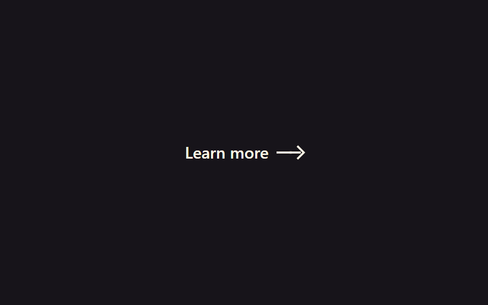
<main class="stage">
  <a class="ae-link is-demo" href="#">
    <span class="ae-link__label">Learn more</span>
    <span class="ae-link__arrow">
      <span class="ae-link__shaft"></span>
      <span class="ae-link__head"></span>
      <span class="ae-link__trail ae-link__trail--1" aria-hidden="true"></span>
      <span class="ae-link__trail ae-link__trail--2" aria-hidden="true"></span>
    </span>
  </a>
</main>
@use "../../../../site/static/demo-tokens" as *;
// ── 변수 3개 ──────────────────────────────────────────
$duration: $dur-loop; // is-demo 강제 루프 주기(캡처용). 실제 호버 전환은 아래 220ms 를 쓴다
$easing: $ease-elastic; // 고무줄식 오버슛 — 늘어났다 살짝 되돌아와 멈춘다
$color: $subject-cream;
@include stage($stage-ink);
.ae-link {
display: inline-flex;
align-items: center;
gap: $sp-2;
color: $color;
text-decoration: none;
font: 600 16px/1 -apple-system, "Segoe UI", sans-serif;
}
.ae-link__arrow {
position: relative;
display: inline-flex;
align-items: center;
width: 26px;
height: 12px;
}
.ae-link__shaft {
position: absolute;
left: 0;
width: 16px;
height: 2px;
background: $color;
transform-origin: left center; // 규칙8: 화살대 왼쪽서 늘어남
transform: scaleX(1);
transition: transform 260ms $easing;
}
.ae-link__head {
position: absolute;
left: 10px;
width: 8px;
height: 8px;
border-top: 2px solid $color;
border-right: 2px solid $color;
transform: translateX(0) rotate(45deg);
transition: transform 260ms $easing;
}
// 화살촉 트레일 파티클 — 신장하는 동안 화살촉 뒤로 작은 점 두 개가 지연·감쇠하며 따라붙는다
.ae-link__trail {
position: absolute;
left: 10px;
width: 4px;
height: 4px;
border-radius: 50%;
background: $color;
opacity: 0;
}
// 실사용: 링크에 마우스를 올리면 몸통(shaft)이 길게 늘어나고 화살촉(head)이 따라 밀려난다. $easing 이 고무줄 오버슛을 만든다
.ae-link:hover .ae-link__shaft { transform: scaleX(1.8); }
.ae-link:hover .ae-link__head { transform: translateX(10px) rotate(45deg); }
@keyframes ae-trail-hover {
0% { opacity: 0; transform: translateX(0) scale(.6); }
45% { opacity: .5; transform: translateX(5px) scale(1); }
100% { opacity: 0; transform: translateX(9px) scale(.4); }
}
.ae-link:hover .ae-link__trail--1 { animation: ae-trail-hover 420ms $ease-out forwards; }
.ae-link:hover .ae-link__trail--2 { animation: ae-trail-hover 420ms $ease-out 70ms forwards; }
// 데모 루프: is-demo 는 :hover 를 흉내 낸 keyframes 로 무한 반복 (헤드리스는 :hover 를 못 건다)
@keyframes ae-extend-shaft {
0%, 20% { transform: scaleX(1); }
50%, 70% { transform: scaleX(1.8); }
100% { transform: scaleX(1); }
}
@keyframes ae-extend-head {
0%, 20% { transform: translateX(0) rotate(45deg); }
50%, 70% { transform: translateX(10px) rotate(45deg); }
100% { transform: translateX(0) rotate(45deg); }
}
@keyframes ae-trail-loop {
0%, 20% { opacity: 0; transform: translateX(0) scale(.6); }
38% { opacity: .5; transform: translateX(5px) scale(1); }
50%, 70% { opacity: 0; transform: translateX(9px) scale(.4); }
100% { opacity: 0; transform: translateX(0) scale(.6); }
}
.ae-link.is-demo .ae-link__shaft { animation: ae-extend-shaft $duration $easing infinite; }
.ae-link.is-demo .ae-link__head { animation: ae-extend-head $duration $easing infinite; }
.ae-link.is-demo .ae-link__trail--1 { animation: ae-trail-loop $duration $ease-out infinite; }
.ae-link.is-demo .ae-link__trail--2 { animation: ae-trail-loop $duration $ease-out 60ms infinite; }
@media (prefers-reduced-motion: reduce) {
.ae-link:hover .ae-link__shaft,
.ae-link.is-demo .ae-link__shaft {
animation: none !important;
transition: none !important;
transform: scaleX(1) !important;
}
.ae-link:hover .ae-link__head,
.ae-link.is-demo .ae-link__head {
animation: none !important;
transition: none !important;
transform: translateX(0) rotate(45deg) !important;
}
.ae-link__trail,
.ae-link:hover .ae-link__trail,
.ae-link.is-demo .ae-link__trail {
animation: none !important;
opacity: 0 !important;
}
}html, body {
margin: 0;
overflow: hidden;
}
.stage {
box-sizing: border-box;
min-height: 100vh;
display: grid;
place-items: center;
margin: 0;
background: #17141a;
font-family: -apple-system, "Segoe UI", "Noto Sans KR", sans-serif;
padding: clamp(8px, 4vw, 24px);
}
.ae-link {
display: inline-flex;
align-items: center;
gap: 8px;
color: #fff7e6;
text-decoration: none;
font: 600 16px/1 -apple-system, "Segoe UI", sans-serif;
}
.ae-link__arrow {
position: relative;
display: inline-flex;
align-items: center;
width: 26px;
height: 12px;
}
.ae-link__shaft {
position: absolute;
left: 0;
width: 16px;
height: 2px;
background: #fff7e6;
transform-origin: left center;
transform: scaleX(1);
transition: transform 260ms cubic-bezier(0.34, 1.56, 0.64, 1);
}
.ae-link__head {
position: absolute;
left: 10px;
width: 8px;
height: 8px;
border-top: 2px solid #fff7e6;
border-right: 2px solid #fff7e6;
transform: translateX(0) rotate(45deg);
transition: transform 260ms cubic-bezier(0.34, 1.56, 0.64, 1);
}
.ae-link__trail {
position: absolute;
left: 10px;
width: 4px;
height: 4px;
border-radius: 50%;
background: #fff7e6;
opacity: 0;
}
.ae-link:hover .ae-link__shaft {
transform: scaleX(1.8);
}
.ae-link:hover .ae-link__head {
transform: translateX(10px) rotate(45deg);
}
@keyframes ae-trail-hover {
0% {
opacity: 0;
transform: translateX(0) scale(0.6);
}
45% {
opacity: 0.5;
transform: translateX(5px) scale(1);
}
100% {
opacity: 0;
transform: translateX(9px) scale(0.4);
}
}
.ae-link:hover .ae-link__trail--1 {
animation: ae-trail-hover 420ms ease-out forwards;
}
.ae-link:hover .ae-link__trail--2 {
animation: ae-trail-hover 420ms ease-out 70ms forwards;
}
@keyframes ae-extend-shaft {
0%, 20% {
transform: scaleX(1);
}
50%, 70% {
transform: scaleX(1.8);
}
100% {
transform: scaleX(1);
}
}
@keyframes ae-extend-head {
0%, 20% {
transform: translateX(0) rotate(45deg);
}
50%, 70% {
transform: translateX(10px) rotate(45deg);
}
100% {
transform: translateX(0) rotate(45deg);
}
}
@keyframes ae-trail-loop {
0%, 20% {
opacity: 0;
transform: translateX(0) scale(0.6);
}
38% {
opacity: 0.5;
transform: translateX(5px) scale(1);
}
50%, 70% {
opacity: 0;
transform: translateX(9px) scale(0.4);
}
100% {
opacity: 0;
transform: translateX(0) scale(0.6);
}
}
.ae-link.is-demo .ae-link__shaft {
animation: ae-extend-shaft 2s cubic-bezier(0.34, 1.56, 0.64, 1) infinite;
}
.ae-link.is-demo .ae-link__head {
animation: ae-extend-head 2s cubic-bezier(0.34, 1.56, 0.64, 1) infinite;
}
.ae-link.is-demo .ae-link__trail--1 {
animation: ae-trail-loop 2s ease-out infinite;
}
.ae-link.is-demo .ae-link__trail--2 {
animation: ae-trail-loop 2s ease-out 60ms infinite;
}
@media (prefers-reduced-motion: reduce) {
.ae-link:hover .ae-link__shaft,
.ae-link.is-demo .ae-link__shaft {
animation: none !important;
transition: none !important;
transform: scaleX(1) !important;
}
.ae-link:hover .ae-link__head,
.ae-link.is-demo .ae-link__head {
animation: none !important;
transition: none !important;
transform: translateX(0) rotate(45deg) !important;
}
.ae-link__trail,
.ae-link:hover .ae-link__trail,
.ae-link.is-demo .ae-link__trail {
animation: none !important;
opacity: 0 !important;
}
}import { CSSProperties } from "react";
import styles from "./ExtendingArrow.module.scss";
export interface ExtendingArrowProps {
duration?: string;
easing?: string;
color?: string;
}
// 실사용: :hover 만으로 동작한다. is-demo 강제 루프는 넣지 않는다 (블로그공장 react 컨벤션)
export default function ExtendingArrow({
duration = "260ms",
easing = "cubic-bezier(.34, 1.56, .64, 1)",
color = "#fff7e6",
}: ExtendingArrowProps) {
const style = { "--duration": duration, "--easing": easing, "--color": color } as CSSProperties;
return (
<a className={styles.link} href="#" style={style}>
<span>Learn more</span>
<span className={styles.arrow}>
<span className={styles.shaft} />
<span className={styles.head} />
<span className={`${styles.trail} ${styles.trail1}`} aria-hidden="true" />
<span className={`${styles.trail} ${styles.trail2}`} aria-hidden="true" />
</span>
</a>
);
}01 Mũi tên dài ra — Diện tích đo được 0.163% · khung hình chuyển động 15/23Nguyên tác GODRICH · SCSS và React nằm trong tệp zip · 9 css arrow animation — dán một dòng là chạy
Bài viết chứa demo này
 9 css arrow animation — dán một dòng là chạycss arrow animation là mũi tên tự chuyển động trên trang: hover thì thân tên dài ra, hoặc nó nảy lên như giục bạn bấm nú Xem tất cả demo trong bài này