02Badge quét vệt sáng
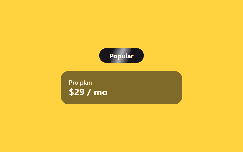
Một dải sáng mảnh định kỳ lướt qua badge 'Phổ biến', tự kéo mắt về badge mà chẳng cần thao tác nào.
Dùng choBadge gói đề xuất, nhãn mới·giảm giá
::aftertranslateX2.4s
<main class="stage">
  <div class="sh-wrap">
    <span class="sh-badge">Popular</span>
    <div class="sh-card">
      <span class="sh-card__tag">Pro plan</span>
      <span class="sh-card__price">$29 / mo</span>
    </div>
  </div>
</main>
@use "../../../../site/static/demo-tokens" as *;
// ── 변수 3개 ──────────────────────────────────────────
$duration: 2.4s;
$easing: ease-in-out;
$color: $subject-blue;
@include stage($stage-yellow);
.sh-wrap {
width: min(240px, 84vw);
display: flex;
flex-direction: column;
align-items: center;
gap: $sp-4;
}
.sh-badge {
position: relative;
overflow: hidden;
display: inline-block;
border-radius: $r-pill;
padding: $sp-2 $sp-5;
background: $subject-ink;
color: $subject-cream;
font: 700 13px/1 -apple-system, "Segoe UI", sans-serif;
}
// 광택 띠 — 폭 고정, transform 만 움직인다 (그라디언트 자체는 정적)
.sh-badge::after {
content: "";
position: absolute;
top: 0;
left: 0;
width: 40%;
height: 100%;
background: linear-gradient(100deg, transparent, rgba(255, 255, 255, .65), transparent);
transform: translateX(-260%) skewX(-12deg);
}
// 자동 재생 (호버 불필요) — badge 는 항상 스윕한다
.sh-badge::after {
animation: sh-sweep $duration $easing infinite;
}
@keyframes sh-sweep {
0% { transform: translateX(-260%) skewX(-12deg); }
60%, 100% { transform: translateX(360%) skewX(-12deg); }
}
.sh-card {
width: 100%;
box-sizing: border-box;
border-radius: $r-card;
padding: $sp-4;
background: rgba(23, 20, 26, .55);
color: $subject-cream;
display: flex;
flex-direction: column;
gap: $sp-1;
font: 600 12px/1 -apple-system, "Segoe UI", sans-serif;
}
.sh-card__tag { opacity: 1; } // AA: 뱃지 면(잉크 55% 옐로 겹침) 위 크림 100% — 4.89:1
.sh-card__price { font-size: 18px; font-weight: 700; }
@media (prefers-reduced-motion: reduce) {
.sh-badge::after { animation: none !important; opacity: 0 !important; }
}html, body {
margin: 0;
overflow: hidden;
}
.stage {
box-sizing: border-box;
min-height: 100vh;
display: grid;
place-items: center;
margin: 0;
background: #ffd23f;
font-family: -apple-system, "Segoe UI", "Noto Sans KR", sans-serif;
padding: clamp(8px, 4vw, 24px);
}
.sh-wrap {
width: min(240px, 84vw);
display: flex;
flex-direction: column;
align-items: center;
gap: 16px;
}
.sh-badge {
position: relative;
overflow: hidden;
display: inline-block;
border-radius: 999px;
padding: 8px 20px;
background: #17141a;
color: #fff7e6;
font: 700 13px/1 -apple-system, "Segoe UI", sans-serif;
}
.sh-badge::after {
content: "";
position: absolute;
top: 0;
left: 0;
width: 40%;
height: 100%;
background: linear-gradient(100deg, transparent, rgba(255, 255, 255, 0.65), transparent);
transform: translateX(-260%) skewX(-12deg);
}
.sh-badge::after {
animation: sh-sweep 2.4s ease-in-out infinite;
}
@keyframes sh-sweep {
0% {
transform: translateX(-260%) skewX(-12deg);
}
60%, 100% {
transform: translateX(360%) skewX(-12deg);
}
}
.sh-card {
width: 100%;
box-sizing: border-box;
border-radius: 16px;
padding: 16px;
background: rgba(23, 20, 26, 0.55);
color: #fff7e6;
display: flex;
flex-direction: column;
gap: 4px;
font: 600 12px/1 -apple-system, "Segoe UI", sans-serif;
}
.sh-card__tag {
opacity: 1;
}
.sh-card__price {
font-size: 18px;
font-weight: 700;
}
@media (prefers-reduced-motion: reduce) {
.sh-badge::after {
animation: none !important;
opacity: 0 !important;
}
}import { CSSProperties } from "react";
import styles from "./BadgeShineSweep.module.scss";
export interface BadgeShineSweepProps {
duration?: string;
easing?: string;
tag?: string;
}
export default function BadgeShineSweep({
duration = "2.4s",
easing = "ease-in-out",
tag = "Popular",
}: BadgeShineSweepProps) {
const style = { "--duration": duration, "--easing": easing } as CSSProperties;
return (
<div className={styles.wrap} style={style}>
<span className={styles.badge}>{tag}</span>
<div className={styles.card}>
<span className={styles.tag}>Pro plan</span>
<span className={styles.price}>$29 / mo</span>
</div>
</div>
);
}02 Badge quét vệt sáng — Diện tích đo được 1.628% · khung hình chuyển động 7/23Nguyên tác GODRICH · SCSS và React nằm trong tệp zip · 9 mẫu css pricing table animation copy-paste
Bài viết chứa demo này
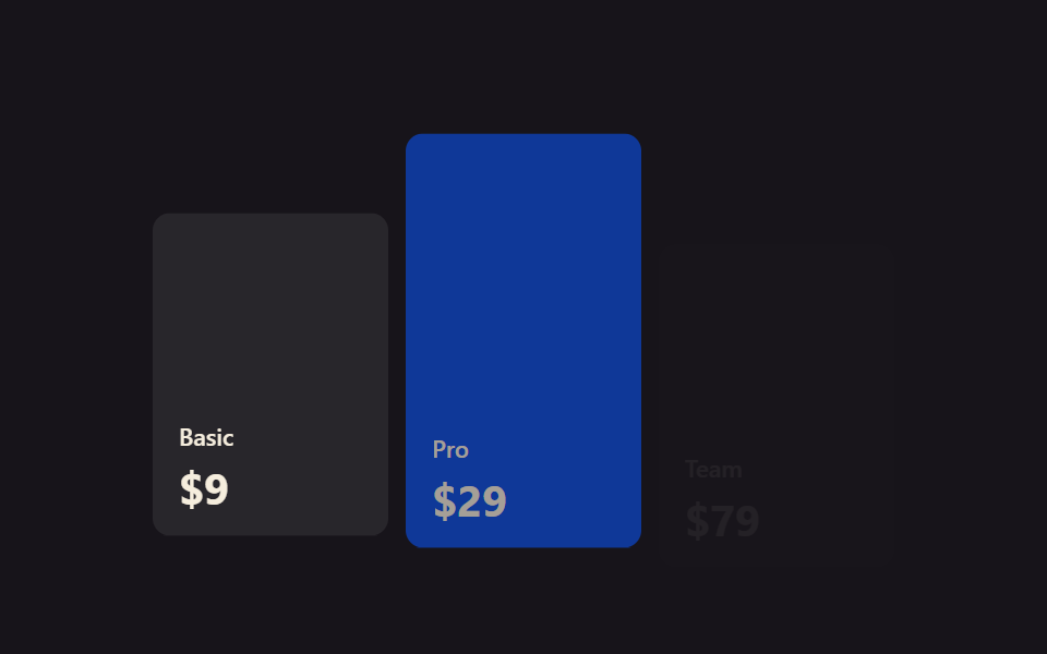 9 mẫu css pricing table animation copy-pasteCss pricing table là khối hiển thị các gói giá xếp cạnh nhau trên một trang. Chín animation cho bảng giá dưới đây viết g Xem tất cả demo trong bài này