02Mũi tên chảy mãi
Ba mũi tên giữ khoảng cách ngắn, chảy sang phải theo vòng lặp lệch nhịp, tự động báo rằng còn bước tiếp theo.
Dùng choGợi ý bước kế tiếp, gợi ý carousel·swipe
opacitytranslateXstagger
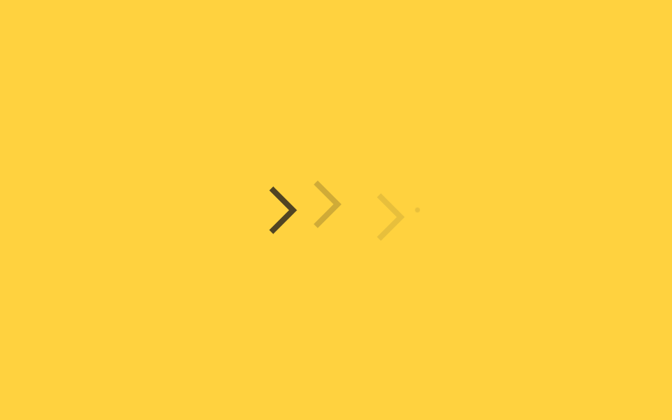
<main class="stage">
  <div class="sl-row" aria-hidden="true">
    <span class="sl-chevron sl-chevron--1"></span>
    <span class="sl-chevron sl-chevron--2"></span>
    <span class="sl-chevron sl-chevron--3"></span>
    <span class="sl-trail"></span>
  </div>
</main>
@use "../../../../site/static/demo-tokens" as *;
// ── 변수 3개 ──────────────────────────────────────────
$duration: 1.6s;
$easing: $ease-out;
$color: $subject-ink;
@include stage($stage-yellow);
.sl-row {
display: flex;
align-items: center;
gap: $sp-3;
}
.sl-chevron {
width: 20px;
height: 20px;
border-top: 4px solid $color;
border-right: 4px solid $color;
transform: rotate(45deg) translateX(-8px);
opacity: 0;
}
// 실사용·자동재생 공통: 세 개가 짧은 시차를 두고 같은 방향으로 흐른다. 26%에서 살짝 오버슛했다 38%에서 정착한다(고무줄 신장)
@keyframes sl-flow {
0% { opacity: 0; transform: rotate(45deg) translateX(-8px); }
26% { opacity: 1; transform: rotate(45deg) translateX(3px); }
38% { opacity: 1; transform: rotate(45deg) translateX(0); }
70% { opacity: 1; transform: rotate(45deg) translateX(0); }
100% { opacity: 0; transform: rotate(45deg) translateX(8px); }
}
.sl-chevron { animation: sl-flow $duration $easing infinite; }
.sl-chevron--1 { animation-delay: 0ms; }
.sl-chevron--2 { animation-delay: 180ms; }
.sl-chevron--3 { animation-delay: 360ms; }
// 트레일 파티클 — 맨 앞 화살표 뒤로 작은 점 하나가 더 늦게, 더 흐리게 따라간다
.sl-trail {
width: 6px;
height: 6px;
border-radius: 50%;
background: $color;
opacity: 0;
}
@keyframes sl-trail-flow {
0% { opacity: 0; transform: translateX(-8px) scale(.5); }
26% { opacity: .35; transform: translateX(2px) scale(1); }
38% { opacity: .2; transform: translateX(0) scale(.8); }
70% { opacity: .2; transform: translateX(0) scale(.8); }
100% { opacity: 0; transform: translateX(8px) scale(.4); }
}
.sl-trail { animation: sl-trail-flow $duration $easing 540ms infinite; }
@media (prefers-reduced-motion: reduce) {
.sl-chevron {
animation: none !important;
opacity: .6 !important;
transform: rotate(45deg) translateX(0) !important;
}
.sl-trail { animation: none !important; opacity: 0 !important; }
}html, body {
margin: 0;
overflow: hidden;
}
.stage {
box-sizing: border-box;
min-height: 100vh;
display: grid;
place-items: center;
margin: 0;
background: #ffd23f;
font-family: -apple-system, "Segoe UI", "Noto Sans KR", sans-serif;
padding: clamp(8px, 4vw, 24px);
}
.sl-row {
display: flex;
align-items: center;
gap: 12px;
}
.sl-chevron {
width: 20px;
height: 20px;
border-top: 4px solid #17141a;
border-right: 4px solid #17141a;
transform: rotate(45deg) translateX(-8px);
opacity: 0;
}
@keyframes sl-flow {
0% {
opacity: 0;
transform: rotate(45deg) translateX(-8px);
}
26% {
opacity: 1;
transform: rotate(45deg) translateX(3px);
}
38% {
opacity: 1;
transform: rotate(45deg) translateX(0);
}
70% {
opacity: 1;
transform: rotate(45deg) translateX(0);
}
100% {
opacity: 0;
transform: rotate(45deg) translateX(8px);
}
}
.sl-chevron {
animation: sl-flow 1.6s ease-out infinite;
}
.sl-chevron--1 {
animation-delay: 0ms;
}
.sl-chevron--2 {
animation-delay: 180ms;
}
.sl-chevron--3 {
animation-delay: 360ms;
}
.sl-trail {
width: 6px;
height: 6px;
border-radius: 50%;
background: #17141a;
opacity: 0;
}
@keyframes sl-trail-flow {
0% {
opacity: 0;
transform: translateX(-8px) scale(0.5);
}
26% {
opacity: 0.35;
transform: translateX(2px) scale(1);
}
38% {
opacity: 0.2;
transform: translateX(0) scale(0.8);
}
70% {
opacity: 0.2;
transform: translateX(0) scale(0.8);
}
100% {
opacity: 0;
transform: translateX(8px) scale(0.4);
}
}
.sl-trail {
animation: sl-trail-flow 1.6s ease-out 540ms infinite;
}
@media (prefers-reduced-motion: reduce) {
.sl-chevron {
animation: none !important;
opacity: 0.6 !important;
transform: rotate(45deg) translateX(0) !important;
}
.sl-trail {
animation: none !important;
opacity: 0 !important;
}
}import { CSSProperties } from "react";
import styles from "./LoopingSlideArrow.module.scss";
export interface LoopingSlideArrowProps {
duration?: string;
easing?: string;
color?: string;
}
export default function LoopingSlideArrow({
duration = "1.6s",
easing = "ease-out",
color = "#17141a",
}: LoopingSlideArrowProps) {
const style = { "--duration": duration, "--easing": easing, "--color": color } as CSSProperties;
return (
<div className={styles.row} style={style} aria-hidden="true">
<span className={`${styles.chevron} ${styles.c1}`} />
<span className={`${styles.chevron} ${styles.c2}`} />
<span className={`${styles.chevron} ${styles.c3}`} />
<span className={styles.trail} />
</div>
);
}02 Mũi tên chảy mãi — Diện tích đo được 1.146% · khung hình chuyển động 23/23Nguyên tác GODRICH · SCSS và React nằm trong tệp zip · 9 css arrow animation — dán một dòng là chạy
Bài viết chứa demo này
 9 css arrow animation — dán một dòng là chạycss arrow animation là mũi tên tự chuyển động trên trang: hover thì thân tên dài ra, hoặc nó nảy lên như giục bạn bấm nú Xem tất cả demo trong bài này