07Dấu check hiện lần lượt
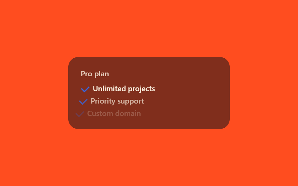
Hover vào thẻ, các dòng checkmark trong danh sách tính năng lộ ra từ trên xuống, mỗi dòng chênh nhau một nhịp.
Dùng choDanh sách tính năng kèm theo từng gói, thẻ so sánh kiểu checklist
transition-delayopacitytranslateX
<main class="stage">
  <div class="fc-card is-demo">
    <span class="fc-card__tag">Pro plan</span>
    <ul class="fc-list">
      <li class="fc-row"><span class="fc-check"></span>Unlimited projects</li>
      <li class="fc-row"><span class="fc-check"></span>Priority support</li>
      <li class="fc-row"><span class="fc-check"></span>Custom domain</li>
    </ul>
  </div>
</main>
@use "../../../../site/static/demo-tokens" as *;
// ── 변수 3개 ──────────────────────────────────────────
$duration: 320ms;
$easing: $ease-out;
$color: $subject-blue;
@include stage($stage-orange);
.fc-card {
width: min(260px, 84vw);
box-sizing: border-box;
border-radius: $r-card;
padding: $sp-5;
background: rgba(23, 20, 26, .55);
display: flex;
flex-direction: column;
gap: $sp-3;
}
.fc-card__tag {
color: $subject-cream;
opacity: .8;
font: 600 12px/1 -apple-system, "Segoe UI", sans-serif;
}
.fc-list { list-style: none; margin: 0; padding: 0; display: flex; flex-direction: column; gap: $sp-2; }
.fc-row {
display: flex;
align-items: center;
gap: $sp-2;
color: $subject-cream;
font: 500 12px/1 -apple-system, "Segoe UI", sans-serif;
opacity: 0;
transform: translateX(-#{$sp-3});
transition: opacity $duration $easing, transform $duration $easing;
}
// 체크 아이콘 — 한 요소를 border-right+border-bottom 으로 L자로 그린 뒤 45deg 회전 (두 막대 방식보다 안전, BD16)
.fc-check {
flex: 0 0 auto;
width: 6px;
height: 10px;
border-right: 2px solid $color;
border-bottom: 2px solid $color;
transform: rotate(45deg);
margin-left: $sp-1;
}
// 실사용: 카드에 마우스를 올리면 체크 목록이 위에서부터 시차를 두고 나타난다
.fc-card:hover .fc-row { opacity: 1; transform: none; }
.fc-card:hover .fc-row:nth-child(2) { transition-delay: 120ms; }
.fc-card:hover .fc-row:nth-child(3) { transition-delay: 240ms; }
// 데모 루프: is-demo 는 같은 등장을 keyframes 로 반복 재생 (캡처용)
@keyframes fc-in {
0% { opacity: 0; transform: translateX(-#{$sp-3}); }
20%, 85% { opacity: 1; transform: none; }
100% { opacity: 0; transform: translateX(-#{$sp-3}); }
}
.fc-card.is-demo .fc-row { animation: fc-in $dur-loop $easing infinite; }
.fc-card.is-demo .fc-row:nth-child(2) { animation-delay: 140ms; }
.fc-card.is-demo .fc-row:nth-child(3) { animation-delay: 280ms; }
@media (prefers-reduced-motion: reduce) {
.fc-row,
.fc-card.is-demo .fc-row { animation: none !important; transition: none !important; opacity: 1 !important; transform: none !important; }
}html, body {
margin: 0;
overflow: hidden;
}
.stage {
box-sizing: border-box;
min-height: 100vh;
display: grid;
place-items: center;
margin: 0;
background: #ff4d1f;
font-family: -apple-system, "Segoe UI", "Noto Sans KR", sans-serif;
padding: clamp(8px, 4vw, 24px);
}
.fc-card {
width: min(260px, 84vw);
box-sizing: border-box;
border-radius: 16px;
padding: 20px;
background: rgba(23, 20, 26, 0.55);
display: flex;
flex-direction: column;
gap: 12px;
}
.fc-card__tag {
color: #fff7e6;
opacity: 0.8;
font: 600 12px/1 -apple-system, "Segoe UI", sans-serif;
}
.fc-list {
list-style: none;
margin: 0;
padding: 0;
display: flex;
flex-direction: column;
gap: 8px;
}
.fc-row {
display: flex;
align-items: center;
gap: 8px;
color: #fff7e6;
font: 500 12px/1 -apple-system, "Segoe UI", sans-serif;
opacity: 0;
transform: translateX(-12px);
transition: opacity 320ms ease-out, transform 320ms ease-out;
}
.fc-check {
flex: 0 0 auto;
width: 6px;
height: 10px;
border-right: 2px solid #2f6df6;
border-bottom: 2px solid #2f6df6;
transform: rotate(45deg);
margin-left: 4px;
}
.fc-card:hover .fc-row {
opacity: 1;
transform: none;
}
.fc-card:hover .fc-row:nth-child(2) {
transition-delay: 120ms;
}
.fc-card:hover .fc-row:nth-child(3) {
transition-delay: 240ms;
}
@keyframes fc-in {
0% {
opacity: 0;
transform: translateX(-12px);
}
20%, 85% {
opacity: 1;
transform: none;
}
100% {
opacity: 0;
transform: translateX(-12px);
}
}
.fc-card.is-demo .fc-row {
animation: fc-in 2s ease-out infinite;
}
.fc-card.is-demo .fc-row:nth-child(2) {
animation-delay: 140ms;
}
.fc-card.is-demo .fc-row:nth-child(3) {
animation-delay: 280ms;
}
@media (prefers-reduced-motion: reduce) {
.fc-row,
.fc-card.is-demo .fc-row {
animation: none !important;
transition: none !important;
opacity: 1 !important;
transform: none !important;
}
}import { CSSProperties } from "react";
import styles from "./FeatureCheckStagger.module.scss";
export interface FeatureCheckStaggerProps {
duration?: string;
easing?: string;
features?: string[];
}
export default function FeatureCheckStagger({
duration = "320ms",
easing = "ease-out",
features = ["Unlimited projects", "Priority support", "Custom domain"],
}: FeatureCheckStaggerProps) {
const style = { "--duration": duration, "--easing": easing } as CSSProperties;
return (
<div className={styles.card} style={style}>
<span className={styles.tag}>Pro plan</span>
<ul className={styles.list}>
{features.map((f) => (
<li key={f} className={styles.row}>
<span className={styles.check} />{f}
</li>
))}
</ul>
</div>
);
}07 Dấu check hiện lần lượt — Diện tích đo được 2.008% · khung hình chuyển động 11/23Nguyên tác GODRICH · SCSS và React nằm trong tệp zip · 9 mẫu css pricing table animation copy-paste
Bài viết chứa demo này
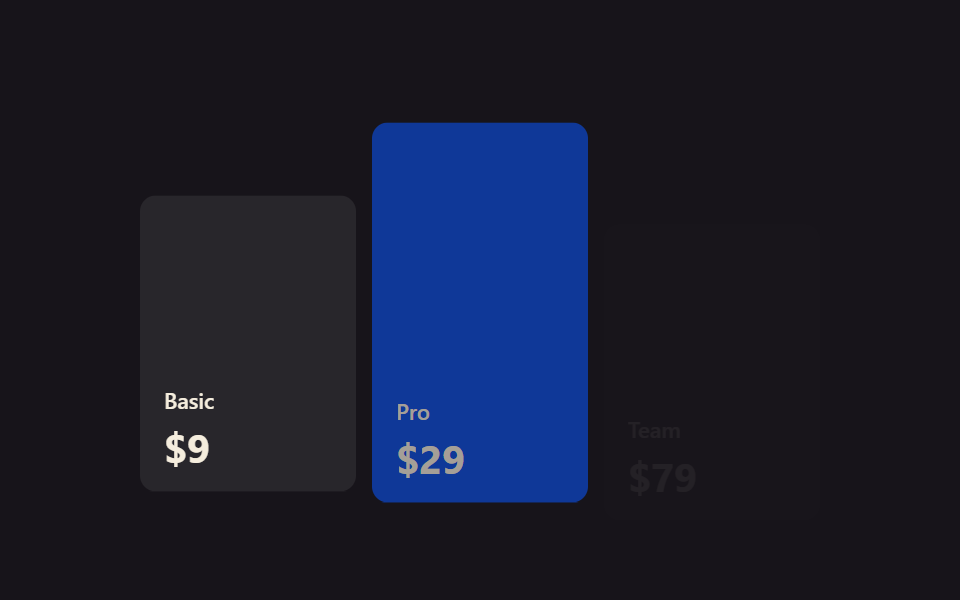 9 mẫu css pricing table animation copy-pasteCss pricing table là khối hiển thị các gói giá xếp cạnh nhau trên một trang. Chín animation cho bảng giá dưới đây viết g Xem tất cả demo trong bài này