08Nhịp tim
`.a-heartbeat` chia keyframes thành nhịp 'đập, đập, nghỉ' với hai lần bật scale ngắn rồi một quãng nghỉ, mô phỏng đúng nhịp không đều của một nhịp tim thật.
Dùng choTrạng thái chờ của icon thích, chấm trạng thái trên dashboard giám sát thời gian thực
scale 2단불균등 리듬1.2초
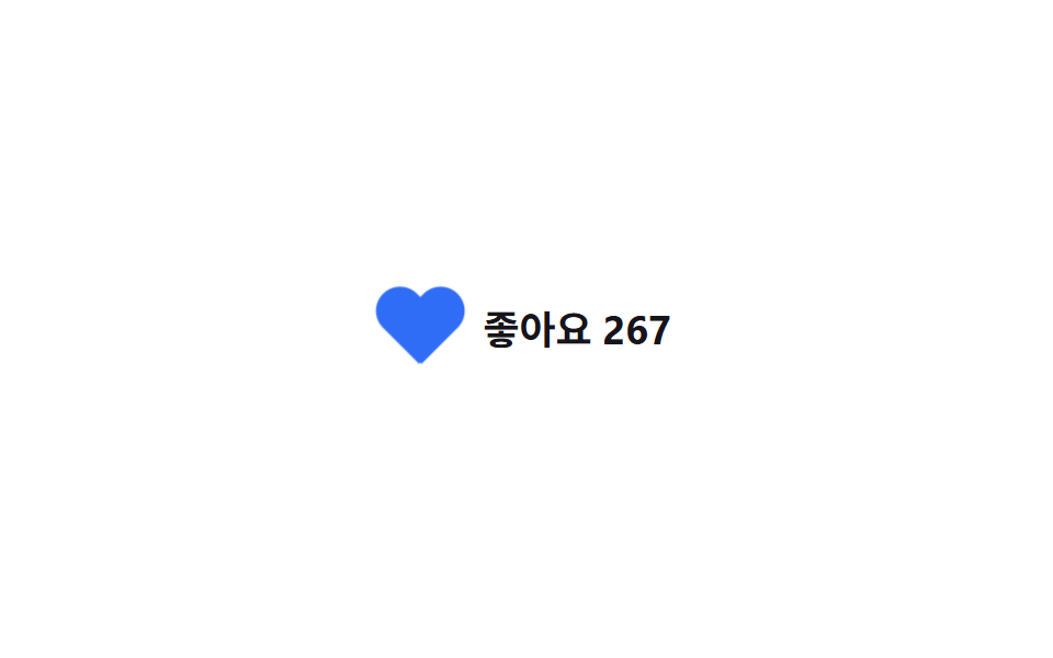
<main class="stage">
  <div class="like">
    <span class="heart a-heartbeat" aria-hidden="true"></span>
    267 lượt thích
  </div>
</main>
@use "../../../../site/static/demo-tokens" as *;
// ── 변수 3개 ──────────────────────────────────────────
$duration: 1.2s;
$easing: ease-in-out;
$color: $subject-blue;
// ── 데모 무대 ───────────────────────────────
@include stage($stage-paper);
.like {
display: inline-flex;
align-items: center;
gap: 12px;
color: $stage-ink;
font-weight: 700; font-size: clamp(15px, 4vw, 18px); line-height: 1; font-family: inherit;
}
// 순수 CSS 하트 — 원 두 개 + 45도 회전한 사각형
.heart {
position: relative;
display: inline-block;
width: 34px;
height: 30px;
flex: none;
}
.heart::before,
.heart::after {
content: "";
position: absolute;
top: 0;
width: 18px;
height: 28px;
background: $color;
border-radius: 18px 18px 0 0;
}
.heart::before { left: 17px; transform: rotate(-45deg); transform-origin: 0 100%; } // 규칙8: 하트반쪽 밑변꼭짓점 회전
.heart::after { left: 0; transform: rotate(45deg); transform-origin: 100% 100%; } // 규칙8: 하트반쪽 밑변꼭짓점 회전
// ── .a-heartbeat 는 scale 을 두 번 짧게 튀우고 쉬어, 실제 심박처럼 불균등하다 ─
.a-heartbeat {
animation: heartbeat $duration $easing infinite;
}
@keyframes heartbeat {
0%, 100% { transform: scale(1); }
14% { transform: scale(1.24); }
28% { transform: scale(1); }
42% { transform: scale(1.18); }
70% { transform: scale(1); }
}
@media (prefers-reduced-motion: reduce) {
.a-heartbeat { animation: none; }
}html, body {
margin: 0;
overflow: hidden;
}
.stage {
box-sizing: border-box;
min-height: 100vh;
display: grid;
place-items: center;
margin: 0;
background: #ffffff;
font-family: -apple-system, "Segoe UI", "Noto Sans KR", sans-serif;
padding: clamp(8px, 4vw, 24px);
}
.like {
display: inline-flex;
align-items: center;
gap: 12px;
color: #17141a;
font-weight: 700;
font-size: clamp(15px, 4vw, 18px);
line-height: 1;
font-family: inherit;
}
.heart {
position: relative;
display: inline-block;
width: 34px;
height: 30px;
flex: none;
}
.heart::before,
.heart::after {
content: "";
position: absolute;
top: 0;
width: 18px;
height: 28px;
background: #2f6df6;
border-radius: 18px 18px 0 0;
}
.heart::before {
left: 17px;
transform: rotate(-45deg);
transform-origin: 0 100%;
}
.heart::after {
left: 0;
transform: rotate(45deg);
transform-origin: 100% 100%;
}
.a-heartbeat {
animation: heartbeat 1.2s ease-in-out infinite;
}
@keyframes heartbeat {
0%, 100% {
transform: scale(1);
}
14% {
transform: scale(1.24);
}
28% {
transform: scale(1);
}
42% {
transform: scale(1.18);
}
70% {
transform: scale(1);
}
}
@media (prefers-reduced-motion: reduce) {
.a-heartbeat {
animation: none;
}
}import type { CSSProperties, ReactNode } from "react";
import styles from "./HeartbeatLike.module.scss";
export type HeartbeatLikeProps = {
children: ReactNode;
/** 한 박자가 걸리는 시간 (기본 1200ms) */
duration?: number;
/** CSS easing (기본 ease-in-out) */
easing?: string;
/** 하트 색 */
color?: string;
};
type Vars = CSSProperties & {
"--duration"?: string;
"--easing"?: string;
"--color"?: string;
};
export default function HeartbeatLike({
children,
duration = 1200,
easing = "ease-in-out",
color = "#2f6df6",
}: HeartbeatLikeProps) {
const vars: Vars = {
"--duration": `${duration}ms`,
"--easing": easing,
"--color": color,
};
return (
<div className={styles.like} style={vars}>
<span className={styles.heart} aria-hidden="true" />
{children}
</div>
);
}08 Nhịp tim — Diện tích đo được 0.356% · khung hình chuyển động 19/23Nguyên tác GODRICH · SCSS và React nằm trong tệp zip · 9 CSS Keyframe Animations — dán 1 dòng là chạy
Bài viết chứa demo này
 9 CSS Keyframe Animations — dán 1 dòng là chạyCSS keyframe animation là chuyển động lặp được định nghĩa bằng @keyframes rồi gộp vào một class duy nhất, dán vào phần t Xem tất cả demo trong bài này