03Ba chấm đang gõ
Ba chấm tròn nảy lên xuống theo translateY, mỗi chấm trễ nhau 200ms, báo hiệu đối phương đang gõ.
Dùng choTrạng thái đối phương đang gõ trong messenger, chỉ báo chờ phản hồi của chatbot
translateYanimation-delay무한 반복
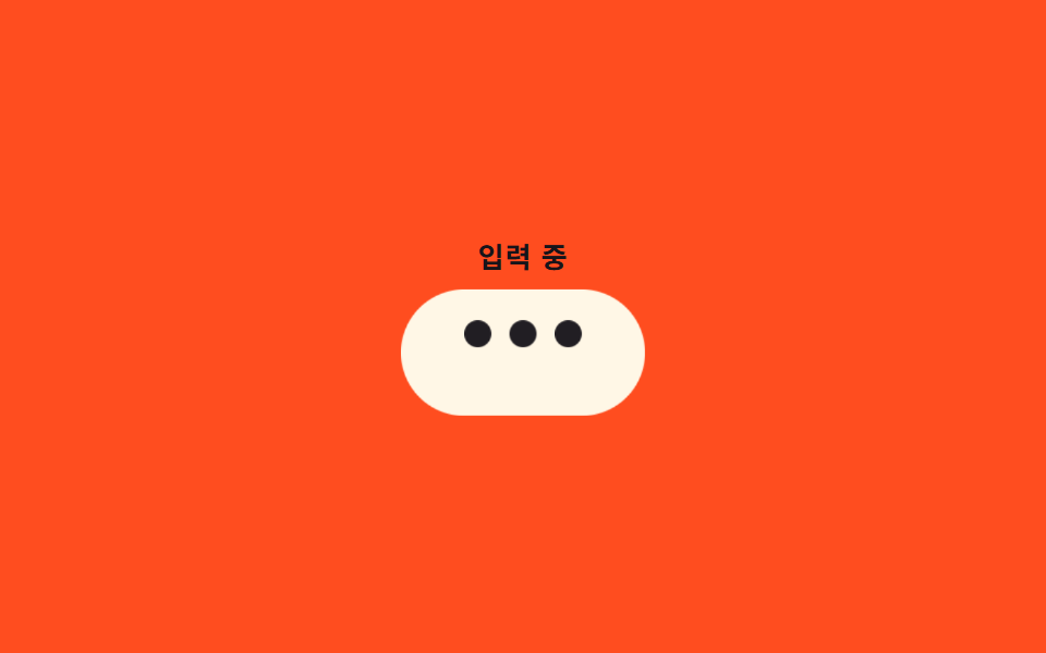
<main class="stage">
  <div class="wrap">
    <p class="label">Đang nhập</p>
    <div class="bubble is-demo">
      <span class="dot"></span>
      <span class="dot"></span>
      <span class="dot"></span>
    </div>
  </div>
</main>
@use "../../../../site/static/demo-tokens" as *;
// ── 변수 3개 ──────────────────────────────────────────────
$duration: $dur-base; // 점 하나가 튀는 데 걸리는 시간
$easing: $ease-out;
$color: $subject-ink; // 점 색 (orange 무대라 cream 말풍선 위 ink 점)
@include stage($stage-orange);
.wrap { display: grid; gap: 10px; justify-items: center; }
.label {
margin: 0;
font-weight: 600; font-size: clamp(11px, 3.2vw, 13px); line-height: 1; font-family: inherit;
letter-spacing: .04em;
color: $subject-ink; // 주황 무대 위 글자 — AA 4.5 (blog-design 글자 대비)
}
.bubble {
display: inline-flex;
align-items: center;
gap: 8px;
padding: 22px 28px;
border-radius: $r-pill;
background: $subject-cream;
transform-origin: center;
&.is-demo { animation: bubble-breathe-loop $dur-loop $easing infinite; }
}
.dot {
width: 12px;
height: 12px;
border-radius: 50%;
background: $color;
opacity: .4;
.bubble.is-demo & {
animation: dot-bounce-loop $dur-loop $easing infinite;
}
// 세 점이 200ms 씩 어긋나게 시작해 파도처럼 보인다 (음수 delay = 이미 진행 중인 위상에서 시작)
&:nth-child(1) { animation-delay: 0s; }
&:nth-child(2) { animation-delay: -.2s; }
&:nth-child(3) { animation-delay: -.4s; }
}
// 점 세 개가 파도처럼 튀는 동안 말풍선 전체도 아주 살짝 숨쉬듯 커졌다 줄어든다 — 작은 UI 라 캔버스 대비 면적을 함께 확보
@keyframes bubble-breathe-loop {
0% { transform: scale(1); }
10% { transform: scale(1.06); }
20% { transform: scale(1); }
100% { transform: scale(1); }
}
@keyframes dot-bounce-loop {
0% { transform: translateY(0); opacity: .4; }
16% { transform: translateY(-9px); opacity: 1; }
32% { transform: translateY(0); opacity: .4; }
100% { transform: translateY(0); opacity: .4; }
}
@media (prefers-reduced-motion: reduce) {
.dot, .bubble.is-demo { animation: none !important; }
.dot { opacity: .7; }
}html, body {
margin: 0;
overflow: hidden;
}
.stage {
box-sizing: border-box;
min-height: 100vh;
display: grid;
place-items: center;
margin: 0;
background: #ff4d1f;
font-family: -apple-system, "Segoe UI", "Noto Sans KR", sans-serif;
padding: clamp(8px, 4vw, 24px);
}
.wrap {
display: grid;
gap: 10px;
justify-items: center;
}
.label {
margin: 0;
font-weight: 600;
font-size: clamp(11px, 3.2vw, 13px);
line-height: 1;
font-family: inherit;
letter-spacing: 0.04em;
color: #17141a;
}
.bubble {
display: inline-flex;
align-items: center;
gap: 8px;
padding: 22px 28px;
border-radius: 999px;
background: #fff7e6;
transform-origin: center;
}
.bubble.is-demo {
animation: bubble-breathe-loop 2s ease-out infinite;
}
.dot {
width: 12px;
height: 12px;
border-radius: 50%;
background: #17141a;
opacity: 0.4;
}
.bubble.is-demo .dot {
animation: dot-bounce-loop 2s ease-out infinite;
}
.dot:nth-child(1) {
animation-delay: 0s;
}
.dot:nth-child(2) {
animation-delay: -0.2s;
}
.dot:nth-child(3) {
animation-delay: -0.4s;
}
@keyframes bubble-breathe-loop {
0% {
transform: scale(1);
}
10% {
transform: scale(1.06);
}
20% {
transform: scale(1);
}
100% {
transform: scale(1);
}
}
@keyframes dot-bounce-loop {
0% {
transform: translateY(0);
opacity: 0.4;
}
16% {
transform: translateY(-9px);
opacity: 1;
}
32% {
transform: translateY(0);
opacity: 0.4;
}
100% {
transform: translateY(0);
opacity: 0.4;
}
}
@media (prefers-reduced-motion: reduce) {
.dot, .bubble.is-demo {
animation: none !important;
}
.dot {
opacity: 0.7;
}
}import type { CSSProperties } from "react";
import styles from "./TypingDots.module.scss";
export type TypingDotsProps = {
/** 점 하나가 튀는 데 걸리는 시간 (기본 300ms) */
duration?: number;
easing?: string;
color?: string;
className?: string;
};
type Vars = CSSProperties & { "--duration"?: string; "--easing"?: string; "--color"?: string };
export default function TypingDots({
duration = 300,
easing = "ease-out",
color = "#17141a",
className = "",
}: TypingDotsProps) {
const vars: Vars = { "--duration": `${duration}ms`, "--easing": easing, "--color": color };
return (
<div className={`${styles.bubble} ${className}`} style={vars}>
<span className={styles.dot} />
<span className={styles.dot} />
<span className={styles.dot} />
</div>
);
}03 Ba chấm đang gõ — Diện tích đo được 1.219% · khung hình chuyển động 8/23Nguyên tác GODRICH · SCSS và React nằm trong tệp zip · 9 CSS Chat Bubble Animation — dán 1 dòng là chạy
Bài viết chứa demo này
 9 CSS Chat Bubble Animation — dán 1 dòng là chạyCSS chat bubble animation là hiệu ứng bong bóng chat chạy bằng CSS thuần khi tin nhắn xuất hiện hoặc được xem. Chín kiểu Xem tất cả demo trong bài này