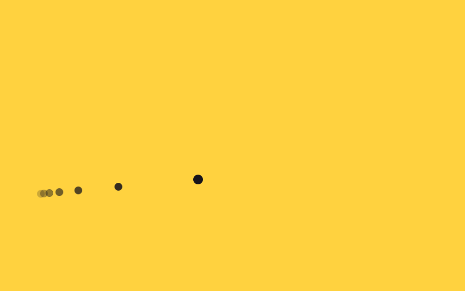
06Vệt đuôi mờ dần
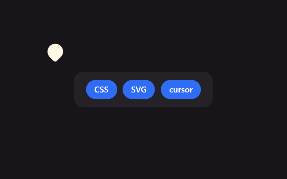
Những chấm nhỏ được thả ra ở khoảng cách ngắn dọc đường đi của con trỏ, mỗi chấm chuyển opacity về 0, để lại một cái đuôi mờ dần sau khi di chuyển.
Dùng choPortfolio sáng tạo, landing nghệ thuật tương tác
animation-delayopacity 트랜지션잔상 점
<main class="stage">
  <div class="trail is-demo" aria-hidden="true">
    <span></span><span></span><span></span><span></span><span></span><span></span>
  </div>
  <div class="cursor is-demo" aria-hidden="true"></div>
</main>
@use "../../../../site/static/demo-tokens" as *;
$duration: $dur-loop; // 경로를 한 바퀴 도는 시간
$easing: $ease-spring;
$color: $subject-ink; // 점 색
@include stage($stage-yellow);
.stage { position: relative; overflow: hidden; cursor: none; }
.cursor {
position: absolute;
top: 0;
left: 0;
width: 10px;
height: 10px;
margin: -5px 0 0 -5px;
border-radius: 50%;
background: $color;
pointer-events: none;
&.is-demo { animation: cursor-path $duration $easing infinite; }
}
.trail span {
position: absolute;
top: 0;
left: 0;
width: 8px;
height: 8px;
margin: -4px 0 0 -4px;
border-radius: 50%;
background: $color;
pointer-events: none;
}
// 점마다 같은 경로를 시차(음수 delay)를 두고 돌아 순간마다 서로 다른 위치에 있게 되고, 그게 꼬리로 보인다.
@for $i from 1 through 6 {
.trail.is-demo span:nth-child(#{$i}) {
opacity: 1 - $i * .13;
animation: cursor-path $duration $easing infinite;
animation-delay: -#{$i * 90}ms;
}
}
@keyframes cursor-path {
0% { transform: translate(40px, 200px); }
30% { transform: translate(140px, 60px); }
60% { transform: translate(260px, 180px); }
100% { transform: translate(40px, 200px); }
}
@media (pointer: coarse) {
.cursor, .trail { display: none; }
.stage { cursor: auto; }
}
@media (prefers-reduced-motion: reduce) {
.cursor.is-demo { animation: none; transform: translate(40px, 200px); }
.trail.is-demo span { animation: none; opacity: 0; }
}html, body {
margin: 0;
overflow: hidden;
}
.stage {
box-sizing: border-box;
min-height: 100vh;
display: grid;
place-items: center;
margin: 0;
background: #ffd23f;
font-family: -apple-system, "Segoe UI", "Noto Sans KR", sans-serif;
padding: clamp(8px, 4vw, 24px);
}
.stage {
position: relative;
overflow: hidden;
cursor: none;
}
.cursor {
position: absolute;
top: 0;
left: 0;
width: 10px;
height: 10px;
margin: -5px 0 0 -5px;
border-radius: 50%;
background: #17141a;
pointer-events: none;
}
.cursor.is-demo {
animation: cursor-path 2s cubic-bezier(0.2, 0.8, 0.2, 1) infinite;
}
.trail span {
position: absolute;
top: 0;
left: 0;
width: 8px;
height: 8px;
margin: -4px 0 0 -4px;
border-radius: 50%;
background: #17141a;
pointer-events: none;
}
.trail.is-demo span:nth-child(1) {
opacity: 0.87;
animation: cursor-path 2s cubic-bezier(0.2, 0.8, 0.2, 1) infinite;
animation-delay: -90ms;
}
.trail.is-demo span:nth-child(2) {
opacity: 0.74;
animation: cursor-path 2s cubic-bezier(0.2, 0.8, 0.2, 1) infinite;
animation-delay: -180ms;
}
.trail.is-demo span:nth-child(3) {
opacity: 0.61;
animation: cursor-path 2s cubic-bezier(0.2, 0.8, 0.2, 1) infinite;
animation-delay: -270ms;
}
.trail.is-demo span:nth-child(4) {
opacity: 0.48;
animation: cursor-path 2s cubic-bezier(0.2, 0.8, 0.2, 1) infinite;
animation-delay: -360ms;
}
.trail.is-demo span:nth-child(5) {
opacity: 0.35;
animation: cursor-path 2s cubic-bezier(0.2, 0.8, 0.2, 1) infinite;
animation-delay: -450ms;
}
.trail.is-demo span:nth-child(6) {
opacity: 0.22;
animation: cursor-path 2s cubic-bezier(0.2, 0.8, 0.2, 1) infinite;
animation-delay: -540ms;
}
@keyframes cursor-path {
0% {
transform: translate(40px, 200px);
}
30% {
transform: translate(140px, 60px);
}
60% {
transform: translate(260px, 180px);
}
100% {
transform: translate(40px, 200px);
}
}
@media (pointer: coarse) {
.cursor, .trail {
display: none;
}
.stage {
cursor: auto;
}
}
@media (prefers-reduced-motion: reduce) {
.cursor.is-demo {
animation: none;
transform: translate(40px, 200px);
}
.trail.is-demo span {
animation: none;
opacity: 0;
}
}// 실제 포인터를 움직이면 맨 앞 점이 그 좌표를 따라간다. 꼬리 점들은 같은 경로를 시차를 두고 도는 채로 남는다.
if (matchMedia('(pointer: fine)').matches) {
var stage = document.querySelector('.stage'), cur = document.querySelector('.cursor');
stage.addEventListener('pointermove', function (e) {
cur.classList.remove('is-demo');
var r = stage.getBoundingClientRect();
cur.style.transform = 'translate(' + (e.clientX - r.left) + 'px,' + (e.clientY - r.top) + 'px)';
});
}import { useState } from "react";
import type { CSSProperties, PointerEvent } from "react";
import styles from "./CursorTrail.module.scss";
export type CursorTrailProps = {
dots?: number;
duration?: number;
easing?: string;
color?: string;
};
type Vars = CSSProperties & { "--duration"?: string; "--easing"?: string; "--color"?: string };
export default function CursorTrail({
dots = 6,
duration = 2000,
easing = "cubic-bezier(.2,.8,.2,1)",
color = "#17141a",
}: CursorTrailProps) {
const [demo, setDemo] = useState(true);
const [pos, setPos] = useState({ x: 40, y: 200 });
const move = (e: PointerEvent<HTMLDivElement>) => {
const r = e.currentTarget.getBoundingClientRect();
setDemo(false);
setPos({ x: e.clientX - r.left, y: e.clientY - r.top });
};
const vars: Vars = { "--duration": `${duration}ms`, "--easing": easing, "--color": color };
return (
<div className={styles.stage} style={vars} onPointerMove={move}>
{demo &&
Array.from({ length: dots }).map((_, i) => (
<span
key={i}
className={styles.trailDot}
style={{ opacity: 1 - (i + 1) * 0.13, animationDelay: `${-(i + 1) * 90}ms` }}
/>
))}
<div
className={demo ? `${styles.cursor} ${styles.isDemo}` : styles.cursor}
style={demo ? undefined : { transform: `translate(${pos.x}px,${pos.y}px)` }}
aria-hidden="true"
/>
</div>
);
}06 Vệt đuôi mờ dần — Diện tích đo được 2.407% · khung hình chuyển động 23/23Nguyên tác GODRICH · SCSS và React nằm trong tệp zip · 9 hiệu ứng custom cursor css — copy dán một dòng
Bài viết chứa demo này
 9 hiệu ứng custom cursor css — copy dán một dòngCustom cursor css là cách thay mũi tên mặc định của trình duyệt bằng một phần tử tự vẽ, bám theo toạ độ chuột thật qua p Xem tất cả demo trong bài này