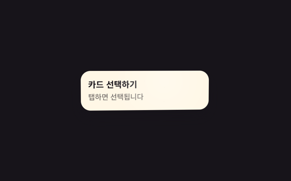
05Hàng danh sách sáng lên khi chạm
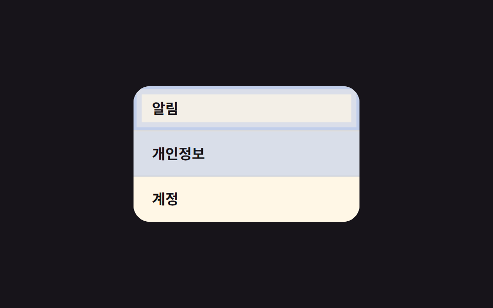
-webkit-tap-highlight-color bị tắt trên toàn hàng, thay vào đó màu nền tự viết bằng :active sáng lên ngay rồi tắt dần, cho biết đúng hàng nào vừa được chạm.
Dùng choDanh sách menu cài đặt hoặc phòng chat, nơi tap được chọn theo từng hàng.
-webkit-tap-highlight-color:active0.2초
<main class="stage">
  <ul class="list">
    <li class="is-demo" tabindex="0">Thông báo</li>
    <li class="is-demo" tabindex="0">Quyền riêng tư</li>
    <li class="is-demo" tabindex="0">Tài khoản</li>
  </ul>
</main>
@use "../../../../site/static/demo-tokens" as *;
$duration: $dur-quick; // 하이라이트가 사라지는 시간
$easing: $ease-out;
$color: $subject-blue; // 하이라이트 색
@include stage($stage-ink);
.list {
width: min(220px, 70vw);
background: $subject-cream;
border-radius: $r-card;
overflow: hidden;
list-style: none;
margin: 0;
padding: 0;
}
.list li {
position: relative;
min-height: 44px; // 터치 목표 44px (WCAG 2.5.8 / Apple HIG)
box-sizing: border-box;
display: flex;
align-items: center;
padding: 14px 18px;
font-weight: 600; font-size: 14px; line-height: 1; font-family: inherit;
color: $stage-ink;
background: $subject-cream;
border-bottom: 1px solid rgba($stage-ink, .08);
-webkit-tap-highlight-color: transparent;
cursor: pointer;
transition: background $duration $easing;
overflow: hidden;
// 규칙8 한 겹: 배경 플래시와 함께 행 안쪽 가장자리로 두 겹 링이 불규칙하게 번지다 감쇠
&::after {
content: "";
position: absolute;
inset: 0;
border-radius: inherit;
box-shadow: inset 0 0 0 0 rgba($color, .4), inset 0 0 0 0 rgba($color, .22);
opacity: 0;
pointer-events: none;
}
}
.list li:last-child { border-bottom: 0; }
.list li:active {
background: rgba($color, .18);
transition: background 0s; // 눌리는 순간은 지연 없이 즉시
}
.list li:active::after {
animation: ripple-wave $dur-enter $easing;
}
.list li.is-demo { animation: row-flash $dur-loop $easing infinite; }
.list li.is-demo::after { animation: ripple-loop $dur-loop $easing infinite; }
.list li:nth-child(2).is-demo,
.list li:nth-child(2).is-demo::after { animation-delay: .4s; }
.list li:nth-child(3).is-demo,
.list li:nth-child(3).is-demo::after { animation-delay: .8s; }
@keyframes row-flash {
0%, 8% { background: rgba($color, .18); }
35% { background: $subject-cream; }
100% { background: $subject-cream; }
}
@keyframes ripple-wave {
0% { box-shadow: inset 0 0 0 0 rgba($color, .4), inset 0 0 0 0 rgba($color, .22); opacity: 1; }
38% { box-shadow: inset 0 0 0 8px rgba($color, .18), inset 0 0 0 3px rgba($color, .22); opacity: .7; }
66% { box-shadow: inset 0 0 0 14px rgba($color, .08), inset 0 0 0 9px rgba($color, .12); opacity: .3; }
100% { box-shadow: inset 0 0 0 20px rgba($color, 0), inset 0 0 0 16px rgba($color, 0); opacity: 0; }
}
@keyframes ripple-loop {
0%, 8% { box-shadow: inset 0 0 0 0 rgba($color, .4), inset 0 0 0 0 rgba($color, .22); opacity: 1; }
22% { box-shadow: inset 0 0 0 8px rgba($color, .18), inset 0 0 0 3px rgba($color, .22); opacity: .7; }
35% { box-shadow: inset 0 0 0 14px rgba($color, .08), inset 0 0 0 9px rgba($color, .12); opacity: .3; }
50%, 100% { box-shadow: inset 0 0 0 20px rgba($color, 0), inset 0 0 0 16px rgba($color, 0); opacity: 0; }
}
@media (prefers-reduced-motion: reduce) {
.list li { transition: none; }
.list li::after { animation: none !important; opacity: 0; }
.list li.is-demo { animation: none; }
}html, body {
margin: 0;
overflow: hidden;
}
.stage {
box-sizing: border-box;
min-height: 100vh;
display: grid;
place-items: center;
margin: 0;
background: #17141a;
font-family: -apple-system, "Segoe UI", "Noto Sans KR", sans-serif;
padding: clamp(8px, 4vw, 24px);
}
.list {
width: min(220px, 70vw);
background: #fff7e6;
border-radius: 16px;
overflow: hidden;
list-style: none;
margin: 0;
padding: 0;
}
.list li {
position: relative;
min-height: 44px;
box-sizing: border-box;
display: flex;
align-items: center;
padding: 14px 18px;
font-weight: 600;
font-size: 14px;
line-height: 1;
font-family: inherit;
color: #17141a;
background: #fff7e6;
border-bottom: 1px solid rgba(23, 20, 26, 0.08);
-webkit-tap-highlight-color: transparent;
cursor: pointer;
transition: background 220ms ease-out;
overflow: hidden;
}
.list li::after {
content: "";
position: absolute;
inset: 0;
border-radius: inherit;
box-shadow: inset 0 0 0 0 rgba(47, 109, 246, 0.4), inset 0 0 0 0 rgba(47, 109, 246, 0.22);
opacity: 0;
pointer-events: none;
}
.list li:last-child {
border-bottom: 0;
}
.list li:active {
background: rgba(47, 109, 246, 0.18);
transition: background 0s;
}
.list li:active::after {
animation: ripple-wave 600ms ease-out;
}
.list li.is-demo {
animation: row-flash 2s ease-out infinite;
}
.list li.is-demo::after {
animation: ripple-loop 2s ease-out infinite;
}
.list li:nth-child(2).is-demo,
.list li:nth-child(2).is-demo::after {
animation-delay: 0.4s;
}
.list li:nth-child(3).is-demo,
.list li:nth-child(3).is-demo::after {
animation-delay: 0.8s;
}
@keyframes row-flash {
0%, 8% {
background: rgba(47, 109, 246, 0.18);
}
35% {
background: #fff7e6;
}
100% {
background: #fff7e6;
}
}
@keyframes ripple-wave {
0% {
box-shadow: inset 0 0 0 0 rgba(47, 109, 246, 0.4), inset 0 0 0 0 rgba(47, 109, 246, 0.22);
opacity: 1;
}
38% {
box-shadow: inset 0 0 0 8px rgba(47, 109, 246, 0.18), inset 0 0 0 3px rgba(47, 109, 246, 0.22);
opacity: 0.7;
}
66% {
box-shadow: inset 0 0 0 14px rgba(47, 109, 246, 0.08), inset 0 0 0 9px rgba(47, 109, 246, 0.12);
opacity: 0.3;
}
100% {
box-shadow: inset 0 0 0 20px rgba(47, 109, 246, 0), inset 0 0 0 16px rgba(47, 109, 246, 0);
opacity: 0;
}
}
@keyframes ripple-loop {
0%, 8% {
box-shadow: inset 0 0 0 0 rgba(47, 109, 246, 0.4), inset 0 0 0 0 rgba(47, 109, 246, 0.22);
opacity: 1;
}
22% {
box-shadow: inset 0 0 0 8px rgba(47, 109, 246, 0.18), inset 0 0 0 3px rgba(47, 109, 246, 0.22);
opacity: 0.7;
}
35% {
box-shadow: inset 0 0 0 14px rgba(47, 109, 246, 0.08), inset 0 0 0 9px rgba(47, 109, 246, 0.12);
opacity: 0.3;
}
50%, 100% {
box-shadow: inset 0 0 0 20px rgba(47, 109, 246, 0), inset 0 0 0 16px rgba(47, 109, 246, 0);
opacity: 0;
}
}
@media (prefers-reduced-motion: reduce) {
.list li {
transition: none;
}
.list li::after {
animation: none !important;
opacity: 0;
}
.list li.is-demo {
animation: none;
}
}import type { CSSProperties } from "react";
import styles from "./TapHighlightList.module.scss";
export type TapHighlightListProps = {
items: string[];
duration?: number;
easing?: string;
color?: string;
};
type Vars = CSSProperties & { "--duration"?: string; "--easing"?: string; "--color"?: string };
export default function TapHighlightList({
items,
duration = 220,
easing = "ease-out",
color = "#2f6df6",
}: TapHighlightListProps) {
const vars: Vars = { "--duration": `${duration}ms`, "--easing": easing, "--color": color };
return (
<ul className={styles.list} style={vars}>
{items.map((label) => (
<li key={label}>{label}</li>
))}
</ul>
);
}05 Hàng danh sách sáng lên khi chạm — Diện tích đo được 19.752% · khung hình chuyển động 16/23Nguyên tác GODRICH · SCSS và React nằm trong tệp zip · 9 CSS Button Click Feedback, dán 1 dòng chạy ngay
Bài viết chứa demo này
 9 CSS Button Click Feedback, dán 1 dòng chạy ngayCSS button click feedback là chuyển động CSS ngắn xuất hiện khi bạn nhấn hoặc chạm vào một nút, báo hiệu rằng thao tác đ Xem tất cả demo trong bài này