09Link trong đoạn văn sáng lên khi chạm
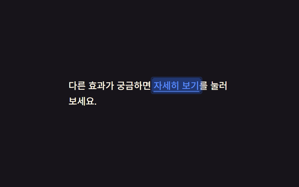
Chạm vào một link nằm giữa câu văn, một khối màu hiện lên sau chữ rồi tắt trong 140ms, để lại dấu vết đã bấm dù tap-highlight mặc định của trình duyệt đã bị tắt.
Dùng choBài blog hoặc trang điều khoản, nơi link nằm lẫn trong câu văn chứ không đứng riêng.
background:active0.14초
<main class="stage">
  <p class="p">Muốn xem thêm hiệu ứng khác? <a href="#" class="p__link is-demo">Xem chi tiết</a> ở bên dưới.</p>
</main>
@use "../../../../site/static/demo-tokens" as *;
$duration: $dur-instant; // 배경 블록이 사라지는 시간 (0.14초)
$easing: $ease-out;
$color: $subject-blue; // 링크·하이라이트 색
@include stage($stage-ink);
.stage { padding: clamp(10px, 4vw, 28px); }
.p {
max-width: 260px;
font-weight: 500; font-size: 15px; line-height: 1.7; font-family: inherit;
color: $subject-cream;
margin: 0;
}
.p__link {
position: relative;
color: $subject-blue-light; // AA: 잉크 면 위 파란 링크 5.69:1 (탭 하이라이트는 $color 유지)
text-decoration: underline;
text-underline-offset: 3px;
-webkit-tap-highlight-color: transparent;
padding: 2px 3px;
margin: -2px -3px;
border-radius: 4px;
background: transparent;
transition: background $duration $easing;
// 규칙8 한 겹: 배경 플래시와 함께 두 겹 링이 불규칙하게 번지다 감쇠
&::after {
content: "";
position: absolute;
inset: -2px;
border-radius: inherit;
box-shadow: inset 0 0 0 0 rgba($color, .4), inset 0 0 0 0 rgba($color, .22);
opacity: 0;
pointer-events: none;
}
}
.p__link:active {
background: rgba($color, .32);
transition: background 0s;
}
.p__link:active::after {
animation: ripple-wave $dur-instant $ease-out;
}
.p__link.is-demo { animation: link-flash $dur-loop cubic-bezier(0, 0, 1, 1) infinite; }
.p__link.is-demo::after { animation: ripple-loop $dur-loop cubic-bezier(0, 0, 1, 1) infinite; }
@keyframes link-flash {
0% { background: rgba($color, .62); }
35% { background: rgba($color, 0); }
100% { background: rgba($color, 0); }
}
@keyframes ripple-wave {
0% { box-shadow: inset 0 0 0 0 rgba($color, .4), inset 0 0 0 0 rgba($color, .22); opacity: 1; }
100% { box-shadow: inset 0 0 0 6px rgba($color, 0), inset 0 0 0 4px rgba($color, 0); opacity: 0; }
}
@keyframes ripple-loop {
0% { box-shadow: inset 0 0 0 0 rgba($color, .4), inset 0 0 0 0 rgba($color, .22); opacity: 1; }
35% { box-shadow: inset 0 0 0 6px rgba($color, 0), inset 0 0 0 4px rgba($color, 0); opacity: 0; }
100% { box-shadow: inset 0 0 0 6px rgba($color, 0), inset 0 0 0 4px rgba($color, 0); opacity: 0; }
}
@media (prefers-reduced-motion: reduce) {
.p__link { transition: none; }
.p__link::after { animation: none !important; opacity: 0; }
.p__link.is-demo { animation: none; }
}html, body {
margin: 0;
overflow: hidden;
}
.stage {
box-sizing: border-box;
min-height: 100vh;
display: grid;
place-items: center;
margin: 0;
background: #17141a;
font-family: -apple-system, "Segoe UI", "Noto Sans KR", sans-serif;
padding: clamp(8px, 4vw, 24px);
}
.stage {
padding: clamp(10px, 4vw, 28px);
}
.p {
max-width: 260px;
font-weight: 500;
font-size: 15px;
line-height: 1.7;
font-family: inherit;
color: #fff7e6;
margin: 0;
}
.p__link {
position: relative;
color: #5b8cf8;
text-decoration: underline;
text-underline-offset: 3px;
-webkit-tap-highlight-color: transparent;
padding: 2px 3px;
margin: -2px -3px;
border-radius: 4px;
background: transparent;
transition: background 140ms ease-out;
}
.p__link::after {
content: "";
position: absolute;
inset: -2px;
border-radius: inherit;
box-shadow: inset 0 0 0 0 rgba(47, 109, 246, 0.4), inset 0 0 0 0 rgba(47, 109, 246, 0.22);
opacity: 0;
pointer-events: none;
}
.p__link:active {
background: rgba(47, 109, 246, 0.32);
transition: background 0s;
}
.p__link:active::after {
animation: ripple-wave 140ms ease-out;
}
.p__link.is-demo {
animation: link-flash 2s cubic-bezier(0, 0, 1, 1) infinite;
}
.p__link.is-demo::after {
animation: ripple-loop 2s cubic-bezier(0, 0, 1, 1) infinite;
}
@keyframes link-flash {
0% {
background: rgba(47, 109, 246, 0.62);
}
35% {
background: rgba(47, 109, 246, 0);
}
100% {
background: rgba(47, 109, 246, 0);
}
}
@keyframes ripple-wave {
0% {
box-shadow: inset 0 0 0 0 rgba(47, 109, 246, 0.4), inset 0 0 0 0 rgba(47, 109, 246, 0.22);
opacity: 1;
}
100% {
box-shadow: inset 0 0 0 6px rgba(47, 109, 246, 0), inset 0 0 0 4px rgba(47, 109, 246, 0);
opacity: 0;
}
}
@keyframes ripple-loop {
0% {
box-shadow: inset 0 0 0 0 rgba(47, 109, 246, 0.4), inset 0 0 0 0 rgba(47, 109, 246, 0.22);
opacity: 1;
}
35% {
box-shadow: inset 0 0 0 6px rgba(47, 109, 246, 0), inset 0 0 0 4px rgba(47, 109, 246, 0);
opacity: 0;
}
100% {
box-shadow: inset 0 0 0 6px rgba(47, 109, 246, 0), inset 0 0 0 4px rgba(47, 109, 246, 0);
opacity: 0;
}
}
@media (prefers-reduced-motion: reduce) {
.p__link {
transition: none;
}
.p__link::after {
animation: none !important;
opacity: 0;
}
.p__link.is-demo {
animation: none;
}
}import type { CSSProperties, ReactNode } from "react";
import styles from "./TapLinkText.module.scss";
export type TapLinkTextProps = {
before: string;
linkText: string;
after: string;
href?: string;
duration?: number;
easing?: string;
color?: string;
children?: ReactNode;
};
type Vars = CSSProperties & { "--duration"?: string; "--easing"?: string; "--color"?: string };
export default function TapLinkText({
before,
linkText,
after,
href = "#",
duration = 140,
easing = "ease-out",
color = "#5b8cf8",
}: TapLinkTextProps) {
const vars: Vars = { "--duration": `${duration}ms`, "--easing": easing, "--color": color };
return (
<p className={styles.p} style={vars}>
{before} <a href={href} className={styles.link}>{linkText}</a>{after}
</p>
);
}09 Link trong đoạn văn sáng lên khi chạm — Diện tích đo được 1.469% · khung hình chuyển động 8/23Nguyên tác GODRICH · SCSS và React nằm trong tệp zip · 9 CSS Button Click Feedback, dán 1 dòng chạy ngay
Bài viết chứa demo này
 9 CSS Button Click Feedback, dán 1 dòng chạy ngayCSS button click feedback là chuyển động CSS ngắn xuất hiện khi bạn nhấn hoặc chạm vào một nút, báo hiệu rằng thao tác đ Xem tất cả demo trong bài này