02Mưa confetti
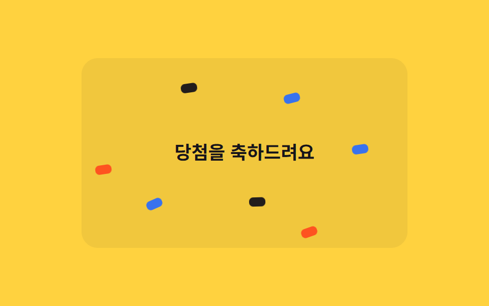
Trên banner chúc mừng, các mảnh confetti to nhỏ khác nhau rơi mãi với delay riêng, chỉ dùng translateY và rotate mà lấp đầy khung hình như mưa.
Dùng choBanner trúng thưởng, màn hình chúc đạt mục tiêu
@for 루프translateY2.4s
<main class="stage">
  <div class="cr-wrap is-demo">
    <span class="cr-banner">Chúc mừng bạn trúng thưởng</span>
    <span class="cr-piece"></span><span class="cr-piece"></span><span class="cr-piece"></span>
    <span class="cr-piece"></span><span class="cr-piece"></span><span class="cr-piece"></span>
    <span class="cr-piece"></span><span class="cr-piece"></span><span class="cr-piece"></span>
    <span class="cr-piece"></span><span class="cr-piece"></span><span class="cr-piece"></span>
    <span class="cr-piece"></span><span class="cr-piece"></span><span class="cr-piece"></span>
    <span class="cr-piece"></span><span class="cr-piece"></span><span class="cr-piece"></span>
  </div>
</main>
@use "../../../../site/static/demo-tokens" as *;
// ── 변수 3개 ──────────────────────────────────────────
$duration: 2s;
$easing: linear;
$color: $subject-blue;
@include stage($stage-yellow);
$piece-colors: $color, $stage-orange, $subject-ink, $subject-cream;
.cr-wrap {
position: relative;
width: min(320px, 88vw);
height: min(220px, 62vh);
overflow: hidden;
border-radius: $r-card;
background: rgba(23, 20, 26, .06);
}
.cr-banner {
position: absolute;
inset: 0;
display: grid;
place-items: center;
padding: $sp-4;
box-sizing: border-box;
text-align: center;
color: $subject-ink;
font: 700 18px/1.3 -apple-system, "Segoe UI", "Noto Sans KR", sans-serif;
}
.cr-piece {
position: absolute;
top: -220px;
width: 9px;
height: 16px;
border-radius: $r-xs;
opacity: .95;
animation-duration: $duration;
}
// 조각 18개가 카드 높이 전체에 걸쳐 서로 다른 top 시작값을 갖는다 — delay 만 다르면 전부 위쪽에서
// 한 줄로 뭉쳐 같이 출발해 버린다 (실측). top 순서를 왼쪽 순서(left%)와 다르게 섞어야 대각선 한 줄이
// 아니라 흩뿌린 비처럼 보인다 (실측: left·top 을 같은 $i 로 선형 배치하면 완벽한 대각선이 된다)
$tops: -40px, 160px, -180px, 20px, 100px, -120px, 60px, -200px, 140px, -20px, 180px, -100px, 40px, -160px, 120px, -60px, 200px, -140px;
@for $i from 1 through 18 {
.cr-piece:nth-child(#{$i + 1}) {
left: percentage($i / 19);
top: nth($tops, $i);
background: nth($piece-colors, $i % 4 + 1);
animation-duration: #{1700ms + ($i % 5) * 140ms};
}
}
@keyframes cr-fall {
0% { transform: translateY(0) rotate(0deg); }
100% { transform: translateY(520px) rotate(300deg); }
}
// duration 은 shorthand 로 주지 않는다 — 그러면 specificity 가 더 높아 항목마다 다른 animation-duration(위) 을
// 덮어써 18개가 전부 같은 박자로 떨어져 버린다 (실측). name·timing·iteration 만 여기서, duration 은 조각마다
.cr-wrap.is-demo .cr-piece { animation-name: cr-fall; animation-timing-function: $easing; animation-iteration-count: infinite; }
@media (prefers-reduced-motion: reduce) {
.cr-wrap.is-demo .cr-piece { animation: none !important; opacity: 0 !important; }
}html, body {
margin: 0;
overflow: hidden;
}
.stage {
box-sizing: border-box;
min-height: 100vh;
display: grid;
place-items: center;
margin: 0;
background: #ffd23f;
font-family: -apple-system, "Segoe UI", "Noto Sans KR", sans-serif;
padding: clamp(8px, 4vw, 24px);
}
.cr-wrap {
position: relative;
width: min(320px, 88vw);
height: min(220px, 62vh);
overflow: hidden;
border-radius: 16px;
background: rgba(23, 20, 26, 0.06);
}
.cr-banner {
position: absolute;
inset: 0;
display: grid;
place-items: center;
padding: 16px;
box-sizing: border-box;
text-align: center;
color: #17141a;
font: 700 18px/1.3 -apple-system, "Segoe UI", "Noto Sans KR", sans-serif;
}
.cr-piece {
position: absolute;
top: -220px;
width: 9px;
height: 16px;
border-radius: 4px;
opacity: 0.95;
animation-duration: 2s;
}
.cr-piece:nth-child(2) {
left: 5.2631578947%;
top: -40px;
background: #ff4d1f;
animation-duration: 1840ms;
}
.cr-piece:nth-child(3) {
left: 10.5263157895%;
top: 160px;
background: #17141a;
animation-duration: 1980ms;
}
.cr-piece:nth-child(4) {
left: 15.7894736842%;
top: -180px;
background: #fff7e6;
animation-duration: 2120ms;
}
.cr-piece:nth-child(5) {
left: 21.0526315789%;
top: 20px;
background: #2f6df6;
animation-duration: 2260ms;
}
.cr-piece:nth-child(6) {
left: 26.3157894737%;
top: 100px;
background: #ff4d1f;
animation-duration: 1700ms;
}
.cr-piece:nth-child(7) {
left: 31.5789473684%;
top: -120px;
background: #17141a;
animation-duration: 1840ms;
}
.cr-piece:nth-child(8) {
left: 36.8421052632%;
top: 60px;
background: #fff7e6;
animation-duration: 1980ms;
}
.cr-piece:nth-child(9) {
left: 42.1052631579%;
top: -200px;
background: #2f6df6;
animation-duration: 2120ms;
}
.cr-piece:nth-child(10) {
left: 47.3684210526%;
top: 140px;
background: #ff4d1f;
animation-duration: 2260ms;
}
.cr-piece:nth-child(11) {
left: 52.6315789474%;
top: -20px;
background: #17141a;
animation-duration: 1700ms;
}
.cr-piece:nth-child(12) {
left: 57.8947368421%;
top: 180px;
background: #fff7e6;
animation-duration: 1840ms;
}
.cr-piece:nth-child(13) {
left: 63.1578947368%;
top: -100px;
background: #2f6df6;
animation-duration: 1980ms;
}
.cr-piece:nth-child(14) {
left: 68.4210526316%;
top: 40px;
background: #ff4d1f;
animation-duration: 2120ms;
}
.cr-piece:nth-child(15) {
left: 73.6842105263%;
top: -160px;
background: #17141a;
animation-duration: 2260ms;
}
.cr-piece:nth-child(16) {
left: 78.9473684211%;
top: 120px;
background: #fff7e6;
animation-duration: 1700ms;
}
.cr-piece:nth-child(17) {
left: 84.2105263158%;
top: -60px;
background: #2f6df6;
animation-duration: 1840ms;
}
.cr-piece:nth-child(18) {
left: 89.4736842105%;
top: 200px;
background: #ff4d1f;
animation-duration: 1980ms;
}
.cr-piece:nth-child(19) {
left: 94.7368421053%;
top: -140px;
background: #17141a;
animation-duration: 2120ms;
}
@keyframes cr-fall {
0% {
transform: translateY(0) rotate(0deg);
}
100% {
transform: translateY(520px) rotate(300deg);
}
}
.cr-wrap.is-demo .cr-piece {
animation-name: cr-fall;
animation-timing-function: linear;
animation-iteration-count: infinite;
}
@media (prefers-reduced-motion: reduce) {
.cr-wrap.is-demo .cr-piece {
animation: none !important;
opacity: 0 !important;
}
}import { CSSProperties } from "react";
import styles from "./ConfettiRain.module.scss";
type Vars = CSSProperties & Record<string, string>;
export interface ConfettiRainProps {
duration?: string;
easing?: string;
color?: string;
}
const COLORS = ["var(--color)", "#ff4d1f", "#17141a", "#fff7e6"];
// top 을 left% 순서와 다르게 섞는다 — 둘을 같은 인덱스로 선형 배치하면 낙하가 아니라 대각선 한 줄로 보인다
const TOPS = [-40, 160, -180, 20, 100, -120, 60, -200, 140, -20, 180, -100, 40, -160, 120, -60, 200, -140];
export default function ConfettiRain({
duration = "2s",
easing = "linear",
color = "#2f6df6",
}: ConfettiRainProps) {
const style: Vars = { "--duration": duration, "--easing": easing, "--color": color };
return (
<div className={styles.wrap} style={style}>
<span className={styles.banner}>당첨을 축하드려요</span>
{TOPS.map((top, i) => {
const pieceStyle: Vars = {
left: `${((i + 1) / (TOPS.length + 1)) * 100}%`,
top: `${top}px`,
background: COLORS[i % COLORS.length],
animationDuration: `${1700 + (i % 5) * 140}ms`,
};
return <span key={i} className={styles.piece} style={pieceStyle} />;
})}
</div>
);
}02 Mưa confetti — Diện tích đo được 12.233% · khung hình chuyển động 22/23Nguyên tác GODRICH · SCSS và React nằm trong tệp zip · 9 css confetti animation — dán một file là chạy
Bài viết chứa demo này
 9 css confetti animation — dán một file là chạyBạn hẳn đã gặp css confetti animation ít nhất một lần: giấy màu bắn ra khoảnh khắc đăng ký hay thanh toán xong. Chín các Xem tất cả demo trong bài này