03Nút lấp lánh
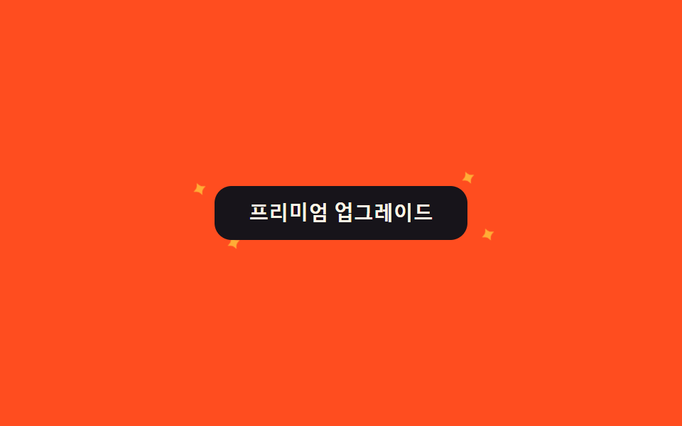
Hover lên nút premium, bốn ngôi sao nhỏ quanh viền lần lượt nhấp nháy bằng cách đổi qua lại scale và opacity, mỗi ngôi một animation-delay riêng.
Dùng choNút nâng cấp premium, CTA gói giá được đề xuất
scaleopacitystaggered delay
<main class="stage">
  <div class="sk-wrap is-demo">
    <button class="sk-btn" type="button">Nâng cấp lên Premium</button>
    <span class="sk-star sk-star--1">✦</span>
    <span class="sk-star sk-star--2">✦</span>
    <span class="sk-star sk-star--3">✦</span>
    <span class="sk-star sk-star--4">✦</span>
  </div>
</main>
@use "../../../../site/static/demo-tokens" as *;
// ── 변수 3개 ──────────────────────────────────────────
$duration: 1.1s;
$easing: $ease-out;
$color: $stage-yellow;
@include stage($stage-orange);
.sk-wrap {
position: relative;
width: min(240px, 82vw);
display: grid;
place-items: center;
}
.sk-btn {
position: relative;
z-index: 1;
border: 0;
border-radius: $r-control;
padding: $sp-3 $sp-6;
background: $subject-ink;
color: $subject-cream;
font: 700 14px/1 -apple-system, "Segoe UI", sans-serif;
cursor: pointer;
transition: transform $dur-quick $easing;
}
.sk-wrap:hover .sk-btn { transform: scale(1.03); }
.sk-star {
position: absolute;
color: $color;
font-size: 16px;
line-height: 1;
opacity: 0;
transform: scale(.3);
pointer-events: none;
}
.sk-star--1 { top: -6px; left: 6%; }
.sk-star--2 { top: -14px; right: 10%; }
.sk-star--3 { bottom: -10px; left: 16%; }
.sk-star--4 { bottom: -4px; right: 4%; }
@keyframes sk-twinkle {
0%, 100% { opacity: 0; transform: scale(.3) rotate(0deg); }
50% { opacity: 1; transform: scale(1) rotate(90deg); }
}
// 실사용: 호버 중에만 반짝인다. 캡처용 is-demo 는 항상 켠다
.sk-wrap:hover .sk-star,
.sk-wrap.is-demo .sk-star { animation: sk-twinkle $duration $easing infinite; }
.sk-star--2 { animation-delay: 160ms; }
.sk-star--3 { animation-delay: 320ms; }
.sk-star--4 { animation-delay: 480ms; }
@media (prefers-reduced-motion: reduce) {
.sk-wrap:hover .sk-star,
.sk-wrap.is-demo .sk-star { animation: none !important; opacity: 0 !important; }
}html, body {
margin: 0;
overflow: hidden;
}
.stage {
box-sizing: border-box;
min-height: 100vh;
display: grid;
place-items: center;
margin: 0;
background: #ff4d1f;
font-family: -apple-system, "Segoe UI", "Noto Sans KR", sans-serif;
padding: clamp(8px, 4vw, 24px);
}
.sk-wrap {
position: relative;
width: min(240px, 82vw);
display: grid;
place-items: center;
}
.sk-btn {
position: relative;
z-index: 1;
border: 0;
border-radius: 12px;
padding: 12px 24px;
background: #17141a;
color: #fff7e6;
font: 700 14px/1 -apple-system, "Segoe UI", sans-serif;
cursor: pointer;
transition: transform 220ms ease-out;
}
.sk-wrap:hover .sk-btn {
transform: scale(1.03);
}
.sk-star {
position: absolute;
color: #ffd23f;
font-size: 16px;
line-height: 1;
opacity: 0;
transform: scale(0.3);
pointer-events: none;
}
.sk-star--1 {
top: -6px;
left: 6%;
}
.sk-star--2 {
top: -14px;
right: 10%;
}
.sk-star--3 {
bottom: -10px;
left: 16%;
}
.sk-star--4 {
bottom: -4px;
right: 4%;
}
@keyframes sk-twinkle {
0%, 100% {
opacity: 0;
transform: scale(0.3) rotate(0deg);
}
50% {
opacity: 1;
transform: scale(1) rotate(90deg);
}
}
.sk-wrap:hover .sk-star,
.sk-wrap.is-demo .sk-star {
animation: sk-twinkle 1.1s ease-out infinite;
}
.sk-star--2 {
animation-delay: 160ms;
}
.sk-star--3 {
animation-delay: 320ms;
}
.sk-star--4 {
animation-delay: 480ms;
}
@media (prefers-reduced-motion: reduce) {
.sk-wrap:hover .sk-star,
.sk-wrap.is-demo .sk-star {
animation: none !important;
opacity: 0 !important;
}
}import { CSSProperties } from "react";
import styles from "./SparkleButton.module.scss";
type Vars = CSSProperties & Record<string, string>;
export interface SparkleButtonProps {
duration?: string;
easing?: string;
color?: string;
}
// 실사용: 진짜 :hover 중에만 반짝인다 (module.scss 의 .wrap:hover). props 는 변수 3개만 넘긴다
export default function SparkleButton({
duration = "1.1s",
easing = "ease-out",
color = "#ffd23f",
}: SparkleButtonProps) {
const style: Vars = { "--duration": duration, "--easing": easing, "--color": color };
return (
<div className={styles.wrap} style={style}>
<button className={styles.btn} type="button">
프리미엄 업그레이드
</button>
<span className={`${styles.star} ${styles.star1}`}>✦</span>
<span className={`${styles.star} ${styles.star2}`}>✦</span>
<span className={`${styles.star} ${styles.star3}`}>✦</span>
<span className={`${styles.star} ${styles.star4}`}>✦</span>
</div>
);
}03 Nút lấp lánh — Diện tích đo được 0.213% · khung hình chuyển động 22/23Nguyên tác GODRICH · SCSS và React nằm trong tệp zip · 9 css confetti animation — dán một file là chạy
Bài viết chứa demo này
 9 css confetti animation — dán một file là chạyBạn hẳn đã gặp css confetti animation ít nhất một lần: giấy màu bắn ra khoảnh khắc đăng ký hay thanh toán xong. Chín các Xem tất cả demo trong bài này