04Chữ lấp lánh
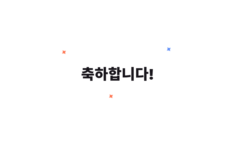
Ba đốm sáng nhỏ đặt quanh tiêu đề chúc mừng, chớp tắt theo thời điểm riêng bằng animation scale và opacity.
Dùng choTiêu đề lời chúc mừng, tít khuyến mãi
scaleopacity@keyframes twinkle
<main class="stage">
  <div class="st-wrap is-demo">
    <h2 class="st-title">Chúc mừng!</h2>
    <span class="st-star st-star--1">✦</span>
    <span class="st-star st-star--2">✦</span>
    <span class="st-star st-star--3">✦</span>
  </div>
</main>
@use "../../../../site/static/demo-tokens" as *;
// ── 변수 3개 ──────────────────────────────────────────
$duration: 1.3s;
$easing: $ease-out;
$color: $subject-blue;
@include stage($stage-paper);
.st-wrap {
position: relative;
display: grid;
place-items: center;
padding: $sp-6;
}
.st-title {
margin: 0;
color: $subject-ink;
font: 800 30px/1 -apple-system, "Segoe UI", "Noto Sans KR", sans-serif;
}
.st-star {
position: absolute;
color: $color;
font-size: 18px;
line-height: 1;
opacity: 0;
transform: scale(.2);
pointer-events: none;
}
.st-star--1 { top: -14px; left: -18px; color: $stage-orange; }
.st-star--2 { top: -20px; right: -14px; }
.st-star--3 { bottom: -16px; left: 40%; color: $stage-orange; }
@keyframes st-twinkle {
0%, 100% { opacity: 0; transform: scale(.2) rotate(0deg); }
50% { opacity: 1; transform: scale(1) rotate(70deg); }
}
.st-wrap.is-demo .st-star { animation: st-twinkle $duration $easing infinite; }
.st-star--2 { animation-delay: 260ms; }
.st-star--3 { animation-delay: 480ms; }
@media (prefers-reduced-motion: reduce) {
.st-wrap.is-demo .st-star { animation: none !important; opacity: 0 !important; }
}html, body {
margin: 0;
overflow: hidden;
}
.stage {
box-sizing: border-box;
min-height: 100vh;
display: grid;
place-items: center;
margin: 0;
background: #ffffff;
font-family: -apple-system, "Segoe UI", "Noto Sans KR", sans-serif;
padding: clamp(8px, 4vw, 24px);
}
.st-wrap {
position: relative;
display: grid;
place-items: center;
padding: 24px;
}
.st-title {
margin: 0;
color: #17141a;
font: 800 30px/1 -apple-system, "Segoe UI", "Noto Sans KR", sans-serif;
}
.st-star {
position: absolute;
color: #2f6df6;
font-size: 18px;
line-height: 1;
opacity: 0;
transform: scale(0.2);
pointer-events: none;
}
.st-star--1 {
top: -14px;
left: -18px;
color: #ff4d1f;
}
.st-star--2 {
top: -20px;
right: -14px;
}
.st-star--3 {
bottom: -16px;
left: 40%;
color: #ff4d1f;
}
@keyframes st-twinkle {
0%, 100% {
opacity: 0;
transform: scale(0.2) rotate(0deg);
}
50% {
opacity: 1;
transform: scale(1) rotate(70deg);
}
}
.st-wrap.is-demo .st-star {
animation: st-twinkle 1.3s ease-out infinite;
}
.st-star--2 {
animation-delay: 260ms;
}
.st-star--3 {
animation-delay: 480ms;
}
@media (prefers-reduced-motion: reduce) {
.st-wrap.is-demo .st-star {
animation: none !important;
opacity: 0 !important;
}
}import { CSSProperties } from "react";
import styles from "./SparkleText.module.scss";
type Vars = CSSProperties & Record<string, string>;
export interface SparkleTextProps {
duration?: string;
easing?: string;
color?: string;
}
export default function SparkleText({
duration = "1.3s",
easing = "ease-out",
color = "#2f6df6",
}: SparkleTextProps) {
const style: Vars = { "--duration": duration, "--easing": easing, "--color": color };
return (
<div className={styles.wrap} style={style}>
<h2 className={styles.title}>축하합니다!</h2>
<span className={`${styles.star} ${styles.star1}`}>✦</span>
<span className={`${styles.star} ${styles.star2}`}>✦</span>
<span className={`${styles.star} ${styles.star3}`}>✦</span>
</div>
);
}04 Chữ lấp lánh — Diện tích đo được 0.193% · khung hình chuyển động 21/23Nguyên tác GODRICH · SCSS và React nằm trong tệp zip · 9 css confetti animation — dán một file là chạy
Bài viết chứa demo này
 9 css confetti animation — dán một file là chạyBạn hẳn đã gặp css confetti animation ít nhất một lần: giấy màu bắn ra khoảnh khắc đăng ký hay thanh toán xong. Chín các Xem tất cả demo trong bài này