05Mask nhật thực
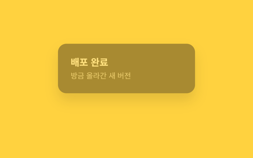
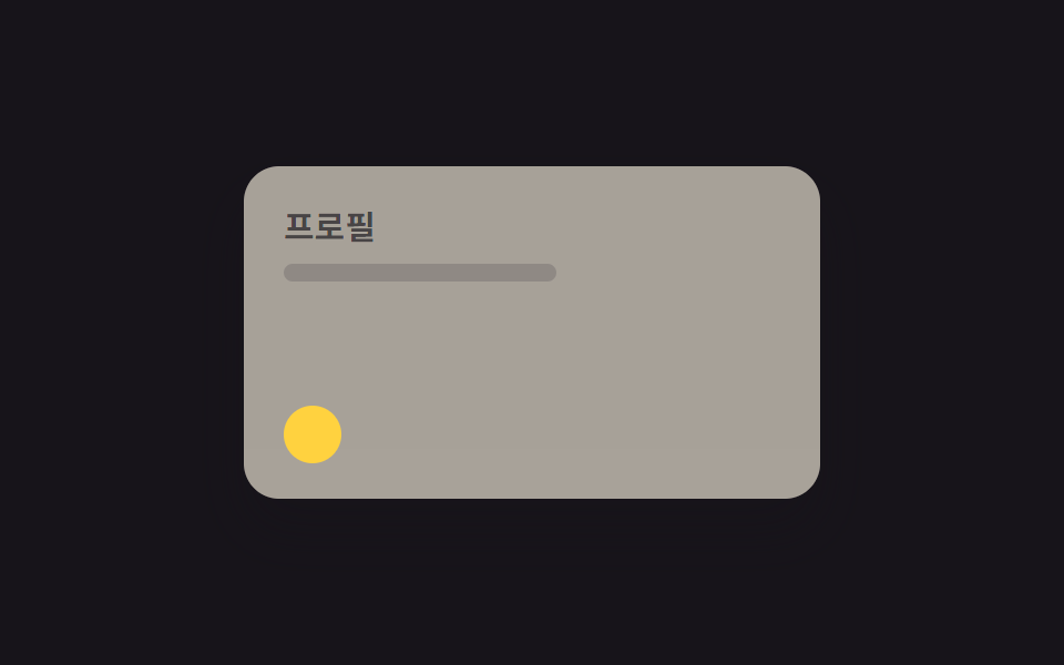
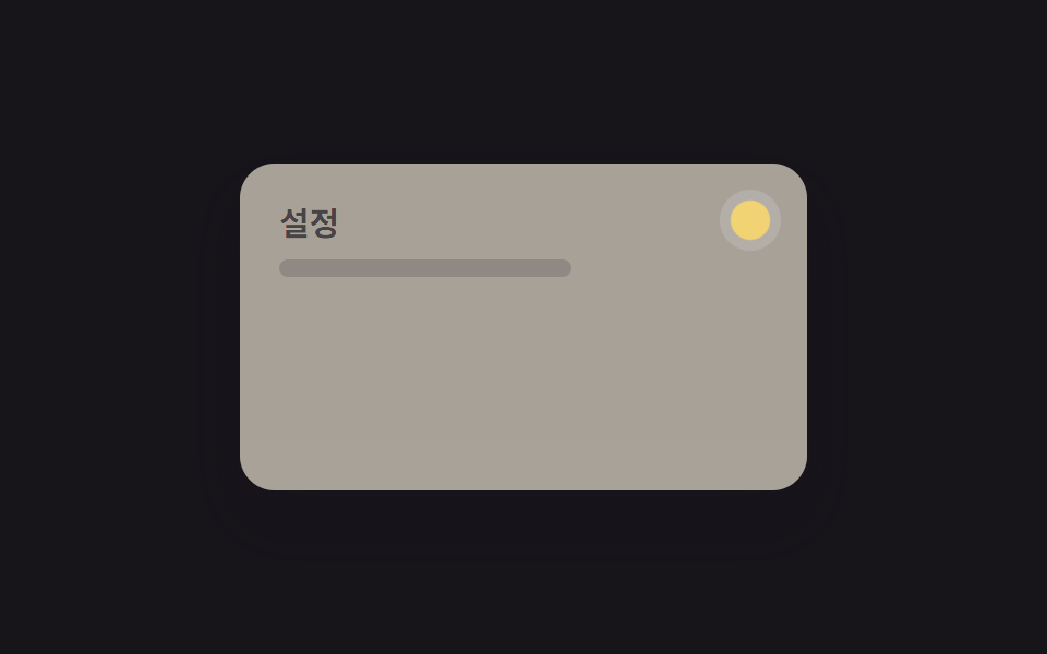
Mask hình mặt trăng che dần icon mặt trời khi chuyển sang dark mode.
Dùng choToggle nhấn mạnh thương hiệu, trang giới thiệu sản phẩm
500ms그림자 진하게역방향 재생
<main class="stage">
  <div class="panel">
    <div class="panel__face panel__face--light">
      <p class="panel__title">Hồ sơ</p>
      <p class="panel__line"></p>
    </div>
    <div class="panel__face panel__face--dark">
      <p class="panel__title">Hồ sơ</p>
      <p class="panel__line"></p>
    </div>
    <span class="sun"></span>
    <span class="mask"></span>
  </div>
</main>
@use "../../../../site/static/demo-tokens" as *;
// ── 변수 3개 ──────────────────────────────
$duration: $dur-enter;
$easing: $ease-spring;
$color: $stage-yellow;
// ── 데모 무대 ───────────────────────────────
@include stage($stage-ink);
.panel {
position: relative; overflow: hidden;
width: clamp(200px, 70vw, 260px); height: clamp(120px, 42vw, 150px);
border-radius: $r-card; box-shadow: $shadow-raised;
}
.panel__face {
position: absolute; inset: 0; box-sizing: border-box;
padding: clamp(12px, 5vw, 18px); text-align: left;
}
.panel__face--light {
background: $subject-cream; color: $subject-ink;
opacity: 1; animation: face-light $dur-loop $easing infinite;
}
.panel__face--dark {
background: $stage-ink; color: $subject-cream;
opacity: 0; animation: face-dark $dur-loop $easing infinite;
}
.panel__title { margin: 0 0 6px; font-weight: 700; font-size: clamp(12px, 3.6vw, 15px); line-height: 1.3; font-family: inherit; }
.panel__line { margin: 0; width: 55%; height: 8px; border-radius: 4px; background: currentColor; opacity: .25; }
// 태양 아이콘을 달 모양 마스크가 옆에서 밀려와 가리며 다크모드로 넘어간다. transform: translateX 만 쓴다.
.sun {
position: absolute; z-index: 1; bottom: clamp(10px, 4vw, 16px); left: clamp(12px, 5vw, 18px);
width: 26px; height: 26px; border-radius: 50%; background: $color;
}
.mask {
position: absolute; z-index: 2; bottom: clamp(6px, 4vw, 12px); left: clamp(0px, 2vw, 4px);
width: 26px; height: 26px; border-radius: 50%; background: $stage-ink;
transform: translateX(-60px); animation: mask-slide $dur-loop $easing infinite;
}
@keyframes face-light { 0%, 15% { opacity: 1; } 40%, 60% { opacity: 0; } 85%, 100% { opacity: 1; } }
@keyframes face-dark { 0%, 15% { opacity: 0; } 40%, 60% { opacity: 1; } 85%, 100% { opacity: 0; } }
@keyframes mask-slide {
0%, 15% { transform: translateX(-60px); }
40%, 60% { transform: translateX(4px); }
85%, 100% { transform: translateX(-60px); }
}
// ── 접근성: 움직임 줄이기 설정이면 라이트 상태로 고정 ──────────
@media (prefers-reduced-motion: reduce) {
.panel__face--light, .panel__face--dark, .mask { animation: none !important; }
}html, body {
margin: 0;
overflow: hidden;
}
.stage {
box-sizing: border-box;
min-height: 100vh;
display: grid;
place-items: center;
margin: 0;
background: #17141a;
font-family: -apple-system, "Segoe UI", "Noto Sans KR", sans-serif;
padding: clamp(8px, 4vw, 24px);
}
.panel {
position: relative;
overflow: hidden;
width: clamp(200px, 70vw, 260px);
height: clamp(120px, 42vw, 150px);
border-radius: 16px;
box-shadow: 0 14px 24px rgba(23, 20, 26, 0.32);
}
.panel__face {
position: absolute;
inset: 0;
box-sizing: border-box;
padding: clamp(12px, 5vw, 18px);
text-align: left;
}
.panel__face--light {
background: #fff7e6;
color: #17141a;
opacity: 1;
animation: face-light 2s cubic-bezier(0.2, 0.8, 0.2, 1) infinite;
}
.panel__face--dark {
background: #17141a;
color: #fff7e6;
opacity: 0;
animation: face-dark 2s cubic-bezier(0.2, 0.8, 0.2, 1) infinite;
}
.panel__title {
margin: 0 0 6px;
font-weight: 700;
font-size: clamp(12px, 3.6vw, 15px);
line-height: 1.3;
font-family: inherit;
}
.panel__line {
margin: 0;
width: 55%;
height: 8px;
border-radius: 4px;
background: currentColor;
opacity: 0.25;
}
.sun {
position: absolute;
z-index: 1;
bottom: clamp(10px, 4vw, 16px);
left: clamp(12px, 5vw, 18px);
width: 26px;
height: 26px;
border-radius: 50%;
background: #ffd23f;
}
.mask {
position: absolute;
z-index: 2;
bottom: clamp(6px, 4vw, 12px);
left: clamp(0px, 2vw, 4px);
width: 26px;
height: 26px;
border-radius: 50%;
background: #17141a;
transform: translateX(-60px);
animation: mask-slide 2s cubic-bezier(0.2, 0.8, 0.2, 1) infinite;
}
@keyframes face-light {
0%, 15% {
opacity: 1;
}
40%, 60% {
opacity: 0;
}
85%, 100% {
opacity: 1;
}
}
@keyframes face-dark {
0%, 15% {
opacity: 0;
}
40%, 60% {
opacity: 1;
}
85%, 100% {
opacity: 0;
}
}
@keyframes mask-slide {
0%, 15% {
transform: translateX(-60px);
}
40%, 60% {
transform: translateX(4px);
}
85%, 100% {
transform: translateX(-60px);
}
}
@media (prefers-reduced-motion: reduce) {
.panel__face--light, .panel__face--dark, .mask {
animation: none !important;
}
}import type { CSSProperties } from "react";
import styles from "./EclipseMaskToggle.module.scss";
export type EclipseMaskToggleProps = {
dark: boolean;
onToggle?: () => void;
/** 마스크가 밀려오는 시간 (기본 600ms) */
duration?: number;
easing?: string;
/** 마스크(다크) 색 */
color?: string;
className?: string;
};
type Vars = CSSProperties & { "--duration"?: string; "--easing"?: string; "--color"?: string };
export default function EclipseMaskToggle({
dark,
onToggle,
duration = 600,
easing = "cubic-bezier(.2,.8,.2,1)",
color = "#17141a",
className = "",
}: EclipseMaskToggleProps) {
const vars: Vars = { "--duration": `${duration}ms`, "--easing": easing, "--color": color };
return (
<button
type="button"
className={`${styles.wrap} ${className}`}
style={vars}
data-dark={dark}
aria-label="다크모드 전환"
onClick={onToggle}
>
<span className={styles.sun} />
<span className={styles.mask} />
</button>
);
}05 Mask nhật thực — Diện tích đo được 26.797% · khung hình chuyển động 11/23Nguyên tác GODRICH · SCSS và React nằm trong tệp zip · 9 hiệu ứng css dark mode toggle 1 dòng CSS
Bài viết chứa demo này
 9 hiệu ứng css dark mode toggle 1 dòng CSSCss dark mode toggle là nút chuyển đổi giữa giao diện sáng và tối, thường đặt ở header hoặc menu cài đặt. Đây là chín hi Xem tất cả demo trong bài này