05Gạch ngang vẽ dần
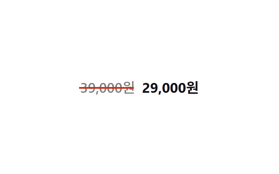
Một thanh `.price__strike` riêng nằm giữa chiều cao chữ mọc rộng qua transform: scaleX(0 → 1) với transform-origin: left, dựng lại đúng khoảnh khắc một mức giá bị gạch ngang trước mắt.
Dùng choHiển thị giá trước khi giảm, mục việc-cần-làm đã hoàn tất
transform-origin: lefttransform:scaleX500ms
<main class="stage">
  <p class="price">
    <span class="price__old">39,000 KRW<span class="price__strike" aria-hidden="true"></span></span>
    <span class="price__new">29,000 KRW</span>
  </p>
</main>
@use "../../../../site/static/demo-tokens" as *;
// ── 변수 3개 ─────────────────────────────
$duration: 500ms;
$easing: $ease-spring;
$color: $error; // 취소선 색
// ── 데모 무대 ───────────────────────────────
@include stage($stage-paper);
.price {
display: flex;
align-items: baseline;
gap: $sp-3;
margin: 0;
font-weight: 700;
font-size: clamp(18px, 5vw, 24px);
line-height: 1;
font-family: inherit;
}
.price__old {
position: relative;
color: color-mix(in srgb, $stage-ink 55%, transparent);
font-weight: 500;
}
// 글자 중간 높이에 놓인 가로선을 왼쪽부터 그어 취소선을 만든다
.price__strike {
position: absolute;
left: -2%;
right: -2%;
top: 52%;
height: 2px;
background: $color;
transform: scaleX(0);
transform-origin: left center; // 규칙8: 취소선 왼쪽에서 그어짐
animation: strike $duration $easing infinite, strike-thick $duration ease-in-out infinite;
}
.price__new {
color: $stage-ink;
}
@keyframes strike {
0% { transform: scaleX(0); }
30% { transform: scaleX(1); }
80% { transform: scaleX(1); }
100% { transform: scaleX(0); }
}
// 한 겹: 취소선 두께 요동 — height 변조(transform 아님)라 strike 의 scaleX 와 병렬 가능.
// rotate 진동은 transform 충돌이라 생략하고 height 로만 펜 압력을 표현한다
@keyframes strike-thick {
0% { height: 2px; }
25% { height: 3px; }
50% { height: 1.5px; }
75% { height: 2.5px; }
100% { height: 2px; }
}
@media (prefers-reduced-motion: reduce) {
.price__strike { animation: none; transform: scaleX(1); }
}html, body {
margin: 0;
overflow: hidden;
}
.stage {
box-sizing: border-box;
min-height: 100vh;
display: grid;
place-items: center;
margin: 0;
background: #ffffff;
font-family: -apple-system, "Segoe UI", "Noto Sans KR", sans-serif;
padding: clamp(8px, 4vw, 24px);
}
.price {
display: flex;
align-items: baseline;
gap: 12px;
margin: 0;
font-weight: 700;
font-size: clamp(18px, 5vw, 24px);
line-height: 1;
font-family: inherit;
}
.price__old {
position: relative;
color: color-mix(in srgb, #17141a 55%, transparent);
font-weight: 500;
}
.price__strike {
position: absolute;
left: -2%;
right: -2%;
top: 52%;
height: 2px;
background: #c2361a;
transform: scaleX(0);
transform-origin: left center;
animation: strike 500ms cubic-bezier(0.2, 0.8, 0.2, 1) infinite, strike-thick 500ms ease-in-out infinite;
}
.price__new {
color: #17141a;
}
@keyframes strike {
0% {
transform: scaleX(0);
}
30% {
transform: scaleX(1);
}
80% {
transform: scaleX(1);
}
100% {
transform: scaleX(0);
}
}
@keyframes strike-thick {
0% {
height: 2px;
}
25% {
height: 3px;
}
50% {
height: 1.5px;
}
75% {
height: 2.5px;
}
100% {
height: 2px;
}
}
@media (prefers-reduced-motion: reduce) {
.price__strike {
animation: none;
transform: scaleX(1);
}
}import type { CSSProperties } from "react";
import styles from "./StrikeDraw.module.scss";
export type StrikeDrawProps = {
/** 취소선이 그어지는 이전 가격 */
oldPrice: string;
/** 강조되는 새 가격 */
newPrice: string;
/** 선이 그어지는 시간 (기본 500ms) */
duration?: number;
easing?: string;
/** 취소선 색 */
color?: string;
};
type Vars = CSSProperties & {
"--duration"?: string;
"--easing"?: string;
"--color"?: string;
};
export default function StrikeDraw({
oldPrice,
newPrice,
duration = 500,
easing = "cubic-bezier(.2,1.4,.4,1)",
color = "#c2361a",
}: StrikeDrawProps) {
const vars: Vars = {
"--duration": `${duration}ms`,
"--easing": easing,
"--color": color,
};
return (
<p className={styles.price} style={vars}>
<span className={styles.old}>
{oldPrice}
<span className={styles.strike} aria-hidden="true" />
</span>
<span className={styles.new}>{newPrice}</span>
</p>
);
}05 Gạch ngang vẽ dần — Diện tích đo được 0.204% · khung hình chuyển động 19/23Nguyên tác GODRICH · SCSS và React nằm trong tệp zip · 9 CSS Text Highlight Animation: dán 1 dòng là chạy
Bài viết chứa demo này
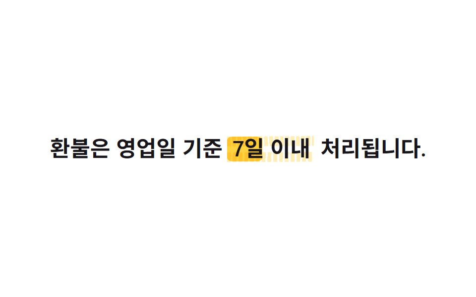 9 CSS Text Highlight Animation: dán 1 dòng là chạyCSS text highlight animation là hiệu ứng CSS thuần giúp tô sáng, gạch chân hoặc gạch ngang một từ trong câu ngay khi tra Xem tất cả demo trong bài này