09Cường độ glow theo scroll
Càng gần tâm viewport, IntersectionObserver càng tăng biến --intensity cho box-shadow đậm thêm; demo cho cùng biến đó chạy vòng bằng keyframes nên không cần cuộn thật vẫn thấy.
Dùng choĐoạn giới thiệu tính năng trên trang landing, card highlight sản phẩm
IntersectionObserver(JS)@propertybox-shadow
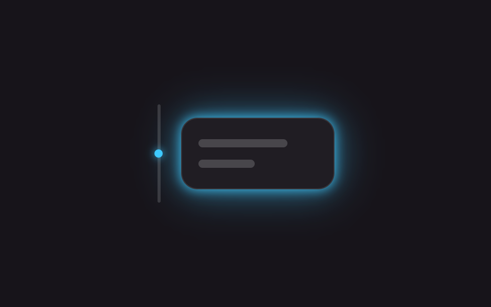
<main class="stage is-demo">
  <div class="row" aria-hidden="true">
    <span class="track"><span class="dot"></span></span>
    <div class="card">
      <span class="bar bar--lg"></span>
      <span class="bar bar--sm"></span>
    </div>
  </div>
</main>
@use "../../../../site/static/demo-tokens" as *;
// ── 변수 3개 ──────────────────────────────────────────
$duration: $dur-loop; // 2s — 오르내림 한 번
$easing: ease-in-out;
$color: #3ec9ff; // 네온 블루
@include stage($stage-ink);
.row { display: flex; align-items: center; gap: $sp-5; }
$track-h: 96px;
.track {
position: relative;
width: 3px; height: $track-h;
border-radius: $r-xs;
background: rgba($stage-paper, .15);
}
.dot {
position: absolute; top: 0; left: 50%;
width: $sp-2; height: $sp-2; margin-left: -$sp-1;
border-radius: 50%;
background: $color;
box-shadow: 0 0 $sp-2 $color;
}
// @property 로 등록해야 숫자로 보간된다 — box-shadow·opacity 계산에 그대로 쓴다
@property --intensity { syntax: '<number>'; inherits: false; initial-value: 0; }
.card {
box-sizing: border-box;
width: clamp(150px, 44vmin, 200px);
padding: $sp-5 $sp-4;
border-radius: $r-card;
background: rgba($stage-paper, .04);
border: 1px solid rgba($stage-paper, .1);
display: flex; flex-direction: column; gap: $sp-3;
opacity: calc(.45 + var(--intensity) * .55);
box-shadow: 0 0 calc(var(--intensity) * #{$sp-3}) $color,
0 0 calc(var(--intensity) * #{$sp-10}) rgba($color, .55);
}
.bar { display: block; height: $sp-2; border-radius: $r-xs; background: rgba($stage-paper, .18); }
.bar--lg { width: 75%; }
.bar--sm { width: 48%; }
// translateY(점) · --intensity(카드) 만 움직인다
.stage.is-demo .dot {
animation: move $duration $easing infinite;
}
.stage.is-demo .card:not(.is-live) {
animation: rise $duration $easing infinite;
}
@keyframes move {
0%, 100% { transform: translateY(0); }
50% { transform: translateY(#{$track-h - 8px}); }
}
@keyframes rise {
0%, 100% { --intensity: 0; }
50% { --intensity: 1; }
}
@media (prefers-reduced-motion: reduce) {
.stage.is-demo .dot,
.stage.is-demo .card:not(.is-live) { animation: none; }
.card { --intensity: 1; }
}html, body {
margin: 0;
overflow: hidden;
}
.stage {
box-sizing: border-box;
min-height: 100vh;
display: grid;
place-items: center;
margin: 0;
background: #17141a;
font-family: -apple-system, "Segoe UI", "Noto Sans KR", sans-serif;
padding: clamp(8px, 4vw, 24px);
}
.row {
display: flex;
align-items: center;
gap: 20px;
}
.track {
position: relative;
width: 3px;
height: 96px;
border-radius: 4px;
background: rgba(255, 255, 255, 0.15);
}
.dot {
position: absolute;
top: 0;
left: 50%;
width: 8px;
height: 8px;
margin-left: -4px;
border-radius: 50%;
background: #3ec9ff;
box-shadow: 0 0 8px #3ec9ff;
}
@property --intensity {
syntax: "<number>";
inherits: false;
initial-value: 0;
}
.card {
box-sizing: border-box;
width: clamp(150px, 44vmin, 200px);
padding: 20px 16px;
border-radius: 16px;
background: rgba(255, 255, 255, 0.04);
border: 1px solid rgba(255, 255, 255, 0.1);
display: flex;
flex-direction: column;
gap: 12px;
opacity: calc(0.45 + var(--intensity) * 0.55);
box-shadow: 0 0 calc(var(--intensity) * 12px) #3ec9ff, 0 0 calc(var(--intensity) * 40px) rgba(62, 201, 255, 0.55);
}
.bar {
display: block;
height: 8px;
border-radius: 4px;
background: rgba(255, 255, 255, 0.18);
}
.bar--lg {
width: 75%;
}
.bar--sm {
width: 48%;
}
.stage.is-demo .dot {
animation: move 2s ease-in-out infinite;
}
.stage.is-demo .card:not(.is-live) {
animation: rise 2s ease-in-out infinite;
}
@keyframes move {
0%, 100% {
transform: translateY(0);
}
50% {
transform: translateY(88px);
}
}
@keyframes rise {
0%, 100% {
--intensity: 0;
}
50% {
--intensity: 1;
}
}
@media (prefers-reduced-motion: reduce) {
.stage.is-demo .dot,
.stage.is-demo .card:not(.is-live) {
animation: none;
}
.card {
--intensity: 1;
}
}// 실제 스크롤에서는 IntersectionObserver 가 뷰포트 교차 비율로 --intensity 를 정한다(8줄).
// 이 아이프레임은 너무 작아 실스크롤이 안 나므로, 데모 루프(.is-demo)가 같은 변수를 대신 돌린다.
(function () {
var card = document.querySelector('.card');
var io = new IntersectionObserver(function (entries) {
entries.forEach(function (en) {
card.style.setProperty('--intensity', en.intersectionRatio.toFixed(2));
card.classList.add('is-live');
});
}, { threshold: [0, .25, .5, .75, 1] });
io.observe(card);
})();import { useEffect, useRef } from "react";
import type { CSSProperties } from "react";
import styles from "./ScrollIntensityGlow.module.scss";
export type ScrollIntensityGlowProps = {
/** intensity 값이 부드러워지는 시간 (기본 300ms) */
duration?: number;
color?: string;
};
export default function ScrollIntensityGlow({ duration = 300, color = "#3ec9ff" }: ScrollIntensityGlowProps) {
const cardRef = useRef<HTMLDivElement | null>(null);
// 뷰포트 교차 비율(0~1)을 그대로 --intensity 로 쓴다 — 실제 스크롤에서만 값이 바뀐다
useEffect(() => {
const el = cardRef.current;
if (!el) return;
const io = new IntersectionObserver(
(entries) => {
entries.forEach((en) => el.style.setProperty("--intensity", en.intersectionRatio.toFixed(2)));
},
{ threshold: [0, .25, .5, .75, 1] }
);
io.observe(el);
return () => io.disconnect();
}, []);
const vars: CSSProperties = { "--duration": `${duration}ms`, "--color": color } as CSSProperties;
return (
<div ref={cardRef} className={styles.card} style={vars}>
<span className={`${styles.bar} ${styles.barLg}`} />
<span className={`${styles.bar} ${styles.barSm}`} />
</div>
);
}09 Cường độ glow theo scroll — Diện tích đo được 1.083% · khung hình chuyển động 23/23Nguyên tác GODRICH · SCSS và React nằm trong tệp zip · 9 css glow effect — nút chữ phát sáng như neon
Bài viết chứa demo này
 9 css glow effect — nút chữ phát sáng như neoncss glow effect là lớp trang trí tạo vầng sáng lan ra quanh nút hoặc dòng chữ, trông như biển neon nhưng chỉ làm bằng và Xem tất cả demo trong bài này