04Viền phát sáng nhấp nháy
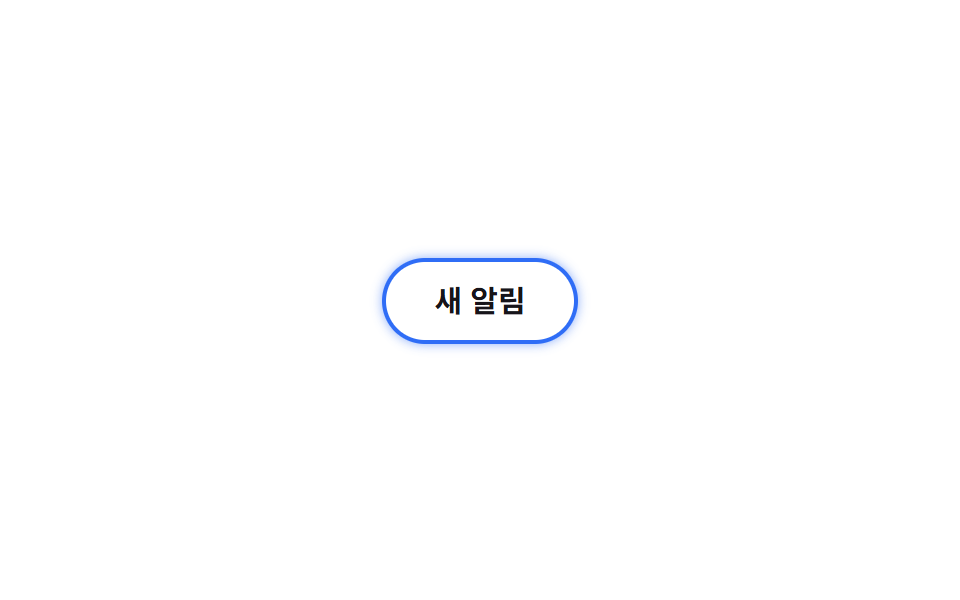
Animate giá trị length --glow đã đăng ký bằng @property từ 0 lên 16px giúp bán kính mờ của box-shadow lớn dần rồi nhỏ lại mượt mà thay vì nhảy khựng giữa các bước.
Dùng choViền badge thông báo, card trạng thái theo thời gian thực
@propertybox-shadow2초
<main class="stage">
  <span class="badge is-demo">Thông báo mới</span>
</main>
@use "../../../../site/static/demo-tokens" as *;
$duration: $dur-loop; // 한 번 번졌다 가라앉는 시간
$easing: $ease-spring;
$color: $subject-blue; // 번짐 색
@include stage($stage-paper);
.stage { padding: clamp(6px, 2.4vw, 16px); }
// @property 로 길이를 등록해야 box-shadow 번짐 반경이 중간값을 거치며 부드럽게 바뀐다
@property --glow {
syntax: "<length>";
inherits: false;
initial-value: 0px;
}
.badge {
display: inline-block;
border: 2px solid $color;
border-radius: $r-pill;
padding: 12px 24px;
font-weight: 700; font-size: clamp(13px, 3.6vw, 15px); line-height: 1; font-family: inherit;
color: $stage-ink;
background: $stage-paper;
box-shadow: 0 0 var(--glow) 0 rgba($color, .55);
}
.badge.is-demo { animation: glow $duration $easing infinite; }
@keyframes glow {
0%, 100% { --glow: 0px; }
50% { --glow: 16px; }
}
@media (prefers-reduced-motion: reduce) {
.badge.is-demo { animation: none; --glow: 8px; }
}html, body {
margin: 0;
overflow: hidden;
}
.stage {
box-sizing: border-box;
min-height: 100vh;
display: grid;
place-items: center;
margin: 0;
background: #ffffff;
font-family: -apple-system, "Segoe UI", "Noto Sans KR", sans-serif;
padding: clamp(8px, 4vw, 24px);
}
.stage {
padding: clamp(6px, 2.4vw, 16px);
}
@property --glow {
syntax: "<length>";
inherits: false;
initial-value: 0px;
}
.badge {
display: inline-block;
border: 2px solid #2f6df6;
border-radius: 999px;
padding: 12px 24px;
font-weight: 700;
font-size: clamp(13px, 3.6vw, 15px);
line-height: 1;
font-family: inherit;
color: #17141a;
background: #ffffff;
box-shadow: 0 0 var(--glow) 0 rgba(47, 109, 246, 0.55);
}
.badge.is-demo {
animation: glow 2s cubic-bezier(0.2, 0.8, 0.2, 1) infinite;
}
@keyframes glow {
0%, 100% {
--glow: 0px;
}
50% {
--glow: 16px;
}
}
@media (prefers-reduced-motion: reduce) {
.badge.is-demo {
animation: none;
--glow: 8px;
}
}import type { CSSProperties } from "react";
import styles from "./GlowPulseBadge.module.scss";
export type GlowPulseBadgeProps = {
label: string;
/** 번졌다 가라앉는 한 번의 시간 (기본 2000ms) */
duration?: number;
easing?: string;
/** 번짐 색 */
color?: string;
};
type Vars = CSSProperties & { "--duration"?: string; "--easing"?: string; "--color"?: string };
export default function GlowPulseBadge({
label,
duration = 2000,
easing = "cubic-bezier(.2,.8,.2,1)",
color = "#2f6df6",
}: GlowPulseBadgeProps) {
const vars: Vars = { "--duration": `${duration}ms`, "--easing": easing, "--color": color };
return <span className={styles.badge} style={vars}>{label}</span>;
}04 Viền phát sáng nhấp nháy — Diện tích đo được 1.765% · khung hình chuyển động 8/23Nguyên tác GODRICH · SCSS và React nằm trong tệp zip · 9 CSS Border Animations — dán 1 dòng là chạy
Bài viết chứa demo này
 9 CSS Border Animations — dán 1 dòng là chạyCSS border animation là hiệu ứng viền của card hay ô nhập di chuyển, phát sáng hoặc đổi màu bằng thuần CSS để báo một tr Xem tất cả demo trong bài này