03CTA đập nhịp phát sáng
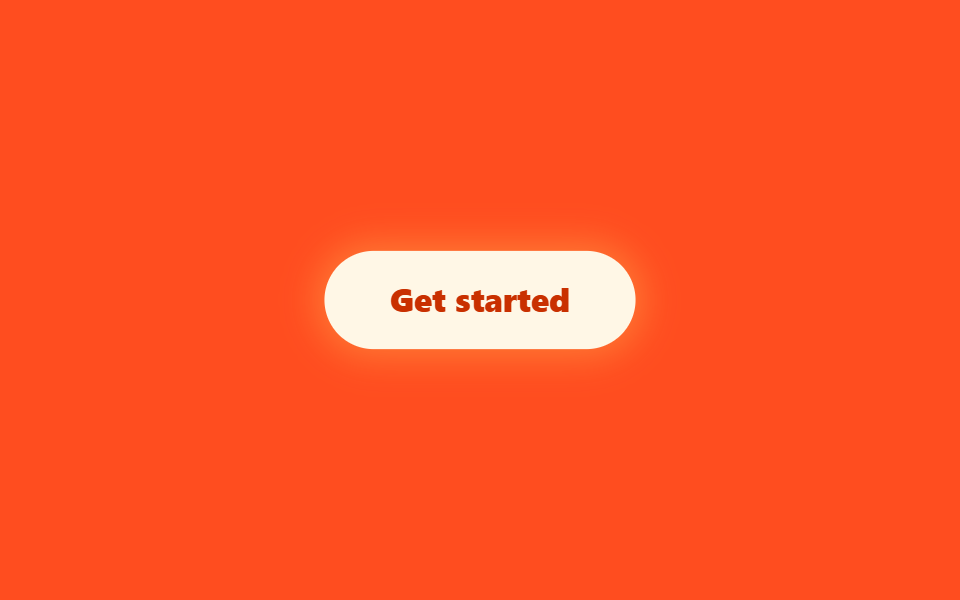
Nút hero thở bằng cách cùng lúc điều chỉnh scale với bán kính và độ đậm của box-shadow, và đến :hover hay :focus-visible nó vẫn phản ứng đúng tông màu đó.
Dùng choNút bắt đầu dùng thử miễn phí, CTA đăng ký danh sách chờ
box-shadowscale:hover · :focus-visible
<main class="stage is-demo">
  <button type="button" class="cta">Get started</button>
</main>
@use "../../../../site/static/demo-tokens" as *;
// ── 변수 3개 ──────────────────────────────────────────
$duration: $dur-loop; // 2s — 펄스 한 바퀴
$easing: $ease-pop;
$color: $subject-cream;
@include stage($stage-orange);
.cta {
box-sizing: border-box;
border: 0;
cursor: pointer;
padding: $sp-4 $sp-8;
border-radius: $r-pill;
background: $color;
color: $subject-orange-deep;
font-weight: 800;
font-size: clamp(14px, 4vw, 16px);
line-height: 1;
font-family: inherit;
box-shadow: 0 0 0 0 rgba(255, 224, 102, 0);
transition: transform $dur-quick $ease-out;
}
.cta:hover { transform: translateY(-2px); }
.cta:focus-visible { outline: 2px solid $subject-ink; outline-offset: 2px; }
// box-shadow 를 애니메이션 대상으로 쓴다 — blog-demo 규칙 1(transform·opacity 만)의 의도적 예외.
// 글로우는 box-shadow(또는 filter) 없이는 성립하지 않는다 (사실.md 기록)
.stage.is-demo .cta { animation: pulse $duration $easing infinite; }
@keyframes pulse {
0% { transform: scale(1); box-shadow: 0 0 0 0 rgba(255, 224, 102, .55); }
50% { transform: scale(1.045); box-shadow: 0 0 $sp-8 $sp-2 rgba(255, 224, 102, .55); }
100% { transform: scale(1); box-shadow: 0 0 0 0 rgba(255, 224, 102, 0); }
}
@media (prefers-reduced-motion: reduce) {
.stage.is-demo .cta { animation: none; box-shadow: 0 0 $sp-6 $sp-1 rgba(255, 224, 102, .35); }
}html, body {
margin: 0;
overflow: hidden;
}
.stage {
box-sizing: border-box;
min-height: 100vh;
display: grid;
place-items: center;
margin: 0;
background: #ff4d1f;
font-family: -apple-system, "Segoe UI", "Noto Sans KR", sans-serif;
padding: clamp(8px, 4vw, 24px);
}
.cta {
box-sizing: border-box;
border: 0;
cursor: pointer;
padding: 16px 32px;
border-radius: 999px;
background: #fff7e6;
color: #c93000;
font-weight: 800;
font-size: clamp(14px, 4vw, 16px);
line-height: 1;
font-family: inherit;
box-shadow: 0 0 0 0 rgba(255, 224, 102, 0);
transition: transform 220ms ease-out;
}
.cta:hover {
transform: translateY(-2px);
}
.cta:focus-visible {
outline: 2px solid #17141a;
outline-offset: 2px;
}
.stage.is-demo .cta {
animation: pulse 2s cubic-bezier(0.2, 1.4, 0.4, 1) infinite;
}
@keyframes pulse {
0% {
transform: scale(1);
box-shadow: 0 0 0 0 rgba(255, 224, 102, 0.55);
}
50% {
transform: scale(1.045);
box-shadow: 0 0 32px 8px rgba(255, 224, 102, 0.55);
}
100% {
transform: scale(1);
box-shadow: 0 0 0 0 rgba(255, 224, 102, 0);
}
}
@media (prefers-reduced-motion: reduce) {
.stage.is-demo .cta {
animation: none;
box-shadow: 0 0 24px 4px rgba(255, 224, 102, 0.35);
}
}import type { CSSProperties } from "react";
import styles from "./CtaPulseGlow.module.scss";
export type CtaPulseGlowProps = {
label?: string;
duration?: number;
easing?: string;
color?: string;
};
type Vars = CSSProperties & { "--duration"?: string; "--easing"?: string; "--color"?: string };
export default function CtaPulseGlow({
label = "Get started",
duration = 2000,
easing = "cubic-bezier(.2,1.4,.4,1)",
color = "#fff7e6",
}: CtaPulseGlowProps) {
const vars: Vars = { "--duration": `${duration}ms`, "--easing": easing, "--color": color };
return (
<button type="button" className={styles.cta} style={vars}>
{label}
</button>
);
}03 CTA đập nhịp phát sáng — Diện tích đo được 8.864% · khung hình chuyển động 16/23Nguyên tác GODRICH · SCSS và React nằm trong tệp zip · 9 hero section css animation — không cần JS
Bài viết chứa demo này
 9 hero section css animation — không cần JSHero section là màn hình lớn đập vào mắt đầu tiên khi bạn vừa vào một trang web, nơi đặt tiêu đề cỡ đại và nút bấm dựng Xem tất cả demo trong bài này