04Bước đang chạy đập nhịp
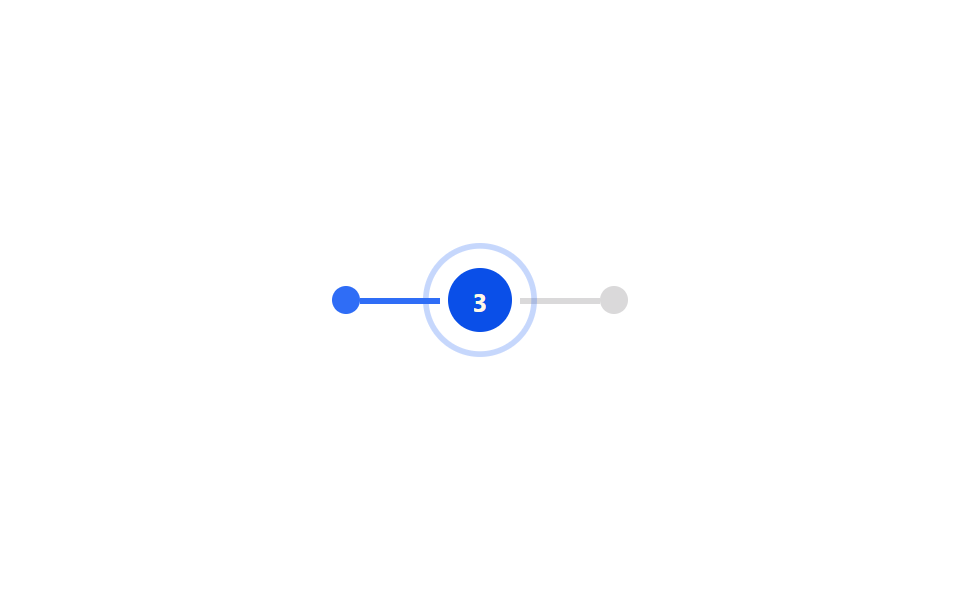
Sau vòng tròn của bước đang xử lý, phần tử .ts04-ring phóng từ scale(.7) lên scale(1.8) trong khi opacity mờ dần từ .8 về 0 rồi lặp lại, tỏa ra như sóng radar.
Dùng choBước đơn hàng đang xử lý, badge báo tiến trình realtime
scaleopacity1.6s
<main class="stage">
  <div class="ts04-track">
    <span class="ts04-node is-done"></span>
    <span class="ts04-line is-done"></span>
    <span class="ts04-step is-demo">
      <span class="ts04-ring"></span>
      <span class="ts04-circle">3</span>
    </span>
    <span class="ts04-line"></span>
    <span class="ts04-node"></span>
  </div>
</main>
@use "../../../../site/static/demo-tokens" as *;
// ── 변수 3개 ──────────────────────────────────────────
$duration: $dur-loop;
$easing: $ease-out;
$color: $subject-blue;
@include stage($stage-paper);
.ts04-track {
display: flex;
align-items: center;
gap: 0;
}
.ts04-node {
width: 14px;
height: 14px;
border-radius: 50%;
background: rgba(23, 20, 26, .16);
flex: 0 0 auto;
&.is-done { background: $color; }
}
.ts04-line {
width: 40px;
height: 3px;
background: rgba(23, 20, 26, .16);
flex: 0 0 auto;
&.is-done { background: $color; }
}
.ts04-step {
position: relative;
width: 40px;
height: 40px;
flex: 0 0 auto;
display: grid;
place-items: center;
}
// 지금 처리 중인 단계: 뒤에서 링이 번지는 펄스
.ts04-ring {
position: absolute;
inset: 0;
border-radius: 50%;
border: 2px solid $color;
opacity: 0;
}
.ts04-step.is-demo .ts04-ring {
animation: ts04-pulse $duration $easing infinite;
}
@keyframes ts04-pulse {
0% { transform: scale(.7); opacity: .8; }
70% { transform: scale(1.8); opacity: 0; }
100% { transform: scale(1.8); opacity: 0; }
}
.ts04-circle {
width: 32px;
height: 32px;
border-radius: 50%;
background: $subject-blue-deep; // 크림 글자가 얹히므로 진한 파랑
color: $subject-cream;
display: grid;
place-items: center;
font: 700 13px/1 -apple-system, "Segoe UI", "Noto Sans KR", sans-serif;
}
@media (prefers-reduced-motion: reduce) {
.ts04-ring, .ts04-step.is-demo .ts04-ring { animation: none !important; opacity: .6 !important; transform: scale(1) !important; }
}html, body {
margin: 0;
overflow: hidden;
}
.stage {
box-sizing: border-box;
min-height: 100vh;
display: grid;
place-items: center;
margin: 0;
background: #ffffff;
font-family: -apple-system, "Segoe UI", "Noto Sans KR", sans-serif;
padding: clamp(8px, 4vw, 24px);
}
.ts04-track {
display: flex;
align-items: center;
gap: 0;
}
.ts04-node {
width: 14px;
height: 14px;
border-radius: 50%;
background: rgba(23, 20, 26, 0.16);
flex: 0 0 auto;
}
.ts04-node.is-done {
background: #2f6df6;
}
.ts04-line {
width: 40px;
height: 3px;
background: rgba(23, 20, 26, 0.16);
flex: 0 0 auto;
}
.ts04-line.is-done {
background: #2f6df6;
}
.ts04-step {
position: relative;
width: 40px;
height: 40px;
flex: 0 0 auto;
display: grid;
place-items: center;
}
.ts04-ring {
position: absolute;
inset: 0;
border-radius: 50%;
border: 2px solid #2f6df6;
opacity: 0;
}
.ts04-step.is-demo .ts04-ring {
animation: ts04-pulse 2s ease-out infinite;
}
@keyframes ts04-pulse {
0% {
transform: scale(0.7);
opacity: 0.8;
}
70% {
transform: scale(1.8);
opacity: 0;
}
100% {
transform: scale(1.8);
opacity: 0;
}
}
.ts04-circle {
width: 32px;
height: 32px;
border-radius: 50%;
background: #0a4fe8;
color: #fff7e6;
display: grid;
place-items: center;
font: 700 13px/1 -apple-system, "Segoe UI", "Noto Sans KR", sans-serif;
}
@media (prefers-reduced-motion: reduce) {
.ts04-ring, .ts04-step.is-demo .ts04-ring {
animation: none !important;
opacity: 0.6 !important;
transform: scale(1) !important;
}
}import { CSSProperties } from "react";
import styles from "./ActiveStepPulse.module.scss";
type Vars = CSSProperties & {
"--duration"?: string;
"--easing"?: string;
"--color"?: string;
};
export interface ActiveStepPulseProps {
duration?: string;
easing?: string;
color?: string;
activeNumber?: number;
}
export default function ActiveStepPulse({
duration = "1.6s",
easing = "ease-out",
color = "#2f6df6",
activeNumber = 3,
}: ActiveStepPulseProps) {
const style: Vars = { "--duration": duration, "--easing": easing, "--color": color };
return (
<div className={styles.track} style={style}>
<span className={`${styles.node} ${styles.done}`} />
<span className={`${styles.line} ${styles.done}`} />
<span className={styles.step}>
<span className={styles.ring} />
<span className={styles.circle}>{activeNumber}</span>
</span>
<span className={styles.line} />
<span className={styles.node} />
</div>
);
}04 Bước đang chạy đập nhịp — Diện tích đo được 2.033% · khung hình chuyển động 13/23Nguyên tác GODRICH · SCSS và React nằm trong tệp zip · 9 css timeline animation không JS, copy-paste
Bài viết chứa demo này
 9 css timeline animation không JS, copy-pasteCss timeline animation là cách nối nhiều bước bằng đường kẻ với vòng tròn để bày ra theo thứ tự. Chín mẫu dưới đây không Xem tất cả demo trong bài này