07Chữ mờ lùi khi cuộn
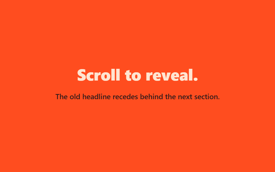
Đúng ra scroll-timeline buộc scale·opacity·translateY của tiêu đề trực tiếp vào tiến trình cuộn, nhưng trình duyệt hỗ trợ còn lệch nhau nên demo thay bằng vòng lặp @keyframes cùng một hình dáng.
Dùng choHero kể chuyện theo cuộn, chuyển cảnh tiêu đề giữa các section
scale · opacitytranslateYtransform-origin: center top
<main class="stage is-demo">
  <div class="hero">
    <h1 class="hero__title">Scroll to reveal.</h1>
    <p class="hero__sub">The old headline recedes behind the next section.</p>
  </div>
</main>
@use "../../../../site/static/demo-tokens" as *;
// ── 변수 3개 ──────────────────────────────────────────
$duration: $dur-loop; // 2s — 물러남 한 바퀴
$easing: $ease-out;
$color: $subject-cream;
@include stage($stage-orange);
// 실제 서비스라면 scroll-timeline / animation-timeline: view() 로 스크롤 진행률에 직접 묶지만,
// 브라우저 지원 차이가 커서(blog-demo 규칙 6) 데모는 같은 모양을 keyframes 루프로 대신한다 (사실.md 명시)
.hero {
box-sizing: border-box;
max-width: clamp(220px, 78vw, 360px);
text-align: center;
display: grid;
gap: $sp-3;
}
.hero__title { margin: 0; color: $color; font-weight: 800; font-size: clamp(20px, 6vw, 28px); line-height: 1.25; font-family: inherit; }
.hero__sub { margin: 0; color: $subject-ink; font-weight: 500; font-size: clamp(12px, 3.4vw, 13px); line-height: 1.5; font-family: inherit; }
.stage.is-demo .hero { animation: recede $duration $easing infinite; transform-origin: center top; }
@keyframes recede {
0% { opacity: 1; transform: scale(1) translateY(0); }
55% { opacity: .15; transform: scale(.85) translateY(-$sp-10); }
100% { opacity: 1; transform: scale(1) translateY(0); }
}
@media (prefers-reduced-motion: reduce) {
.stage.is-demo .hero { animation: none; opacity: 1; transform: none; }
}html, body {
margin: 0;
overflow: hidden;
}
.stage {
box-sizing: border-box;
min-height: 100vh;
display: grid;
place-items: center;
margin: 0;
background: #ff4d1f;
font-family: -apple-system, "Segoe UI", "Noto Sans KR", sans-serif;
padding: clamp(8px, 4vw, 24px);
}
.hero {
box-sizing: border-box;
max-width: clamp(220px, 78vw, 360px);
text-align: center;
display: grid;
gap: 12px;
}
.hero__title {
margin: 0;
color: #fff7e6;
font-weight: 800;
font-size: clamp(20px, 6vw, 28px);
line-height: 1.25;
font-family: inherit;
}
.hero__sub {
margin: 0;
color: #17141a;
font-weight: 500;
font-size: clamp(12px, 3.4vw, 13px);
line-height: 1.5;
font-family: inherit;
}
.stage.is-demo .hero {
animation: recede 2s ease-out infinite;
transform-origin: center top;
}
@keyframes recede {
0% {
opacity: 1;
transform: scale(1) translateY(0);
}
55% {
opacity: 0.15;
transform: scale(0.85) translateY(-40px);
}
100% {
opacity: 1;
transform: scale(1) translateY(0);
}
}
@media (prefers-reduced-motion: reduce) {
.stage.is-demo .hero {
animation: none;
opacity: 1;
transform: none;
}
}import type { CSSProperties } from "react";
import styles from "./ScrollFadeBehind.module.scss";
export type ScrollFadeBehindProps = {
title?: string;
subtitle?: string;
duration?: number;
easing?: string;
color?: string;
};
type Vars = CSSProperties & { "--duration"?: string; "--easing"?: string; "--color"?: string };
export default function ScrollFadeBehind({
title = "Scroll to reveal.",
subtitle = "The old headline recedes behind the next section.",
duration = 2000,
easing = "ease-out",
color = "#fff7e6",
}: ScrollFadeBehindProps) {
const vars: Vars = { "--duration": `${duration}ms`, "--easing": easing, "--color": color };
// 실제 서비스라면 scroll-timeline / animation-timeline: view() 로 스크롤 진행률에 직접 묶는다.
// 브라우저 지원 차이가 커서 이 컴포넌트는 같은 모양을 keyframes 루프로 대신 보여준다.
return (
<div className={styles.hero} style={vars}>
<h1 className={styles.title}>{title}</h1>
<p className={styles.sub}>{subtitle}</p>
</div>
);
}07 Chữ mờ lùi khi cuộn — Diện tích đo được 13.056% · khung hình chuyển động 23/23Nguyên tác GODRICH · SCSS và React nằm trong tệp zip · 9 hero section css animation — không cần JS
Bài viết chứa demo này
 9 hero section css animation — không cần JSHero section là màn hình lớn đập vào mắt đầu tiên khi bạn vừa vào một trang web, nơi đặt tiêu đề cỡ đại và nút bấm dựng Xem tất cả demo trong bài này