03Stagger theo từng chữ
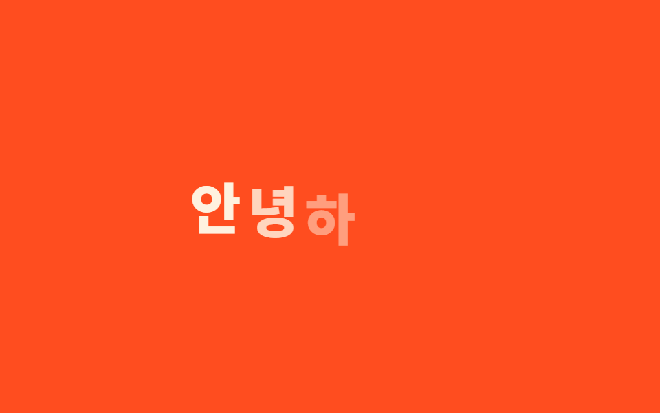
Mỗi chữ trong tiêu đề nằm trong một span riêng, trễ nhau 30ms và nảy lên từ phía dưới.
Dùng choTiêu đề hero, animation intro logo
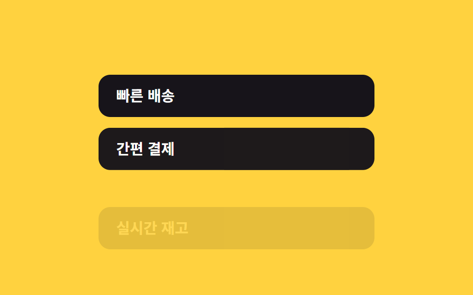
글자별 span30ms 간격translateY 바운스
<main class="stage">
  <h1 class="letters is-demo">
    <span>C</span><span>H</span><span>À</span><span>O</span><span>!</span>
  </h1>
</main>
@use "../../../../site/static/demo-tokens" as *;
$duration: $dur-quick; // 글자 하나가 튀어오르는 시간
$easing: $ease-pop; // 아래에서 튀어오르는 느낌
$stagger: 30ms; // 글자 사이 시차
@include stage($stage-orange);
.letters {
margin: 0;
display: flex;
gap: clamp(2px, 1vw, 6px);
font-weight: 800; font-size: clamp(24px, 9vw, 40px); line-height: 1; font-family: inherit;
color: $subject-cream;
span {
display: inline-block;
animation: letter-loop $dur-loop $easing infinite;
}
@for $i from 1 through 5 {
span:nth-child(#{$i}) { animation-delay: ($i - 1) * $stagger; }
}
}
@keyframes letter-loop {
0%, 4% { opacity: 0; transform: translateY(16px); }
20%, 66% { opacity: 1; transform: translateY(0); }
86%, 100% { opacity: 0; transform: translateY(-10px); }
}
@media (prefers-reduced-motion: reduce) {
.letters span { animation: none; opacity: 1; transform: none; }
}html, body {
margin: 0;
overflow: hidden;
}
.stage {
box-sizing: border-box;
min-height: 100vh;
display: grid;
place-items: center;
margin: 0;
background: #ff4d1f;
font-family: -apple-system, "Segoe UI", "Noto Sans KR", sans-serif;
padding: clamp(8px, 4vw, 24px);
}
.letters {
margin: 0;
display: flex;
gap: clamp(2px, 1vw, 6px);
font-weight: 800;
font-size: clamp(24px, 9vw, 40px);
line-height: 1;
font-family: inherit;
color: #fff7e6;
}
.letters span {
display: inline-block;
animation: letter-loop 2s cubic-bezier(0.2, 1.4, 0.4, 1) infinite;
}
.letters span:nth-child(1) {
animation-delay: 0ms;
}
.letters span:nth-child(2) {
animation-delay: 30ms;
}
.letters span:nth-child(3) {
animation-delay: 60ms;
}
.letters span:nth-child(4) {
animation-delay: 90ms;
}
.letters span:nth-child(5) {
animation-delay: 120ms;
}
@keyframes letter-loop {
0%, 4% {
opacity: 0;
transform: translateY(16px);
}
20%, 66% {
opacity: 1;
transform: translateY(0);
}
86%, 100% {
opacity: 0;
transform: translateY(-10px);
}
}
@media (prefers-reduced-motion: reduce) {
.letters span {
animation: none;
opacity: 1;
transform: none;
}
}export type LetterStaggerProps = {
text: string;
/** 글자 사이 시차 ms (기본 30ms) */
stagger?: number;
duration?: number;
easing?: string;
};
import styles from "./LetterStagger.module.scss";
export default function LetterStagger({ text, stagger = 30 }: LetterStaggerProps) {
return (
<h1 className={styles.letters}>
{[...text].map((ch, i) => (
<span key={i} style={{ animationDelay: `${i * stagger}ms` }}>
{ch}
</span>
))}
</h1>
);
}03 Stagger theo từng chữ — Diện tích đo được 4.64% · khung hình chuyển động 10/23Nguyên tác GODRICH · SCSS và React nằm trong tệp zip · 9 CSS Stagger Animation Demos Copy-Paste Là Chạy
Bài viết chứa demo này
 9 CSS Stagger Animation Demos Copy-Paste Là ChạyCSS stagger animation là kỹ thuật khiến các phần tử trong danh sách hay lưới xuất hiện trễ nhau, thay vì bung ra cùng lú Xem tất cả demo trong bài này