02Chấm nảy lần lượt
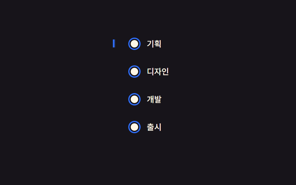
Các chấm trên đường kẻ lần lượt bật từ scale(0) lên scale(1) từ trên xuống; chỉ riêng animation-delay khác nhau, sinh theo từng nth-child bằng vòng @for của SCSS.
Dùng choChecklist onboarding, chỉ báo bước xử lý đơn hàng
scaleanimation-delaynth-child

<main class="stage">
  <div class="ts02-row is-demo">
    <span class="ts02-dot"></span>
    <span class="ts02-dot"></span>
    <span class="ts02-dot"></span>
    <span class="ts02-dot"></span>
    <span class="ts02-dot"></span>
  </div>
</main>
@use "../../../../site/static/demo-tokens" as *;
// ── 변수 3개 ──────────────────────────────────────────
$duration: $dur-loop;
$easing: $ease-pop;
$color: $stage-ink;
@include stage($stage-yellow);
.ts02-row {
display: flex;
align-items: center;
gap: $sp-4;
}
.ts02-dot {
width: 28px;
height: 28px;
border-radius: 50%;
background: $color;
transform: scale(0);
opacity: 0;
}
// 실제 사용 코드: 뷰포트에 들어오면 순서대로 팝 (nth-child 델레이만 다르다)
@for $i from 1 through 5 {
.ts02-row .ts02-dot:nth-child(#{$i}) {
animation-delay: #{($i - 1) * 140}ms;
}
}
.ts02-row.is-demo .ts02-dot {
animation: ts02-pop $duration $easing infinite;
}
@keyframes ts02-pop {
0% { transform: scale(0); opacity: 0; }
10% { transform: scale(1.25); opacity: 1; }
20% { transform: scale(1); opacity: 1; }
85% { transform: scale(1); opacity: 1; }
92% { transform: scale(0); opacity: 0; }
100% { transform: scale(0); opacity: 0; }
}
@media (prefers-reduced-motion: reduce) {
.ts02-dot, .ts02-row.is-demo .ts02-dot { animation: none !important; transform: scale(1) !important; opacity: 1 !important; }
}html, body {
margin: 0;
overflow: hidden;
}
.stage {
box-sizing: border-box;
min-height: 100vh;
display: grid;
place-items: center;
margin: 0;
background: #ffd23f;
font-family: -apple-system, "Segoe UI", "Noto Sans KR", sans-serif;
padding: clamp(8px, 4vw, 24px);
}
.ts02-row {
display: flex;
align-items: center;
gap: 16px;
}
.ts02-dot {
width: 28px;
height: 28px;
border-radius: 50%;
background: #17141a;
transform: scale(0);
opacity: 0;
}
.ts02-row .ts02-dot:nth-child(1) {
animation-delay: 0ms;
}
.ts02-row .ts02-dot:nth-child(2) {
animation-delay: 140ms;
}
.ts02-row .ts02-dot:nth-child(3) {
animation-delay: 280ms;
}
.ts02-row .ts02-dot:nth-child(4) {
animation-delay: 420ms;
}
.ts02-row .ts02-dot:nth-child(5) {
animation-delay: 560ms;
}
.ts02-row.is-demo .ts02-dot {
animation: ts02-pop 2s cubic-bezier(0.2, 1.4, 0.4, 1) infinite;
}
@keyframes ts02-pop {
0% {
transform: scale(0);
opacity: 0;
}
10% {
transform: scale(1.25);
opacity: 1;
}
20% {
transform: scale(1);
opacity: 1;
}
85% {
transform: scale(1);
opacity: 1;
}
92% {
transform: scale(0);
opacity: 0;
}
100% {
transform: scale(0);
opacity: 0;
}
}
@media (prefers-reduced-motion: reduce) {
.ts02-dot, .ts02-row.is-demo .ts02-dot {
animation: none !important;
transform: scale(1) !important;
opacity: 1 !important;
}
}import { CSSProperties } from "react";
import styles from "./DotPopStagger.module.scss";
type Vars = CSSProperties & {
"--duration"?: string;
"--easing"?: string;
"--color"?: string;
};
export interface DotPopStaggerProps {
duration?: string;
easing?: string;
color?: string;
count?: number;
stepDelay?: number;
}
export default function DotPopStagger({
duration = "2s",
easing = "cubic-bezier(.2, 1.4, .4, 1)",
color = "#17141a",
count = 5,
stepDelay = 140,
}: DotPopStaggerProps) {
const style: Vars = { "--duration": duration, "--easing": easing, "--color": color };
return (
<div className={styles.row} style={style}>
{Array.from({ length: count }).map((_, i) => (
<span key={i} className={styles.dot} style={{ animationDelay: `${i * stepDelay}ms` }} />
))}
</div>
);
}02 Chấm nảy lần lượt — Diện tích đo được 4.049% · khung hình chuyển động 6/23Nguyên tác GODRICH · SCSS và React nằm trong tệp zip · 9 css timeline animation không JS, copy-paste
Bài viết chứa demo này
 9 css timeline animation không JS, copy-pasteCss timeline animation là cách nối nhiều bước bằng đường kẻ với vòng tròn để bày ra theo thứ tự. Chín mẫu dưới đây không Xem tất cả demo trong bài này