06Tưng tưng nhảy (pyonpyon)
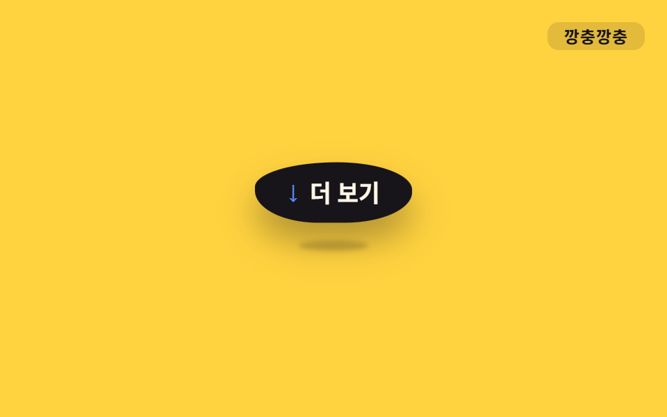
Trước khi tiếp đất `.o-pyon` ép scale dọc cho dẹt ra, còn lúc bật lên lại kéo dài translateY cùng scale, tạo nhịp nhảy dùng cho mũi tên "xem thêm".
Dùng choMũi tên 'xem thêm', icon gợi ý cuộn, minh họa trạng thái rỗng
translateY+scale착지 스쿼시900ms
<main class="stage">
  <div class="hint o-pyon is-demo">
    <span class="hint__arrow" aria-hidden="true">↓</span>
    Xem thêm
  </div>
  <span class="tag">Tưng tưng</span>
</main>
@use "../../../../site/static/demo-tokens" as *;
// ── 변수 3개 ──────────────────────────────────────────
$duration: 900ms;
$easing: ease-in-out;
$color: $subject-blue;
// ── 데모 무대 ───────────────────────────────
@include stage($stage-yellow);
.stage { position: relative; }
.hint {
position: relative;
display: inline-flex;
align-items: center;
gap: $sp-2;
padding: $sp-3 $sp-6;
border-radius: $r-pill;
background: $stage-ink;
color: $subject-cream;
font-weight: 700;
font-size: clamp(14px, 4vw, 17px);
line-height: 1;
font-family: inherit;
box-shadow: $shadow-raised;
}
// 바닥 접촉 그림자 — 알약 자체와 별개 레이어. 착지 순간(스쿼시) 넓고 짙게, 정점(공중)엔 좁고 옅게 ──
.hint::after {
content: "";
position: absolute;
left: 50%;
bottom: -8px;
width: 60%;
height: 8px;
border-radius: 50%;
background: rgba($stage-ink, .38);
filter: blur(2px);
transform: translateX(-50%) scale(1, 1);
}
.hint__arrow { font-size: 18px; line-height: 1; color: $subject-blue-light; } // 먹 알약 위 파란 글자 — AA 4.5
.tag {
position: absolute;
top: $sp-4;
right: $sp-4;
padding: $sp-1 $sp-3;
border-radius: $r-sm;
background: rgba(23, 20, 26, .12);
color: $stage-ink;
font-weight: 700;
font-size: 12px;
line-height: 1;
font-family: inherit;
letter-spacing: .04em;
}
// ── 사인파 soft-body + 바닥 그림자 (형태 2차, 사용자 2026-09-14) ─────
// 몸: border-radius 여덟 값(가로4·세로4)을 위상차 π/4 사인파 r_k = 50 + 10·sin(2πt + k·π/4) 로 흔들고,
// scaleX·scaleY 는 곱이 1 (면적 보존) — 눌리면 옆으로 퍼지고 늘어나면 가늘어진다.
// keyframes 다섯 지점(0·10·40·70·85%)은 t = pct/100·2π 를 대입한 계산 결과값.
// 그림자: 몸이 -16px 뜬 순간 +16px 내려와 바닥에 붙어 있다(상쇄). 착지 스쿼시 땐 넓고 짙게(무게),
// 공중 정점 땐 좁고 옅게 — 몸이 높을수록 그림자는 퍼져 약해진다는 역수 관계로 계산했다.
.o-pyon {
animation: o-pyon $duration $easing infinite;
}
.o-pyon::after {
animation: o-pyon-shadow $duration $easing infinite;
}
@keyframes o-pyon {
0%, 100% { transform: translateY(0) scale(1, 1); border-radius: 50% 57% 60% 57% / 50% 43% 40% 43%; }
10% { transform: translateY(2px) scale(1.11, .9); border-radius: 56% 60% 58% 52% / 44% 40% 42% 48%; }
40% { transform: translateY(-16px) scale(.93, 1.08); border-radius: 56% 48% 42% 40% / 44% 52% 58% 60%; }
70% { transform: translateY(2px) scale(1.11, .9); border-radius: 40% 41% 47% 55% / 60% 59% 53% 45%; }
85% { transform: translateY(0) scale(1.02, 1.03); border-radius: 42% 48% 56% 60% / 58% 52% 44% 40%; }
}
@keyframes o-pyon-shadow {
0%, 100% { transform: translate(-50%, 0) scale(1, 1); opacity: .9; }
10% { transform: translate(-50%, 0) scale(1.14, 1.3); opacity: 1; }
40% { transform: translate(-50%, 16px) scale(.6, .75); opacity: .4; }
70% { transform: translate(-50%, 0) scale(1.14, 1.3); opacity: 1; }
85% { transform: translate(-50%, 0) scale(1.05, 1.1); opacity: .95; }
}
// ── 접근성 ──────────────────────────────────────────
@media (prefers-reduced-motion: reduce) {
.o-pyon, .o-pyon::after { animation: none; }
}html, body {
margin: 0;
overflow: hidden;
}
.stage {
box-sizing: border-box;
min-height: 100vh;
display: grid;
place-items: center;
margin: 0;
background: #ffd23f;
font-family: -apple-system, "Segoe UI", "Noto Sans KR", sans-serif;
padding: clamp(8px, 4vw, 24px);
}
.stage {
position: relative;
}
.hint {
position: relative;
display: inline-flex;
align-items: center;
gap: 8px;
padding: 12px 24px;
border-radius: 999px;
background: #17141a;
color: #fff7e6;
font-weight: 700;
font-size: clamp(14px, 4vw, 17px);
line-height: 1;
font-family: inherit;
box-shadow: 0 14px 24px rgba(23, 20, 26, 0.32);
}
.hint::after {
content: "";
position: absolute;
left: 50%;
bottom: -8px;
width: 60%;
height: 8px;
border-radius: 50%;
background: rgba(23, 20, 26, 0.38);
filter: blur(2px);
transform: translateX(-50%) scale(1, 1);
}
.hint__arrow {
font-size: 18px;
line-height: 1;
color: #5b8cf8;
}
.tag {
position: absolute;
top: 16px;
right: 16px;
padding: 4px 12px;
border-radius: 8px;
background: rgba(23, 20, 26, 0.12);
color: #17141a;
font-weight: 700;
font-size: 12px;
line-height: 1;
font-family: inherit;
letter-spacing: 0.04em;
}
.o-pyon {
animation: o-pyon 900ms ease-in-out infinite;
}
.o-pyon::after {
animation: o-pyon-shadow 900ms ease-in-out infinite;
}
@keyframes o-pyon {
0%, 100% {
transform: translateY(0) scale(1, 1);
border-radius: 50% 57% 60% 57%/50% 43% 40% 43%;
}
10% {
transform: translateY(2px) scale(1.11, 0.9);
border-radius: 56% 60% 58% 52%/44% 40% 42% 48%;
}
40% {
transform: translateY(-16px) scale(0.93, 1.08);
border-radius: 56% 48% 42% 40%/44% 52% 58% 60%;
}
70% {
transform: translateY(2px) scale(1.11, 0.9);
border-radius: 40% 41% 47% 55%/60% 59% 53% 45%;
}
85% {
transform: translateY(0) scale(1.02, 1.03);
border-radius: 42% 48% 56% 60%/58% 52% 44% 40%;
}
}
@keyframes o-pyon-shadow {
0%, 100% {
transform: translate(-50%, 0) scale(1, 1);
opacity: 0.9;
}
10% {
transform: translate(-50%, 0) scale(1.14, 1.3);
opacity: 1;
}
40% {
transform: translate(-50%, 16px) scale(0.6, 0.75);
opacity: 0.4;
}
70% {
transform: translate(-50%, 0) scale(1.14, 1.3);
opacity: 1;
}
85% {
transform: translate(-50%, 0) scale(1.05, 1.1);
opacity: 0.95;
}
}
@media (prefers-reduced-motion: reduce) {
.o-pyon, .o-pyon::after {
animation: none;
}
}import type { CSSProperties, ReactNode } from "react";
import styles from "./HopHint.module.scss";
export type HopHintProps = {
children: ReactNode;
/** 한 번 뛰는 데 걸리는 시간 (기본 900ms) */
duration?: number;
easing?: string;
color?: string;
};
type Vars = CSSProperties & {
"--duration"?: string;
"--easing"?: string;
"--color"?: string;
};
export default function HopHint({
children,
duration = 900,
easing = "ease-in-out",
color = "#2f6df6",
}: HopHintProps) {
const vars: Vars = {
"--duration": `${duration}ms`,
"--easing": easing,
"--color": color,
};
return (
<div className={styles.hint} style={vars}>
<span className={styles.arrow} aria-hidden="true">
↓
</span>
{children}
</div>
);
}06 Tưng tưng nhảy (pyonpyon) — Diện tích đo được 5.925% · khung hình chuyển động 23/23Nguyên tác GODRICH · SCSS và React nằm trong tệp zip · 9 css bounce animation — dán một dòng là chạy
Bài viết chứa demo này
 9 css bounce animation — dán một dòng là chạycss bounce animation là chuyển động cho phần tử nổi lên, nảy, rung và đung đưa như đang sống. Chín mục gọi theo từ tượng Xem tất cả demo trong bài này