05Chuyển kiểu stack push của app
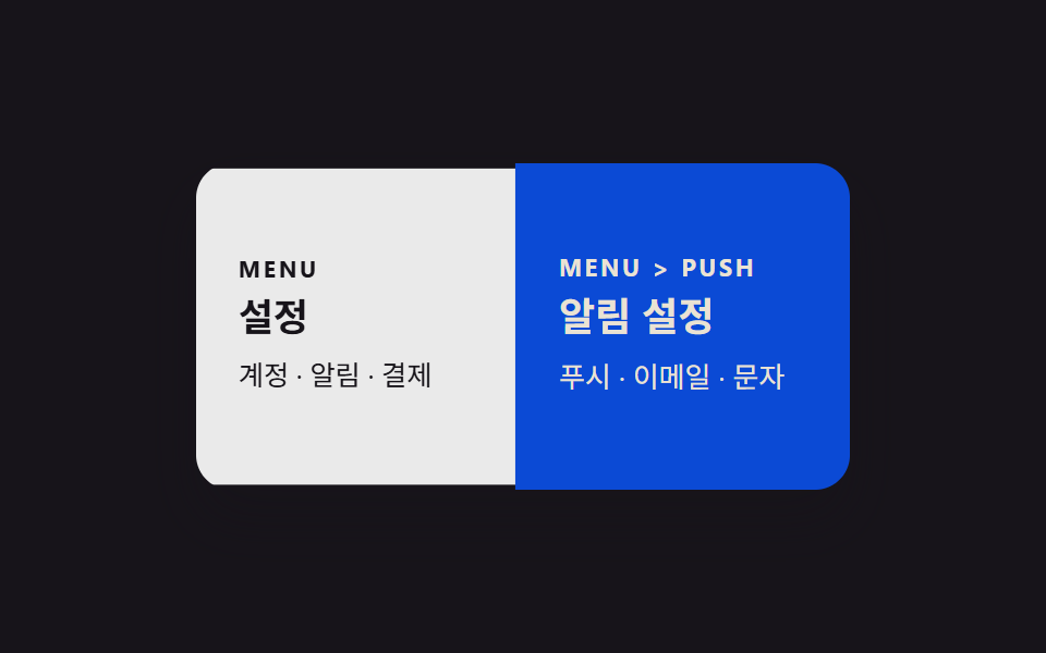
Màn hình mới trượt vào từ phải như chồng lên, giống điều hướng app native.
Dùng choWeb app trên mobile, chuyển màn hình cài đặt
280ms뒤 화면 어둡게엣지 스와이프
<main class="stage">
<div class="pages is-demo">
<section class="page page--a">
<p class="page__tag">MENU</p>
<h2 class="page__title">Cài đặt</h2>
<p class="page__body">Tài khoản · Thông báo · Thanh toán</p>
</section>
<section class="page page--b">
<p class="page__tag">MENU > PUSH</p>
<h2 class="page__title">Cài đặt thông báo</h2>
<p class="page__body">Push · Email · SMS</p>
</section>
<div class="dim"></div>
</div>
</main>@use "../../../../site/static/demo-tokens" as *;
// ── 변수 3개. 변형은 이것만 바꾼다 (값은 토큰에서 받는다) ──────
$duration: $dur-base;
$easing: $ease-out;
$color: $subject-blue-deep;
// ── 데모 무대 ───────────────────────────────
@include stage($stage-ink);
.pages { position: relative; width: min(300px, 88%); height: 150px; border-radius: $r-card; overflow: hidden; box-shadow: $shadow-raised; }
.page {
position: absolute; inset: 0; box-sizing: border-box;
display: flex; flex-direction: column; justify-content: center; gap: 6px;
padding: clamp(12px, 5vw, 20px); text-align: left;
}
.page--a { background: #fff; color: $subject-ink; }
.page--b { background: $color; color: $subject-cream; }
.page__tag { margin: 0; font-weight: 700; font-size: clamp(9px, 2.6vw, 11px); line-height: 1; font-family: inherit; letter-spacing: .12em; }
.page__title { margin: 0; font-weight: 700; font-size: clamp(14px, 4.2vw, 18px); line-height: 1.3; font-family: inherit; }
.page__body { margin: 0; font-weight: 400; font-size: clamp(11px, 3.2vw, 13px); line-height: 1.5; font-family: inherit; }
.dim { position: absolute; inset: 0; background: $subject-ink; opacity: 0; pointer-events: none; }
// 새 화면이 오른쪽에서 쌓이듯 밀려 들어오고, 이전 화면은 살짝 줄어들며 어두워진다.
.page--a { animation: push-back $dur-loop $easing infinite; transform-origin: left center; } // 규칙8: 새 화면이 오른쪽에서 들어오니 이전 화면은 왼쪽 변을 축으로 물러난다
.page--b { animation: push-front $dur-loop $easing infinite; transform: translateX(100%); }
.dim { animation: push-dim $dur-loop $easing infinite; }
@keyframes push-back {
0%, 5% { transform: scale(1); }
50% { transform: scale(.94); }
95%, 100% { transform: scale(1); }
}
@keyframes push-front {
0%, 5% { transform: translateX(100%); }
50% { transform: translateX(0); }
95%, 100% { transform: translateX(100%); }
}
@keyframes push-dim {
0%, 5% { opacity: 0; }
50% { opacity: .18; }
95%, 100% { opacity: 0; }
}
// ── 접근성: 움직임 줄이기 설정이면 최종 상태만 고정으로 ────────
@media (prefers-reduced-motion: reduce) {
.page--a, .page--b, .dim { animation: none !important; }
.page--b { transform: translateX(100%); }
.dim { opacity: 0; }
}html, body {
margin: 0;
overflow: hidden;
}
.stage {
box-sizing: border-box;
min-height: 100vh;
display: grid;
place-items: center;
margin: 0;
background: #17141a;
font-family: -apple-system, "Segoe UI", "Noto Sans KR", sans-serif;
padding: clamp(8px, 4vw, 24px);
}
.pages {
position: relative;
width: min(300px, 88%);
height: 150px;
border-radius: 16px;
overflow: hidden;
box-shadow: 0 14px 24px rgba(23, 20, 26, 0.32);
}
.page {
position: absolute;
inset: 0;
box-sizing: border-box;
display: flex;
flex-direction: column;
justify-content: center;
gap: 6px;
padding: clamp(12px, 5vw, 20px);
text-align: left;
}
.page--a {
background: #fff;
color: #17141a;
}
.page--b {
background: #0a4fe8;
color: #fff7e6;
}
.page__tag {
margin: 0;
font-weight: 700;
font-size: clamp(9px, 2.6vw, 11px);
line-height: 1;
font-family: inherit;
letter-spacing: 0.12em;
}
.page__title {
margin: 0;
font-weight: 700;
font-size: clamp(14px, 4.2vw, 18px);
line-height: 1.3;
font-family: inherit;
}
.page__body {
margin: 0;
font-weight: 400;
font-size: clamp(11px, 3.2vw, 13px);
line-height: 1.5;
font-family: inherit;
}
.dim {
position: absolute;
inset: 0;
background: #17141a;
opacity: 0;
pointer-events: none;
}
.page--a {
animation: push-back 2s ease-out infinite;
transform-origin: left center;
}
.page--b {
animation: push-front 2s ease-out infinite;
transform: translateX(100%);
}
.dim {
animation: push-dim 2s ease-out infinite;
}
@keyframes push-back {
0%, 5% {
transform: scale(1);
}
50% {
transform: scale(0.94);
}
95%, 100% {
transform: scale(1);
}
}
@keyframes push-front {
0%, 5% {
transform: translateX(100%);
}
50% {
transform: translateX(0);
}
95%, 100% {
transform: translateX(100%);
}
}
@keyframes push-dim {
0%, 5% {
opacity: 0;
}
50% {
opacity: 0.18;
}
95%, 100% {
opacity: 0;
}
}
@media (prefers-reduced-motion: reduce) {
.page--a, .page--b, .dim {
animation: none !important;
}
.page--b {
transform: translateX(100%);
}
.dim {
opacity: 0;
}
}import type { CSSProperties, ReactNode } from "react";
import styles from "./StackPushTransition.module.scss";
export type StackPushTransitionProps = {
/** "root": 뒤 화면만, "pushed": 새 화면이 쌓인 상태 */
active: "root" | "pushed";
root: ReactNode;
pushed: ReactNode;
/** 새 화면이 밀려 들어오는 시간 (기본 300ms) */
duration?: number;
easing?: string;
color?: string;
className?: string;
};
type Vars = CSSProperties & { "--duration"?: string; "--easing"?: string; "--color"?: string };
export default function StackPushTransition({
active,
root,
pushed,
duration = 300,
easing = "ease-out",
color = "#0a4fe8",
className = "",
}: StackPushTransitionProps) {
const vars: Vars = { "--duration": `${duration}ms`, "--easing": easing, "--color": color };
return (
<div className={`${styles.pages} ${className}`} style={vars} data-active={active}>
<section className={styles.root}>{root}</section>
<div className={styles.dim} />
<section className={styles.pushed}>{pushed}</section>
</div>
);
}05 Chuyển kiểu stack push của app — Diện tích đo được 31.126% · khung hình chuyển động 22/23Nguyên tác GODRICH · SCSS và React nằm trong tệp zip · 9 hiệu ứng css page transition animation không JS
Bài viết chứa demo này
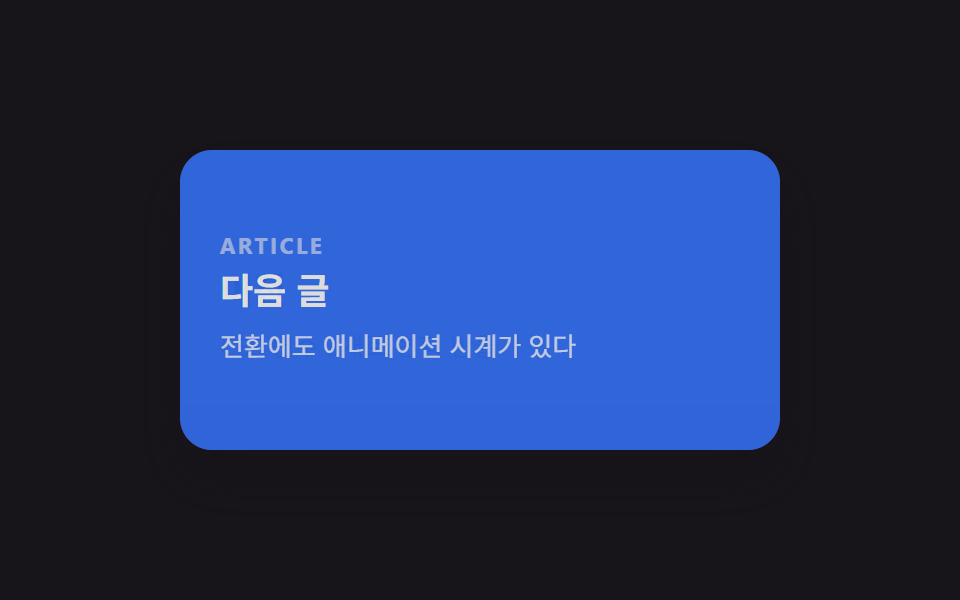 9 hiệu ứng css page transition animation không JSCss page transition animation là hiệu ứng chuyển trang dựng bằng transform, opacity và clip-path thay vì đợi router vẽ l Xem tất cả demo trong bài này