06Card phóng to thành chi tiết
Card vừa nhấn phóng to lấp đầy màn hình rồi trở thành trang chi tiết.
Dùng choGallery, danh sách card tin tức
350ms모서리 반경 0으로배경 어둡게
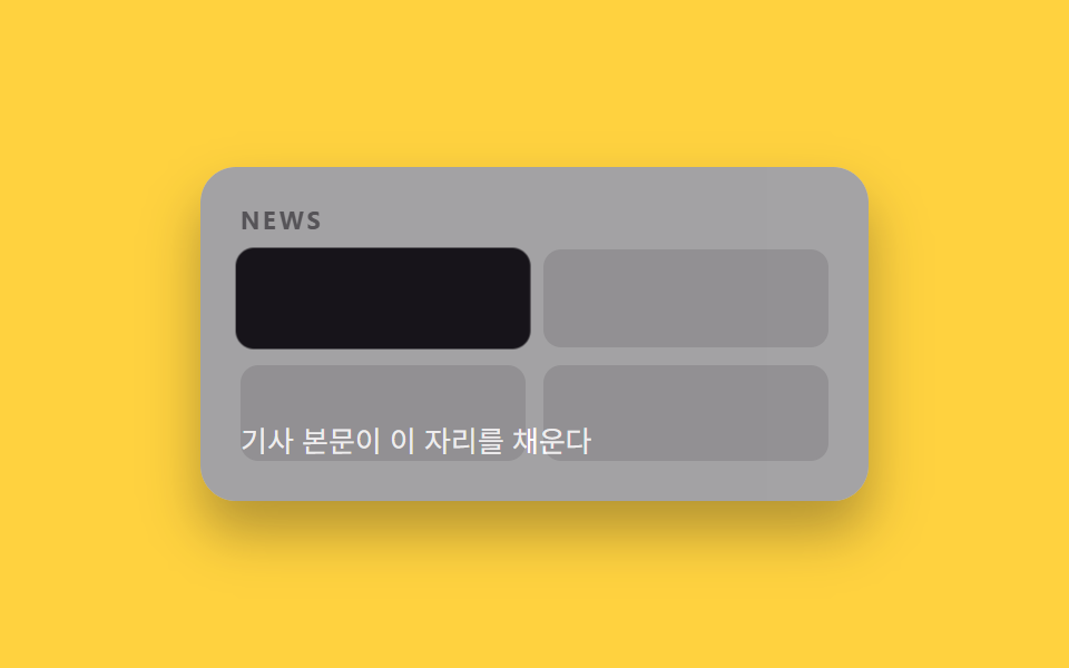
<main class="stage">
  <div class="pages is-demo">
    <section class="page page--grid">
      <p class="page__tag">NEWS</p>
      <div class="grid">
        <span class="cell cell--focus"></span>
        <span class="cell"></span>
        <span class="cell"></span>
        <span class="cell"></span>
      </div>
    </section>
    <div class="detail">
      <p class="detail__body">Nội dung bài viết sẽ nằm ở đây</p>
    </div>
  </div>
</main>
@use "../../../../site/static/demo-tokens" as *;
// ── 변수 3개. 변형은 이것만 바꾼다 (값은 토큰에서 받는다) ──────
$duration: $dur-enter;
$easing: $ease-spring;
$color: $subject-ink;
// ── 데모 무대 ───────────────────────────────
@include stage($stage-yellow);
.pages { position: relative; width: min(300px, 88%); height: 150px; border-radius: $r-card; overflow: hidden; box-shadow: $shadow-raised; background: #fff; }
.page--grid { position: absolute; inset: 0; box-sizing: border-box; padding: clamp(12px, 5vw, 18px); display: flex; flex-direction: column; gap: 8px; }
.page__tag { margin: 0; font-weight: 700; font-size: clamp(9px, 2.6vw, 11px); line-height: 1; font-family: inherit; letter-spacing: .12em; color: $subject-ink; opacity: .55; }
.grid { display: grid; grid-template-columns: 1fr 1fr; gap: 8px; flex: 1; }
.cell { border-radius: 8px; background: $subject-ink; opacity: .12; }
.cell--focus { background: $color; opacity: 1; }
// 클릭한 카드(cell--focus)가 화면을 가득 채우도록 transform 으로만 확대한다.
.cell--focus {
position: relative;
animation: zoom-card $dur-loop $easing infinite;
}
.detail {
position: absolute; inset: 0; background: $color; color: #fff;
display: flex; align-items: flex-end; box-sizing: border-box; padding: clamp(12px, 5vw, 18px);
opacity: 0;
animation: zoom-detail $dur-loop $easing infinite;
}
.detail__body { margin: 0; font-weight: 400; font-size: clamp(11px, 3.2vw, 13px); line-height: 1.5; font-family: inherit; }
@keyframes zoom-card {
0%, 40% { transform: scale(1); }
70% { transform: scale(4); }
100% { transform: scale(1); }
}
@keyframes zoom-detail {
0%, 55% { opacity: 0; }
75%, 90% { opacity: 1; }
100% { opacity: 0; }
}
// ── 접근성: 움직임 줄이기 설정이면 최종 상태만 고정으로 ────────
@media (prefers-reduced-motion: reduce) {
.cell--focus, .detail { animation: none !important; }
.detail { opacity: 0; }
}html, body {
margin: 0;
overflow: hidden;
}
.stage {
box-sizing: border-box;
min-height: 100vh;
display: grid;
place-items: center;
margin: 0;
background: #ffd23f;
font-family: -apple-system, "Segoe UI", "Noto Sans KR", sans-serif;
padding: clamp(8px, 4vw, 24px);
}
.pages {
position: relative;
width: min(300px, 88%);
height: 150px;
border-radius: 16px;
overflow: hidden;
box-shadow: 0 14px 24px rgba(23, 20, 26, 0.32);
background: #fff;
}
.page--grid {
position: absolute;
inset: 0;
box-sizing: border-box;
padding: clamp(12px, 5vw, 18px);
display: flex;
flex-direction: column;
gap: 8px;
}
.page__tag {
margin: 0;
font-weight: 700;
font-size: clamp(9px, 2.6vw, 11px);
line-height: 1;
font-family: inherit;
letter-spacing: 0.12em;
color: #17141a;
opacity: 0.55;
}
.grid {
display: grid;
grid-template-columns: 1fr 1fr;
gap: 8px;
flex: 1;
}
.cell {
border-radius: 8px;
background: #17141a;
opacity: 0.12;
}
.cell--focus {
background: #17141a;
opacity: 1;
}
.cell--focus {
position: relative;
animation: zoom-card 2s cubic-bezier(0.2, 0.8, 0.2, 1) infinite;
}
.detail {
position: absolute;
inset: 0;
background: #17141a;
color: #fff;
display: flex;
align-items: flex-end;
box-sizing: border-box;
padding: clamp(12px, 5vw, 18px);
opacity: 0;
animation: zoom-detail 2s cubic-bezier(0.2, 0.8, 0.2, 1) infinite;
}
.detail__body {
margin: 0;
font-weight: 400;
font-size: clamp(11px, 3.2vw, 13px);
line-height: 1.5;
font-family: inherit;
}
@keyframes zoom-card {
0%, 40% {
transform: scale(1);
}
70% {
transform: scale(4);
}
100% {
transform: scale(1);
}
}
@keyframes zoom-detail {
0%, 55% {
opacity: 0;
}
75%, 90% {
opacity: 1;
}
100% {
opacity: 0;
}
}
@media (prefers-reduced-motion: reduce) {
.cell--focus, .detail {
animation: none !important;
}
.detail {
opacity: 0;
}
}import type { CSSProperties, ReactNode } from "react";
import styles from "./ZoomCardTransition.module.scss";
export type ZoomCardTransitionProps = {
/** "grid": 카드 목록, "detail": 확대된 상세 */
active: "grid" | "detail";
detail: ReactNode;
/** 확대가 끝나는 시간 (기본 600ms) */
duration?: number;
easing?: string;
color?: string;
className?: string;
};
type Vars = CSSProperties & { "--duration"?: string; "--easing"?: string; "--color"?: string };
export default function ZoomCardTransition({
active,
detail,
duration = 600,
easing = "cubic-bezier(.2,.8,.2,1)",
color = "#17141a",
className = "",
}: ZoomCardTransitionProps) {
const vars: Vars = { "--duration": `${duration}ms`, "--easing": easing, "--color": color };
return (
<div className={`${styles.pages} ${className}`} style={vars} data-active={active}>
<div className={styles.grid}>
<span className={styles.cellFocus} />
<span className={styles.cell} />
<span className={styles.cell} />
<span className={styles.cell} />
</div>
<div className={styles.detail}>{detail}</div>
</div>
);
}06 Card phóng to thành chi tiết — Diện tích đo được 27.268% · khung hình chuyển động 12/23Nguyên tác GODRICH · SCSS và React nằm trong tệp zip · 9 hiệu ứng css page transition animation không JS
Bài viết chứa demo này
 9 hiệu ứng css page transition animation không JSCss page transition animation là hiệu ứng chuyển trang dựng bằng transform, opacity và clip-path thay vì đợi router vẽ l Xem tất cả demo trong bài này