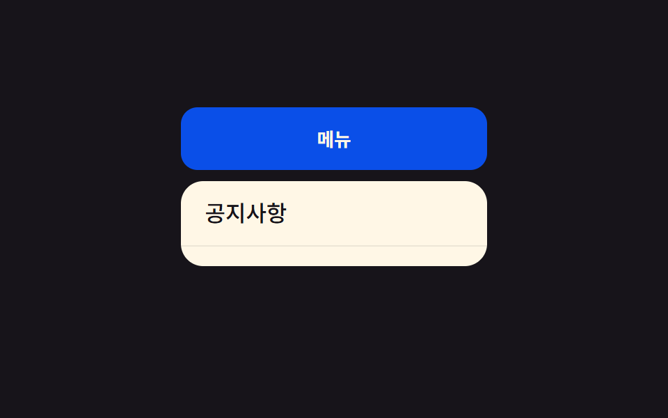
09Wipe chuyển sang dark mode
Màu tối lan chéo từ góc màn hình khi chuyển sang dark mode.
Dùng choNút chuyển dark mode, màn hình cài đặt
대각선450ms가장자리부터

<main class="stage">
  <div class="pages is-demo">
    <section class="page page--a">
      <p class="page__tag">HOME</p>
      <h2 class="page__title">Sáng</h2>
      <p class="page__body">Giao diện mặc định</p>
    </section>
    <section class="page page--b page--wipe">
      <p class="page__tag">HOME</p>
      <h2 class="page__title">Tối</h2>
      <p class="page__body">Giao diện dịu mắt</p>
    </section>
  </div>
</main>
@use "../../../../site/static/demo-tokens" as *;
// ── 변수 3개. 변형은 이것만 바꾼다 (값은 토큰에서 받는다) ──────
$duration: $dur-enter;
$easing: $ease-out;
$color: $subject-blue;
// ── 데모 무대 ───────────────────────────────
@include stage($stage-ink);
.pages { position: relative; width: min(300px, 88%); height: 150px; border-radius: $r-card; overflow: hidden; box-shadow: $shadow-raised; }
.page {
position: absolute; inset: 0; box-sizing: border-box;
display: flex; flex-direction: column; justify-content: center; gap: 6px;
padding: clamp(12px, 5vw, 20px); text-align: left;
}
.page--a { background: #fff; color: $subject-ink; }
.page--b { background: $subject-ink; color: #fff; }
.page__tag { margin: 0; font-weight: 700; font-size: clamp(9px, 2.6vw, 11px); line-height: 1; font-family: inherit; letter-spacing: .12em; opacity: .6; }
.page__title { margin: 0; font-weight: 700; font-size: clamp(14px, 4.2vw, 18px); line-height: 1.3; font-family: inherit; }
.page__body { margin: 0; font-weight: 400; font-size: clamp(11px, 3.2vw, 13px); line-height: 1.5; font-family: inherit; opacity: .82; }
// 모서리에서 대각선으로 자라는 clip-path 쐐기가 다크 페이지를 덮는다.
.page--wipe {
clip-path: polygon(0 0, 0 0, 0 0);
animation: dark-wipe $dur-loop $easing infinite;
}
@keyframes dark-wipe {
0%, 35% { clip-path: polygon(0 0, 0 0, 0 0); }
75%, 90% { clip-path: polygon(0 0, 200% 0, 0 200%); }
100% { clip-path: polygon(0 0, 0 0, 0 0); }
}
// ── 접근성: 움직임 줄이기 설정이면 최종 상태만 고정으로 ────────
@media (prefers-reduced-motion: reduce) {
.page--wipe { animation: none !important; clip-path: polygon(0 0, 0 0, 0 0); }
}html, body {
margin: 0;
overflow: hidden;
}
.stage {
box-sizing: border-box;
min-height: 100vh;
display: grid;
place-items: center;
margin: 0;
background: #17141a;
font-family: -apple-system, "Segoe UI", "Noto Sans KR", sans-serif;
padding: clamp(8px, 4vw, 24px);
}
.pages {
position: relative;
width: min(300px, 88%);
height: 150px;
border-radius: 16px;
overflow: hidden;
box-shadow: 0 14px 24px rgba(23, 20, 26, 0.32);
}
.page {
position: absolute;
inset: 0;
box-sizing: border-box;
display: flex;
flex-direction: column;
justify-content: center;
gap: 6px;
padding: clamp(12px, 5vw, 20px);
text-align: left;
}
.page--a {
background: #fff;
color: #17141a;
}
.page--b {
background: #17141a;
color: #fff;
}
.page__tag {
margin: 0;
font-weight: 700;
font-size: clamp(9px, 2.6vw, 11px);
line-height: 1;
font-family: inherit;
letter-spacing: 0.12em;
opacity: 0.6;
}
.page__title {
margin: 0;
font-weight: 700;
font-size: clamp(14px, 4.2vw, 18px);
line-height: 1.3;
font-family: inherit;
}
.page__body {
margin: 0;
font-weight: 400;
font-size: clamp(11px, 3.2vw, 13px);
line-height: 1.5;
font-family: inherit;
opacity: 0.82;
}
.page--wipe {
clip-path: polygon(0 0, 0 0, 0 0);
animation: dark-wipe 2s ease-out infinite;
}
@keyframes dark-wipe {
0%, 35% {
clip-path: polygon(0 0, 0 0, 0 0);
}
75%, 90% {
clip-path: polygon(0 0, 200% 0, 0 200%);
}
100% {
clip-path: polygon(0 0, 0 0, 0 0);
}
}
@media (prefers-reduced-motion: reduce) {
.page--wipe {
animation: none !important;
clip-path: polygon(0 0, 0 0, 0 0);
}
}import type { CSSProperties, ReactNode } from "react";
import styles from "./ThemeWipeTransition.module.scss";
export type ThemeWipeTransitionProps = {
active: "light" | "dark";
light: ReactNode;
dark: ReactNode;
/** 와이프가 다 덮는 시간 (기본 600ms) */
duration?: number;
easing?: string;
className?: string;
};
type Vars = CSSProperties & { "--duration"?: string; "--easing"?: string };
export default function ThemeWipeTransition({
active,
light,
dark,
duration = 600,
easing = "ease-out",
className = "",
}: ThemeWipeTransitionProps) {
const vars: Vars = { "--duration": `${duration}ms`, "--easing": easing };
return (
<div className={`${styles.pages} ${className}`} style={vars} data-active={active}>
<section className={styles.light}>{light}</section>
<section className={styles.dark}>{dark}</section>
</div>
);
}09 Wipe chuyển sang dark mode — Diện tích đo được 31.016% · khung hình chuyển động 11/23Nguyên tác GODRICH · SCSS và React nằm trong tệp zip · 9 hiệu ứng css page transition animation không JS
Bài viết chứa demo này
 9 hiệu ứng css page transition animation không JSCss page transition animation là hiệu ứng chuyển trang dựng bằng transform, opacity và clip-path thay vì đợi router vẽ l Xem tất cả demo trong bài này