03Nhấc cao gói phổ biến
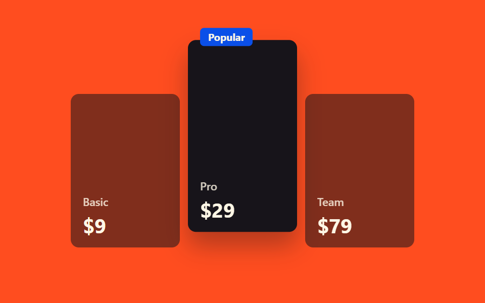
Hover vào thẻ gói phổ biến vốn đã nổi bật bằng viền, thẻ lại được nhấc lên thêm một tầng kèm bóng đổ sâu hơn.
Dùng choThẻ gói đề xuất giữa ba mức giá, cột highlight của bảng so sánh
translateYbox-shadow240ms
<main class="stage">
  <div class="pl-grid is-demo">
    <div class="pl-card">
      <span class="pl-card__tag">Basic</span>
      <span class="pl-card__price">$9</span>
    </div>
    <div class="pl-card pl-card--popular pl-focal">
      <span class="pl-card__badge">Popular</span>
      <span class="pl-card__tag">Pro</span>
      <span class="pl-card__price">$29</span>
    </div>
    <div class="pl-card">
      <span class="pl-card__tag">Team</span>
      <span class="pl-card__price">$79</span>
    </div>
  </div>
</main>
@use "../../../../site/static/demo-tokens" as *;
// ── 변수 3개 ──────────────────────────────────────────
$duration: $dur-base;
$easing: $ease-spring;
$color: $subject-blue-deep; // 크림 글자가 얹히므로 진한 파랑
@include stage($stage-orange);
.pl-grid {
width: min(340px, 90vw);
aspect-ratio: 340 / 190;
display: flex;
align-items: flex-end;
gap: $sp-2;
}
.pl-card {
flex: 1 1 0;
height: 80%;
border-radius: $r-sm;
box-sizing: border-box;
padding: $sp-3;
display: flex;
flex-direction: column;
justify-content: flex-end;
gap: $sp-1;
position: relative;
color: $subject-cream;
background: rgba(23, 20, 26, .55);
font: 600 12px/1 -apple-system, "Segoe UI", sans-serif;
}
.pl-card--popular {
height: 100%;
background: $subject-ink;
box-shadow: $shadow-press;
transition: transform $duration $easing, box-shadow $duration $easing;
}
.pl-card--popular:hover {
transform: translateY(-#{$sp-4});
box-shadow: $shadow-raised;
}
.pl-card__badge {
position: absolute;
top: -#{$sp-3};
left: $sp-3;
border-radius: $r-xs;
background: $color;
color: $subject-cream;
padding: $sp-1 $sp-2;
font-size: 10px;
font-weight: 700;
}
.pl-card__tag { opacity: .8; font-size: 11px; }
.pl-card__price { font-size: 20px; font-weight: 700; margin-top: $sp-1; }
// 데모 루프: is-demo 는 같은 들림을 무한 재생 (캡처용)
@keyframes pl-lift {
0%, 100% { transform: translateY(0); box-shadow: $shadow-press; }
50% { transform: translateY(-#{$sp-4}); box-shadow: $shadow-raised; }
}
.pl-grid.is-demo .pl-focal { animation: pl-lift $duration $easing infinite; }
@media (prefers-reduced-motion: reduce) {
.pl-card--popular:hover,
.pl-grid.is-demo .pl-focal { animation: none !important; transform: none !important; box-shadow: $shadow-press !important; }
}html, body {
margin: 0;
overflow: hidden;
}
.stage {
box-sizing: border-box;
min-height: 100vh;
display: grid;
place-items: center;
margin: 0;
background: #ff4d1f;
font-family: -apple-system, "Segoe UI", "Noto Sans KR", sans-serif;
padding: clamp(8px, 4vw, 24px);
}
.pl-grid {
width: min(340px, 90vw);
aspect-ratio: 340/190;
display: flex;
align-items: flex-end;
gap: 8px;
}
.pl-card {
flex: 1 1 0;
height: 80%;
border-radius: 8px;
box-sizing: border-box;
padding: 12px;
display: flex;
flex-direction: column;
justify-content: flex-end;
gap: 4px;
position: relative;
color: #fff7e6;
background: rgba(23, 20, 26, 0.55);
font: 600 12px/1 -apple-system, "Segoe UI", sans-serif;
}
.pl-card--popular {
height: 100%;
background: #17141a;
box-shadow: 0 6px 12px rgba(23, 20, 26, 0.32);
transition: transform 300ms cubic-bezier(0.2, 0.8, 0.2, 1), box-shadow 300ms cubic-bezier(0.2, 0.8, 0.2, 1);
}
.pl-card--popular:hover {
transform: translateY(-16px);
box-shadow: 0 14px 24px rgba(23, 20, 26, 0.32);
}
.pl-card__badge {
position: absolute;
top: -12px;
left: 12px;
border-radius: 4px;
background: #0a4fe8;
color: #fff7e6;
padding: 4px 8px;
font-size: 10px;
font-weight: 700;
}
.pl-card__tag {
opacity: 0.8;
font-size: 11px;
}
.pl-card__price {
font-size: 20px;
font-weight: 700;
margin-top: 4px;
}
@keyframes pl-lift {
0%, 100% {
transform: translateY(0);
box-shadow: 0 6px 12px rgba(23, 20, 26, 0.32);
}
50% {
transform: translateY(-16px);
box-shadow: 0 14px 24px rgba(23, 20, 26, 0.32);
}
}
.pl-grid.is-demo .pl-focal {
animation: pl-lift 300ms cubic-bezier(0.2, 0.8, 0.2, 1) infinite;
}
@media (prefers-reduced-motion: reduce) {
.pl-card--popular:hover,
.pl-grid.is-demo .pl-focal {
animation: none !important;
transform: none !important;
box-shadow: 0 6px 12px rgba(23, 20, 26, 0.32) !important;
}
}import { CSSProperties } from "react";
import styles from "./PopularPlanLift.module.scss";
export interface PopularPlanLiftProps {
duration?: string;
easing?: string;
color?: string;
}
const SIDE = [
{ tag: "Basic", price: "$9" },
{ tag: "Team", price: "$79" },
];
export default function PopularPlanLift({
duration = "300ms",
easing = "cubic-bezier(.2, .8, .2, 1)",
color = "#0a4fe8",
}: PopularPlanLiftProps) {
const style = { "--duration": duration, "--easing": easing, "--color": color } as CSSProperties;
return (
<div className={styles.grid} style={style}>
<div className={styles.card}>
<span className={styles.tag}>{SIDE[0].tag}</span>
<span className={styles.price}>{SIDE[0].price}</span>
</div>
<div className={`${styles.card} ${styles.popular}`}>
<span className={styles.badge}>Popular</span>
<span className={styles.tag}>Pro</span>
<span className={styles.price}>$29</span>
</div>
<div className={styles.card}>
<span className={styles.tag}>{SIDE[1].tag}</span>
<span className={styles.price}>{SIDE[1].price}</span>
</div>
</div>
);
}03 Nhấc cao gói phổ biến — Diện tích đo được 5.008% · khung hình chuyển động 23/23Nguyên tác GODRICH · SCSS và React nằm trong tệp zip · 9 mẫu css pricing table animation copy-paste
Bài viết chứa demo này
 9 mẫu css pricing table animation copy-pasteCss pricing table là khối hiển thị các gói giá xếp cạnh nhau trên một trang. Chín animation cho bảng giá dưới đây viết g Xem tất cả demo trong bài này