06Đổi giá bằng :has(:checked), 0 JS
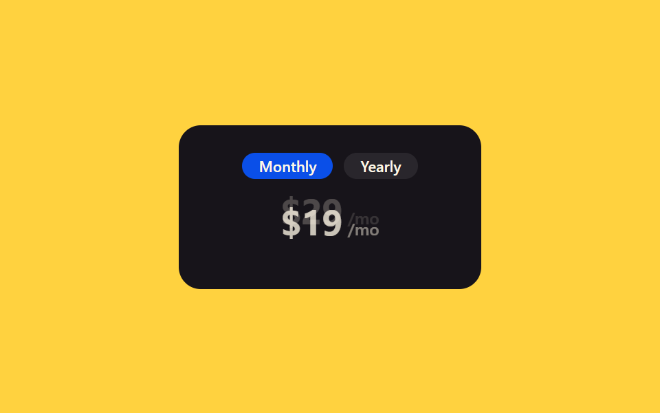
Selector :has() đọc trạng thái của nút radio ẩn, nên giá tháng và giá năm cross-fade với nhau mà không một dòng JavaScript.
Dùng choBảng giá đổi chu kỳ thanh toán đặt trên site tĩnh không chạy JS
:has():checkedopacity
<main class="stage">
  <div class="hc-card is-demo">
    <div class="hc-toggle">
      <input type="radio" name="hc-period" id="hc-monthly" class="hc-radio hc-radio--m" checked>
      <input type="radio" name="hc-period" id="hc-yearly" class="hc-radio hc-radio--y">
      <label for="hc-monthly">Monthly</label>
      <label for="hc-yearly">Yearly</label>
    </div>
    <div class="hc-price-stack">
      <div class="hc-price hc-price--monthly">$29<span>/mo</span></div>
      <div class="hc-price hc-price--yearly">$19<span>/mo</span></div>
    </div>
  </div>
</main>
@use "../../../../site/static/demo-tokens" as *;
// ── 변수 3개 ──────────────────────────────────────────
$duration: $dur-base;
$easing: $ease-out;
$color: $subject-blue-deep; // 크림 글자가 얹히므로 진한 파랑
@include stage($stage-yellow);
.hc-card {
width: min(220px, 80vw);
box-sizing: border-box;
border-radius: $r-card;
padding: $sp-5;
background: $subject-ink;
display: flex;
flex-direction: column;
align-items: center;
gap: $sp-4;
}
.hc-toggle {
display: flex;
gap: $sp-2;
}
.hc-radio { position: absolute; opacity: 0; pointer-events: none; }
.hc-toggle label {
padding: $sp-1 $sp-3;
border-radius: $r-pill;
cursor: pointer;
color: $subject-cream;
background: rgba(255, 255, 255, .08);
font: 600 11px/1 -apple-system, "Segoe UI", sans-serif;
transition: background $duration $easing;
}
// 순수 CSS: 숨긴 라디오의 :checked 상태를 :has() 로 읽어 카드 전체에서 판단한다 (JS 0)
.hc-card:has(.hc-radio--m:checked) label[for="hc-monthly"],
.hc-card:has(.hc-radio--y:checked) label[for="hc-yearly"] {
background: $color;
}
.hc-price-stack { position: relative; width: 100%; height: 44px; }
.hc-price {
position: absolute;
inset: 0;
display: flex;
align-items: baseline;
justify-content: center;
gap: $sp-1;
color: $subject-cream;
font: 700 26px/1 -apple-system, "Segoe UI", sans-serif;
opacity: 0;
transform: translateY($sp-2);
transition: opacity $duration $easing, transform $duration $easing;
}
.hc-price span { font-size: 12px; font-weight: 500; opacity: .6; }
.hc-price--monthly { opacity: 1; transform: none; }
.hc-card:has(.hc-radio--y:checked) .hc-price--monthly { opacity: 0; transform: translateY(-#{$sp-2}); }
.hc-card:has(.hc-radio--y:checked) .hc-price--yearly { opacity: 1; transform: none; }
// 데모 루프: 헤드리스는 :has(:checked) 를 못 걸어 is-demo 가 같은 크로스페이드를 keyframes 로 반복한다
@keyframes hc-cross-a {
0%, 40% { opacity: 1; transform: none; }
50%, 90% { opacity: 0; transform: translateY(-#{$sp-2}); }
100% { opacity: 1; transform: none; }
}
@keyframes hc-cross-b {
0%, 40% { opacity: 0; transform: translateY($sp-2); }
50%, 90% { opacity: 1; transform: none; }
100% { opacity: 0; transform: translateY($sp-2); }
}
.hc-card.is-demo .hc-price--monthly { animation: hc-cross-a $duration * 4 $easing infinite; }
.hc-card.is-demo .hc-price--yearly { animation: hc-cross-b $duration * 4 $easing infinite; }
@media (prefers-reduced-motion: reduce) {
.hc-price,
.hc-card.is-demo .hc-price { animation: none !important; transition: none !important; }
}html, body {
margin: 0;
overflow: hidden;
}
.stage {
box-sizing: border-box;
min-height: 100vh;
display: grid;
place-items: center;
margin: 0;
background: #ffd23f;
font-family: -apple-system, "Segoe UI", "Noto Sans KR", sans-serif;
padding: clamp(8px, 4vw, 24px);
}
.hc-card {
width: min(220px, 80vw);
box-sizing: border-box;
border-radius: 16px;
padding: 20px;
background: #17141a;
display: flex;
flex-direction: column;
align-items: center;
gap: 16px;
}
.hc-toggle {
display: flex;
gap: 8px;
}
.hc-radio {
position: absolute;
opacity: 0;
pointer-events: none;
}
.hc-toggle label {
padding: 4px 12px;
border-radius: 999px;
cursor: pointer;
color: #fff7e6;
background: rgba(255, 255, 255, 0.08);
font: 600 11px/1 -apple-system, "Segoe UI", sans-serif;
transition: background 300ms ease-out;
}
.hc-card:has(.hc-radio--m:checked) label[for=hc-monthly],
.hc-card:has(.hc-radio--y:checked) label[for=hc-yearly] {
background: #0a4fe8;
}
.hc-price-stack {
position: relative;
width: 100%;
height: 44px;
}
.hc-price {
position: absolute;
inset: 0;
display: flex;
align-items: baseline;
justify-content: center;
gap: 4px;
color: #fff7e6;
font: 700 26px/1 -apple-system, "Segoe UI", sans-serif;
opacity: 0;
transform: translateY(8px);
transition: opacity 300ms ease-out, transform 300ms ease-out;
}
.hc-price span {
font-size: 12px;
font-weight: 500;
opacity: 0.6;
}
.hc-price--monthly {
opacity: 1;
transform: none;
}
.hc-card:has(.hc-radio--y:checked) .hc-price--monthly {
opacity: 0;
transform: translateY(-8px);
}
.hc-card:has(.hc-radio--y:checked) .hc-price--yearly {
opacity: 1;
transform: none;
}
@keyframes hc-cross-a {
0%, 40% {
opacity: 1;
transform: none;
}
50%, 90% {
opacity: 0;
transform: translateY(-8px);
}
100% {
opacity: 1;
transform: none;
}
}
@keyframes hc-cross-b {
0%, 40% {
opacity: 0;
transform: translateY(8px);
}
50%, 90% {
opacity: 1;
transform: none;
}
100% {
opacity: 0;
transform: translateY(8px);
}
}
.hc-card.is-demo .hc-price--monthly {
animation: hc-cross-a 1200ms ease-out infinite;
}
.hc-card.is-demo .hc-price--yearly {
animation: hc-cross-b 1200ms ease-out infinite;
}
@media (prefers-reduced-motion: reduce) {
.hc-price,
.hc-card.is-demo .hc-price {
animation: none !important;
transition: none !important;
}
}import { CSSProperties } from "react";
import styles from "./PriceSwapHasChecked.module.scss";
export interface PriceSwapHasCheckedProps {
duration?: string;
easing?: string;
monthly?: string;
yearly?: string;
name?: string;
}
// 실사용: 숨긴 라디오 상태를 :has() 로 카드 전체에서 읽는다. 자바스크립트 0.
export default function PriceSwapHasChecked({
duration = "300ms",
easing = "ease-out",
monthly = "$29",
yearly = "$19",
name = "hc-period",
}: PriceSwapHasCheckedProps) {
const style = { "--duration": duration, "--easing": easing } as CSSProperties;
return (
<div className={styles.card} style={style}>
<div className={styles.toggle}>
<input type="radio" name={name} id={`${name}-m`} className={styles.radioM} defaultChecked />
<input type="radio" name={name} id={`${name}-y`} className={styles.radioY} />
<label htmlFor={`${name}-m`}>Monthly</label>
<label htmlFor={`${name}-y`}>Yearly</label>
</div>
<div className={styles.stack}>
<div className={`${styles.price} ${styles.priceMonthly}`}>{monthly}<span>/mo</span></div>
<div className={`${styles.price} ${styles.priceYearly}`}>{yearly}<span>/mo</span></div>
</div>
</div>
);
}06 Đổi giá bằng :has(:checked), 0 JS — Diện tích đo được 1.061% · khung hình chuyển động 8/23Nguyên tác GODRICH · SCSS và React nằm trong tệp zip · 9 mẫu css pricing table animation copy-paste
Bài viết chứa demo này
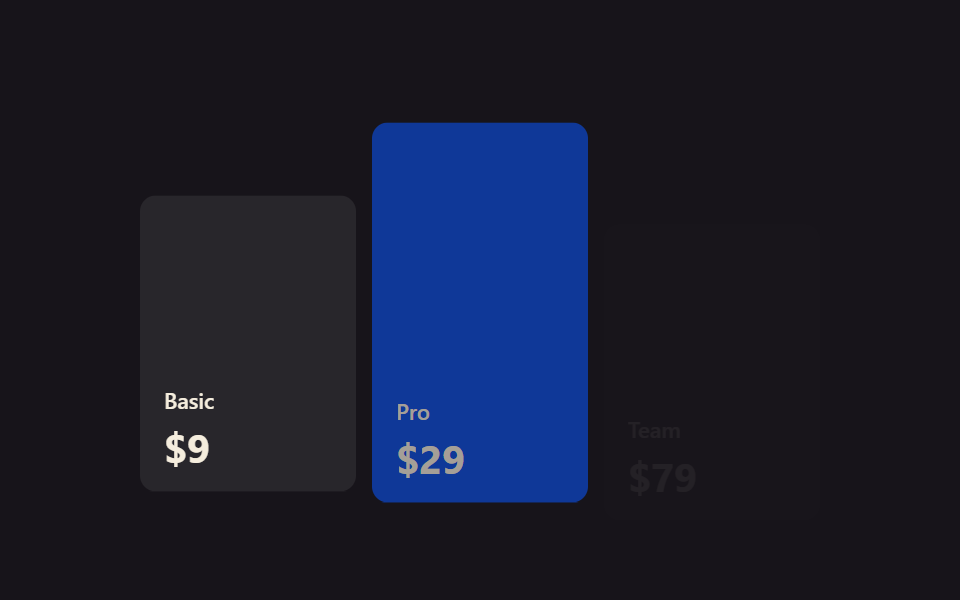 9 mẫu css pricing table animation copy-pasteCss pricing table là khối hiển thị các gói giá xếp cạnh nhau trên một trang. Chín animation cho bảng giá dưới đây viết g Xem tất cả demo trong bài này