05Đẩy nội dung
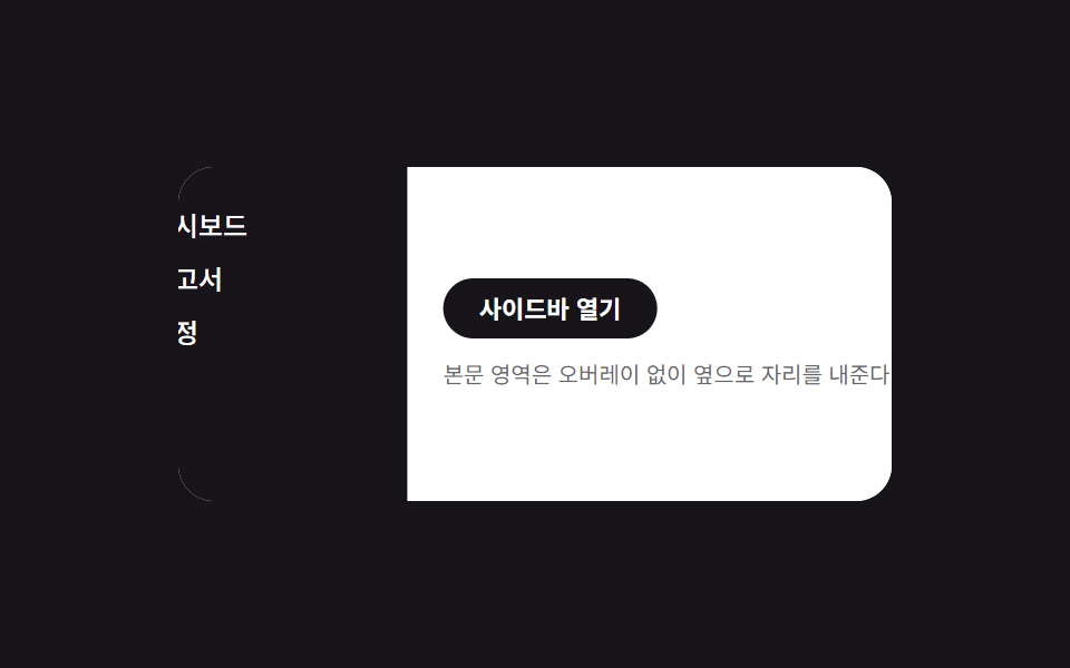
Sidebar và nội dung bên cạnh cùng translateX trong cùng một khoảng thời gian, chia chỗ mà không cần overlay.
Dùng choPanel điều hướng trong công cụ soạn tài liệu trên desktop
콘텐츠 동반 이동translateX 쌍오버레이 없음
<main class="stage is-demo">
  <div class="layout">
    <nav class="drawer" aria-label="Điều hướng bên" aria-hidden="true">
      <a class="drawer__link" href="#" tabindex="-1">Bảng điều khiển</a>
      <a class="drawer__link" href="#" tabindex="-1">Báo cáo</a>
      <a class="drawer__link" href="#" tabindex="-1">Thiết lập</a>
    </nav>
    <div class="content">
      <button class="trigger" type="button" aria-expanded="false">Mở sidebar</button>
      <p class="content__line">Vùng nội dung dịch sang bên mà không cần lớp phủ.</p>
    </div>
  </div>
</main>
@use "../../../../site/static/demo-tokens" as *;
// ── 변수 3개 ──────────────────────────────────────────
$duration: $dur-enter; // 600ms — 사이드바·콘텐츠가 함께 이동하는 시간
$easing: $ease-spring;
$color: $subject-blue; // 링크 hover 강조색
// ── 데모 무대 ───────────────────────────────────────────
@include stage($stage-ink);
.stage { position: relative; }
.layout {
position: relative;
overflow: hidden;
width: min(88vw, 320px);
height: min(50vw, 150px);
border-radius: $r-card;
background: $stage-paper;
}
// 드로어는 콘텐츠 밑에 고정, 처음엔 왼쪽 밖으로 밀려 있다
.drawer {
position: absolute; inset: 0 auto 0 0;
width: 40%;
box-sizing: border-box;
display: flex; flex-direction: column; gap: $sp-1;
padding: $sp-4 $sp-2;
background: $stage-ink; color: $stage-paper;
transform: translateX(-100%);
transition: transform $duration $easing;
z-index: 1;
}
.drawer__link {
padding: $sp-1;
border-radius: $r-xs;
color: $stage-paper; text-decoration: none; font-weight: 500; font-size: 12px; line-height: 1; font-family: inherit;
&:hover, &:focus-visible { background: rgba($stage-paper, .16); color: $color; }
}
// 콘텐츠는 항상 레이아웃 전체 폭 — 오른쪽으로 밀려 드로어를 드러낸다(오버레이 없음)
.content {
position: relative;
height: 100%;
box-sizing: border-box;
display: flex; flex-direction: column; gap: $sp-2; justify-content: center;
padding: $sp-4;
background: $stage-paper; color: $stage-ink;
transform: translateX(0);
transition: transform $duration $easing;
z-index: 2;
}
.content__line { margin: 0; font-size: clamp(10px, 3vmin, 12px); color: rgba($stage-ink, .65); }
.trigger {
align-self: flex-start;
border: 0; border-radius: $r-pill;
padding: $sp-2 $sp-4;
font-weight: 600;
font-size: clamp(11px, 3.4vmin, 13px);
line-height: 1;
font-family: inherit;
color: $stage-paper; background: $stage-ink;
cursor: pointer; -webkit-tap-highlight-color: transparent;
}
.stage.is-open .drawer { transform: translateX(0); }
.stage.is-open .content { transform: translateX(40%); }
// 데모 루프: 닫힘 → 밀려남 → 닫힘 순으로 2초에 한 바퀴
.stage.is-demo .drawer { animation: drawer-loop $dur-loop $easing infinite; }
.stage.is-demo .content { animation: content-loop $dur-loop $easing infinite; }
@keyframes drawer-loop {
0%, 100% { transform: translateX(-100%); }
15%, 70% { transform: translateX(0); }
85% { transform: translateX(-100%); }
}
@keyframes content-loop {
0%, 100% { transform: translateX(0); }
15%, 70% { transform: translateX(40%); }
85% { transform: translateX(0); }
}
@media (prefers-reduced-motion: reduce) {
.stage.is-demo .drawer, .stage.is-demo .content { animation: none; }
.drawer, .content { transition-duration: 1ms; }
}html, body {
margin: 0;
overflow: hidden;
}
.stage {
box-sizing: border-box;
min-height: 100vh;
display: grid;
place-items: center;
margin: 0;
background: #17141a;
font-family: -apple-system, "Segoe UI", "Noto Sans KR", sans-serif;
padding: clamp(8px, 4vw, 24px);
}
.stage {
position: relative;
}
.layout {
position: relative;
overflow: hidden;
width: min(88vw, 320px);
height: min(50vw, 150px);
border-radius: 16px;
background: #ffffff;
}
.drawer {
position: absolute;
inset: 0 auto 0 0;
width: 40%;
box-sizing: border-box;
display: flex;
flex-direction: column;
gap: 4px;
padding: 16px 8px;
background: #17141a;
color: #ffffff;
transform: translateX(-100%);
transition: transform 600ms cubic-bezier(0.2, 0.8, 0.2, 1);
z-index: 1;
}
.drawer__link {
padding: 4px;
border-radius: 4px;
color: #ffffff;
text-decoration: none;
font-weight: 500;
font-size: 12px;
line-height: 1;
font-family: inherit;
}
.drawer__link:hover, .drawer__link:focus-visible {
background: rgba(255, 255, 255, 0.16);
color: #2f6df6;
}
.content {
position: relative;
height: 100%;
box-sizing: border-box;
display: flex;
flex-direction: column;
gap: 8px;
justify-content: center;
padding: 16px;
background: #ffffff;
color: #17141a;
transform: translateX(0);
transition: transform 600ms cubic-bezier(0.2, 0.8, 0.2, 1);
z-index: 2;
}
.content__line {
margin: 0;
font-size: clamp(10px, 3vmin, 12px);
color: rgba(23, 20, 26, 0.65);
}
.trigger {
align-self: flex-start;
border: 0;
border-radius: 999px;
padding: 8px 16px;
font-weight: 600;
font-size: clamp(11px, 3.4vmin, 13px);
line-height: 1;
font-family: inherit;
color: #ffffff;
background: #17141a;
cursor: pointer;
-webkit-tap-highlight-color: transparent;
}
.stage.is-open .drawer {
transform: translateX(0);
}
.stage.is-open .content {
transform: translateX(40%);
}
.stage.is-demo .drawer {
animation: drawer-loop 2s cubic-bezier(0.2, 0.8, 0.2, 1) infinite;
}
.stage.is-demo .content {
animation: content-loop 2s cubic-bezier(0.2, 0.8, 0.2, 1) infinite;
}
@keyframes drawer-loop {
0%, 100% {
transform: translateX(-100%);
}
15%, 70% {
transform: translateX(0);
}
85% {
transform: translateX(-100%);
}
}
@keyframes content-loop {
0%, 100% {
transform: translateX(0);
}
15%, 70% {
transform: translateX(40%);
}
85% {
transform: translateX(0);
}
}
@media (prefers-reduced-motion: reduce) {
.stage.is-demo .drawer, .stage.is-demo .content {
animation: none;
}
.drawer, .content {
transition-duration: 1ms;
}
}// 모달이 아니라 상시 내비게이션이라 inert 대신 aria-hidden·tabindex 로만 여닫힘을 알린다.
(function () {
var stage = document.querySelector('.stage');
var trigger = document.querySelector('.trigger');
var drawer = document.querySelector('.drawer');
var links = drawer.querySelectorAll('a');
function set(open) {
stage.classList.remove('is-demo');
stage.classList.toggle('is-open', open);
trigger.setAttribute('aria-expanded', String(open));
drawer.setAttribute('aria-hidden', String(!open));
links.forEach(function (a) { a.tabIndex = open ? 0 : -1; });
}
trigger.addEventListener('click', function () { set(!stage.classList.contains('is-open')); });
document.addEventListener('keydown', function (e) {
if (e.key === 'Escape' && stage.classList.contains('is-open')) { set(false); trigger.focus({ preventScroll: true }); }
});
})();import { useState } from "react";
import type { CSSProperties } from "react";
import styles from "./PushContentDrawer.module.scss";
export type PushContentDrawerProps = {
duration?: number;
easing?: string;
color?: string;
};
export default function PushContentDrawer({
duration = 600,
easing = "cubic-bezier(.2,.8,.2,1)",
color = "#2f6df6",
}: PushContentDrawerProps) {
const [open, setOpen] = useState(false);
const vars: CSSProperties = { "--duration": `${duration}ms`, "--easing": easing, "--color": color };
return (
<div className={styles.stage} style={vars}>
<div className={styles.layout}>
<nav className={styles.drawer} data-open={open} aria-label="사이드 내비게이션" aria-hidden={!open}>
<a className={styles.link} href="#" tabIndex={open ? 0 : -1}>대시보드</a>
<a className={styles.link} href="#" tabIndex={open ? 0 : -1}>보고서</a>
<a className={styles.link} href="#" tabIndex={open ? 0 : -1}>설정</a>
</nav>
<div className={styles.content} data-open={open}>
<button className={styles.trigger} type="button" aria-expanded={open} onClick={() => setOpen((v) => !v)}>
사이드바 열기
</button>
<p className={styles.line}>본문 영역은 오버레이 없이 옆으로 자리를 내준다.</p>
</div>
</div>
</div>
);
}05 Đẩy nội dung — Diện tích đo được 15.844% · khung hình chuyển động 9/23Nguyên tác GODRICH · SCSS và React nằm trong tệp zip · 9 hiệu ứng CSS Sidebar Animation - JS tối thiểu
Bài viết chứa demo này
 9 hiệu ứng CSS Sidebar Animation - JS tối thiểuCSS sidebar animation là cách một drawer đóng mở bằng transform và opacity, còn JavaScript chỉ lo phần bắt buộc: bật trạ Xem tất cả demo trong bài này