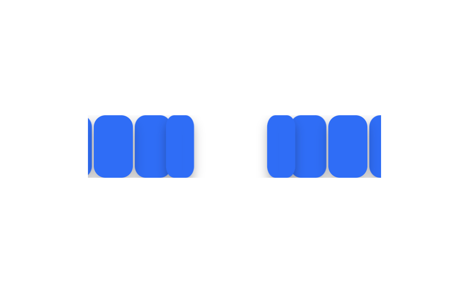
04Lật thẻ 3D tuần tự
Ba thẻ đứng chờ ở trạng thái nghiêng 90 độ trên trục Y, rồi lần lượt mở ra cách nhau 150ms để lộ mặt trước.
Dùng choSo sánh thẻ giá, thẻ thông số sản phẩm
rotateY 90→0150ms 간격perspective
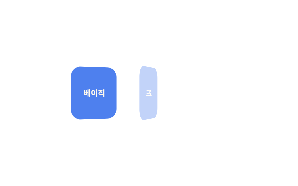
<main class="stage">
  <div class="cards is-demo">
    <div class="card">Cơ bản</div>
    <div class="card">Pro</div>
    <div class="card">Nhóm</div>
  </div>
</main>
@use "../../../../site/static/demo-tokens" as *;
$duration: $dur-base; // 카드 한 장이 펴지는 시간
$easing: $ease-out; // 시작 빠르고 끝은 부드럽게
$stagger: 150ms; // 카드 사이 시차
@include stage($stage-paper);
.cards {
display: flex;
gap: clamp(8px, 2.6vw, 14px);
perspective: 600px;
}
.card {
width: clamp(56px, 16vw, 76px);
height: clamp(64px, 18vw, 84px);
display: grid;
place-items: center;
border-radius: $r-card;
background: $subject-blue-deep;
color: $subject-cream;
font-weight: 700; font-size: clamp(11px, 3vw, 13px); line-height: 1.2; font-family: inherit;
transform-style: preserve-3d;
}
// 반복 재생은 데모 상태에서만 — 정지 상태의 카드는 불투명해야 글자가 읽힌다(크림 글자 · 진파랑 면 5.98:1)
.cards.is-demo .card { animation: flip-loop $dur-loop $easing infinite; }
@for $i from 1 through 3 {
.cards.is-demo .card:nth-child(#{$i}) { animation-delay: ($i - 1) * $stagger; }
}
@keyframes flip-loop {
0%, 6% { opacity: 0; transform: rotateY(90deg); }
26%, 66% { opacity: 1; transform: rotateY(0deg); }
86%, 100% { opacity: 0; transform: rotateY(-90deg); }
}
@media (prefers-reduced-motion: reduce) {
.card { animation: none; opacity: 1; transform: none; }
}html, body {
margin: 0;
overflow: hidden;
}
.stage {
box-sizing: border-box;
min-height: 100vh;
display: grid;
place-items: center;
margin: 0;
background: #ffffff;
font-family: -apple-system, "Segoe UI", "Noto Sans KR", sans-serif;
padding: clamp(8px, 4vw, 24px);
}
.cards {
display: flex;
gap: clamp(8px, 2.6vw, 14px);
perspective: 600px;
}
.card {
width: clamp(56px, 16vw, 76px);
height: clamp(64px, 18vw, 84px);
display: grid;
place-items: center;
border-radius: 16px;
background: #0a4fe8;
color: #fff7e6;
font-weight: 700;
font-size: clamp(11px, 3vw, 13px);
line-height: 1.2;
font-family: inherit;
transform-style: preserve-3d;
}
.cards.is-demo .card {
animation: flip-loop 2s ease-out infinite;
}
.cards.is-demo .card:nth-child(1) {
animation-delay: 0ms;
}
.cards.is-demo .card:nth-child(2) {
animation-delay: 150ms;
}
.cards.is-demo .card:nth-child(3) {
animation-delay: 300ms;
}
@keyframes flip-loop {
0%, 6% {
opacity: 0;
transform: rotateY(90deg);
}
26%, 66% {
opacity: 1;
transform: rotateY(0deg);
}
86%, 100% {
opacity: 0;
transform: rotateY(-90deg);
}
}
@media (prefers-reduced-motion: reduce) {
.card {
animation: none;
opacity: 1;
transform: none;
}
}import styles from "./CardFlipSequence.module.scss";
export type CardFlipSequenceProps = {
cards: string[];
/** 카드 사이 시차 ms (기본 150ms) */
stagger?: number;
duration?: number;
easing?: string;
};
export default function CardFlipSequence({ cards, stagger = 150 }: CardFlipSequenceProps) {
return (
<div className={styles.cards}>
{cards.map((label, i) => (
<div key={label} className={styles.card} style={{ animationDelay: `${i * stagger}ms` }}>
{label}
</div>
))}
</div>
);
}04 Lật thẻ 3D tuần tự — Diện tích đo được 13.364% · khung hình chuyển động 17/23Nguyên tác GODRICH · SCSS và React nằm trong tệp zip · 9 CSS Stagger Animation Demos Copy-Paste Là Chạy
Bài viết chứa demo này
 9 CSS Stagger Animation Demos Copy-Paste Là ChạyCSS stagger animation là kỹ thuật khiến các phần tử trong danh sách hay lưới xuất hiện trễ nhau, thay vì bung ra cùng lú Xem tất cả demo trong bài này