04Chữ quét sáng
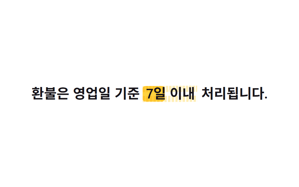
Chồng thêm một lớp chữ giống hệt lên trên nền chữ màu đơn, riêng lớp đó chỉ để lộ một dải sáng hẹp qua background-clip:text rồi quét một lượt bằng background-position, như ánh sáng lướt qua bề mặt kim loại.
Dùng choBadge hội viên cao cấp, tiêu đề dành riêng cho VIP
background-position 스윕대각선 하이라이트2s

<main class="stage">
  <h1 class="sheen">
    <span class="sheen__base">Chỉ dành cho hội viên Gold</span>
    <span class="sheen__light" aria-hidden="true">Chỉ dành cho hội viên Gold</span>
  </h1>
</main>
@use "../../../../site/static/demo-tokens" as *;
$duration: $dur-loop; // 빛 띠가 한 번 훑고 돌아오는 시간
$easing: $ease-out;
$color: $subject-ink; // 바탕 글자 색 (금속처럼 진하게)
@include stage($stage-paper);
.sheen {
position: relative;
margin: 0;
font-weight: 800; font-size: clamp(26px, 8vw, 42px); line-height: 1.2; font-family: inherit;
text-align: center;
}
.sheen__base, .sheen__light {
display: block;
grid-area: 1 / 1;
}
.sheen { display: grid; } // 두 겹을 같은 자리에 포갠다
.sheen__base { color: $color; }
.sheen__light {
background: linear-gradient(100deg, transparent 42%, rgba($stage-paper, .95) 50%, transparent 58%);
background-size: 260% 100%;
-webkit-background-clip: text;
background-clip: text;
color: transparent;
-webkit-text-fill-color: transparent;
animation: sweep $duration $easing infinite;
}
@keyframes sweep {
0% { background-position: 140% 50%; }
60% { background-position: -40% 50%; }
100% { background-position: -40% 50%; }
}
@media (prefers-reduced-motion: reduce) {
.sheen__light { animation: none; background-position: 50% 50%; }
}html, body {
margin: 0;
overflow: hidden;
}
.stage {
box-sizing: border-box;
min-height: 100vh;
display: grid;
place-items: center;
margin: 0;
background: #ffffff;
font-family: -apple-system, "Segoe UI", "Noto Sans KR", sans-serif;
padding: clamp(8px, 4vw, 24px);
}
.sheen {
position: relative;
margin: 0;
font-weight: 800;
font-size: clamp(26px, 8vw, 42px);
line-height: 1.2;
font-family: inherit;
text-align: center;
}
.sheen__base, .sheen__light {
display: block;
grid-area: 1/1;
}
.sheen {
display: grid;
}
.sheen__base {
color: #17141a;
}
.sheen__light {
background: linear-gradient(100deg, transparent 42%, rgba(255, 255, 255, 0.95) 50%, transparent 58%);
background-size: 260% 100%;
-webkit-background-clip: text;
background-clip: text;
color: transparent;
-webkit-text-fill-color: transparent;
animation: sweep 2s ease-out infinite;
}
@keyframes sweep {
0% {
background-position: 140% 50%;
}
60% {
background-position: -40% 50%;
}
100% {
background-position: -40% 50%;
}
}
@media (prefers-reduced-motion: reduce) {
.sheen__light {
animation: none;
background-position: 50% 50%;
}
}import type { CSSProperties } from "react";
import styles from "./ShineSweepText.module.scss";
export type ShineSweepTextProps = {
text: string;
/** 빛 띠가 한 번 훑고 돌아오는 시간 (기본 2000ms) */
duration?: number;
easing?: string;
/** 바탕 글자 색 */
color?: string;
};
type Vars = CSSProperties & { "--duration"?: string; "--easing"?: string; "--color"?: string };
export default function ShineSweepText({
text,
duration = 2000,
easing = "ease-out",
color = "#17141a",
}: ShineSweepTextProps) {
const vars: Vars = { "--duration": `${duration}ms`, "--easing": easing, "--color": color };
return (
<h1 className={styles.sheen} style={vars}>
<span className={styles.base}>{text}</span>
<span className={styles.light} aria-hidden="true">{text}</span>
</h1>
);
}04 Chữ quét sáng — Diện tích đo được 2.915% · khung hình chuyển động 6/23Nguyên tác GODRICH · SCSS và React nằm trong tệp zip · 9 CSS Text Shine Animation — dán 1 dòng là chạy
Bài viết chứa demo này
 9 CSS Text Shine Animation — dán 1 dòng là chạyCSS text shine animation là các hiệu ứng CSS thuần khiến chữ phát sáng hoặc đổi màu liên tục, không cần ảnh hay JavaScri Xem tất cả demo trong bài này