06Chữ kim loại chrome
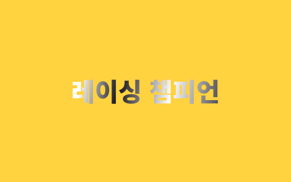
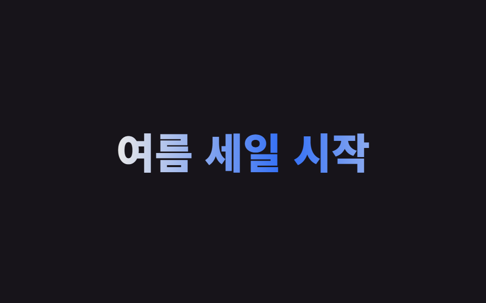
Gradient xen kẽ dày đặc giữa màu tối, trắng và kem được nạp vào chữ qua background-clip:text, rồi background-position trượt chậm rãi mô phỏng ánh phản chiếu lướt qua bề mặt chrome.
Dùng choWordmark thương hiệu game và thể thao, logo tiêu đề
다중 스톱 그러데이션background-position2s · ease-out
<main class="stage">
  <h1 class="chrome">Nhà vô địch đua xe</h1>
</main>
@use "../../../../site/static/demo-tokens" as *;
$duration: $dur-loop; // 반사광이 표면을 한 번 훑는 시간
$easing: $ease-out;
$color: $subject-ink; // 가장 어두운 밴드 색
@include stage($stage-yellow);
.chrome {
margin: 0;
font-weight: 900; font-size: clamp(28px, 8.8vw, 46px); line-height: 1.2; font-family: inherit;
text-align: center;
background: linear-gradient(
100deg,
$color 0%, $stage-paper 12%, $color 24%,
$subject-cream 40%, $stage-paper 52%, $color 64%,
$stage-paper 80%, $color 100%
);
background-size: 220% 100%;
-webkit-background-clip: text;
background-clip: text;
color: transparent;
-webkit-text-fill-color: transparent;
animation: reflect $duration $easing infinite;
}
@keyframes reflect {
0% { background-position: 100% 50%; }
100% { background-position: -20% 50%; }
}
@media (prefers-reduced-motion: reduce) {
.chrome { animation: none; background-position: 40% 50%; }
}html, body {
margin: 0;
overflow: hidden;
}
.stage {
box-sizing: border-box;
min-height: 100vh;
display: grid;
place-items: center;
margin: 0;
background: #ffd23f;
font-family: -apple-system, "Segoe UI", "Noto Sans KR", sans-serif;
padding: clamp(8px, 4vw, 24px);
}
.chrome {
margin: 0;
font-weight: 900;
font-size: clamp(28px, 8.8vw, 46px);
line-height: 1.2;
font-family: inherit;
text-align: center;
background: linear-gradient(100deg, #17141a 0%, #ffffff 12%, #17141a 24%, #fff7e6 40%, #ffffff 52%, #17141a 64%, #ffffff 80%, #17141a 100%);
background-size: 220% 100%;
-webkit-background-clip: text;
background-clip: text;
color: transparent;
-webkit-text-fill-color: transparent;
animation: reflect 2s ease-out infinite;
}
@keyframes reflect {
0% {
background-position: 100% 50%;
}
100% {
background-position: -20% 50%;
}
}
@media (prefers-reduced-motion: reduce) {
.chrome {
animation: none;
background-position: 40% 50%;
}
}import type { CSSProperties } from "react";
import styles from "./ChromeMetalText.module.scss";
export type ChromeMetalTextProps = {
text: string;
/** 반사광이 표면을 한 번 훑는 시간 (기본 2000ms) */
duration?: number;
easing?: string;
/** 가장 어두운 밴드 색 */
color?: string;
};
type Vars = CSSProperties & { "--duration"?: string; "--easing"?: string; "--color"?: string };
export default function ChromeMetalText({
text,
duration = 2000,
easing = "ease-out",
color = "#17141a",
}: ChromeMetalTextProps) {
const vars: Vars = { "--duration": `${duration}ms`, "--easing": easing, "--color": color };
return <h1 className={styles.chrome} style={vars}>{text}</h1>;
}06 Chữ kim loại chrome — Diện tích đo được 3.683% · khung hình chuyển động 23/23Nguyên tác GODRICH · SCSS và React nằm trong tệp zip · 9 CSS Text Shine Animation — dán 1 dòng là chạy
Bài viết chứa demo này
 9 CSS Text Shine Animation — dán 1 dòng là chạyCSS text shine animation là các hiệu ứng CSS thuần khiến chữ phát sáng hoặc đổi màu liên tục, không cần ảnh hay JavaScri Xem tất cả demo trong bài này