04Gạch chân dạng sóng
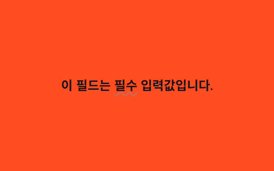
text-decoration-style: wavy vẽ sẵn gạch chân gợn sóng có trong trình duyệt, còn một custom property <length> đăng ký qua @property được đưa vào text-underline-offset để dao động giữa 0px và 5px như đang thở.
Dùng choNhấn mạnh kiểu kiểm tra chính tả, câu cảnh báo cần thu hút chú ý
text-decoration-style:wavy@property <length>1s
<main class="stage">
  <p class="line">Trường này là <span class="hl">bắt buộc</span> nhập.</p>
</main>
@use "../../../../site/static/demo-tokens" as *;
// ── 변수 3개 ─────────────────────────────
$duration: 1s; // 물결이 한 번 오가는 시간
$easing: $ease-out;
$color: $error; // 경고 색 밑줄
// @property 로 <length> 타입을 등록해야 브라우저가 이 값을 보간(애니메이션)한다
@property --underline-offset {
syntax: "<length>";
inherits: true;
initial-value: 1px;
}
// ── 데모 무대 ───────────────────────────────
@include stage($stage-orange);
.line {
max-width: 92%;
margin: 0;
color: $subject-ink; // 주황 무대 위 글자 — AA 4.5 (blog-design 글자 대비)
font-weight: 600;
font-size: clamp(16px, 4.6vw, 22px);
line-height: 1.6;
font-family: inherit;
text-align: center;
}
// 네이티브 물결 밑줄 — text-decoration-style: wavy 가 곡선을 그리고,
// text-underline-offset 만 --underline-offset 을 통해 오간다
.hl {
text-decoration-line: underline;
text-decoration-style: wavy;
text-decoration-color: $color;
text-decoration-thickness: 2px;
text-underline-offset: var(--underline-offset);
animation: wave $duration linear infinite;
}
// 한 겹: 펜 두께 불균일 — thickness 진동을 wave 안에 싣는다(같은 요소라 별도 키프레임
// 대신 기존 0/50/100% 스텝은 유지하고 사이 스텝에 thickness 요동을 추가)
@keyframes wave {
0% { --underline-offset: 0px; text-decoration-thickness: 2px; text-decoration-color: $color; }
18% { --underline-offset: 1.8px; text-decoration-thickness: 3px; }
34% { --underline-offset: 3.4px; text-decoration-thickness: 2.2px; }
50% { --underline-offset: 5px; text-decoration-thickness: 2.6px; text-decoration-color: color-mix(in srgb, $color 55%, white); }
66% { --underline-offset: 3.6px; text-decoration-thickness: 3.2px; }
82% { --underline-offset: 1.6px; text-decoration-thickness: 2px; }
100% { --underline-offset: 0px; text-decoration-thickness: 2px; text-decoration-color: $color; }
}
@media (prefers-reduced-motion: reduce) {
.hl { animation: none; text-underline-offset: 2px; }
}@property --underline-offset {
syntax: "<length>";
inherits: true;
initial-value: 1px;
}
html, body {
margin: 0;
overflow: hidden;
}
.stage {
box-sizing: border-box;
min-height: 100vh;
display: grid;
place-items: center;
margin: 0;
background: #ff4d1f;
font-family: -apple-system, "Segoe UI", "Noto Sans KR", sans-serif;
padding: clamp(8px, 4vw, 24px);
}
.line {
max-width: 92%;
margin: 0;
color: #17141a;
font-weight: 600;
font-size: clamp(16px, 4.6vw, 22px);
line-height: 1.6;
font-family: inherit;
text-align: center;
}
.hl {
text-decoration-line: underline;
text-decoration-style: wavy;
text-decoration-color: #c2361a;
text-decoration-thickness: 2px;
text-underline-offset: var(--underline-offset);
animation: wave 1s linear infinite;
}
@keyframes wave {
0% {
--underline-offset: 0px;
text-decoration-thickness: 2px;
text-decoration-color: #c2361a;
}
18% {
--underline-offset: 1.8px;
text-decoration-thickness: 3px;
}
34% {
--underline-offset: 3.4px;
text-decoration-thickness: 2.2px;
}
50% {
--underline-offset: 5px;
text-decoration-thickness: 2.6px;
text-decoration-color: color-mix(in srgb, #c2361a 55%, white);
}
66% {
--underline-offset: 3.6px;
text-decoration-thickness: 3.2px;
}
82% {
--underline-offset: 1.6px;
text-decoration-thickness: 2px;
}
100% {
--underline-offset: 0px;
text-decoration-thickness: 2px;
text-decoration-color: #c2361a;
}
}
@media (prefers-reduced-motion: reduce) {
.hl {
animation: none;
text-underline-offset: 2px;
}
}import type { CSSProperties, ReactNode } from "react";
import styles from "./WavyUnderline.module.scss";
export type WavyUnderlineProps = {
before: ReactNode;
keyword: ReactNode;
after?: ReactNode;
/** 한 번 오가는 시간 (기본 1000ms) */
duration?: number;
/** 밑줄 색 */
color?: string;
};
type Vars = CSSProperties & {
"--duration"?: string;
"--color"?: string;
};
export default function WavyUnderline({
before,
keyword,
after,
duration = 1000,
color = "#c2361a",
}: WavyUnderlineProps) {
const vars: Vars = {
"--duration": `${duration}ms`,
"--color": color,
};
return (
<p className={styles.line} style={vars}>
{before} <span className={styles.hl}>{keyword}</span> {after}
</p>
);
}04 Gạch chân dạng sóng — Diện tích đo được 0.284% · khung hình chuyển động 23/23Nguyên tác GODRICH · SCSS và React nằm trong tệp zip · 9 CSS Text Highlight Animation: dán 1 dòng là chạy
Bài viết chứa demo này
 9 CSS Text Highlight Animation: dán 1 dòng là chạyCSS text highlight animation là hiệu ứng CSS thuần giúp tô sáng, gạch chân hoặc gạch ngang một từ trong câu ngay khi tra Xem tất cả demo trong bài này