06Tô nền lấp đầy
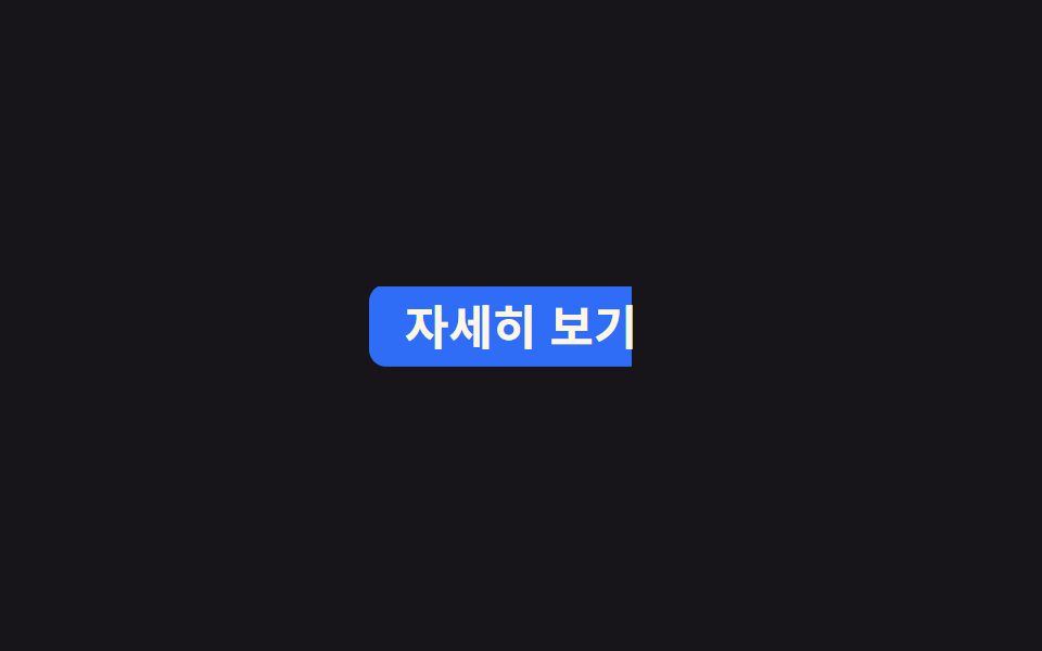
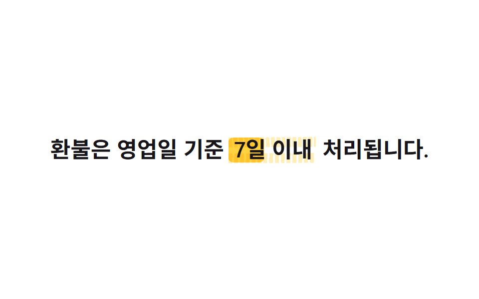
linear-gradient phủ nền liên kết và background-size chạy từ 0% 100% lên 100% 100% để màu lấp đầy từ trái sang, còn background-position: left giữ cố định để phần đã tô không trôi ngược lại.
Dùng choLiên kết trong menu điều hướng, nút dạng văn bản trong card
background-sizebackground-position:left2s
<main class="stage">
  <a class="nav" href="#">Xem chi tiết</a>
</main>
@use "../../../../site/static/demo-tokens" as *;
// ── 변수 3개 ─────────────────────────────
$duration: $dur-loop;
$easing: $ease-out;
$color: $subject-blue; // 채워지는 색
// ── 데모 무대 ───────────────────────────────
@include stage($stage-ink);
.nav {
display: inline-block;
padding: $sp-2 $sp-4;
border-radius: $r-sm;
color: $subject-cream;
text-decoration: none;
font-weight: 700;
font-size: clamp(16px, 4.6vw, 22px);
line-height: 1;
font-family: inherit;
// 배경만 왼쪽부터 차오른다. 위치는 left 로 고정해 채워진 가장자리가 밀리지 않는다
background: linear-gradient(90deg, $color, $color);
background-repeat: no-repeat;
background-position: left center;
background-size: 0% 100%;
animation: fill-thickness $duration $easing infinite;
}
@keyframes fill {
0% { background-size: 0% 100%; }
25% { background-size: 100% 100%; }
75% { background-size: 100% 100%; }
100% { background-size: 0% 100%; }
}
// 페인트 물성: 채워지는 동안 수직 두께(펜 압력)가 불규칙 요동친다 — 이중 background-size 값 보간
@keyframes fill-thickness {
0% { background-size: 0% 100%; }
6% { background-size: 22% 92%; }
12% { background-size: 44% 96%; }
18% { background-size: 68% 88%; }
25% { background-size: 100% 104%; }
32% { background-size: 100% 96%; }
45% { background-size: 100% 101%; }
60% { background-size: 100% 94%; }
75% { background-size: 100% 102%; }
82% { background-size: 74% 97%; }
90% { background-size: 38% 93%; }
100% { background-size: 0% 100%; }
}
@media (prefers-reduced-motion: reduce) {
.nav { animation: none; background-size: 100% 100%; }
}html, body {
margin: 0;
overflow: hidden;
}
.stage {
box-sizing: border-box;
min-height: 100vh;
display: grid;
place-items: center;
margin: 0;
background: #17141a;
font-family: -apple-system, "Segoe UI", "Noto Sans KR", sans-serif;
padding: clamp(8px, 4vw, 24px);
}
.nav {
display: inline-block;
padding: 8px 16px;
border-radius: 8px;
color: #fff7e6;
text-decoration: none;
font-weight: 700;
font-size: clamp(16px, 4.6vw, 22px);
line-height: 1;
font-family: inherit;
background: linear-gradient(90deg, #2f6df6, #2f6df6);
background-repeat: no-repeat;
background-position: left center;
background-size: 0% 100%;
animation: fill-thickness 2s ease-out infinite;
}
@keyframes fill {
0% {
background-size: 0% 100%;
}
25% {
background-size: 100% 100%;
}
75% {
background-size: 100% 100%;
}
100% {
background-size: 0% 100%;
}
}
@keyframes fill-thickness {
0% {
background-size: 0% 100%;
}
6% {
background-size: 22% 92%;
}
12% {
background-size: 44% 96%;
}
18% {
background-size: 68% 88%;
}
25% {
background-size: 100% 104%;
}
32% {
background-size: 100% 96%;
}
45% {
background-size: 100% 101%;
}
60% {
background-size: 100% 94%;
}
75% {
background-size: 100% 102%;
}
82% {
background-size: 74% 97%;
}
90% {
background-size: 38% 93%;
}
100% {
background-size: 0% 100%;
}
}
@media (prefers-reduced-motion: reduce) {
.nav {
animation: none;
background-size: 100% 100%;
}
}import type { CSSProperties, ReactNode } from "react";
import styles from "./BgFillLink.module.scss";
export type BgFillLinkProps = {
children: ReactNode;
href?: string;
/** 배경이 다 차는 시간 (기본 2000ms) */
duration?: number;
easing?: string;
/** 채워지는 색 */
color?: string;
};
type Vars = CSSProperties & {
"--duration"?: string;
"--easing"?: string;
"--color"?: string;
};
export default function BgFillLink({
children,
href = "#",
duration = 2000,
easing = "ease-out",
color = "#2f6df6",
}: BgFillLinkProps) {
const vars: Vars = {
"--duration": `${duration}ms`,
"--easing": easing,
"--color": color,
};
return (
<a className={styles.nav} href={href} style={vars}>
{children}
</a>
);
}06 Tô nền lấp đầy — Diện tích đo được 3.281% · khung hình chuyển động 21/23Nguyên tác GODRICH · SCSS và React nằm trong tệp zip · 9 CSS Text Highlight Animation: dán 1 dòng là chạy
Bài viết chứa demo này
 9 CSS Text Highlight Animation: dán 1 dòng là chạyCSS text highlight animation là hiệu ứng CSS thuần giúp tô sáng, gạch chân hoặc gạch ngang một từ trong câu ngay khi tra Xem tất cả demo trong bài này