08Sự kiện hiện dần bằng view()
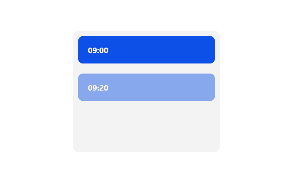
Mỗi card sự kiện đặt animation-timeline: view() kèm animation-range, nên opacity và translateY tự chạy đúng lúc card cuộn vào tầm mắt, không cần IntersectionObserver.
Dùng choTimeline sự kiện hiện từng bước theo scroll, section bài dài xuất hiện dần
animation-timeline: view()animation-rangeJS 0줄
<main class="stage">
  <div class="ts08-box">
    <div class="ts08-card is-demo">09:00</div>
    <div class="ts08-card is-demo">09:20</div>
    <div class="ts08-card is-demo">10:00</div>
    <div class="ts08-card is-demo">10:40</div>
  </div>
</main>
@use "../../../../site/static/demo-tokens" as *;
// ── 변수 3개 ──────────────────────────────────────────
$duration: $dur-loop;
$easing: $ease-out;
$color: $subject-blue-deep; // 크림 글자가 얹히므로 진한 파랑
@include stage($stage-paper);
.ts08-box {
width: min(240px, 84vw);
height: clamp(120px, 66vh, 220px);
overflow-y: auto;
padding: $sp-2;
box-sizing: border-box;
background: rgba(23, 20, 26, .05);
border-radius: $r-sm;
}
.ts08-card {
padding: $sp-4;
margin-bottom: $sp-2;
border-radius: $r-sm;
background: $color;
color: $subject-cream;
font: 700 13px/1 -apple-system, "Segoe UI", "Noto Sans KR", sans-serif;
opacity: 0;
transform: translateY(16px);
&:last-of-type { margin-bottom: 0; }
}
// 실제 사용 코드: 카드마다 자기가 스크롤로 보이는 구간에 맞춰 자동으로 드러난다
@supports (animation-timeline: view()) {
.ts08-card:not(.is-demo) {
animation: ts08-reveal $easing both;
animation-timeline: view();
animation-range: entry 0% cover 40%;
}
}
// 미지원 브라우저(Firefox·Safari): 다 드러난 최종 상태로 고정
@supports not (animation-timeline: view()) {
.ts08-card:not(.is-demo) { opacity: 1; transform: none; }
}
@keyframes ts08-reveal { from { opacity: 0; transform: translateY(16px); } to { opacity: 1; transform: translateY(0); } }
// 데모 루프: 실제 스크롤 대신, 카드가 하나씩 드러나는 걸 순서대로 흉내(캡처용)
.ts08-card.is-demo { animation: ts08-reveal-loop $duration $easing infinite; }
.ts08-card.is-demo:nth-child(1) { animation-delay: 0ms; }
.ts08-card.is-demo:nth-child(2) { animation-delay: 220ms; }
.ts08-card.is-demo:nth-child(3) { animation-delay: 440ms; }
.ts08-card.is-demo:nth-child(4) { animation-delay: 660ms; }
@keyframes ts08-reveal-loop {
0% { opacity: 0; transform: translateY(16px); }
18% { opacity: 1; transform: translateY(0); }
85% { opacity: 1; transform: translateY(0); }
100% { opacity: 0; transform: translateY(16px); }
}
@media (prefers-reduced-motion: reduce) {
.ts08-card, .ts08-card.is-demo { animation: none !important; opacity: 1 !important; transform: none !important; }
}html, body {
margin: 0;
overflow: hidden;
}
.stage {
box-sizing: border-box;
min-height: 100vh;
display: grid;
place-items: center;
margin: 0;
background: #ffffff;
font-family: -apple-system, "Segoe UI", "Noto Sans KR", sans-serif;
padding: clamp(8px, 4vw, 24px);
}
.ts08-box {
width: min(240px, 84vw);
height: clamp(120px, 66vh, 220px);
overflow-y: auto;
padding: 8px;
box-sizing: border-box;
background: rgba(23, 20, 26, 0.05);
border-radius: 8px;
}
.ts08-card {
padding: 16px;
margin-bottom: 8px;
border-radius: 8px;
background: #0a4fe8;
color: #fff7e6;
font: 700 13px/1 -apple-system, "Segoe UI", "Noto Sans KR", sans-serif;
opacity: 0;
transform: translateY(16px);
}
.ts08-card:last-of-type {
margin-bottom: 0;
}
@supports (animation-timeline: view()) {
.ts08-card:not(.is-demo) {
animation: ts08-reveal ease-out both;
animation-timeline: view();
animation-range: entry 0% cover 40%;
}
}
@supports not (animation-timeline: view()) {
.ts08-card:not(.is-demo) {
opacity: 1;
transform: none;
}
}
@keyframes ts08-reveal {
from {
opacity: 0;
transform: translateY(16px);
}
to {
opacity: 1;
transform: translateY(0);
}
}
.ts08-card.is-demo {
animation: ts08-reveal-loop 2s ease-out infinite;
}
.ts08-card.is-demo:nth-child(1) {
animation-delay: 0ms;
}
.ts08-card.is-demo:nth-child(2) {
animation-delay: 220ms;
}
.ts08-card.is-demo:nth-child(3) {
animation-delay: 440ms;
}
.ts08-card.is-demo:nth-child(4) {
animation-delay: 660ms;
}
@keyframes ts08-reveal-loop {
0% {
opacity: 0;
transform: translateY(16px);
}
18% {
opacity: 1;
transform: translateY(0);
}
85% {
opacity: 1;
transform: translateY(0);
}
100% {
opacity: 0;
transform: translateY(16px);
}
}
@media (prefers-reduced-motion: reduce) {
.ts08-card, .ts08-card.is-demo {
animation: none !important;
opacity: 1 !important;
transform: none !important;
}
}import { CSSProperties } from "react";
import styles from "./ViewRevealEvents.module.scss";
type Vars = CSSProperties & { "--color"?: string };
export interface ViewRevealEventsProps {
color?: string;
times?: string[];
}
// animation-timeline: view() 도 scroll() 과 같은 지원 범위다 — IntersectionObserver 없이
// 카드마다 자기가 뷰포트에 들어오는 구간에서 opacity·translateY 가 자동으로 움직인다.
export default function ViewRevealEvents({
color = "#0a4fe8",
times = ["09:00", "09:20", "10:00", "10:40"],
}: ViewRevealEventsProps) {
const style: Vars = { "--color": color };
return (
<div className={styles.box} style={style}>
{times.map((t) => (
<div key={t} className={styles.card}>{t}</div>
))}
</div>
);
}08 Sự kiện hiện dần bằng view() — Diện tích đo được 29.524% · khung hình chuyển động 16/23Nguyên tác GODRICH · SCSS và React nằm trong tệp zip · 9 css timeline animation không JS, copy-paste
Bài viết chứa demo này
 9 css timeline animation không JS, copy-pasteCss timeline animation là cách nối nhiều bước bằng đường kẻ với vòng tròn để bày ra theo thứ tự. Chín mẫu dưới đây không Xem tất cả demo trong bài này