07Biến --i + calc() một dòng
Mỗi phần tử chỉ cần một giá trị --i trong inline style, còn delay được tính bằng đúng một dòng animation-delay: calc(var(--i) * 80ms).
Dùng choComponent danh sách dùng chung, danh sách thẻ tái sử dụng
--i 변수calc() 한 줄인라인 style
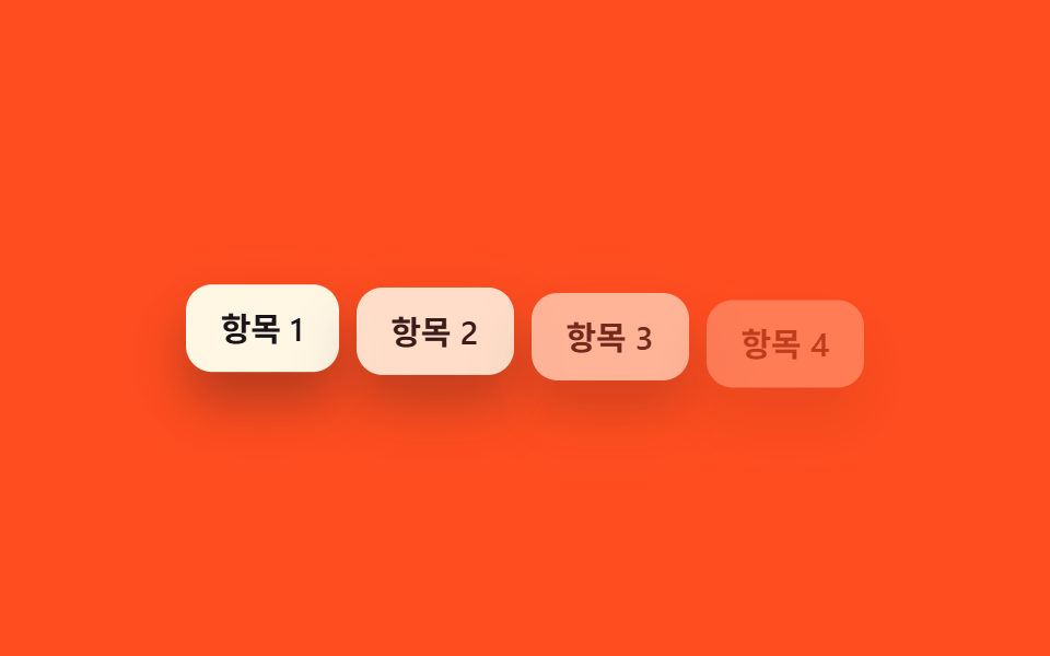
<main class="stage">
  <ul class="i-list is-demo">
    <li style="--i:0">Mục 1</li>
    <li style="--i:1">Mục 2</li>
    <li style="--i:2">Mục 3</li>
    <li style="--i:3">Mục 4</li>
  </ul>
</main>
@use "../../../../site/static/demo-tokens" as *;
$duration: $dur-quick; // 항목 하나가 나타나는 시간
$easing: $ease-out; // 시작 빠르고 끝은 부드럽게
$stagger: 80ms; // --i 1당 시차
@include stage($stage-orange);
.i-list {
margin: 0;
padding: 0;
list-style: none;
display: flex;
flex-wrap: wrap;
justify-content: center;
gap: 8px;
max-width: min(360px, 88vw);
font-weight: 600; font-size: clamp(12px, 3.4vw, 15px); line-height: 1.2; font-family: inherit;
li {
padding: clamp(8px, 2.6vw, 11px) clamp(12px, 3.4vw, 16px);
border-radius: $r-control;
background: $subject-cream;
color: $stage-ink;
box-shadow: $shadow-raised;
animation: i-loop $dur-loop $easing infinite;
animation-delay: calc(var(--i) * #{$stagger}); // ← --i 변수 + calc 한 줄
}
}
@keyframes i-loop {
0%, 6% { opacity: 0; transform: translateY(10px); }
22%, 68% { opacity: 1; transform: translateY(0); }
88%, 100% { opacity: 0; transform: translateY(6px); }
}
@media (prefers-reduced-motion: reduce) {
.i-list li { animation: none; opacity: 1; transform: none; }
}html, body {
margin: 0;
overflow: hidden;
}
.stage {
box-sizing: border-box;
min-height: 100vh;
display: grid;
place-items: center;
margin: 0;
background: #ff4d1f;
font-family: -apple-system, "Segoe UI", "Noto Sans KR", sans-serif;
padding: clamp(8px, 4vw, 24px);
}
.i-list {
margin: 0;
padding: 0;
list-style: none;
display: flex;
flex-wrap: wrap;
justify-content: center;
gap: 8px;
max-width: min(360px, 88vw);
font-weight: 600;
font-size: clamp(12px, 3.4vw, 15px);
line-height: 1.2;
font-family: inherit;
}
.i-list li {
padding: clamp(8px, 2.6vw, 11px) clamp(12px, 3.4vw, 16px);
border-radius: 12px;
background: #fff7e6;
color: #17141a;
box-shadow: 0 14px 24px rgba(23, 20, 26, 0.32);
animation: i-loop 2s ease-out infinite;
animation-delay: calc(var(--i) * 80ms);
}
@keyframes i-loop {
0%, 6% {
opacity: 0;
transform: translateY(10px);
}
22%, 68% {
opacity: 1;
transform: translateY(0);
}
88%, 100% {
opacity: 0;
transform: translateY(6px);
}
}
@media (prefers-reduced-motion: reduce) {
.i-list li {
animation: none;
opacity: 1;
transform: none;
}
}import type { CSSProperties } from "react";
import styles from "./CustomPropertyList.module.scss";
type Vars = CSSProperties & { "--i"?: number };
export type CustomPropertyListProps = {
items: string[];
/** --i 1당 시차 ms (기본 80ms) — CSS 쪽 calc(var(--i) * 80ms) 한 줄이 실제 계산을 한다 */
stagger?: number;
};
export default function CustomPropertyList({ items }: CustomPropertyListProps) {
return (
<ul className={styles.list}>
{items.map((label, i) => (
<li key={label} style={{ "--i": i } as Vars}>
{label}
</li>
))}
</ul>
);
}07 Biến --i + calc() một dòng — Diện tích đo được 13.745% · khung hình chuyển động 15/23Nguyên tác GODRICH · SCSS và React nằm trong tệp zip · 9 CSS Stagger Animation Demos Copy-Paste Là Chạy
Bài viết chứa demo này
 9 CSS Stagger Animation Demos Copy-Paste Là ChạyCSS stagger animation là kỹ thuật khiến các phần tử trong danh sách hay lưới xuất hiện trễ nhau, thay vì bung ra cùng lú Xem tất cả demo trong bài này