01Vẽ đường dọc
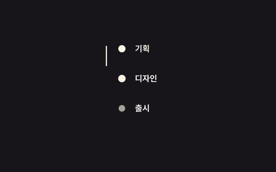
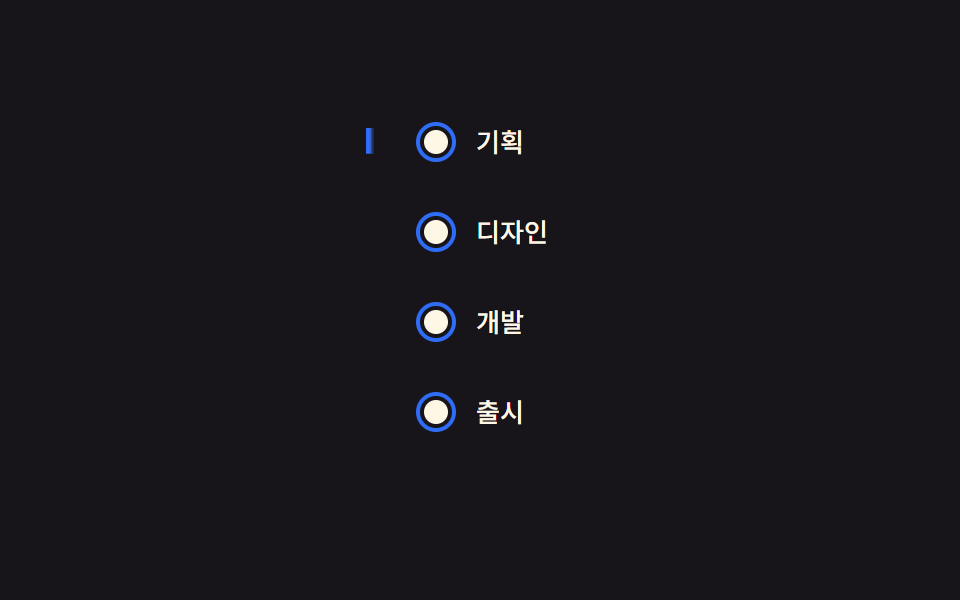
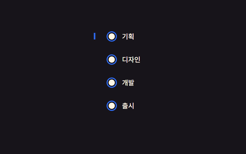
Khi timeline vào khung hình, thanh dọc bên trái dài ra từ scaleY(0) đến scaleY(1) với transform-origin ở đỉnh, như nét bút kẻ từ trên xuống.
Dùng choTrang lịch sử công ty, timeline kinh nghiệm trong CV
scaleYtransform-origin1.4s
<main class="stage">
  <ul class="ts01-timeline is-demo">
    <li class="ts01-step"><span class="ts01-dot"></span>Lên kế hoạch</li>
    <li class="ts01-step"><span class="ts01-dot"></span>Thiết kế</li>
    <li class="ts01-step"><span class="ts01-dot"></span>Phát triển</li>
    <li class="ts01-step"><span class="ts01-dot"></span>Ra mắt</li>
    <li class="ts01-line" aria-hidden="true"></li>
  </ul>
</main>
@use "../../../../site/static/demo-tokens" as *;
// ── 변수 3개 ──────────────────────────────────────────
$duration: $dur-enter;
$easing: $ease-out;
$color: $subject-blue;
@include stage($stage-ink);
.ts01-timeline {
position: relative;
margin: 0;
padding: 0 0 0 32px;
list-style: none;
color: $subject-cream;
font: 500 13px/1 -apple-system, "Segoe UI", "Noto Sans KR", sans-serif;
}
.ts01-step {
position: relative;
padding: $sp-1 0;
margin-bottom: clamp($sp-4, 6vw, $sp-6);
&:last-of-type { margin-bottom: 0; }
}
.ts01-dot {
position: absolute;
left: -28px;
top: 3px;
width: 12px;
height: 12px;
border-radius: 50%;
background: $subject-cream;
border: 2px solid $stage-ink;
box-shadow: 0 0 0 2px $color;
}
// 세로선: 위에서 아래로 그려진다 (실제 사용 코드 — 뷰포트 진입 시 한 번)
.ts01-line {
position: absolute;
left: -23px;
top: 4px;
width: 3px;
height: calc(100% - 12px);
background: $color;
border-radius: $r-xs;
transform: scaleY(1);
transform-origin: top; // 규칙8: 세로선 위에서 그려짐
@supports (animation-timeline: view()) {
transform: scaleY(0);
animation: ts01-draw linear both;
animation-timeline: view();
animation-range: entry 0% cover 70%;
}
}
@keyframes ts01-draw {
from { transform: scaleY(0); }
to { transform: scaleY(1); }
}
// 데모 루프: 뷰포트 진입을 2초 주기로 흉내
.ts01-timeline.is-demo .ts01-line {
animation: ts01-draw-loop $duration $easing infinite;
}
@keyframes ts01-draw-loop {
0%, 8% { transform: scaleY(0); }
75%, 100% { transform: scaleY(1); }
}
@media (prefers-reduced-motion: reduce) {
.ts01-line, .ts01-timeline.is-demo .ts01-line { animation: none !important; transform: scaleY(1) !important; }
}html, body {
margin: 0;
overflow: hidden;
}
.stage {
box-sizing: border-box;
min-height: 100vh;
display: grid;
place-items: center;
margin: 0;
background: #17141a;
font-family: -apple-system, "Segoe UI", "Noto Sans KR", sans-serif;
padding: clamp(8px, 4vw, 24px);
}
.ts01-timeline {
position: relative;
margin: 0;
padding: 0 0 0 32px;
list-style: none;
color: #fff7e6;
font: 500 13px/1 -apple-system, "Segoe UI", "Noto Sans KR", sans-serif;
}
.ts01-step {
position: relative;
padding: 4px 0;
margin-bottom: clamp(16px, 6vw, 24px);
}
.ts01-step:last-of-type {
margin-bottom: 0;
}
.ts01-dot {
position: absolute;
left: -28px;
top: 3px;
width: 12px;
height: 12px;
border-radius: 50%;
background: #fff7e6;
border: 2px solid #17141a;
box-shadow: 0 0 0 2px #2f6df6;
}
.ts01-line {
position: absolute;
left: -23px;
top: 4px;
width: 3px;
height: calc(100% - 12px);
background: #2f6df6;
border-radius: 4px;
transform: scaleY(1);
transform-origin: top;
}
@supports (animation-timeline: view()) {
.ts01-line {
transform: scaleY(0);
animation: ts01-draw linear both;
animation-timeline: view();
animation-range: entry 0% cover 70%;
}
}
@keyframes ts01-draw {
from {
transform: scaleY(0);
}
to {
transform: scaleY(1);
}
}
.ts01-timeline.is-demo .ts01-line {
animation: ts01-draw-loop 600ms ease-out infinite;
}
@keyframes ts01-draw-loop {
0%, 8% {
transform: scaleY(0);
}
75%, 100% {
transform: scaleY(1);
}
}
@media (prefers-reduced-motion: reduce) {
.ts01-line, .ts01-timeline.is-demo .ts01-line {
animation: none !important;
transform: scaleY(1) !important;
}
}import { CSSProperties } from "react";
import styles from "./VerticalLineDraw.module.scss";
type Vars = CSSProperties & {
"--duration"?: string;
"--easing"?: string;
"--color"?: string;
};
export interface VerticalLineDrawProps {
duration?: string;
easing?: string;
color?: string;
steps?: string[];
}
export default function VerticalLineDraw({
duration = "600ms",
easing = "ease-out",
color = "#2f6df6",
steps = ["기획", "디자인", "개발", "출시"],
}: VerticalLineDrawProps) {
const style: Vars = {
"--duration": duration,
"--easing": easing,
"--color": color,
};
return (
<ul className={styles.timeline} style={style}>
{steps.map((s) => (
<li key={s} className={styles.step}>
<span className={styles.dot} />
{s}
</li>
))}
<li className={styles.line} aria-hidden="true" />
</ul>
);
}01 Vẽ đường dọc — Diện tích đo được 0.368% · khung hình chuyển động 20/23Nguyên tác GODRICH · SCSS và React nằm trong tệp zip · 9 css timeline animation không JS, copy-paste
Bài viết chứa demo này
 9 css timeline animation không JS, copy-pasteCss timeline animation là cách nối nhiều bước bằng đường kẻ với vòng tròn để bày ra theo thứ tự. Chín mẫu dưới đây không Xem tất cả demo trong bài này