03Xếp chồng 3 lớp
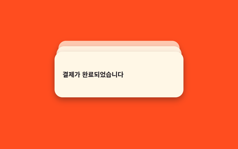
Ba thẻ thông báo nằm chồng khẽ lệch nhau nhờ biến CSS --i gán riêng từng thẻ, hover hoặc focus thì cả cụm bung ra theo hình quạt để đọc từng thẻ.
Dùng choHộp thông báo dashboard khi nhiều sự kiện đến gần như cùng lúc
CSS 변수 --ihover·focus-within덱 펼치기
<main class="stage">
  <div class="stack is-demo" tabindex="0" role="status" aria-live="polite" aria-label="3 thông báo">
    <div class="stack__item" style="--i:2">Điểm đã được cộng</div>
    <div class="stack__item" style="--i:1">Đơn hàng đã bắt đầu giao</div>
    <div class="stack__item" style="--i:0">Thanh toán hoàn tất</div>
  </div>
</main>
@use "../../../../site/static/demo-tokens" as *;
// ── 변수 3개 ──────────────────────────────
$duration: $dur-base; // 300ms — 실제 hover/focus 로 펼쳐지는 속도
$easing: $ease-spring;
$color: $subject-cream; // 카드 색
// ── 데모 무대 ───────────────────────────────
@include stage($stage-orange);
.stack {
position: relative;
width: min(260px, 78vw);
height: 92px;
outline: none;
}
.stack__item {
position: absolute; inset: 0;
display: flex; align-items: center;
padding: $sp-4;
border-radius: $r-card;
background: $color;
color: $subject-ink;
font-weight: 600;
font-size: 13px;
line-height: 1.4;
font-family: inherit;
box-shadow: $shadow-press;
// 뒤 카드일수록(--i 클수록) 더 밀리고 작아지고 흐려진다 — 평소엔 살짝 겹친 "덱" 모양
transform: translateY(calc(var(--i) * -6px)) scale(calc(1 - var(--i) * .05));
opacity: calc(1 - var(--i) * .22);
}
// 실제 사용: hover·focus 로 카드 3장을 부채꼴로 펼친다 (JS 없이)
.stack:hover .stack__item,
.stack:focus-within .stack__item {
transform: translateY(calc(var(--i) * -22px)) scale(1);
opacity: 1;
transition: transform $duration $easing, opacity $duration $easing;
}
// 실측 2026-09-10: 018 편의 "토스트 쌓임"(새 토스트가 올수록 기존 걸 밀어 올리는 큐)과 다르다 —
// 여기는 항상 3장이 고정으로 있고, 접힌 덱이 펼쳐졌다 다시 접히는 "카드 뭉치" 자체가 하나의 애니메이션이다.
.stack.is-demo .stack__item { animation: spread $dur-loop $easing infinite; }
@keyframes spread {
0%, 100% {
transform: translateY(calc(var(--i) * -6px)) scale(calc(1 - var(--i) * .05));
opacity: calc(1 - var(--i) * .22);
}
35%, 65% {
transform: translateY(calc(var(--i) * -22px)) scale(1);
opacity: 1;
}
}
// ── 접근성: 움직임 줄이기 설정이면 펼쳐진 채로 고정 ────────
@media (prefers-reduced-motion: reduce) {
.stack.is-demo .stack__item { animation: none; transform: translateY(calc(var(--i) * -22px)) scale(1); opacity: 1; }
}html, body {
margin: 0;
overflow: hidden;
}
.stage {
box-sizing: border-box;
min-height: 100vh;
display: grid;
place-items: center;
margin: 0;
background: #ff4d1f;
font-family: -apple-system, "Segoe UI", "Noto Sans KR", sans-serif;
padding: clamp(8px, 4vw, 24px);
}
.stack {
position: relative;
width: min(260px, 78vw);
height: 92px;
outline: none;
}
.stack__item {
position: absolute;
inset: 0;
display: flex;
align-items: center;
padding: 16px;
border-radius: 16px;
background: #fff7e6;
color: #17141a;
font-weight: 600;
font-size: 13px;
line-height: 1.4;
font-family: inherit;
box-shadow: 0 6px 12px rgba(23, 20, 26, 0.32);
transform: translateY(calc(var(--i) * -6px)) scale(calc(1 - var(--i) * 0.05));
opacity: calc(1 - var(--i) * 0.22);
}
.stack:hover .stack__item,
.stack:focus-within .stack__item {
transform: translateY(calc(var(--i) * -22px)) scale(1);
opacity: 1;
transition: transform 300ms cubic-bezier(0.2, 0.8, 0.2, 1), opacity 300ms cubic-bezier(0.2, 0.8, 0.2, 1);
}
.stack.is-demo .stack__item {
animation: spread 2s cubic-bezier(0.2, 0.8, 0.2, 1) infinite;
}
@keyframes spread {
0%, 100% {
transform: translateY(calc(var(--i) * -6px)) scale(calc(1 - var(--i) * 0.05));
opacity: calc(1 - var(--i) * 0.22);
}
35%, 65% {
transform: translateY(calc(var(--i) * -22px)) scale(1);
opacity: 1;
}
}
@media (prefers-reduced-motion: reduce) {
.stack.is-demo .stack__item {
animation: none;
transform: translateY(calc(var(--i) * -22px)) scale(1);
opacity: 1;
}
}import type { CSSProperties } from "react";
import styles from "./ToastStack3.module.scss";
export type ToastStack3Props = {
/** 앞(맨 위)부터 순서대로 3개 */
items: [string, string, string];
color?: string;
duration?: number;
easing?: string;
};
type ItemVars = CSSProperties & { "--i"?: number };
export default function ToastStack3({
items,
color = "#fff7e6",
duration = 300,
easing = "cubic-bezier(.2,.8,.2,1)",
}: ToastStack3Props) {
const vars = { "--color": color, "--duration": `${duration}ms`, "--easing": easing } as CSSProperties;
const withIndex = items.map((text, i) => ({ text, i }));
const backToFront = [...withIndex].reverse(); // DOM은 뒤(i 큰 값)부터 써야 앞(i=0)이 맨 위에 그려진다
return (
<div
className={styles.stack}
style={vars}
tabIndex={0}
role="status"
aria-live="polite"
aria-label={`알림 ${items.length}개`}
>
{backToFront.map(({ text, i }) => {
const itemVars: ItemVars = { "--i": i };
return (
<div key={i} className={styles.item} style={itemVars}>
{text}
</div>
);
})}
</div>
);
}03 Xếp chồng 3 lớp — Diện tích đo được 9.192% · khung hình chuyển động 16/23Nguyên tác GODRICH · SCSS và React nằm trong tệp zip · 9 CSS Toast Notification — không cần JS
Bài viết chứa demo này
 9 CSS Toast Notification — không cần JSCSS toast notification là thẻ thông báo nhỏ tự nổi lên một góc màn hình rồi tự đóng, dựng bằng CSS thuần, không cần JS. Xem tất cả demo trong bài này