02Kiểu iOS
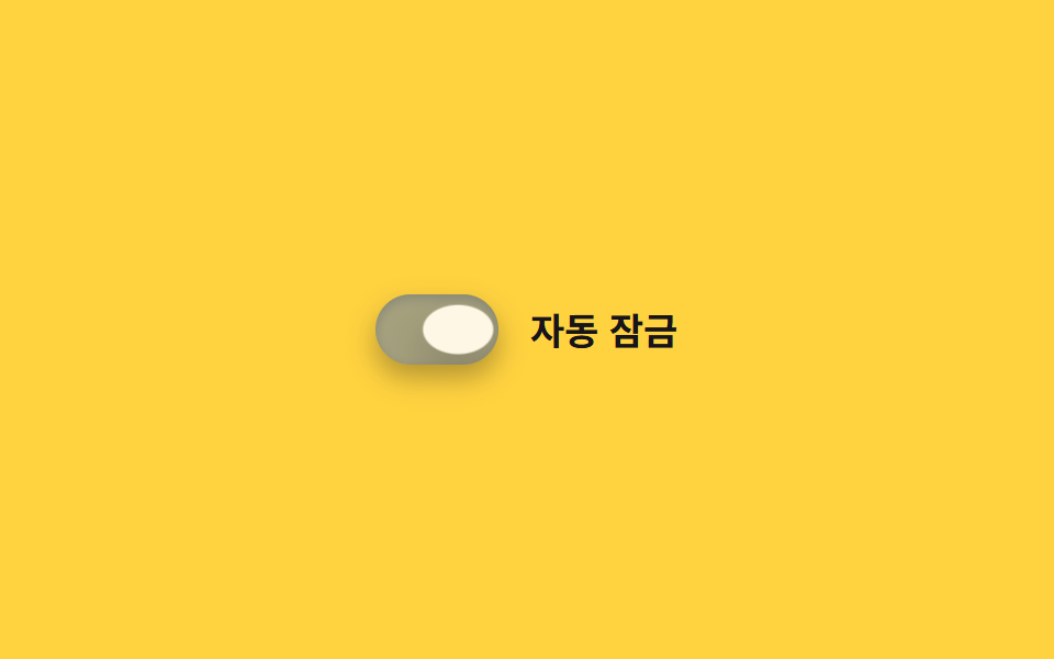
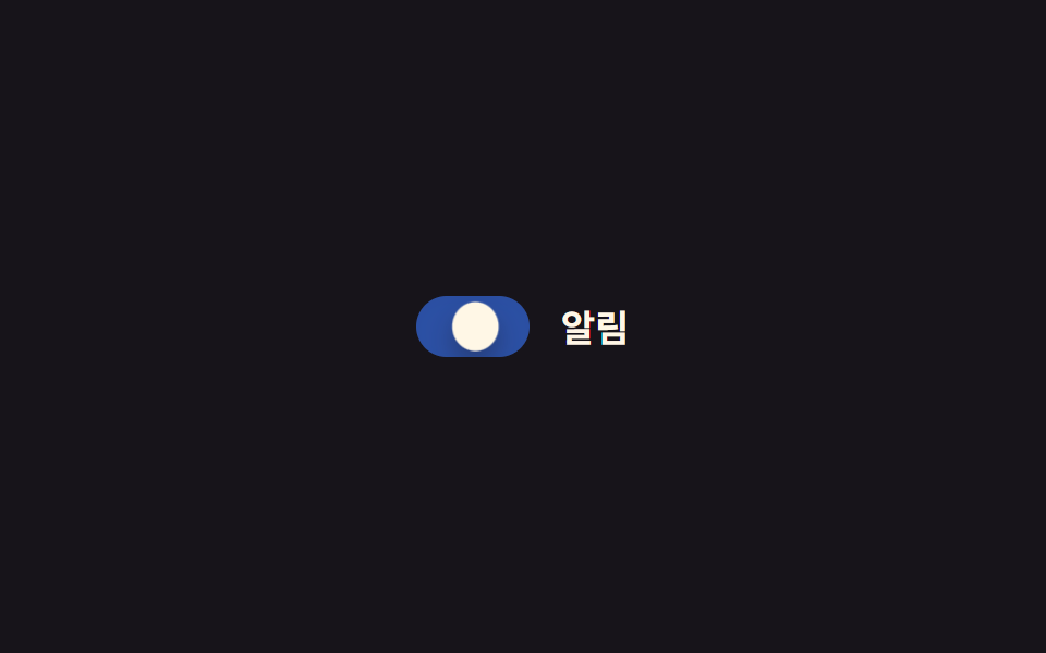
Track bo tròn xanh phối núm trắng như app Cài đặt của iOS, núm nảy vượt điểm đến một nhịp bằng easing kiểu lò xo rồi mới dừng hẳn.
Dùng choMàn hình cài đặt web di động, form mang cảm giác app
cubic-bezier 스프링그림자0.3초
<main class="stage">
  <label class="switch is-demo">
    <input type="checkbox" class="switch__input" role="switch">
    <span class="switch__track">
      <span class="switch__bg switch__bg--off"></span>
      <span class="switch__bg switch__bg--on"></span>
      <span class="switch__knob"></span>
    </span>
    <span class="switch__label">Tự động khóa</span>
  </label>
</main>
@use "../../../../site/static/demo-tokens" as *;
// ── 변수 3개 ──────────────────────────────
$duration: $dur-enter;
$easing: $ease-spring;
$color: $subject-blue;
// ── 데모 무대 ───────────────────────────────
@include stage($stage-yellow);
.switch {
position: relative;
display: inline-flex; align-items: center; gap: clamp(10px, 3vw, 14px);
cursor: pointer;
-webkit-tap-highlight-color: transparent;
}
.switch__input {
position: absolute; inset: 0; width: 100%; height: 100%;
margin: 0; opacity: 0; cursor: pointer;
}
.switch__track {
position: relative; overflow: hidden;
width: clamp(48px, 13vw, 56px); height: clamp(28px, 7.5vw, 32px);
border-radius: $r-pill;
box-shadow: $shadow-press;
}
.switch__bg { position: absolute; inset: 0; }
.switch__bg--off { background: rgba(23, 20, 26, .16); opacity: 1; }
.switch__bg--on { background: $color; opacity: 0; }
.switch__knob {
position: absolute; top: 3px; left: 3px; z-index: 1;
width: clamp(22px, 6vw, 26px); height: clamp(22px, 6vw, 26px);
border-radius: 50%;
background: $subject-cream;
box-shadow: $shadow-raised;
transform: translateX(0);
transition: transform $duration cubic-bezier(0.34, 1.56, 0.64, 1);
}
.switch__label { color: $subject-ink; font-weight: 600; font-size: clamp(14px, 4vw, 17px); line-height: 1; font-family: inherit; }
// ── 실제 동작 ─────────────────────────────
.switch__input:checked ~ .switch__track .switch__bg--off { opacity: 0; transition: opacity $duration $easing; }
.switch__input:checked ~ .switch__track .switch__bg--on { opacity: 1; transition: opacity $duration $easing; }
.switch__input:checked ~ .switch__track .switch__knob { transform: translateX(clamp(20px, 6vw, 24px)); }
.switch__input:focus-visible ~ .switch__track {
outline: 2px solid $subject-ink; outline-offset: 3px;
}
// ── 데모 루프: 도착 지점에서 스프링 이징이 살짝 튕긴다 ─────────
// 한 겹: 오버슈트 순간 노브가 찌그러지고(squash), 트랙은 상태 전환 때
// 내부 그림자가 깊어졌다 얕아진다(바닥에 앉는 깊이).
.switch.is-demo .switch__bg--off { animation: bg-off-loop $dur-loop $ease-out infinite; }
.switch.is-demo .switch__bg--on { animation: bg-on-loop $dur-loop $ease-out infinite; }
.switch.is-demo .switch__knob { animation: knob-spring-loop $dur-loop $easing infinite; }
.switch.is-demo .switch__track { animation: shadow-depth-loop $dur-loop $ease-out infinite; }
@keyframes bg-off-loop { 0%, 15% { opacity: 1; } 40%, 60% { opacity: 0; } 85%, 100% { opacity: 1; } }
@keyframes bg-on-loop { 0%, 15% { opacity: 0; } 40%, 60% { opacity: 1; } 85%, 100% { opacity: 0; } }
@keyframes knob-loop {
0%, 15% { transform: translateX(0); }
38% { transform: translateX(28px); } // 스프링 오버슈트
40%, 60% { transform: translateX(24px); }
85%, 100% { transform: translateX(0); }
}
@keyframes knob-spring-loop {
0%, 15% { transform: translateX(0) scaleX(1) scaleY(1); }
38% { transform: translateX(28px) scaleX(1.3) scaleY(.82); } // 오버슈트 + 찌그러짐
43% { transform: translateX(23px) scaleX(1.1) scaleY(.92); } // 되튕기며 회복
47%, 60% { transform: translateX(24px) scaleX(1) scaleY(1); } // 안착
84% { transform: translateX(-2px) scaleX(.92) scaleY(1.06); } // 출발 반동
85%, 100% { transform: translateX(0) scaleX(1) scaleY(1); }
}
@keyframes shadow-depth-loop {
0%, 15% { box-shadow: $shadow-press, inset 0 1px 3px rgba(0, 0, 0, .15); }
38% { box-shadow: $shadow-press, inset 0 3px 8px rgba(0, 0, 0, .28); }
40%, 60% { box-shadow: $shadow-press, inset 0 3px 8px rgba(0, 0, 0, .28); }
85%, 100% { box-shadow: $shadow-press, inset 0 1px 3px rgba(0, 0, 0, .15); }
}
@media (prefers-reduced-motion: reduce) {
.switch.is-demo .switch__bg--off,
.switch.is-demo .switch__bg--on,
.switch.is-demo .switch__knob,
.switch.is-demo .switch__track { animation: none !important; }
.switch__knob, .switch__bg--off, .switch__bg--on { transition: none; }
}html, body {
margin: 0;
overflow: hidden;
}
.stage {
box-sizing: border-box;
min-height: 100vh;
display: grid;
place-items: center;
margin: 0;
background: #ffd23f;
font-family: -apple-system, "Segoe UI", "Noto Sans KR", sans-serif;
padding: clamp(8px, 4vw, 24px);
}
.switch {
position: relative;
display: inline-flex;
align-items: center;
gap: clamp(10px, 3vw, 14px);
cursor: pointer;
-webkit-tap-highlight-color: transparent;
}
.switch__input {
position: absolute;
inset: 0;
width: 100%;
height: 100%;
margin: 0;
opacity: 0;
cursor: pointer;
}
.switch__track {
position: relative;
overflow: hidden;
width: clamp(48px, 13vw, 56px);
height: clamp(28px, 7.5vw, 32px);
border-radius: 999px;
box-shadow: 0 6px 12px rgba(23, 20, 26, 0.32);
}
.switch__bg {
position: absolute;
inset: 0;
}
.switch__bg--off {
background: rgba(23, 20, 26, 0.16);
opacity: 1;
}
.switch__bg--on {
background: #2f6df6;
opacity: 0;
}
.switch__knob {
position: absolute;
top: 3px;
left: 3px;
z-index: 1;
width: clamp(22px, 6vw, 26px);
height: clamp(22px, 6vw, 26px);
border-radius: 50%;
background: #fff7e6;
box-shadow: 0 14px 24px rgba(23, 20, 26, 0.32);
transform: translateX(0);
transition: transform 600ms cubic-bezier(0.34, 1.56, 0.64, 1);
}
.switch__label {
color: #17141a;
font-weight: 600;
font-size: clamp(14px, 4vw, 17px);
line-height: 1;
font-family: inherit;
}
.switch__input:checked ~ .switch__track .switch__bg--off {
opacity: 0;
transition: opacity 600ms cubic-bezier(0.2, 0.8, 0.2, 1);
}
.switch__input:checked ~ .switch__track .switch__bg--on {
opacity: 1;
transition: opacity 600ms cubic-bezier(0.2, 0.8, 0.2, 1);
}
.switch__input:checked ~ .switch__track .switch__knob {
transform: translateX(clamp(20px, 6vw, 24px));
}
.switch__input:focus-visible ~ .switch__track {
outline: 2px solid #17141a;
outline-offset: 3px;
}
.switch.is-demo .switch__bg--off {
animation: bg-off-loop 2s ease-out infinite;
}
.switch.is-demo .switch__bg--on {
animation: bg-on-loop 2s ease-out infinite;
}
.switch.is-demo .switch__knob {
animation: knob-spring-loop 2s cubic-bezier(0.2, 0.8, 0.2, 1) infinite;
}
.switch.is-demo .switch__track {
animation: shadow-depth-loop 2s ease-out infinite;
}
@keyframes bg-off-loop {
0%, 15% {
opacity: 1;
}
40%, 60% {
opacity: 0;
}
85%, 100% {
opacity: 1;
}
}
@keyframes bg-on-loop {
0%, 15% {
opacity: 0;
}
40%, 60% {
opacity: 1;
}
85%, 100% {
opacity: 0;
}
}
@keyframes knob-loop {
0%, 15% {
transform: translateX(0);
}
38% {
transform: translateX(28px);
}
40%, 60% {
transform: translateX(24px);
}
85%, 100% {
transform: translateX(0);
}
}
@keyframes knob-spring-loop {
0%, 15% {
transform: translateX(0) scaleX(1) scaleY(1);
}
38% {
transform: translateX(28px) scaleX(1.3) scaleY(0.82);
}
43% {
transform: translateX(23px) scaleX(1.1) scaleY(0.92);
}
47%, 60% {
transform: translateX(24px) scaleX(1) scaleY(1);
}
84% {
transform: translateX(-2px) scaleX(0.92) scaleY(1.06);
}
85%, 100% {
transform: translateX(0) scaleX(1) scaleY(1);
}
}
@keyframes shadow-depth-loop {
0%, 15% {
box-shadow: 0 6px 12px rgba(23, 20, 26, 0.32), inset 0 1px 3px rgba(0, 0, 0, 0.15);
}
38% {
box-shadow: 0 6px 12px rgba(23, 20, 26, 0.32), inset 0 3px 8px rgba(0, 0, 0, 0.28);
}
40%, 60% {
box-shadow: 0 6px 12px rgba(23, 20, 26, 0.32), inset 0 3px 8px rgba(0, 0, 0, 0.28);
}
85%, 100% {
box-shadow: 0 6px 12px rgba(23, 20, 26, 0.32), inset 0 1px 3px rgba(0, 0, 0, 0.15);
}
}
@media (prefers-reduced-motion: reduce) {
.switch.is-demo .switch__bg--off,
.switch.is-demo .switch__bg--on,
.switch.is-demo .switch__knob,
.switch.is-demo .switch__track {
animation: none !important;
}
.switch__knob, .switch__bg--off, .switch__bg--on {
transition: none;
}
}document.querySelectorAll(".switch").forEach(function (s) {
var input = s.querySelector(".switch__input");
var sync = function () { input.setAttribute("aria-checked", String(input.checked)); };
input.addEventListener("pointerdown", function () { s.classList.remove("is-demo"); });
input.addEventListener("change", sync);
sync();
});import { useState } from "react";
import type { ChangeEvent, CSSProperties } from "react";
import styles from "./IOSToggle.module.scss";
export type IOSToggleProps = {
label?: string;
/** 도착 지점 트랜지션 시간 (기본 600ms) */
duration?: number;
/** 스프링 이징 */
easing?: string;
color?: string;
defaultChecked?: boolean;
onChange?: (checked: boolean) => void;
};
type Vars = CSSProperties & { "--duration"?: string; "--easing"?: string; "--color"?: string };
export default function IOSToggle({
label = "자동 잠금",
duration = 600,
easing = "cubic-bezier(0.34, 1.56, 0.64, 1)",
color = "#2f6df6",
defaultChecked = false,
onChange,
}: IOSToggleProps) {
const [checked, setChecked] = useState(defaultChecked);
const vars: Vars = { "--duration": `${duration}ms`, "--easing": easing, "--color": color };
return (
<label className={styles.switch} style={vars}>
<input
type="checkbox"
role="switch"
aria-checked={checked}
className={styles.switch__input}
checked={checked}
onChange={(e: ChangeEvent<HTMLInputElement>) => { setChecked(e.target.checked); onChange?.(e.target.checked); }}
/>
<span className={styles.switch__track}>
<span className={styles["switch__bg--off"]} />
<span className={styles["switch__bg--on"]} />
<span className={styles.switch__knob} />
</span>
<span className={styles.switch__label}>{label}</span>
</label>
);
}02 Kiểu iOS — Diện tích đo được 1.118% · khung hình chuyển động 15/23Nguyên tác GODRICH · SCSS và React nằm trong tệp zip · 9 CSS Toggle Switches — dán 1 dòng là chạy
Bài viết chứa demo này
 9 CSS Toggle Switches — dán 1 dòng là chạyCSS toggle switch là control chỉ dùng một input checkbox để bật tắt thật, còn track và núm là lớp vỏ CSS phủ lên trên. C Xem tất cả demo trong bài này