02Hoạt ảnh lưu thành tick
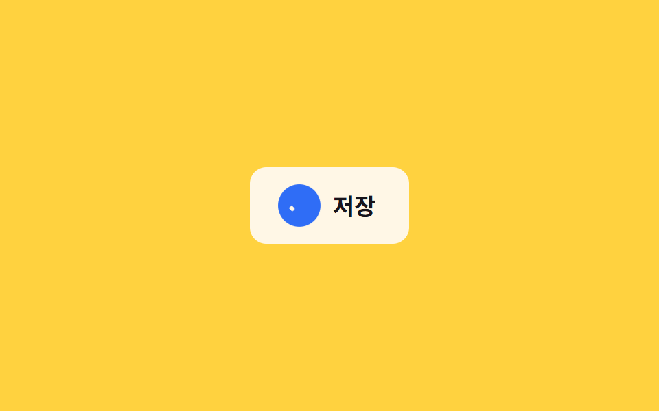
Icon đĩa mềm biến hình thành dấu tick khi bạn bấm lưu, nền đổi màu xanh để báo lưu xong ngay lập tức.
Dùng choNút tự động lưu trong form, trạng thái lưu của ứng dụng ghi chú
scaleX 획 긋기색상 전환0.3초
<main class="stage">
  <button class="save is-demo" type="button">
    <span class="save__icon" aria-hidden="true">
      <span class="save__ring"></span>
      <span class="save__disk"></span>
      <span class="save__check">
        <span class="save__check-bar save__check-bar--short"></span>
        <span class="save__check-bar save__check-bar--long"></span>
      </span>
    </span>
    <span class="save__label">Lưu</span>
  </button>
</main>
@use "../../../../site/static/demo-tokens" as *;
// ── 변수 3개 ──────────────────────────────────────────
$duration: $dur-base; // 디스켓 → 체크 전환 시간
$easing: $ease-pop; // 배지가 팝업하는 이징
$color: $subject-blue; // 완료 배지 강조색
// ── 데모 무대 ──────────────────────────────────────────
@include stage($stage-yellow);
.save {
display: inline-flex;
align-items: center;
gap: clamp(8px, 2.6vw, 12px);
border: 0;
border-radius: $r-control;
padding: clamp(12px, 4vw, 16px) clamp(18px, 5.6vw, 24px);
font-weight: 700;
font-size: clamp(14px, 4vw, 17px);
line-height: 1;
font-family: inherit;
color: $stage-ink;
background: $subject-cream;
cursor: pointer;
-webkit-tap-highlight-color: transparent;
&__icon { position: relative; width: 24px; height: 24px; flex: none; }
// 배지: 원형이 팝업하며 완료를 알린다
&__ring {
position: absolute; inset: -3px;
border-radius: 50%;
background: $color;
opacity: 0;
transform: scale(.4);
}
// 디스켓: 사각 + 오른쪽 위 노치
&__disk {
position: absolute; inset: 0;
border: 2.4px solid currentColor;
border-radius: 4px;
opacity: 1;
transform: scale(1);
&::after {
content: "";
position: absolute; top: 3px; right: 3px;
width: 7px; height: 6px;
background: currentColor;
}
}
// 체크: 두 개의 획이 각각 scaleX 로 그어진다
&__check { position: absolute; inset: 0; color: $subject-cream; }
&__check-bar {
position: absolute;
height: 3px;
border-radius: 2px;
background: currentColor;
transform: scaleX(0);
transform-origin: left center; // 규칙8: 체크 막대 같은 꼭짓점
}
&__check-bar--short { width: 6px; left: 8px; top: 14px; transform: rotate(225deg) scaleX(0); } // 두 막대가 같은 꼭짓점(8,14)에서 출발 — 어긋남 0
&__check-bar--long { width: 13px; left: 8px; top: 14px; transform: rotate(-52deg) scaleX(0); }
&.is-saved &__ring { animation: ring-pop $duration $easing forwards; }
&.is-saved &__disk { animation: disk-out $duration $easing forwards; }
&.is-saved &__check-bar--short { animation: check-short $duration $easing forwards; animation-delay: $duration * .35; }
&.is-saved &__check-bar--long { animation: check-long $duration $easing forwards; animation-delay: $duration * .5; }
&.is-demo &__ring { animation: ring-pop-loop $dur-loop $easing infinite; }
&.is-demo &__disk { animation: disk-out-loop $dur-loop $easing infinite; }
&.is-demo &__check-bar--short { animation: check-short-loop $dur-loop $easing infinite; }
&.is-demo &__check-bar--long { animation: check-long-loop $dur-loop $easing infinite; }
}
@keyframes ring-pop { from { opacity: 0; transform: scale(.4); } to { opacity: 1; transform: scale(1); } }
@keyframes disk-out { from { opacity: 1; transform: scale(1); } to { opacity: 0; transform: scale(.5); } }
@keyframes check-short { to { transform: rotate(225deg) scaleX(1); } }
@keyframes check-long { to { transform: rotate(-52deg) scaleX(1); } }
@keyframes ring-pop-loop {
0%, 20% { opacity: 0; transform: scale(.4); }
40%, 85% { opacity: 1; transform: scale(1); }
100% { opacity: 0; transform: scale(.4); }
}
@keyframes disk-out-loop {
0%, 20% { opacity: 1; transform: scale(1); }
40%, 85% { opacity: 0; transform: scale(.5); }
100% { opacity: 1; transform: scale(1); }
}
@keyframes check-short-loop {
0%, 27% { transform: rotate(225deg) scaleX(0); }
45%, 85% { transform: rotate(225deg) scaleX(1); }
100% { transform: rotate(225deg) scaleX(0); }
}
@keyframes check-long-loop {
0%, 32% { transform: rotate(-52deg) scaleX(0); }
50%, 85% { transform: rotate(-52deg) scaleX(1); }
100% { transform: rotate(-52deg) scaleX(0); }
}
// ── 접근성: 움직임 줄이기 설정이면 상태만 바뀌고 과정은 생략 ────
@media (prefers-reduced-motion: reduce) {
.save__ring, .save__disk, .save__check-bar { animation: none !important; }
.save.is-saved .save__ring { opacity: 1; transform: scale(1); }
.save.is-saved .save__disk { opacity: 0; }
.save.is-saved .save__check-bar--short { transform: rotate(225deg) scaleX(1); }
.save.is-saved .save__check-bar--long { transform: rotate(-52deg) scaleX(1); }
}html, body {
margin: 0;
overflow: hidden;
}
.stage {
box-sizing: border-box;
min-height: 100vh;
display: grid;
place-items: center;
margin: 0;
background: #ffd23f;
font-family: -apple-system, "Segoe UI", "Noto Sans KR", sans-serif;
padding: clamp(8px, 4vw, 24px);
}
.save {
display: inline-flex;
align-items: center;
gap: clamp(8px, 2.6vw, 12px);
border: 0;
border-radius: 12px;
padding: clamp(12px, 4vw, 16px) clamp(18px, 5.6vw, 24px);
font-weight: 700;
font-size: clamp(14px, 4vw, 17px);
line-height: 1;
font-family: inherit;
color: #17141a;
background: #fff7e6;
cursor: pointer;
-webkit-tap-highlight-color: transparent;
}
.save__icon {
position: relative;
width: 24px;
height: 24px;
flex: none;
}
.save__ring {
position: absolute;
inset: -3px;
border-radius: 50%;
background: #2f6df6;
opacity: 0;
transform: scale(0.4);
}
.save__disk {
position: absolute;
inset: 0;
border: 2.4px solid currentColor;
border-radius: 4px;
opacity: 1;
transform: scale(1);
}
.save__disk::after {
content: "";
position: absolute;
top: 3px;
right: 3px;
width: 7px;
height: 6px;
background: currentColor;
}
.save__check {
position: absolute;
inset: 0;
color: #fff7e6;
}
.save__check-bar {
position: absolute;
height: 3px;
border-radius: 2px;
background: currentColor;
transform: scaleX(0);
transform-origin: left center;
}
.save__check-bar--short {
width: 6px;
left: 8px;
top: 14px;
transform: rotate(225deg) scaleX(0);
}
.save__check-bar--long {
width: 13px;
left: 8px;
top: 14px;
transform: rotate(-52deg) scaleX(0);
}
.save.is-saved .save__ring {
animation: ring-pop 300ms cubic-bezier(0.2, 1.4, 0.4, 1) forwards;
}
.save.is-saved .save__disk {
animation: disk-out 300ms cubic-bezier(0.2, 1.4, 0.4, 1) forwards;
}
.save.is-saved .save__check-bar--short {
animation: check-short 300ms cubic-bezier(0.2, 1.4, 0.4, 1) forwards;
animation-delay: 105ms;
}
.save.is-saved .save__check-bar--long {
animation: check-long 300ms cubic-bezier(0.2, 1.4, 0.4, 1) forwards;
animation-delay: 150ms;
}
.save.is-demo .save__ring {
animation: ring-pop-loop 2s cubic-bezier(0.2, 1.4, 0.4, 1) infinite;
}
.save.is-demo .save__disk {
animation: disk-out-loop 2s cubic-bezier(0.2, 1.4, 0.4, 1) infinite;
}
.save.is-demo .save__check-bar--short {
animation: check-short-loop 2s cubic-bezier(0.2, 1.4, 0.4, 1) infinite;
}
.save.is-demo .save__check-bar--long {
animation: check-long-loop 2s cubic-bezier(0.2, 1.4, 0.4, 1) infinite;
}
@keyframes ring-pop {
from {
opacity: 0;
transform: scale(0.4);
}
to {
opacity: 1;
transform: scale(1);
}
}
@keyframes disk-out {
from {
opacity: 1;
transform: scale(1);
}
to {
opacity: 0;
transform: scale(0.5);
}
}
@keyframes check-short {
to {
transform: rotate(225deg) scaleX(1);
}
}
@keyframes check-long {
to {
transform: rotate(-52deg) scaleX(1);
}
}
@keyframes ring-pop-loop {
0%, 20% {
opacity: 0;
transform: scale(0.4);
}
40%, 85% {
opacity: 1;
transform: scale(1);
}
100% {
opacity: 0;
transform: scale(0.4);
}
}
@keyframes disk-out-loop {
0%, 20% {
opacity: 1;
transform: scale(1);
}
40%, 85% {
opacity: 0;
transform: scale(0.5);
}
100% {
opacity: 1;
transform: scale(1);
}
}
@keyframes check-short-loop {
0%, 27% {
transform: rotate(225deg) scaleX(0);
}
45%, 85% {
transform: rotate(225deg) scaleX(1);
}
100% {
transform: rotate(225deg) scaleX(0);
}
}
@keyframes check-long-loop {
0%, 32% {
transform: rotate(-52deg) scaleX(0);
}
50%, 85% {
transform: rotate(-52deg) scaleX(1);
}
100% {
transform: rotate(-52deg) scaleX(0);
}
}
@media (prefers-reduced-motion: reduce) {
.save__ring, .save__disk, .save__check-bar {
animation: none !important;
}
.save.is-saved .save__ring {
opacity: 1;
transform: scale(1);
}
.save.is-saved .save__disk {
opacity: 0;
}
.save.is-saved .save__check-bar--short {
transform: rotate(225deg) scaleX(1);
}
.save.is-saved .save__check-bar--long {
transform: rotate(-52deg) scaleX(1);
}
}// 실제 클릭 한 번 = Lưu 완료 한 번. 데모(.is-demo) 루프는 손을 대면 멈추고 수동 상태로 바뀐다.
document.querySelector('.save').addEventListener('click', function (e) {
var b = e.currentTarget;
b.classList.remove('is-demo');
b.classList.remove('is-saved');
void b.offsetWidth;
b.classList.add('is-saved');
});import { useState } from "react";
import type { CSSProperties, MouseEvent } from "react";
import styles from "./SaveCheckButton.module.scss";
export type SaveCheckButtonProps = {
label: string;
/** 디스켓 → 체크 전환 시간 (기본 300ms) */
duration?: number;
easing?: string;
/** 완료 배지 강조색 */
color?: string;
onSave?: (e: MouseEvent<HTMLButtonElement>) => void;
};
type Vars = CSSProperties & { "--duration"?: string; "--easing"?: string; "--color"?: string };
export default function SaveCheckButton({
label,
duration = 300,
easing = "cubic-bezier(.2,1.4,.4,1)",
color = "#2f6df6",
onSave,
}: SaveCheckButtonProps) {
const [saved, setSaved] = useState(false);
const vars: Vars = { "--duration": `${duration}ms`, "--easing": easing, "--color": color };
const handle = (e: MouseEvent<HTMLButtonElement>) => {
setSaved(true);
onSave?.(e);
};
return (
<button
type="button"
className={saved ? `${styles.save} ${styles.saved}` : styles.save}
style={vars}
onClick={handle}
>
<span className={styles.icon} aria-hidden="true">
<span className={styles.ring} />
<span className={styles.disk} />
<span className={styles.check}>
<span className={`${styles.bar} ${styles.barShort}`} />
<span className={`${styles.bar} ${styles.barLong}`} />
</span>
</span>
<span>{label}</span>
</button>
);
}02 Hoạt ảnh lưu thành tick — Diện tích đo được 0.583% · khung hình chuyển động 11/23Nguyên tác GODRICH · SCSS và React nằm trong tệp zip · 9 micro interactions css — dán 1 dòng chạy ngay
Bài viết chứa demo này
 9 micro interactions css — dán 1 dòng chạy ngayMicro interactions css là những phản hồi cực nhỏ trên giao diện — nút lún xuống, icon đổi hình, toast xếp chồng — báo ch Xem tất cả demo trong bài này